Use this design system
Tokens · motion · components — drop straight into your project.
Download design kitStart a project with it
Similar styles
# DoorDash Design System

## Tokens — Colors

| Token | Hex | Usage |
|-------|-----|-------|
| `color-brand-red` | `#FF3008` | Primary brand color, CTAs, logo |
| `color-burgundy` | `#5D1049` | Dark headings on light backgrounds |
| `color-white` | `#FFFFFF` | Backgrounds, button text |
| `color-black` | `#191919` | Primary text, headings |
| `color-gray-700` | `#5C5C5C` | Body text |
| `color-gray-500` | `#8A8A8A` | Secondary text |
| `color-gray-300` | `#D9D9D9` | Borders, dividers |
| `color-gray-100` | `#F5F5F5` | Light backgrounds |
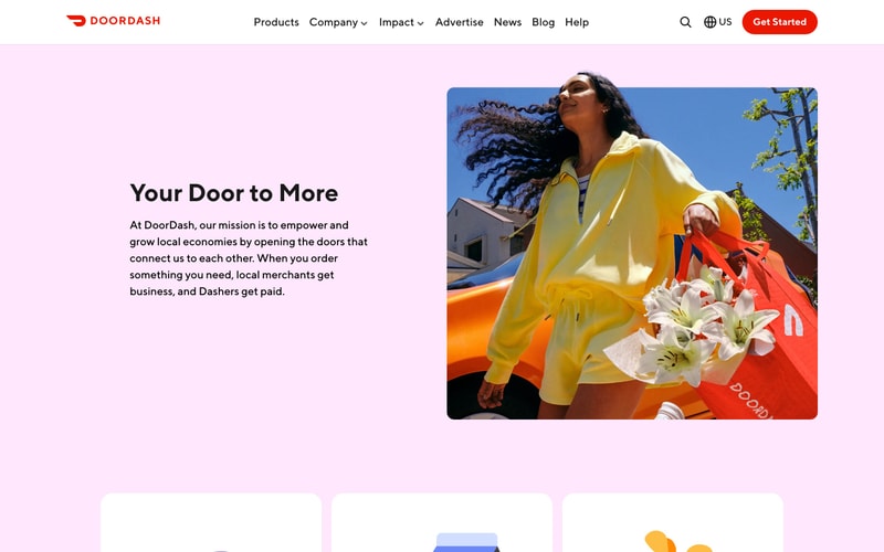
| `color-pink-50` | `#FFE5F0` | Section backgrounds |
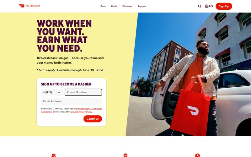
| `color-yellow-100` | `#F9F871` | Section backgrounds (Dashers) |

## Tokens — Typography

**Font Families:**
- Primary: Custom sans-serif (likely "DD-TTNorms" or similar to "Graphik", "Inter")
- Fallback: `-apple-system, BlinkMacSystemFont, "Segoe UI", Roboto, Helvetica, Arial, sans-serif`

**Type Scale:**

| Token | Size | Line Height | Weight | Usage |
|-------|------|-------------|--------|-------|
| `text-hero` | 64px / 4rem | 1.1 | 700 | Hero headings |
| `text-h1` | 48px / 3rem | 1.2 | 700 | Page titles |
| `text-h2` | 36px / 2.25rem | 1.3 | 700 | Section headings |
| `text-h3` | 28px / 1.75rem | 1.4 | 700 | Component headings |
| `text-xl` | 20px / 1.25rem | 1.5 | 600 | Large body |
| `text-base` | 16px / 1rem | 1.6 | 400 | Body text |
| `text-sm` | 14px / 0.875rem | 1.5 | 400 | Small text, captions |

## Tokens — Spacing

| Token | Value | Usage |
|-------|-------|-------|
| `spacing-1` | 4px | Minimal spacing |
| `spacing-2` | 8px | Tight spacing |
| `spacing-3` | 12px | Small gaps |
| `spacing-4` | 16px | Default gap |
| `spacing-5` | 20px | Medium gaps |
| `spacing-6` | 24px | Large gaps |
| `spacing-8` | 32px | Section padding |
| `spacing-10` | 40px | Large padding |
| `spacing-12` | 48px | XL padding |
| `spacing-16` | 64px | Container padding |
| `spacing-20` | 80px | Section spacing |
| `spacing-24` | 96px | Large sections |
| `spacing-30` | 120px | Hero spacing |

## Tokens — Border Radius

| Token | Value | Usage |
|-------|-------|-------|
| `radius-sm` | 4px | Small elements |
| `radius-md` | 8px | Input fields, cards |
| `radius-lg` | 12px | Large cards |
| `radius-xl` | 16px | Featured cards |
| `radius-pill` | 24px | Buttons, badges |
| `radius-full` | 9999px | Circular elements |

## Tokens — Shadows

| Token | Value | Usage |
|-------|-------|-------|
| `shadow-sm` | `0 1px 2px rgba(0, 0, 0, 0.05)` | Subtle elevation |
| `shadow-md` | `0 4px 6px rgba(0, 0, 0, 0.07)` | Cards, dropdowns |
| `shadow-lg` | `0 10px 15px rgba(0, 0, 0, 0.1)` | Modals, popovers |
| `shadow-xl` | `0 20px 25px rgba(0, 0, 0, 0.15)` | High elevation |

## Tokens — Borders

| Token | Value | Usage |
|-------|-------|-------|
| `border-width` | 1px | Default borders |
| `border-width-thick` | 2px | Emphasized borders |
| `border-color` | `#D9D9D9` | Default border color |
| `border-color-focus` | `#FF3008` | Focus states |

## Components

### Button — Primary
- **Background:** `color-brand-red` (#FF3008)
- **Text:** `color-white` (#FFFFFF)
- **Padding:** 12px 32px
- **Border Radius:** `radius-pill` (24px)
- **Font:** `text-base`, weight 600
- **Hover:** Darken background 10%
- **Active:** Scale 0.98

### Button — Secondary
- **Background:** `color-white`
- **Text:** `color-brand-red`
- **Border:** 2px solid `color-brand-red`
- **Padding:** 12px 32px
- **Border Radius:** `radius-pill`

### Navigation Bar
- **Background:** `color-white`
- **Height:** 68px
- **Padding:** 0 80px (desktop), 0 24px (mobile)
- **Box Shadow:** `shadow-sm`
- **Logo:** Left-aligned
- **Links:** Center or right-aligned, `text-base`, weight 500
- **CTA Button:** Right-aligned, primary button

### Form Input
- **Background:** `color-white`
- **Border:** 1px solid `color-gray-300`
- **Padding:** 14px 16px
- **Border Radius:** `radius-md` (8px)
- **Font:** `text-base`
- **Focus:** Border `color-brand-red`, outline none

### Card
- **Background:** `color-white`
- **Padding:** 32px
- **Border Radius:** `radius-lg` (12px)
- **Box Shadow:** `shadow-md`

### Hero Section
- **Layout:** Two-column (text 50%, image 50%)
- **Vertical Padding:** 80-120px
- **Background:** Colored (`color-pink-50`, `color-yellow-100`) or white
- **Heading:** `text-hero`, `color-black` or `color-burgundy`
- **Body:** `text-xl`, `color-gray-700`
- **CTA:** Primary button, 24px margin-top

## Layout Patterns

### Container
- **Max Width:** 1280px
- **Padding:** 0 80px (desktop), 0 24px (mobile)
- **Margin:** 0 auto

### Grid
- **Columns:** 12-column grid
- **Gap:** 24px
- **Responsive:** 4 cols (mobile), 8 cols (tablet), 12 cols (desktop)

### Section Spacing
- **Vertical:** 80-120px between major sections
- **Inner:** 40-60px between subsections

### Breakpoints
- **Mobile:** < 768px
- **Tablet:** 768px - 1024px
- **Desktop:** > 1024px
- **Wide:** > 1440px