Use this design system
Tokens · motion · components — drop straight into your project.
Download design kitStart a project with it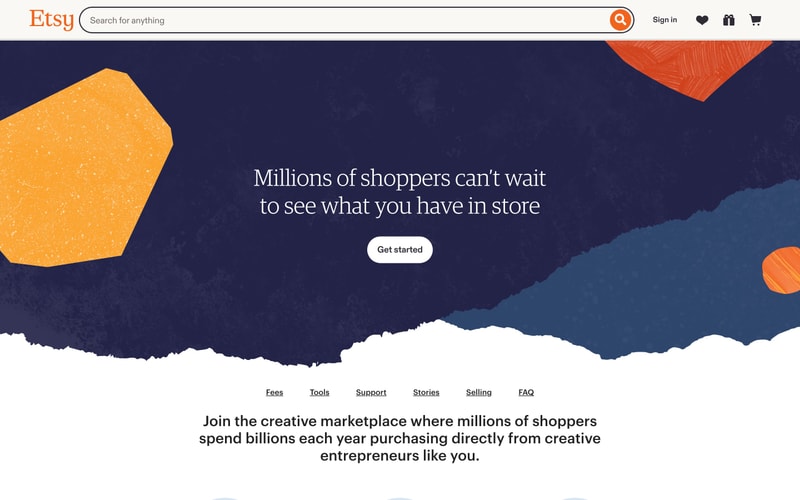
Similar styles
# Etsy Design System

## Tokens — Colors

| Token | Value | Usage |
|-------|-------|-------|
| `--color-brand-orange` | `#F1641E` | Primary brand color, logo, CTA buttons, accents |
| `--color-navy` | `#2D3047` | Dark backgrounds, hero sections |
| `--color-orange-light` | `#FFA05C` | Illustrations, organic shapes, highlights |
| `--color-coral` | `#FF6347` | Accent shapes, decorative elements |
| `--color-red-dark` | `#8B2635` | Illustration details, dark accents |
| `--color-peach` | `#FFB799` | Illustration fills, warm accents |
| `--color-salmon` | `#FFC4B0` | Soft illustration elements |
| `--color-teal` | `#507B9B` | Organic shapes, cool accents |
| `--color-white` | `#FFFFFF` | Primary background, text on dark |
| `--color-cream` | `#FFFBF7` | Subtle background tint |
| `--color-gray-50` | `#F9F9F9` | Light backgrounds |
| `--color-black` | `#222222` | Primary text |
| `--color-gray-700` | `#595959` | Secondary text |
| `--color-gray-500` | `#999999` | Tertiary text, disabled states |

## Tokens — Typography

**Font Families:**
- Headings: `'Guardian Egyptian', 'Guardian TextEgyp', Georgia, serif` (slab serif)
- Body: `'Graphik Webfont', 'Helvetica Neue', Helvetica, Arial, sans-serif`
- Logo: Custom Etsy wordmark (serif)

**Type Scale:**

| Token | Size | Line Height | Weight | Usage |
|-------|------|-------------|--------|-------|
| `--font-display-xl` | `72px` | `1.1` | `500` | Hero headings |
| `--font-display-lg` | `56px` | `1.15` | `500` | Large headings |
| `--font-heading-xl` | `48px` | `1.2` | `500` | Section headings |
| `--font-heading-lg` | `40px` | `1.25` | `500` | Page headings |
| `--font-heading-md` | `32px` | `1.3` | `500` | Subsection headings |
| `--font-body-lg` | `18px` | `1.6` | `400` | Large body text |
| `--font-body-md` | `16px` | `1.5` | `400` | Default body text |
| `--font-body-sm` | `14px` | `1.4` | `400` | Small body, navigation |
| `--font-body-xs` | `13px` | `1.4` | `400` | Captions, metadata |

## Tokens — Spacing

| Token | Value | Usage |
|-------|-------|-------|
| `--space-1` | `4px` | Micro spacing |
| `--space-2` | `8px` | Tight spacing |
| `--space-3` | `12px` | Small spacing |
| `--space-4` | `16px` | Base spacing |
| `--space-5` | `24px` | Medium spacing |
| `--space-6` | `32px` | Large spacing |
| `--space-8` | `48px` | XL spacing |
| `--space-10` | `64px` | Section spacing |
| `--space-12` | `80px` | Hero spacing |
| `--space-16` | `128px` | Massive spacing |

## Tokens — Border Radius

| Token | Value | Usage |
|-------|-------|-------|
| `--radius-sm` | `4px` | Small elements, cards |
| `--radius-md` | `8px` | Inputs, containers |
| `--radius-lg` | `12px` | Cards, modals |
| `--radius-pill` | `24px` | Buttons, search bars (pill shape) |
| `--radius-full` | `9999px` | Circular elements, badges |

## Tokens — Shadows

| Token | Value | Usage |
|-------|-------|-------|
| `--shadow-sm` | `0 1px 2px rgba(0, 0, 0, 0.08)` | Subtle elevation |
| `--shadow-md` | `0 2px 4px rgba(0, 0, 0, 0.1)` | Cards, inputs |
| `--shadow-lg` | `0 4px 8px rgba(0, 0, 0, 0.12)` | Dropdowns, popovers |
| `--shadow-xl` | `0 8px 16px rgba(0, 0, 0, 0.15)` | Modals, overlays |

## Tokens — Borders

| Token | Value | Usage |
|-------|-------|-------|
| `--border-width-thin` | `1px` | Default borders |
| `--border-width-thick` | `2px` | Emphasis, active states |
| `--border-width-heavy` | `3px` | Strong emphasis |
| `--border-color-light` | `#E8E8E8` | Subtle dividers |
| `--border-color-medium` | `#D1D1D1` | Default borders |
| `--border-color-dark` | `#999999` | Strong borders |

## Components

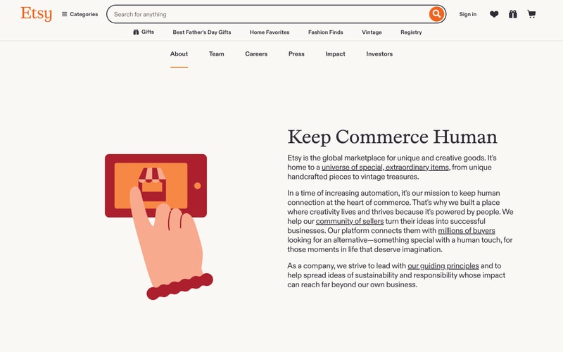
### Navigation Bar
- Height: 60-70px
- White background with subtle bottom border
- Logo left-aligned, search center, actions right
- Icon size: 24px
- Horizontal padding: 24px

### Search Input
- Height: 48px
- Border radius: 24px (pill)
- Light gray border (#E8E8E8)
- Placeholder text: gray-500
- Search button: circular, orange background (#F1641E)
- Button size: 40px diameter
- Padding: 12px 48px 12px 16px

### Primary Button
- Padding: 12px 32px
- Border radius: 24px (pill)
- Font size: 16px, weight 500
- White background on dark sections
- Black text on white button
- Hover: subtle shadow

### Text Links
- Underline on hover
- Color: inherit or brand-orange
- Active state: orange underline (2-3px thick)

### Hero Section
- Full viewport width
- Centered content, max-width ~800px
- Large serif heading
- Organic decorative shapes (SVG or CSS)
- Generous vertical padding (80-120px)

### Illustration Graphics
- Organic, hand-drawn style shapes
- Textured fills with grain/noise
- Overlapping layers
- Warm color palette (oranges, reds, peaches)
- Cool accents (teal, navy)

## Layout Patterns

### Container
- Max width: 1400px
- Horizontal padding: 24-48px
- Centered with auto margins

### Grid
- 12-column grid system
- Gap: 24px or 32px
- Responsive breakpoints:
  - Mobile: < 768px
  - Tablet: 768px - 1024px
  - Desktop: > 1024px

### Section Spacing
- Large sections: 80-120px vertical padding
- Medium sections: 48-64px vertical padding
- Compact sections: 32-48px vertical padding

### Navigation Menu
- Horizontal layout
- Items spaced 24-32px apart
- Active indicator: orange underline
- Dropdown on hover (if applicable)