Use this design system
Tokens · motion · components — drop straight into your project.
Download design kitStart a project with it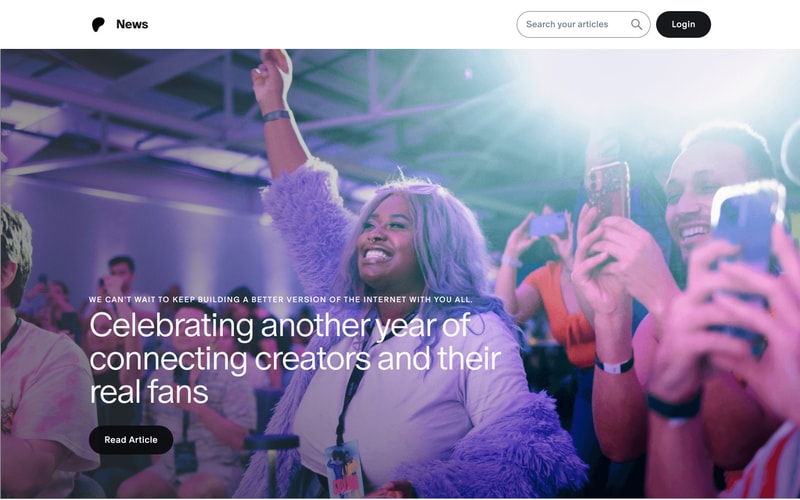
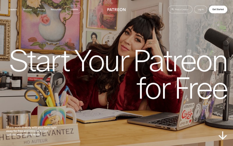
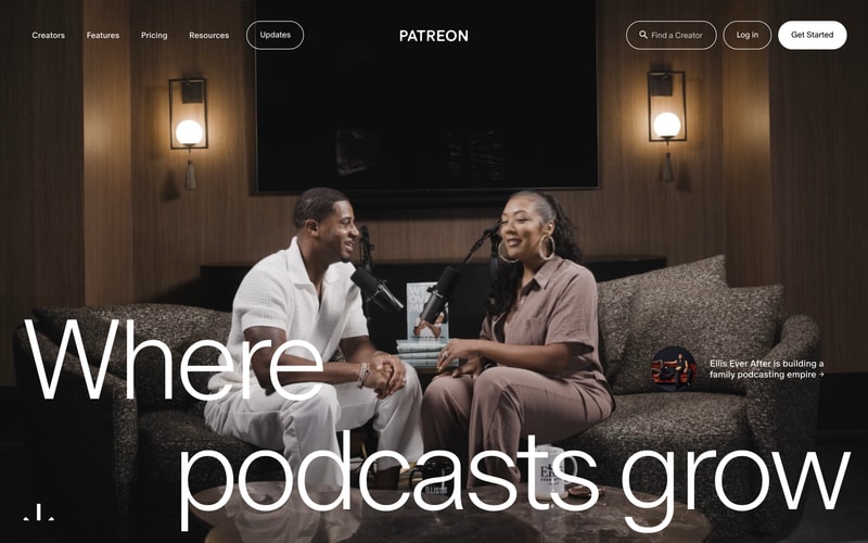
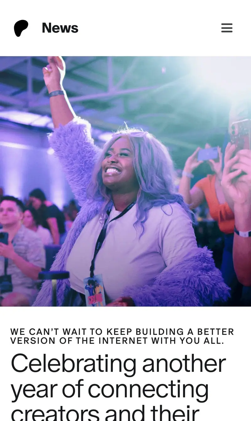
Similar styles
# Patreon Design System

## Tokens — Colors

| Token | Value | Usage |
|-------|-------|-------|
| Primary Blue | `#0052FF` | Primary brand color, CTA buttons, links |
| Primary Blue Dark | `#0041CC` | Button hover states |
| Purple Deep | `#2E1A47` | Hero gradient backgrounds, dark sections |
| Purple Medium | `#6B2FB5` | Gradient accents |
| Blue Bright | `#4D7FFF` | Interactive elements, hover states |
| White | `#FFFFFF` | Light backgrounds, text on dark |
| Black | `#000000` | Primary text, dark buttons |
| Gray Dark | `#1A1A1A` | Secondary text |
| Gray Medium | `#6C6C6C` | Tertiary text, meta information |
| Gray Light | `#E6E6E6` | Borders, dividers |
| Gray Lighter | `#F7F7F7` | Light backgrounds, cards |
| Background Gradient Start | `#2E1A47` | Hero gradient start |
| Background Gradient End | `#0052FF` | Hero gradient end |

## Tokens — Typography

**Font Families:**
- Primary: System UI stack (-apple-system, BlinkMacSystemFont, "Segoe UI", Roboto, sans-serif)
- Fallback: Arial, Helvetica, sans-serif

**Type Scale:**

| Token | Size | Line Height | Weight | Usage |
|-------|------|-------------|--------|-------|
| Display XL | 72px | 1.1 | 600 | Hero headlines |
| Display L | 56px | 1.15 | 600 | Large headlines |
| Display M | 48px | 1.2 | 600 | Section headlines |
| Heading 1 | 36px | 1.25 | 600 | Page titles |
| Heading 2 | 28px | 1.3 | 600 | Section headers |
| Heading 3 | 24px | 1.35 | 600 | Card headers |
| Heading 4 | 20px | 1.4 | 600 | Small headers |
| Body Large | 18px | 1.6 | 400 | Large body text |
| Body | 16px | 1.5 | 400 | Default body text |
| Body Small | 14px | 1.5 | 400 | Secondary text |
| Caption | 12px | 1.4 | 400 | Meta information |

## Tokens — Spacing

Base unit: `8px`

| Token | Value |
|-------|-------|
| xs | 4px |
| sm | 8px |
| md | 16px |
| lg | 24px |
| xl | 32px |
| 2xl | 48px |
| 3xl | 64px |
| 4xl | 96px |
| 5xl | 128px |

## Tokens — Border Radius

| Token | Value | Usage |
|-------|-------|-------|
| sm | 6px | Small cards, inputs |
| md | 8px | Standard cards |
| lg | 12px | Large cards |
| xl | 24px | Buttons |
| pill | 999px | Pill buttons, badges |
| circle | 50% | Avatars |

## Tokens — Shadows

| Token | Value |
|-------|-------|
| sm | 0 1px 2px rgba(0, 0, 0, 0.05) |
| md | 0 2px 8px rgba(0, 0, 0, 0.08) |
| lg | 0 4px 16px rgba(0, 0, 0, 0.12) |
| xl | 0 8px 24px rgba(0, 0, 0, 0.15) |

## Tokens — Borders

| Token | Value |
|-------|-------|
| Default | 1px solid #E6E6E6 |
| Focus | 2px solid #0052FF |
| Input | 1px solid #E6E6E6 |

## Components

### Navigation Bar
- Fixed header, full-width
- Background: Transparent on hero, white on scroll
- Height: ~72px
- Items: Logo (left), nav links (center), actions (right)
- Text links use medium weight, ~14-16px
- Button spacing: 12px gap

### Buttons

**Primary (Solid Black)**
- Background: `#000000`
- Text: `#FFFFFF`
- Padding: `12px 24px`
- Border radius: `24px` (pill)
- Font: 16px, 600 weight
- Hover: Slight opacity or scale

**Secondary (Outlined)**
- Background: Transparent
- Border: `2px solid #FFFFFF` or `#000000`
- Text: `#FFFFFF` or `#000000`
- Padding: `12px 24px`
- Border radius: `24px`
- Font: 16px, 600 weight

**Tertiary (Text)**
- Background: Transparent
- Text: `#0052FF`
- No border
- Padding: `8px 16px`
- Font: 16px, 500 weight

### Search Input
- Border: `1px solid #E6E6E6`
- Border radius: `24px` (pill)
- Padding: `10px 20px 10px 40px`
- Icon: Magnifying glass, left-aligned
- Placeholder color: `#6C6C6C`
- Background: `#F7F7F7` or white

### Profile Card
- Background: White
- Border: `1px solid #E6E6E6`
- Border radius: `8px`
- Padding: `32px`
- Shadow: `0 2px 8px rgba(0, 0, 0, 0.08)`
- Avatar: Circular, 120px diameter
- Center-aligned content

### Hero Section
- Full viewport height
- Background: Gradient or photo overlay
- Text: Center-aligned, white
- Large display typography
- CTA buttons below headline
- Down arrow indicator at bottom

### Footer
- Multi-column layout (3-4 columns)
- Background: White or light gray
- Links: `#0052FF`, underline on hover
- Social icons: 32px, circle background
- App badges: Standard iOS/Android sizes
- Spacing: 24px column gap, 16px row gap

### Call-to-Action Box
- Background: White
- Border: `1px solid #E6E6E6`
- Border radius: `8px`
- Padding: `24px`
- Heading + body + button layout

## Layout Patterns

### Container
- Max width: `1200px` (desktop)
- Padding: `24px` (mobile), `48px` (tablet), `64px` (desktop)
- Centered with `margin: 0 auto`

### Grid
- Profile grid: 3 columns on desktop, 2 on tablet, 1 on mobile
- Gap: `24px`
- Uses CSS Grid or Flexbox

### Hero Layout
- Centered content
- Max width for text: `800px`
- Vertical centering with Flexbox
- Z-index for overlay text

### Sidebar Layout
- 2-column: 70/30 split (main/sidebar)
- Gap: `32px`
- Responsive: Stacks on mobile