Use this design system
Tokens · motion · components — drop straight into your project.
Download design kitStart a project with it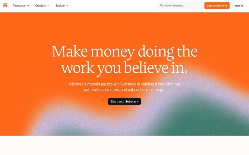
Similar styles
# Substack Design System

## Tokens — Colors

| Token | Hex | Usage |
|-------|-----|-------|
| `--color-primary` | `#FF6719` | Primary CTA buttons, brand accent, active states |
| `--color-primary-hover` | `#E85D15` | Primary button hover state |
| `--color-primary-active` | `#D15312` | Primary button active/pressed state |
| `--color-teal` | `#0F6F5C` | Hero backgrounds, accent panels |
| `--color-teal-light` | `#1A8B76` | Gradient end states |
| `--color-cyan` | `#4EBFAD` | Gradient accents |
| `--color-black` | `#000000` | Headlines, primary text |
| `--color-gray-900` | `#1A1A1A` | Body text, high-emphasis content |
| `--color-gray-700` | `#424242` | Medium-emphasis text |
| `--color-gray-600` | `#6B6B6B` | Secondary text, metadata |
| `--color-gray-500` | `#999999` | Tertiary text, placeholders |
| `--color-gray-400` | `#CCCCCC` | Borders, dividers |
| `--color-gray-300` | `#E0E0E0` | Light borders |
| `--color-gray-200` | `#EBEBEB` | Card backgrounds, subtle dividers |
| `--color-gray-100` | `#F7F7F7` | Sidebar backgrounds, hover states |
| `--color-gray-50` | `#FAFAFA` | Page backgrounds |
| `--color-white` | `#FFFFFF` | Card backgrounds, primary surface |

## Tokens — Typography

### Font Families

- **Serif**: Georgia, "Times New Roman", serif (fallback for Lyon Text / Tiempos Text)
- **Sans-serif**: -apple-system, BlinkMacSystemFont, "Segoe UI", Helvetica, Arial, sans-serif

### Type Scale

| Token | Size | Line Height | Weight | Usage |
|-------|------|-------------|--------|-------|
| `--text-display-xl` | 72px | 1.1 | 700 | Hero headlines |
| `--text-display-lg` | 64px | 1.15 | 700 | Large display text |
| `--text-display-md` | 48px | 1.2 | 700 | Section headlines |
| `--text-display-sm` | 32px | 1.25 | 700 | Card headlines |
| `--text-heading-xl` | 24px | 1.3 | 700 | Page titles |
| `--text-heading-lg` | 20px | 1.4 | 600 | Content headings |
| `--text-heading-md` | 18px | 1.4 | 600 | Sub-headings |
| `--text-body-lg` | 18px | 1.6 | 400 | Large body text |
| `--text-body` | 16px | 1.5 | 400 | Default body text |
| `--text-body-sm` | 15px | 1.5 | 400 | Descriptions |
| `--text-caption` | 14px | 1.4 | 400 | Metadata, labels |
| `--text-caption-sm` | 13px | 1.3 | 400 | Fine print, timestamps |
| `--text-overline` | 11px | 1.4 | 600 | Uppercase labels |

## Tokens — Spacing

Based on 4px base unit:

- `--space-1`: 4px
- `--space-2`: 8px
- `--space-3`: 12px
- `--space-4`: 16px
- `--space-5`: 20px
- `--space-6`: 24px
- `--space-8`: 32px
- `--space-10`: 40px
- `--space-12`: 48px
- `--space-16`: 64px
- `--space-20`: 80px
- `--space-24`: 96px

## Tokens — Border Radius

- `--radius-sm`: 4px (inputs, badges)
- `--radius-md`: 6px (buttons, cards)
- `--radius-lg`: 8px (large panels)
- `--radius-xl`: 12px (modals)
- `--radius-full`: 9999px (pills, avatars)

## Tokens — Shadows

- `--shadow-xs`: 0 1px 2px rgba(0, 0, 0, 0.05)
- `--shadow-sm`: 0 1px 3px rgba(0, 0, 0, 0.1)
- `--shadow-md`: 0 2px 8px rgba(0, 0, 0, 0.08)
- `--shadow-lg`: 0 4px 16px rgba(0, 0, 0, 0.12)
- `--shadow-xl`: 0 8px 24px rgba(0, 0, 0, 0.15)

## Tokens — Borders

- `--border-width`: 1px
- `--border-color`: var(--color-gray-300)
- `--border-color-light`: var(--color-gray-200)

## Components

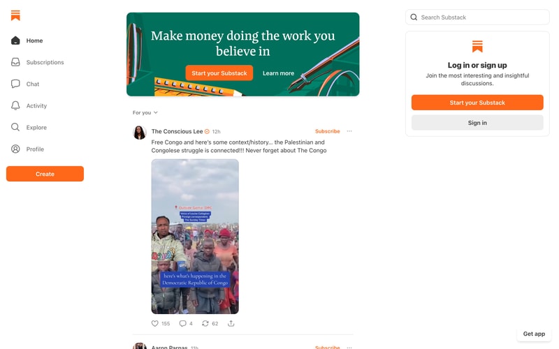
### Navigation Sidebar (Vertical)
- Background: `--color-gray-100`
- Width: 224px
- Item padding: 12px 16px
- Icon size: 24px
- Gap between icon and label: 12px
- Active state: background `--color-white`, border-left 3px solid `--color-primary`

### Top Navigation Bar
- Background: `--color-white`
- Height: 64px
- Border-bottom: 1px solid `--color-gray-200`
- Horizontal padding: 24px
- Logo size: 32px height

### Buttons

**Primary**
- Background: `--color-primary`
- Color: `--color-white`
- Padding: 12px 24px
- Border-radius: `--radius-md`
- Font: 16px, weight 600
- Hover: background `--color-primary-hover`

**Secondary**
- Background: `--color-gray-100`
- Color: `--color-gray-900`
- Padding: 12px 24px
- Border-radius: `--radius-md`

**Ghost/Text**
- Background: transparent
- Color: `--color-white` or `--color-gray-900`
- Padding: 12px 24px

### Cards

**Content Card**
- Background: `--color-white`
- Border-radius: `--radius-lg`
- Padding: 24px
- Shadow: `--shadow-md`
- Border: 1px solid `--color-gray-200`

**List Item Card**
- Padding: 16px 0
- Border-bottom: 1px solid `--color-gray-200`

### Input Fields

**Search**
- Background: `--color-white`
- Border: 1px solid `--color-gray-300`
- Border-radius: `--radius-md`
- Padding: 10px 16px
- Font: 15px
- Focus: border-color `--color-primary`

**Select/Dropdown**
- Same as search input
- Right icon: chevron-down 16px

### Tabs
- Border-bottom: 2px solid `--color-gray-200`
- Active tab: border-bottom 2px solid `--color-black`
- Tab padding: 12px 16px
- Font: 15px, weight 500

### Icons
- Style: Outlined/stroke
- Stroke width: 2px
- Sizes: 16px, 20px, 24px, 32px

### Engagement Metrics
- Icon + count horizontal layout
- Gap: 4px
- Font: 14px, color `--color-gray-600`
- Icon size: 16px

## Layout Patterns

### Three-Column Dashboard
- Left sidebar: 224px fixed
- Main content: flexible, max-width 880px
- Right sidebar: 368px fixed
- Gap: 24px

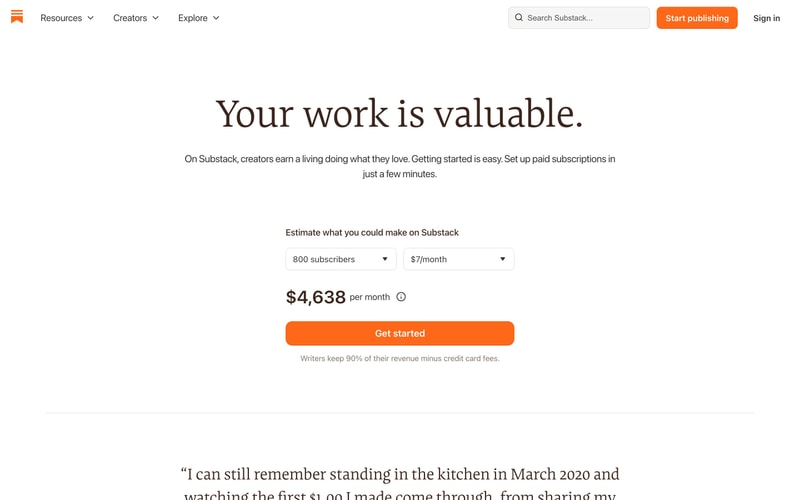
### Center-Aligned Hero
- Max-width: 680px
- Center-aligned text
- Margin: auto
- Padding: 80px 24px

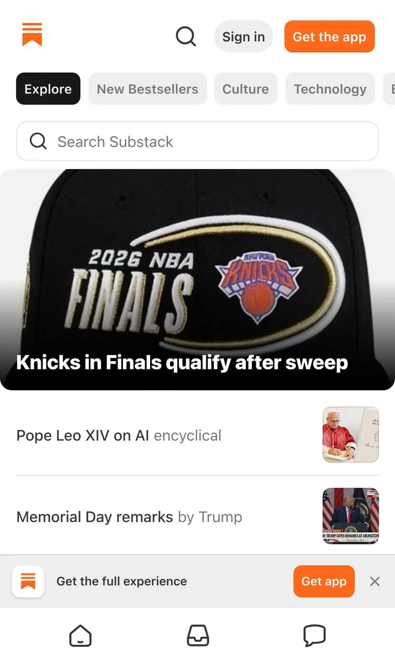
### Content Feed
- Max-width: 680px
- Item spacing: 24px vertical
- Horizontal padding: 24px

### Grid Layout (Cards)
- Columns: 1-3 (responsive)
- Gap: 24px
- Card min-width: 280px