Use this design system
Tokens · motion · components — drop straight into your project.
Download design kitStart a project with it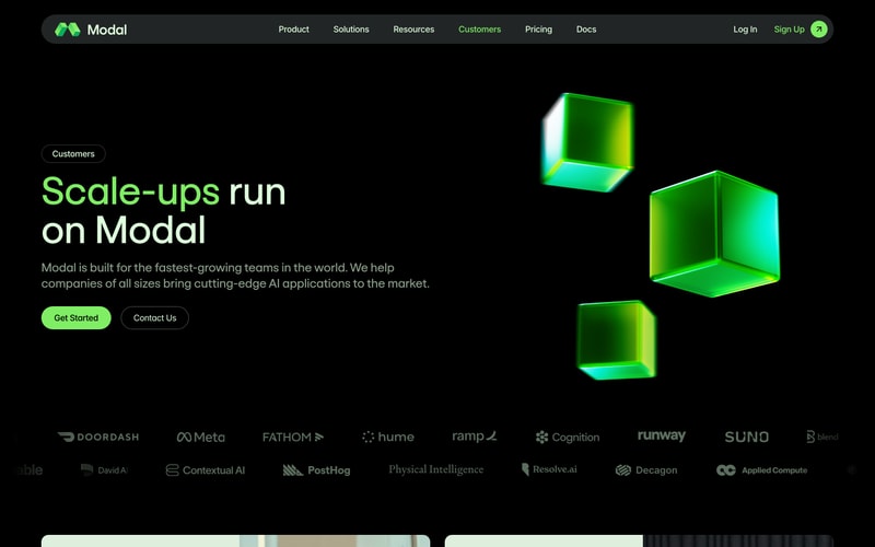


Similar styles
# Modal Design System

## Tokens — Colors

| Token | Hex | Usage |
|-------|-----|-------|
| `--color-primary` | `#8FFF00` | Brand green, primary CTAs, accents, highlights |
| `--color-bg-primary` | `#000000` | Primary background |
| `--color-bg-surface` | `#1A1A1A` | Cards, elevated surfaces |
| `--color-bg-elevated` | `#242424` | Hover states, elevated elements |
| `--color-text-primary` | `#FFFFFF` | Primary text, headings |
| `--color-text-secondary` | `#999999` | Secondary text, descriptions |
| `--color-text-muted` | `#666666` | Muted text, metadata |
| `--color-border` | `#333333` | Borders, dividers |
| `--color-border-subtle` | `#1F1F1F` | Subtle borders |

## Tokens — Typography

**Font Family:**
- Primary: `-apple-system, BlinkMacSystemFont, "Segoe UI", "Inter", sans-serif`
- Monospace: `"Consolas", "Monaco", monospace`

**Type Scale:**

| Token | Size | Line Height | Weight | Usage |
|-------|------|-------------|--------|-------|
| `--font-hero` | 80px | 1.1 | 700 | Hero headlines |
| `--font-display` | 64px | 1.1 | 700 | Page titles |
| `--font-h1` | 48px | 1.2 | 700 | H1 headings |
| `--font-h2` | 32px | 1.3 | 700 | H2 headings |
| `--font-h3` | 24px | 1.4 | 600 | H3 headings |
| `--font-body-lg` | 18px | 1.6 | 400 | Large body text |
| `--font-body` | 16px | 1.6 | 400 | Body text |
| `--font-body-sm` | 14px | 1.5 | 400 | Small text |
| `--font-caption` | 12px | 1.4 | 400 | Captions, labels |

## Tokens — Spacing

| Token | Value | Usage |
|-------|-------|-------|
| `--space-1` | 4px | Tiny gaps |
| `--space-2` | 8px | Small spacing |
| `--space-3` | 12px | Medium-small spacing |
| `--space-4` | 16px | Base spacing |
| `--space-5` | 24px | Medium spacing |
| `--space-6` | 32px | Large spacing |
| `--space-8` | 48px | Extra-large spacing |
| `--space-10` | 64px | Section spacing |
| `--space-12` | 96px | Hero spacing |

## Tokens — Border Radius

| Token | Value | Usage |
|-------|-------|-------|
| `--radius-sm` | 4px | Small elements |
| `--radius-md` | 8px | Buttons, inputs |
| `--radius-lg` | 12px | Cards, modals |
| `--radius-xl` | 16px | Large cards |
| `--radius-full` | 9999px | Pills, badges |

## Tokens — Shadows

| Token | Value | Usage |
|-------|-------|-------|
| `--shadow-sm` | `0 1px 2px rgba(0, 0, 0, 0.3)` | Subtle elevation |
| `--shadow-md` | `0 4px 8px rgba(0, 0, 0, 0.4)` | Cards, dropdowns |
| `--shadow-lg` | `0 8px 16px rgba(0, 0, 0, 0.5)` | Modals, popovers |

## Tokens — Borders

| Token | Value | Usage |
|-------|-------|-------|
| `--border-width` | 1px | Standard borders |
| `--border-width-thick` | 2px | Emphasized borders |

## Components

### Navigation Bar
- Height: 80px
- Background: `rgba(0, 0, 0, 0.8)` with backdrop blur
- Logo: Left-aligned, 32px height
- Links: Center-aligned, 16px font, white text
- Actions: Right-aligned, button group

### Button
**Primary:**
- Background: `#8FFF00`
- Text: `#000000`
- Padding: `12px 24px`
- Border radius: `8px`
- Font: 16px, 500 weight

**Secondary:**
- Background: `transparent`
- Border: `1px solid #FFFFFF`
- Text: `#FFFFFF`
- Padding: `12px 24px`
- Border radius: `8px`

### Card
- Background: `#1A1A1A`
- Border radius: `12px`
- Padding: `24px`
- Border: `1px solid #333333` (optional)

### Filter Pills
- Background (inactive): `transparent`
- Background (active): `#8FFF00`
- Border: `1px solid #333333` (inactive) / `none` (active)
- Text: `#FFFFFF` (inactive) / `#000000` (active)
- Padding: `8px 16px`
- Border radius: `9999px`
- Icon: Checkmark when active

### Toggle Switch
- Background: `#1A1A1A`
- Active segment: `#8FFF00`
- Border radius: `8px`
- Padding: `4px`

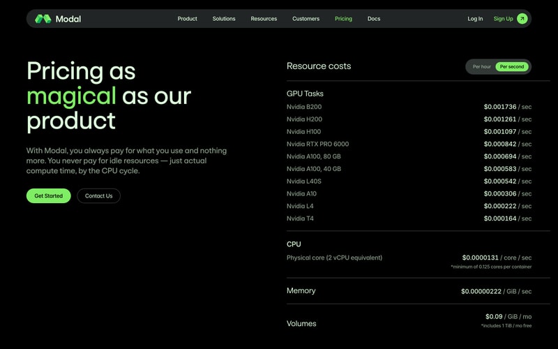
### Pricing Table
- Row spacing: `16px`
- Number alignment: Right
- Dividers: `1px solid #333333`

## Layout Patterns

### Container
- Max width: `1280px`
- Padding: `0 32px`
- Centered: `margin: 0 auto`

### Hero Section
- Text alignment: Center
- Vertical padding: `96px 0`
- Max width: `900px` for text content

### Grid
- Blog cards: 2 columns on desktop, gap `32px`
- Logo grid: Flexible wrap, gap `48px`

### Banner
- Full width
- Background: `#8FFF00`
- Text: `#000000`
- Padding: `12px 0`
- Font: 14px, center-aligned