2 free brands left today.Sign up — unlimited →
Use this design system
Tokens · motion · components — drop straight into your project.
Download design kitStart a project with it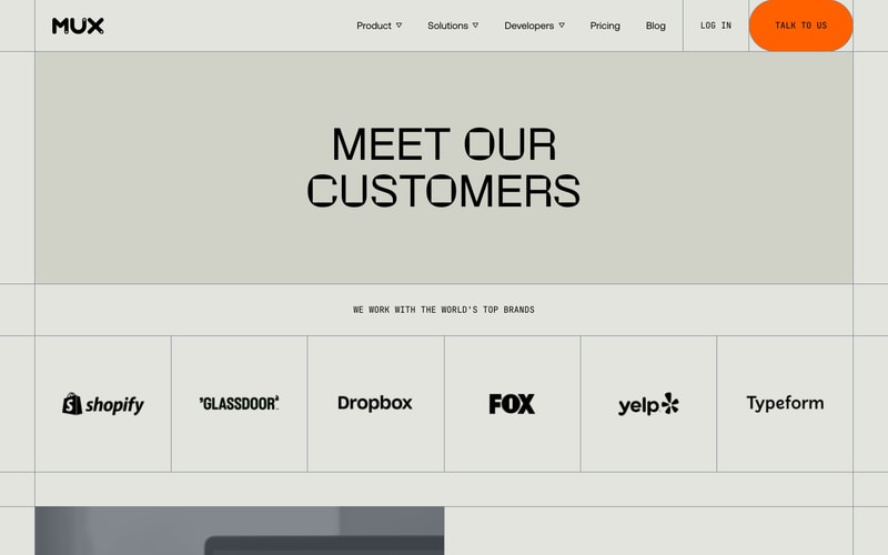
Similar styles
# Mux Design System

## Tokens — Colors

| Token | Hex | Usage |
|-------|-----|-------|
| `--color-background-cream` | `#f5f3ef` | Primary light background |
| `--color-background-white` | `#ffffff` | Card backgrounds, outlined buttons |
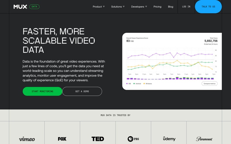
| `--color-background-dark` | `#1f1f1f` | Dark theme background |
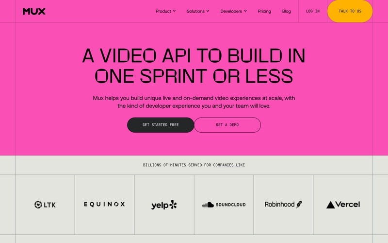
| `--color-background-pink` | `#ff1f7d` | Hero accent background |
| `--color-primary-orange` | `#ff6900` | Primary CTA, links |
| `--color-primary-yellow` | `#fbb900` | Secondary CTA |
| `--color-primary-blue` | `#00c1ff` | Accent CTA (dark theme) |
| `--color-primary-green` | `#00d66e` | Success, monitoring CTA |
| `--color-primary-pink` | `#ff1f7d` | Brand accent |
| `--color-text-primary` | `#000000` | Headlines, body text |
| `--color-text-secondary` | `#666666` | Supporting text |
| `--color-text-inverse` | `#ffffff` | Text on dark backgrounds |
| `--color-border-light` | `#e0ddd8` | Card borders, dividers |
| `--color-border-dark` | `#3a3a3a` | Dark theme borders |

## Tokens — Typography

### Font Families
- **Sans-serif (Primary)**: Custom geometric sans-serif (likely proprietary or "Söhne", "Inter", or similar)
- **Monospace**: Monospace stack for code elements

### Type Scale

| Token | Size | Line Height | Weight | Usage |
|-------|------|-------------|--------|-------|
| `--font-size-hero-xl` | `96px` | `1.0` | `700` | Large hero headlines |
| `--font-size-hero-lg` | `72px` | `1.1` | `700` | Hero headlines |
| `--font-size-hero-md` | `56px` | `1.1` | `700` | Section headlines |
| `--font-size-h1` | `48px` | `1.2` | `700` | H1 headings |
| `--font-size-h2` | `32px` | `1.3` | `700` | H2 headings |
| `--font-size-h3` | `24px` | `1.4` | `600` | H3 headings |
| `--font-size-body-lg` | `20px` | `1.6` | `400` | Large body text, subtitles |
| `--font-size-body` | `16px` | `1.5` | `400` | Body text |
| `--font-size-body-sm` | `14px` | `1.5` | `400` | Small text, captions |
| `--font-size-label` | `12px` | `1.4` | `600` | Labels, badges |

## Tokens — Spacing

| Token | Value | Usage |
|-------|-------|-------|
| `--space-1` | `4px` | Micro spacing |
| `--space-2` | `8px` | Small spacing |
| `--space-3` | `12px` | Compact spacing |
| `--space-4` | `16px` | Base spacing |
| `--space-5` | `20px` | Medium spacing |
| `--space-6` | `24px` | Large spacing |
| `--space-8` | `32px` | XL spacing |
| `--space-10` | `40px` | 2XL spacing |
| `--space-12` | `48px` | 3XL spacing |
| `--space-16` | `64px` | Section spacing |
| `--space-20` | `80px` | Hero spacing |
| `--space-24` | `96px` | Page spacing |
| `--space-32` | `128px` | Mega spacing |

## Tokens — Border Radius

| Token | Value | Usage |
|-------|-------|-------|
| `--radius-sm` | `8px` | Small elements |
| `--radius-md` | `12px` | Medium elements |
| `--radius-lg` | `16px` | Cards, panels |
| `--radius-xl` | `24px` | Large cards |
| `--radius-2xl` | `32px` | Extra large containers |
| `--radius-full` | `9999px` | Pills, buttons |

## Tokens — Shadows

| Token | Value | Usage |
|-------|-------|-------|
| `--shadow-sm` | `0 1px 3px rgba(0,0,0,0.08)` | Subtle elevation |
| `--shadow-md` | `0 4px 12px rgba(0,0,0,0.10)` | Card elevation |
| `--shadow-lg` | `0 8px 24px rgba(0,0,0,0.12)` | Modal, dropdown |
| `--shadow-xl` | `0 16px 48px rgba(0,0,0,0.15)` | Hero elements |

## Tokens — Borders

| Token | Value | Usage |
|-------|-------|-------|
| `--border-width-thin` | `1px` | Default borders |
| `--border-width-medium` | `2px` | Emphasized borders |
| `--border-width-thick` | `3px` | Strong emphasis |

## Components

### Navigation
- Horizontal navigation bar with dropdown menus
- Logo aligned left
- Navigation items centered
- Auth + CTA aligned right
- Sticky/fixed positioning
- Transparent or solid background based on scroll

### Buttons
**Primary (Filled)**
- Pill shape (`border-radius: 9999px`)
- Padding: `14px 32px`
- Font size: `14px`, weight: `600`
- Letter spacing: `0.5px`
- Color variants: Orange, Yellow, Green, Blue, Pink, Dark
- Hover: Slight darkening or scale

**Secondary (Outlined)**
- Same pill shape
- Border: `2px solid`
- Background: transparent or white
- Hover: Background fill with border color

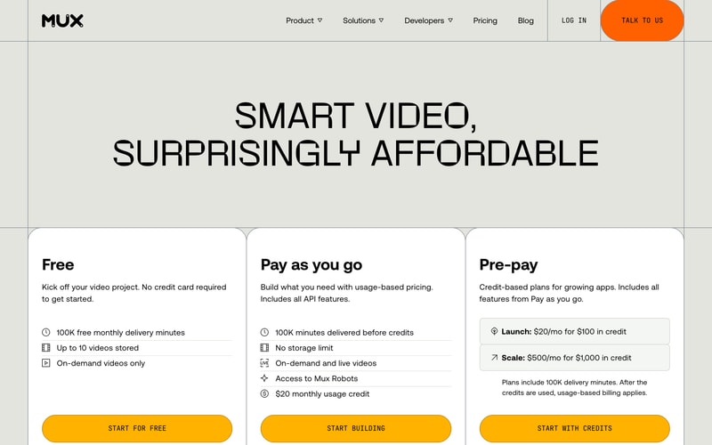
### Cards
- Rounded corners (`16-24px`)
- White background on light theme
- Border: `1px solid rgba(0,0,0,0.08)`
- Box shadow: subtle elevation
- Padding: `32px` or `40px`
- Hover: Shadow lift

### Badge
- Small pill shape
- Border: `1px solid`
- Padding: `4px 12px`
- Font size: `12px`, weight: `600`
- Uppercase text

### Logo Grid
- Grid of brand logos
- Grayscale filter on logos
- Equal spacing
- Responsive columns (2, 3, 4, 6)

### Hero Section
- Full-width container
- Centered content
- Large headline (72-96px)
- Subtitle (18-20px)
- Button group (horizontal flex)
- Generous vertical padding (120-160px)

## Layout Patterns

### Grid System
- 12-column grid
- Max width: `1280px` or `1440px`
- Horizontal padding: `24px` (mobile), `48px` (tablet), `64px` (desktop)

### Responsive Breakpoints
- Mobile: `< 768px`
- Tablet: `768px - 1024px`
- Desktop: `> 1024px`
- Wide: `> 1440px`

### Section Patterns
- Alternating background colors (cream, white, dark, pink)
- Full-width colored backgrounds
- Contained content (max-width)
- Vertical rhythm: 80-160px between sections