2 free brands left today.Sign up — unlimited →
Use this design system
Tokens · motion · components — drop straight into your project.
Download design kitStart a project with it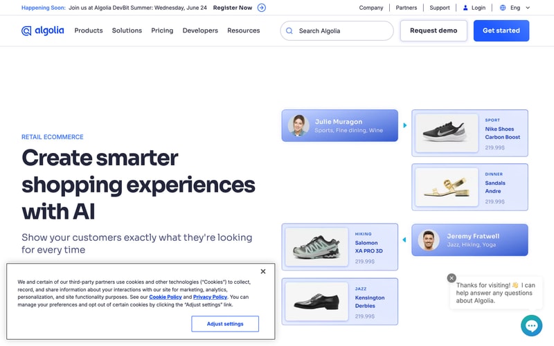
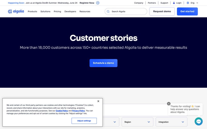
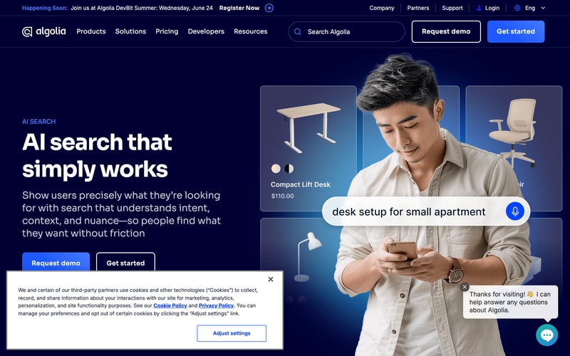
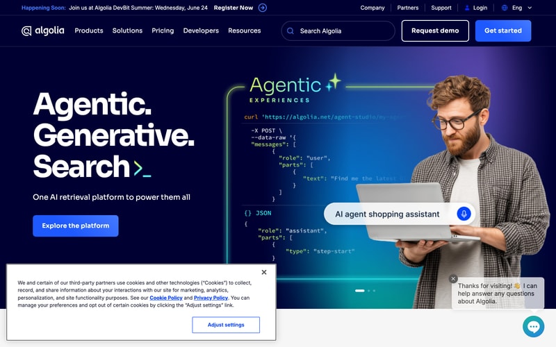
Similar styles
# Algolia Design System

## Tokens — Colors

| Token                  | Value     | Usage                                      |
|------------------------|-----------|---------------------------------------------|
| `--color-primary`      | `#2D7FF9` | Primary CTA buttons, links, accents         |
| `--color-primary-hover`| `#1E6FE8` | Primary button hover state                  |
| `--color-navy-900`     | `#0B1A3D` | Primary dark background, hero sections      |
| `--color-navy-800`     | `#142654` | Card backgrounds, secondary surfaces        |
| `--color-purple-600`   | `#5468FF` | Gradient overlays, accent elements          |
| `--color-purple-500`   | `#7B61FF` | Gradient transitions                        |
| `--color-accent-green` | `#9FEF00` | NEW badges, cursor highlights, success      |
| `--color-white`        | `#FFFFFF` | Text on dark, light backgrounds             |
| `--color-gray-100`     | `#F5F5F7` | Light section backgrounds                   |
| `--color-gray-400`     | `#8B92A6` | Secondary text, muted elements              |
| `--color-gray-700`     | `#3D4556` | Borders, dividers                           |
| `--color-blue-light`   | `#E8F0FF` | Search input backgrounds (light mode)       |

## Tokens — Typography

**Font Families:**
- Primary: `'Averta', -apple-system, BlinkMacSystemFont, 'Segoe UI', sans-serif`
- Monospace: `'Menlo', 'Monaco', 'Courier New', monospace`

**Type Scale:**

| Token               | Size   | Weight | Line Height | Usage                          |
|---------------------|--------|--------|-------------|--------------------------------|
| `--text-hero`       | `96px` | `800`  | `1.05`      | Hero headlines                 |
| `--text-display`    | `64px` | `700`  | `1.1`       | Section headlines              |
| `--text-h1`         | `48px` | `700`  | `1.2`       | Page titles                    |
| `--text-h2`         | `32px` | `700`  | `1.3`       | Card titles, subsections       |
| `--text-h3`         | `24px` | `600`  | `1.4`       | Component headings             |
| `--text-body-lg`    | `18px` | `400`  | `1.6`       | Large body copy                |
| `--text-body`       | `16px` | `400`  | `1.5`       | Default body text              |
| `--text-sm`         | `14px` | `400`  | `1.5`       | Small text, labels             |
| `--text-xs`         | `12px` | `500`  | `1.4`       | Badges, micro-copy             |

## Tokens — Spacing

Base unit: `8px`

| Token        | Value   |
|--------------|---------|
| `--space-1`  | `8px`   |
| `--space-2`  | `16px`  |
| `--space-3`  | `24px`  |
| `--space-4`  | `32px`  |
| `--space-5`  | `40px`  |
| `--space-6`  | `48px`  |
| `--space-8`  | `64px`  |
| `--space-12` | `96px`  |
| `--space-16` | `128px` |

## Tokens — Border Radius

| Token              | Value  | Usage                          |
|--------------------|--------|--------------------------------|
| `--radius-sm`      | `6px`  | Small elements, badges         |
| `--radius-md`      | `8px`  | Buttons, inputs                |
| `--radius-lg`      | `12px` | Cards, modals                  |
| `--radius-xl`      | `16px` | Large cards, hero cards        |
| `--radius-2xl`     | `24px` | Feature sections               |

## Tokens — Shadows

| Token            | Value                                                      |
|------------------|------------------------------------------------------------|
| `--shadow-sm`    | `0 1px 3px rgba(11, 26, 61, 0.1)`                         |
| `--shadow-md`    | `0 4px 12px rgba(11, 26, 61, 0.15)`                       |
| `--shadow-lg`    | `0 12px 32px rgba(11, 26, 61, 0.2)`                       |
| `--shadow-xl`    | `0 24px 64px rgba(11, 26, 61, 0.25)`                      |
| `--shadow-glow`  | `0 0 24px rgba(45, 127, 249, 0.3)`                        |

## Tokens — Borders

| Token               | Value                      |
|---------------------|----------------------------|
| `--border-default`  | `1px solid #3D4556`        |
| `--border-light`    | `1px solid rgba(255, 255, 255, 0.1)` |
| `--border-primary`  | `2px solid #2D7FF9`        |

## Components

### Button

**Primary:**
- Background: `--color-primary`
- Color: `--color-white`
- Padding: `12px 24px` (md), `16px 32px` (lg)
- Border radius: `--radius-md`
- Font: `--text-body`, weight `600`
- Hover: `--color-primary-hover`, subtle lift shadow

**Secondary (Outline):**
- Background: `transparent`
- Border: `2px solid --color-white`
- Color: `--color-white`
- Padding: `12px 24px`
- Border radius: `--radius-md`
- Hover: Background `rgba(255, 255, 255, 0.1)`

### Search Input

- Background: Dark variant `rgba(255, 255, 255, 0.05)`, Light variant `--color-blue-light`
- Border: `1px solid rgba(255, 255, 255, 0.15)`
- Border radius: `--radius-lg`
- Padding: `14px 20px 14px 48px`
- Icon: Left-aligned, 20px, `--color-gray-400`
- Font: `--text-body`
- Focus: Border `--color-primary`, shadow `--shadow-glow`

### Card

**Pricing Card:**
- Background: `--color-navy-800` with gradient overlay
- Border: `1px solid rgba(255, 255, 255, 0.08)`
- Border radius: `--radius-xl`
- Padding: `32px`
- Shadow: `--shadow-lg`

**Product Card:**
- Background: Dark gradient overlay on image
- Border radius: `--radius-lg`
- Padding: `16px`
- Hover: Scale `1.02`, shadow `--shadow-xl`

### Badge

- Background: `--color-accent-green`
- Color: `--color-navy-900`
- Padding: `4px 12px`
- Border radius: `--radius-sm`
- Font: `--text-xs`, weight `700`, uppercase

### Navigation

- Background: `--color-navy-900`
- Height: `72px`
- Border bottom: `1px solid rgba(255, 255, 255, 0.05)`
- Logo: Left-aligned
- Links: Center, `--text-body`, weight `500`, color `--color-white`
- CTAs: Right-aligned, button styles

### Modal / Cookie Banner

- Background: `--color-white`
- Border radius: `--radius-lg`
- Padding: `32px`
- Shadow: `--shadow-xl`
- Close button: Top right, 24px icon

### Chat Widget

- Background: `--color-primary`
- Width/Height: `56px`
- Border radius: `50%`
- Position: Fixed bottom-right
- Shadow: `--shadow-lg`
- Icon: White message bubble

## Layout Patterns

### Hero Section
- Full-width background: `--color-navy-900`
- Gradient overlay: Linear from `--color-navy-900` to `--color-purple-600` (diagonal)
- Content: Centered, max-width `1280px`
- Padding: `128px 64px` (desktop), `64px 24px` (mobile)
- Grid: 50/50 text/visual split

### Container
- Max-width: `1280px`
- Padding: `0 64px` (desktop), `0 24px` (mobile)
- Margin: `0 auto`

### Grid
- Pricing cards: 3-column, gap `32px`
- Product grid: 4-column, gap `24px`
- Responsive: Stack on mobile

### Section Spacing
- Between sections: `128px` (desktop), `64px` (mobile)
- Between elements: `48px` default