2 free brands left today.Sign up — unlimited →
Use this design system
Tokens · motion · components — drop straight into your project.
Download design kitStart a project with it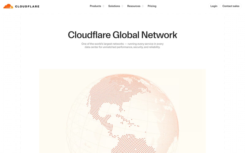
Similar styles
# Cloudflare Design System

## Tokens — Colors

| Token | Hex | Usage |
|-------|-----|-------|
| `orange-primary` | `#FF6633` | Primary brand color, CTAs, active states |
| `orange-hover` | `#E65C2E` | Hover state for primary buttons |
| `orange-light` | `#FFF5F0` | Light backgrounds, subtle accents |
| `white` | `#FFFFFF` | Backgrounds, button text |
| `black` | `#1F1F1F` | Primary text, headings |
| `gray-900` | `#1F2937` | Dark text |
| `gray-700` | `#374151` | Secondary text |
| `gray-600` | `#4B5563` | Tertiary text |
| `gray-500` | `#6B7280` | Muted text, descriptions |
| `gray-400` | `#9CA3AF` | Placeholder text |
| `gray-300` | `#D1D5DB` | Borders, dividers |
| `gray-200` | `#E5E7EB` | Light borders |
| `gray-100` | `#F3F4F6` | Subtle backgrounds |
| `gray-50` | `#F9FAFB` | Page backgrounds |

## Tokens — Typography

### Font Families
- **Primary**: `'CF Sans', -apple-system, BlinkMacSystemFont, 'Segoe UI', Roboto, Oxygen, Ubuntu, Cantarell, sans-serif`
- **Monospace**: `'Fira Code', 'Courier New', monospace`

### Type Scale

| Token | Size | Line Height | Weight | Usage |
|-------|------|-------------|--------|-------|
| `hero` | `72px` | `1.1` | `700` | Hero headlines |
| `display-xl` | `60px` | `1.15` | `700` | Major section headlines |
| `display-lg` | `48px` | `1.2` | `700` | Section headlines |
| `display-md` | `36px` | `1.25` | `600` | Subsection headlines |
| `heading-lg` | `30px` | `1.3` | `600` | Card titles, large headings |
| `heading-md` | `24px` | `1.35` | `600` | Card headings |
| `heading-sm` | `20px` | `1.4` | `600` | Small headings |
| `body-lg` | `18px` | `1.6` | `400` | Large body text, hero subheadings |
| `body-md` | `16px` | `1.6` | `400` | Standard body text |
| `body-sm` | `14px` | `1.5` | `400` | Small body text, captions |
| `label` | `12px` | `1.4` | `500` | Labels, badges |

## Tokens — Spacing

| Token | Value | Usage |
|-------|-------|-------|
| `xs` | `4px` | Tight spacing, icon gaps |
| `sm` | `8px` | Small gaps, padding |
| `md` | `16px` | Standard spacing |
| `lg` | `24px` | Card padding, section gaps |
| `xl` | `32px` | Large gaps |
| `2xl` | `48px` | Section spacing |
| `3xl` | `64px` | Major section spacing |
| `4xl` | `96px` | Hero padding, major sections |
| `5xl` | `128px` | Extra large sections |

## Tokens — Border Radius

| Token | Value | Usage |
|-------|-------|-------|
| `sm` | `4px` | Small elements, badges |
| `md` | `8px` | Buttons, inputs |
| `lg` | `12px` | Cards, modals |
| `xl` | `16px` | Large cards |
| `2xl` | `24px` | Hero sections, large panels |
| `full` | `9999px` | Pills, rounded buttons |

## Tokens — Shadows

| Token | Value | Usage |
|-------|-------|-------|
| `sm` | `0 1px 2px rgba(0, 0, 0, 0.05)` | Subtle elevation |
| `md` | `0 4px 6px rgba(0, 0, 0, 0.07)` | Cards, dropdowns |
| `lg` | `0 10px 15px rgba(0, 0, 0, 0.1)` | Elevated cards |
| `xl` | `0 20px 25px rgba(0, 0, 0, 0.1)` | Modals, major elements |

## Tokens — Borders

| Token | Value | Usage |
|-------|-------|-------|
| `width-default` | `1px` | Standard borders |
| `width-thick` | `2px` | Emphasized borders |
| `color-default` | `#E5E7EB` | Standard border color |
| `color-strong` | `#D1D5DB` | Emphasized borders |

## Components

### Button
- **Primary**: Orange background (`#FF6633`), white text, rounded (`8px`), padding `12px 24px`
- **Secondary**: White background, dark text, border, same dimensions
- **Ghost**: Transparent background, dark text, no border
- **Hover states**: Slight darkening (`#E65C2E`) or shadow increase

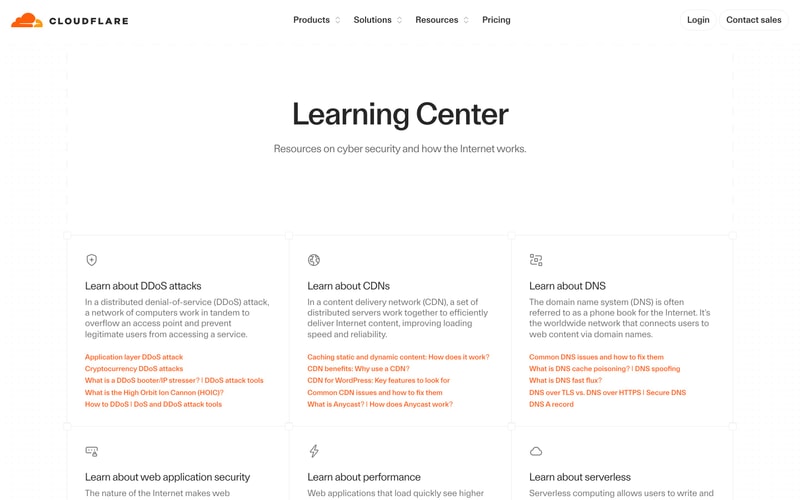
### Card
- White background, subtle shadow (`0 4px 6px rgba(0,0,0,0.07)`)
- Border radius `12px`
- Padding `24px` or `32px`
- Optional icon at top (24x24px or 32x32px)
- Heading + description pattern

### Navigation
- Fixed header, white background with subtle shadow
- Logo on left (height ~40px)
- Horizontal menu items with dropdown indicators
- Right-aligned CTAs
- Hover states with subtle underline or color change

### Pricing Table
- Grid layout (4 columns)
- Card-based design
- Tier name + description
- Price + billing period
- CTA button
- Feature list (expandable)

### Badge/Pill
- Small text label with rounded background
- Border radius `9999px` (fully rounded)
- Padding `4px 12px`
- Various colors (orange, gray, etc.)

### Icon
- Outlined style (stroke-based)
- Consistent stroke width (~2px)
- Size variants: 16px, 20px, 24px, 32px

## Layout Patterns

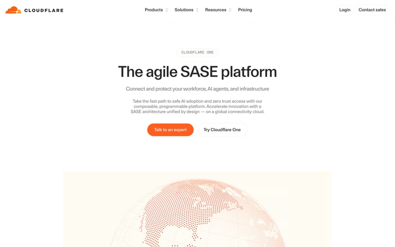
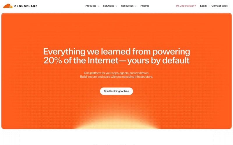
### Hero Section
- Full-width, centered content
- Large gradient background (orange to peach/yellow)
- Max-width container (~1200px)
- Vertical padding 96-128px
- Centered text alignment
- Heading + subheading + CTA pattern

### Content Grid
- 3-column grid on desktop (gap ~24px)
- Responsive: 2-column tablet, 1-column mobile
- Equal-height cards

### Section Container
- Max-width: 1200-1280px
- Horizontal padding: 24px (mobile) to 48px (desktop)
- Centered with auto margins
- Vertical padding: 64-96px between sections

### Pricing Layout
- Centered heading + description
- Tab navigation for plan types
- 4-column grid (responsive to 2/1 column)
- Comparison table below cards