Use this design system
Tokens · motion · components — drop straight into your project.
Download design kitStart a project with it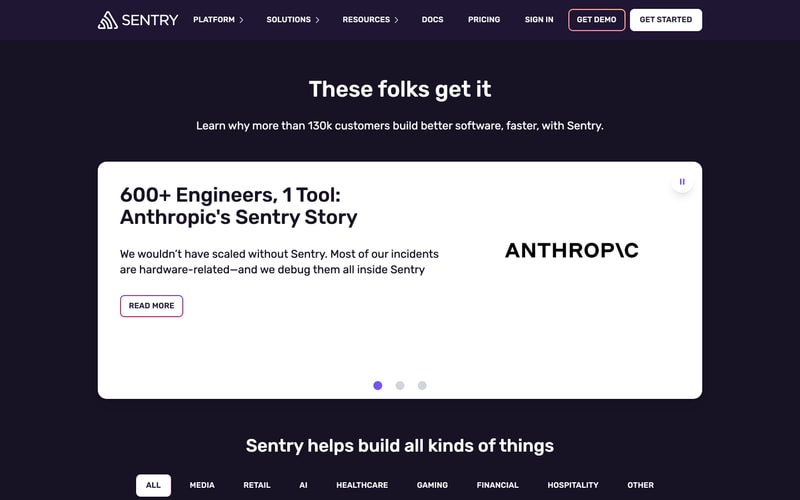
Similar styles
# Sentry Design System

## Tokens — Colors

| Token | Value | Usage |
|-------|-------|-------|
| `--color-background-primary` | `#1D1127` | Main background, deep purple |
| `--color-background-secondary` | `#2B1E3E` | Card backgrounds, elevated surfaces |
| `--color-background-tertiary` | `#3A2D52` | Hover states, subtle elevations |
| `--color-surface-dark` | `#151015` | Darkest backgrounds |
| `--color-surface-card` | `#2D2142` | Card containers |
| `--color-primary` | `#FF4D88` | Primary brand pink, CTAs, accents |
| `--color-primary-hover` | `#FF5E96` | Primary hover state |
| `--color-accent-purple` | `#6C5FC7` | Secondary purple accent |
| `--color-accent-purple-light` | `#8B7AE8` | Lighter purple variant |
| `--color-accent-green` | `#B0FF00` | Neon green, success states |
| `--color-accent-lime` | `#CCFF00` | Bright lime accents |
| `--color-accent-yellow` | `#FFD76D` | Warning, highlights |
| `--color-accent-orange` | `#FF9966` | Gradient stops |
| `--color-accent-pink-light` | `#FF6B9D` | Light pink accents |
| `--color-text-primary` | `#FFFFFF` | Primary text, headings |
| `--color-text-secondary` | `#B8A8CC` | Secondary text, descriptions |
| `--color-text-tertiary` | `#8E7DA8` | Muted text, labels |
| `--color-text-inverse` | `#1D1127` | Text on light backgrounds |
| `--color-border-subtle` | `#3A2D52` | Subtle borders |
| `--color-border-card` | `#4A3D6A` | Card outlines |
| `--color-gradient-start` | `#FF4D88` | Gradient starting point |
| `--color-gradient-end` | `#6C5FC7` | Gradient ending point |

## Tokens — Typography

**Font Families:**
- **Headings**: `'Rubik', -apple-system, BlinkMacSystemFont, 'Segoe UI', sans-serif`
- **Body**: `'Inter', -apple-system, BlinkMacSystemFont, 'Segoe UI', sans-serif`
- **Code**: `'Fira Code', 'Monaco', 'Courier New', monospace`

**Type Scale:**

| Token | Size | Line Height | Weight | Usage |
|-------|------|-------------|--------|-------|
| `--font-size-hero` | `72px` | `1.1` | `700` | Hero headlines |
| `--font-size-h1` | `48px` | `1.2` | `700` | Page titles |
| `--font-size-h2` | `36px` | `1.3` | `600` | Section headers |
| `--font-size-h3` | `28px` | `1.4` | `600` | Subsection headers |
| `--font-size-h4` | `20px` | `1.4` | `600` | Card titles |
| `--font-size-body-lg` | `18px` | `1.6` | `400` | Large body text |
| `--font-size-body` | `16px` | `1.6` | `400` | Default body |
| `--font-size-body-sm` | `14px` | `1.5` | `400` | Small text |
| `--font-size-caption` | `12px` | `1.4` | `400` | Captions, labels |

## Tokens — Spacing

| Token | Value |
|-------|-------|
| `--spacing-1` | `4px` |
| `--spacing-2` | `8px` |
| `--spacing-3` | `12px` |
| `--spacing-4` | `16px` |
| `--spacing-5` | `24px` |
| `--spacing-6` | `32px` |
| `--spacing-8` | `48px` |
| `--spacing-10` | `64px` |
| `--spacing-12` | `80px` |
| `--spacing-16` | `120px` |

## Tokens — Border Radius

| Token | Value | Usage |
|-------|-------|-------|
| `--radius-sm` | `4px` | Small elements |
| `--radius-md` | `8px` | Buttons, inputs |
| `--radius-lg` | `12px` | Cards |
| `--radius-xl` | `16px` | Large cards |
| `--radius-2xl` | `24px` | Hero cards, modals |
| `--radius-full` | `9999px` | Pills, circular elements |

## Tokens — Shadows

| Token | Value |
|-------|-------|
| `--shadow-sm` | `0 1px 2px rgba(0, 0, 0, 0.3)` |
| `--shadow-md` | `0 4px 12px rgba(0, 0, 0, 0.4)` |
| `--shadow-lg` | `0 8px 24px rgba(0, 0, 0, 0.5)` |
| `--shadow-xl` | `0 16px 48px rgba(0, 0, 0, 0.6)` |
| `--shadow-glow-pink` | `0 0 40px rgba(255, 77, 136, 0.4)` |
| `--shadow-glow-purple` | `0 0 40px rgba(108, 95, 199, 0.4)` |

## Tokens — Borders

| Token | Value |
|-------|-------|
| `--border-width-thin` | `1px` |
| `--border-width-medium` | `2px` |
| `--border-width-thick` | `3px` |

## Components

### Navigation Bar
- Fixed header with transparent/dark background
- Logo on left, menu items center-right, CTAs on right
- Dropdown indicators on menu items
- Height: ~64px
- Padding: 16px horizontal

### Buttons
**Primary Button:**
- Background: `--color-primary` or white
- Text: white or `--color-text-inverse`
- Padding: 12px 24px
- Border radius: `--radius-md`
- Font weight: 600
- Hover: slight scale + brightness

**Secondary Button:**
- Background: transparent
- Border: 2px solid `--color-primary` or white
- Text: `--color-primary` or white
- Same padding and radius as primary

### Cards
**Standard Card:**
- Background: `--color-surface-card`
- Border radius: `--radius-lg` to `--radius-xl`
- Padding: 24px to 32px
- Shadow: `--shadow-md`
- Optional gradient overlays

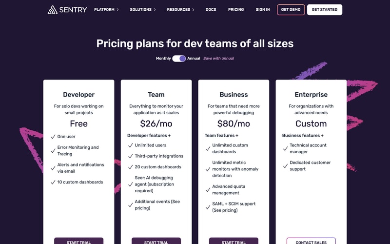
**Pricing Card:**
- White background with dark text for pricing section
- Larger padding: 32px 24px
- Checkmark list items with spacing
- CTA button at bottom

**Feature Card:**
- Dark purple background with gradients
- Title with icon or label
- Code snippet or content area with syntax highlighting
- Border: subtle pink or purple

### Toggle Switch
- Track width: ~48px, height: ~24px
- Knob: circular, white
- Active state: purple/pink gradient
- Smooth transition animation

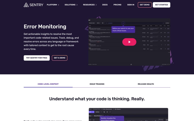
### Tabs
- Underline style
- Active tab: purple/blue underline
- Text color changes on active
- Even spacing between tabs

## Layout Patterns

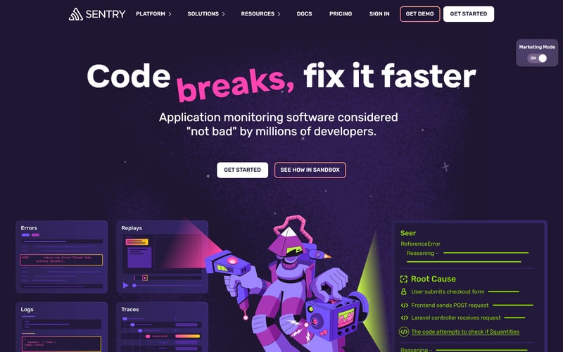
### Hero Section
- Full-width container
- Centered content with max-width ~1200px
- Large heading (hero size) + subheading
- CTA button group (horizontal flex)
- Background with particles/illustrations
- Vertical padding: 80-120px

### Pricing Grid
- 4-column grid (on desktop)
- Equal-width columns with gap of 24px
- Cards aligned to top
- Responsive: 1 column on mobile, 2 on tablet

### Feature Sections
- Two-column layout (text + visual)
- Alternating left/right orientation
- Generous vertical spacing (80-100px)
- Images/screenshots with rounded corners and shadows

### Card Grid
- 2x2 grid for feature cards
- 16-24px gap
- Equal height cards
- Hover effects with subtle scale/glow