Use this design system
Tokens · motion · components — drop straight into your project.
Download design kitStart a project with it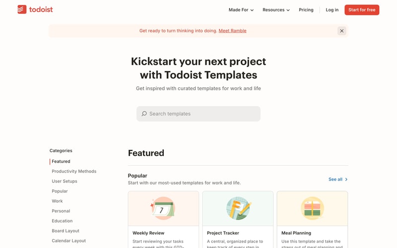
Similar styles
# Todoist Design System

## Tokens — Colors

| Token | Value | Usage |
|-------|-------|-------|
| Primary | `#E44332` | Brand color, CTAs, logo, links, accents |
| Primary Hover | `#D23D2C` | Button hover states |
| Primary Light | `#FFF5F0` | Subtle backgrounds, banners |
| Text Primary | `#202020` | Headings, primary text |
| Text Secondary | `#666666` | Body text, descriptions |
| Text Tertiary | `#999999` | Placeholder text, meta info |
| Background | `#FFFFFF` | Main background |
| Background Secondary | `#FAFAFA` | Subtle sections, cards |
| Background Tertiary | `#F5F5F5` | Input backgrounds, disabled states |
| Border | `#E8E8E8` | Dividers, card borders |
| Border Light | `#F0F0F0` | Subtle separators |
| Success | `#7BA378` | Success states, positive actions |
| Warning | `#F9D262` | Warnings, highlights |
| Coral | `#E57373` | Illustrations, accents |
| Teal | `#5B9AA6` | Illustrations, secondary accents |
| Black | `#000000` | Pure black for emphasis |
| White | `#FFFFFF` | Pure white |

## Tokens — Typography

**Font Families:**
- Primary: `-apple-system, BlinkMacSystemFont, "Segoe UI", Roboto, "Helvetica Neue", Arial, sans-serif`
- System: System UI stack for optimal rendering

**Type Scale:**

| Token | Size | Line Height | Weight | Usage |
|-------|------|-------------|--------|-------|
| Display | `72px` / `4.5rem` | `1.1` | `700` | Hero headings |
| H1 | `48px` / `3rem` | `1.2` | `700` | Page titles |
| H2 | `36px` / `2.25rem` | `1.3` | `700` | Section headings |
| H3 | `24px` / `1.5rem` | `1.4` | `600` | Subsection titles |
| H4 | `20px` / `1.25rem` | `1.5` | `600` | Card titles |
| Body Large | `18px` / `1.125rem` | `1.6` | `400` | Lead paragraphs |
| Body | `16px` / `1rem` | `1.6` | `400` | Default text |
| Body Small | `14px` / `0.875rem` | `1.5` | `400` | Secondary text |
| Caption | `12px` / `0.75rem` | `1.4` | `400` | Meta info, labels |

## Tokens — Spacing

**Base unit: 4px**

| Token | Value | Usage |
|-------|-------|-------|
| xs | `4px` | Tight spacing |
| sm | `8px` | Small gaps |
| md | `16px` | Default spacing |
| lg | `24px` | Section gaps |
| xl | `32px` | Large sections |
| 2xl | `48px` | Page sections |
| 3xl | `64px` | Hero sections |
| 4xl | `96px` | Major sections |
| 5xl | `128px` | Extra large gaps |

## Tokens — Radii

| Token | Value | Usage |
|-------|-------|-------|
| sm | `4px` | Subtle rounding |
| md | `8px` | Buttons, inputs, cards |
| lg | `12px` | Large cards, modals |
| xl | `16px` | Feature cards |
| full | `9999px` | Pills, circular elements |

## Tokens — Shadows

| Token | Value | Usage |
|-------|-------|-------|
| sm | `0 1px 2px rgba(0, 0, 0, 0.05)` | Subtle elevation |
| md | `0 4px 6px rgba(0, 0, 0, 0.07)` | Cards, dropdowns |
| lg | `0 10px 15px rgba(0, 0, 0, 0.1)` | Modals, popovers |
| xl | `0 20px 25px rgba(0, 0, 0, 0.1)` | Large features |
| button | `0 2px 4px rgba(228, 67, 50, 0.2)` | Button elevation |
| button-hover | `0 4px 12px rgba(228, 67, 50, 0.3)` | Button hover |

## Tokens — Borders

| Token | Value | Usage |
|-------|-------|-------|
| width-sm | `1px` | Default borders |
| width-md | `2px` | Emphasis |
| width-lg | `3px` | Strong emphasis |
| style | `solid` | Default style |

## Components

### Button

**Primary Button:**
- Background: Primary color `#E44332`
- Text: White
- Padding: `14px 32px`
- Border radius: `8px`
- Font: 16px, weight 500
- Shadow: `0 2px 4px rgba(228, 67, 50, 0.2)`
- Hover: Darker background `#D23D2C`, larger shadow

**Secondary Button:**
- Background: White
- Text: Primary color
- Border: `1px solid #E8E8E8`
- Same padding and radius as primary

**Text Button:**
- No background
- Text: Primary color
- Underline on hover

### Navigation

**Header:**
- Background: White
- Height: `64px`
- Logo: Left aligned
- Menu items: Right aligned, 16px font
- Dropdown indicators: Chevrons
- Sticky positioning

### Card

**Default Card:**
- Background: White
- Border: `1px solid #E8E8E8` or subtle shadow
- Border radius: `12px`
- Padding: `24px`

**Template Card:**
- Circular icon at top (96px diameter)
- Title: H4 style
- Description: Body small, gray
- Hover: Slight shadow increase

### Input

**Text Input:**
- Background: `#F5F5F5`
- Border: `1px solid transparent`
- Border radius: `8px`
- Padding: `12px 16px`
- Font: 16px
- Focus: Border becomes primary color

**Search Input:**
- Icon: Search magnifier, left aligned
- Background: Light gray
- Full width or fixed width

### Banner

**Announcement Banner:**
- Background: Light pink/beige `#FFF5F0`
- Text: Primary or dark gray
- Links: Underlined
- Close button: Right aligned
- Padding: `12px 24px`

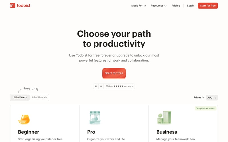
### Pricing Toggle

**Toggle Switch:**
- Background: White
- Border: `1px solid #E8E8E8`
- Active state: Slight shadow or border change
- Padding: `4px`
- Options: Equal width segments

## Layout Patterns

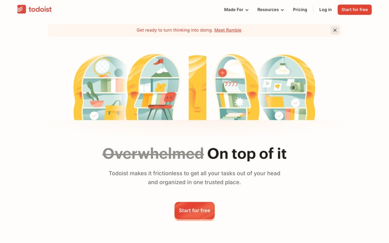
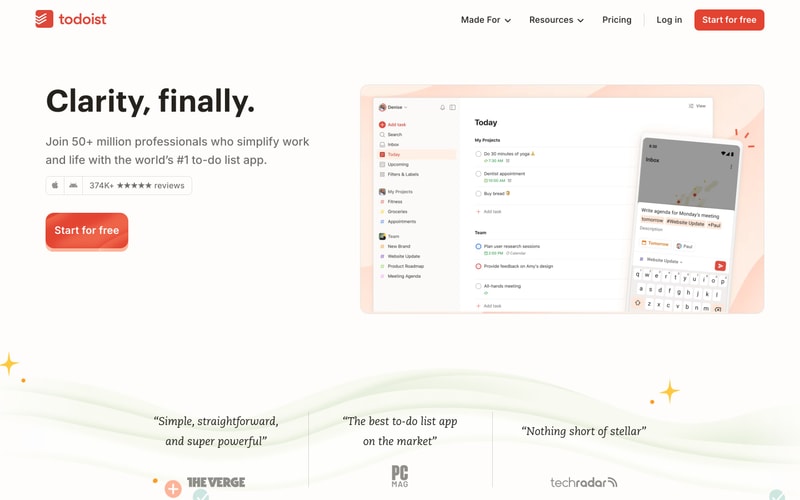
### Hero Section

- Full-width container
- Two-column grid on desktop (60/40 split)
- Text left, image/mockup right
- Large heading (Display size)
- Subheading (Body Large)
- CTA button below
- Vertical centering

### Feature Section

- Centered content, max-width ~1200px
- Heading centered
- Cards in grid (3 columns on desktop)
- Generous spacing between sections (96-128px)

### Sidebar Layout

- Left sidebar: 240-280px fixed width
- Main content: Flexible
- Sidebar items: 16px font, 8px padding vertical
- Active state: Red left border or background tint

### Card Grid

- 3 columns on desktop
- 2 columns on tablet
- 1 column on mobile
- Gap: 24px
- Equal height cards