2 free brands left today.Sign up — unlimited →
Use this design system
Tokens · motion · components — drop straight into your project.
Download design kitStart a project with it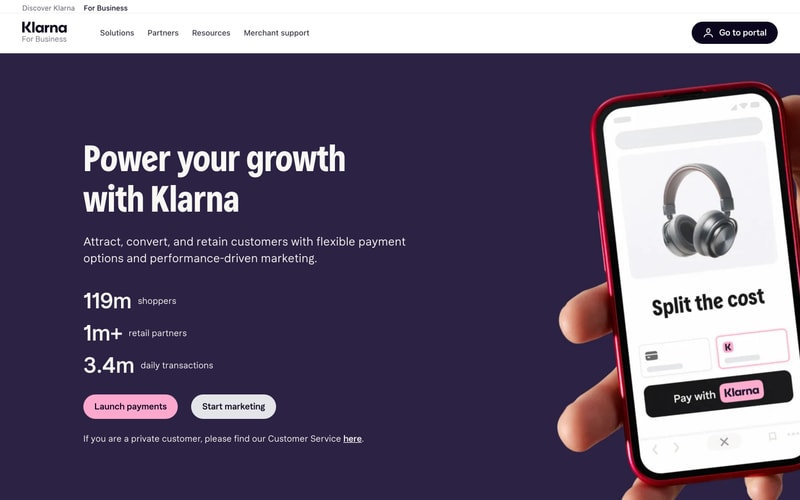
Similar styles
# Klarna Business Design System

## Tokens — Colors

| Token | Value | Usage |
|-------|-------|-------|
| `background-primary` | `#3d2656` | Main page background, hero section |
| `background-secondary` | `#2d1e42` | Darker variant for depth |
| `surface-primary` | `#ffffff` | Card surfaces, phone UI |
| `text-primary` | `#ffffff` | Main headings, primary text on dark |
| `text-secondary` | `rgba(255, 255, 255, 0.85)` | Body text, descriptions on dark |
| `text-tertiary` | `rgba(255, 255, 255, 0.6)` | Muted text, labels |
| `text-inverse` | `#1a1a1a` | Text on light backgrounds |
| `brand-pink` | `#ffb3d9` | Primary CTA, Klarna branding |
| `brand-pink-hover` | `#ff99cc` | Hover state for pink buttons |
| `neutral-100` | `#f5f5f5` | Light backgrounds, secondary buttons |
| `neutral-200` | `#e8e8e8` | Borders, dividers |
| `neutral-900` | `#1a1a1a` | Dark button backgrounds, text |
| `link-color` | `#ffffff` | Navigation links |

## Tokens — Typography

### Font Families
- **Primary**: Custom Klarna Sans (fallback: -apple-system, BlinkMacSystemFont, "Segoe UI", sans-serif)
- **Monospace**: "SF Mono", "Roboto Mono", monospace

### Type Scale

| Token | Size | Line Height | Weight | Usage |
|-------|------|-------------|--------|-------|
| `display-xl` | 80px | 88px | 700 | Hero headlines |
| `display-lg` | 64px | 72px | 700 | Section headlines |
| `heading-1` | 48px | 56px | 700 | Page titles |
| `heading-2` | 36px | 44px | 600 | Section headings |
| `heading-3` | 24px | 32px | 600 | Subsection headings |
| `body-lg` | 20px | 32px | 400 | Large body text, subtitles |
| `body-base` | 16px | 24px | 400 | Default body text |
| `body-sm` | 14px | 20px | 400 | Small text, captions |
| `stat-number` | 72px | 80px | 700 | Large statistics |
| `stat-label` | 18px | 24px | 400 | Stat descriptions |

## Tokens — Spacing

| Token | Value | Usage |
|-------|-------|-------|
| `space-2` | 8px | Tight spacing, icon gaps |
| `space-3` | 12px | Small gaps |
| `space-4` | 16px | Button padding vertical, card gaps |
| `space-5` | 20px | Medium spacing |
| `space-6` | 24px | Large gaps between elements |
| `space-8` | 32px | Section spacing, stat groups |
| `space-10` | 40px | Large section padding |
| `space-12` | 48px | Extra large spacing |
| `space-16` | 64px | Hero section padding |
| `space-20` | 80px | Page section padding |
| `space-24` | 96px | Major section dividers |

## Tokens — Border Radius

| Token | Value | Usage |
|-------|-------|-------|
| `radius-sm` | 4px | Small elements, tags |
| `radius-md` | 8px | Cards, inputs |
| `radius-lg` | 12px | Large cards |
| `radius-xl` | 16px | Prominent cards |
| `radius-2xl` | 24px | Phone screens, modals |
| `radius-full` | 9999px | Pills, fully rounded buttons |

## Tokens — Shadows

| Token | Value | Usage |
|-------|-------|-------|
| `shadow-sm` | `0 1px 2px rgba(0, 0, 0, 0.05)` | Subtle elevation |
| `shadow-md` | `0 4px 6px rgba(0, 0, 0, 0.1)` | Cards, dropdowns |
| `shadow-lg` | `0 10px 15px rgba(0, 0, 0, 0.15)` | Modals, popovers |
| `shadow-xl` | `0 20px 25px rgba(0, 0, 0, 0.15)` | Hero elements, phone mockup |

## Tokens — Borders

| Token | Value | Usage |
|-------|-------|-------|
| `border-width` | 1px | Default borders |
| `border-width-thick` | 2px | Emphasis, active states |
| `border-color` | `rgba(255, 255, 255, 0.1)` | Borders on dark |
| `border-color-light` | `#e8e8e8` | Borders on light backgrounds |

## Components

### Navigation Bar
- **Height**: 80px
- **Background**: Transparent → solid on scroll
- **Layout**: Flex, space-between
- **Logo**: Left-aligned, ~120px width
- **Links**: Center, horizontal list, 16px gap
- **CTA Button**: Right-aligned, pill style, dark background

### Button Variants

#### Primary (Pink)
- **Background**: `#ffb3d9`
- **Text**: `#1a1a1a`
- **Padding**: 14px 32px
- **Radius**: Full (pill)
- **Font**: 16px, weight 500
- **Hover**: Darken 10%

#### Secondary (Light)
- **Background**: `#e8e8e8`
- **Text**: `#1a1a1a`
- **Padding**: 14px 32px
- **Radius**: Full (pill)
- **Font**: 16px, weight 500
- **Hover**: Darken 5%

#### Tertiary (Dark)
- **Background**: `#1a1a1a`
- **Text**: `#ffffff`
- **Padding**: 12px 24px
- **Radius**: Full (pill)
- **Font**: 14px, weight 500

### Hero Section
- **Layout**: Two-column grid (5fr 7fr)
- **Content**: Left column, vertical stack
- **Image**: Right column, relative positioned
- **Heading**: display-xl, white
- **Subheading**: body-lg, white 85% opacity
- **Stats**: Vertical stack, 32px gap
- **CTA Group**: Horizontal flex, 16px gap

### Stat Display
- **Number**: 72px, bold, white
- **Label**: 18px, regular, white 85%
- **Layout**: Vertical stack, 4px gap
- **Spacing**: 32px between stat items

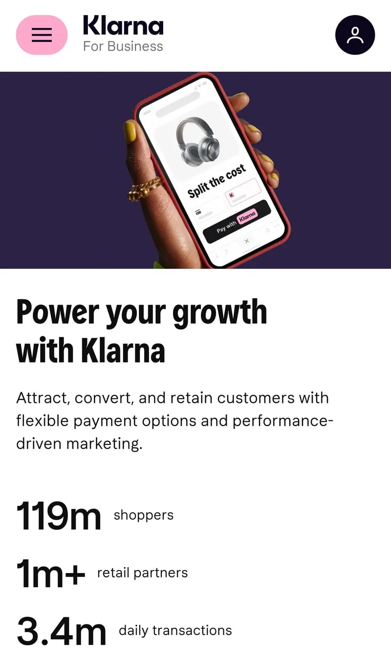
### Phone Mockup
- **Width**: ~360px
- **Aspect**: Standard smartphone (19.5:9)
- **Shadow**: Large, prominent
- **Screen Radius**: 24-36px
- **Position**: Relative, slightly rotated (~2-3deg)

## Layout Patterns

### Container
- **Max Width**: 1280px
- **Padding**: 24px (mobile), 48px (tablet), 80px (desktop)
- **Margin**: 0 auto

### Grid System
- **Columns**: 12-column grid
- **Gap**: 24px (mobile), 32px (desktop)
- **Breakpoints**:
  - Mobile: < 768px
  - Tablet: 768px - 1024px
  - Desktop: > 1024px
  - Wide: > 1440px

### Section Spacing
- **Vertical Padding**: 80px (mobile), 120px (desktop)
- **Between Sections**: 64px min

### Typography Rhythm
- **Heading to Body**: 16px
- **Paragraph Spacing**: 24px
- **List Items**: 12px