Use this design system
Tokens · motion · components — drop straight into your project.
Download design kitStart a project with it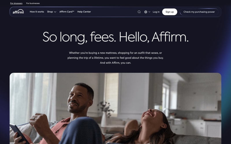
Similar styles
# Affirm Design System

## Tokens — Colors

| Token | Value | Usage |
|-------|-------|-------|
| `color-primary` | `#4E54F2` | Primary brand, buttons, links, logo |
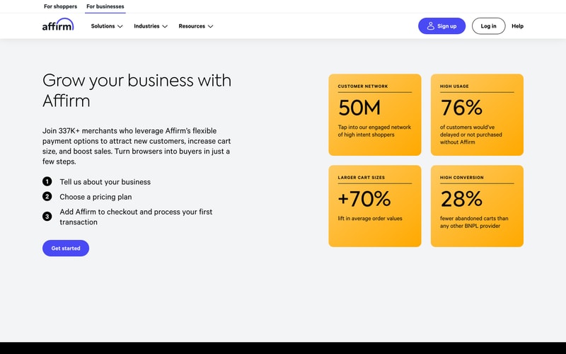
| `color-secondary` | `#FFBB00` | Stat cards, highlights, accents |
| `color-dark-navy` | `#1B2333` | Dark mode background |
| `color-dark-navy-alt` | `#252D42` | Dark mode secondary surfaces |
| `color-black` | `#000000` | Headings, body text (light mode) |
| `color-white` | `#FFFFFF` | Text on dark, buttons, cards |
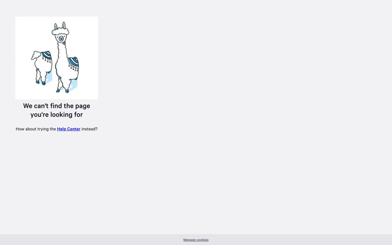
| `color-gray-50` | `#F7F7F7` | Light background (404 page) |
| `color-gray-100` | `#F0F0F0` | Light background alternative |
| `color-gray-200` | `#E5E5E5` | Borders, dividers |
| `color-gray-600` | `#4A4A4A` | Secondary text |
| `color-gray-700` | `#2D2D2D` | Body text (light mode) |
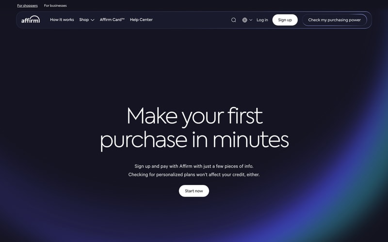
| `color-gradient-blue` | `linear-gradient(135deg, #1B2333 0%, #2A4A7F 50%, #3B8B9E 100%)` | Hero gradient overlay |
| `color-blue-accent` | `#3B8FCC` | Illustration accents |

## Tokens — Typography

**Font Families:**
- Primary: `"Favorit", -apple-system, BlinkMacSystemFont, "Segoe UI", system-ui, sans-serif`
- Monospace: `"SF Mono", "Consolas", monospace`

**Type Scale:**

| Token | Size | Weight | Line Height | Usage |
|-------|------|--------|-------------|-------|
| `text-hero` | `72px` | `300` | `1.1` | Main hero headings |
| `text-h1` | `56px` | `400` | `1.15` | Page headings |
| `text-h2` | `40px` | `400` | `1.2` | Section headings |
| `text-h3` | `32px` | `500` | `1.3` | Sub-headings |
| `text-display` | `64px` | `700` | `1` | Stat numbers |
| `text-body-lg` | `18px` | `400` | `1.6` | Hero body text |
| `text-body` | `16px` | `400` | `1.5` | Body text |
| `text-body-sm` | `14px` | `400` | `1.5` | Small text, labels |
| `text-nav` | `15px` | `500` | `1.4` | Navigation links |
| `text-button` | `16px` | `600` | `1` | Button labels |

## Tokens — Spacing

| Token | Value |
|-------|-------|
| `space-xs` | `4px` |
| `space-sm` | `8px` |
| `space-md` | `16px` |
| `space-lg` | `24px` |
| `space-xl` | `32px` |
| `space-2xl` | `48px` |
| `space-3xl` | `64px` |
| `space-4xl` | `96px` |
| `space-5xl` | `128px` |

## Tokens — Border Radius

| Token | Value | Usage |
|-------|-------|-------|
| `radius-sm` | `8px` | Small elements |
| `radius-md` | `12px` | Cards, stat boxes |
| `radius-lg` | `16px` | Large cards |
| `radius-xl` | `24px` | Buttons |
| `radius-full` | `9999px` | Pill buttons, avatars |

## Tokens — Shadows

| Token | Value |
|-------|-------|
| `shadow-sm` | `0 1px 3px rgba(0, 0, 0, 0.08)` |
| `shadow-md` | `0 4px 12px rgba(0, 0, 0, 0.1)` |
| `shadow-lg` | `0 8px 24px rgba(0, 0, 0, 0.12)` |
| `shadow-stat-card` | `0 2px 8px rgba(0, 0, 0, 0.06)` |

## Tokens — Borders

| Token | Value |
|-------|-------|
| `border-default` | `1px solid #E5E5E5` |
| `border-dark` | `1px solid rgba(255, 255, 255, 0.15)` |
| `border-button` | `2px solid currentColor` |

## Components

### Button
- **Primary**: Blue background (`#4E54F2`), white text, `24px` border radius, `14px 32px` padding
- **Secondary**: White background, dark text, `24px` border radius
- **Outlined**: Transparent background, border (1-2px), matches text color
- **States**: Hover darkens/lightens by ~10%, active scales down slightly

### Card
- **Stat Card**: Golden yellow background (`#FFBB00`), `12px` border radius, `32px` padding, subtle shadow
- **Content Card**: White background, `16px` border radius, `24px` padding
- **404 Card**: White background, `12px` radius, illustration content

### Navigation
- **Top Nav**: Horizontal bar, dark background on dark pages, white on light pages
- **Logo**: Left-aligned, blue on light background, white on dark
- **Links**: Center-aligned menu items, `15px` medium weight
- **Actions**: Right-aligned buttons (Sign up, Log in)

### Hero Section
- **Layout**: Full-width, centered content, large vertical padding (120px+)
- **Heading**: Extra-large text (`72px`), thin weight (300)
- **Body**: Medium text (`18px`), max-width ~600px, centered
- **CTA**: Single prominent button below text

### Stat Display
- **Container**: 2x2 grid of cards
- **Number**: Very large (`64px`), bold (700), black text
- **Label**: Uppercase, small caps, medium weight
- **Description**: Regular body text, black

## Layout Patterns

### Grid System
- 12-column responsive grid
- Max content width: `1200px`
- Horizontal padding: `24px` mobile, `48px` tablet, `64px` desktop

### Hero Layouts
- **Centered**: Text and CTA centered, full-width background
- **Split**: Content left, gradient/visual right (implied by gradient)

### Spacing Rhythm
- Section vertical padding: `96px` desktop, `64px` tablet, `48px` mobile
- Element vertical spacing: `32px` between major elements
- Component internal padding: `16-32px`