Use this design system
Tokens · motion · components — drop straight into your project.
Download design kitStart a project with it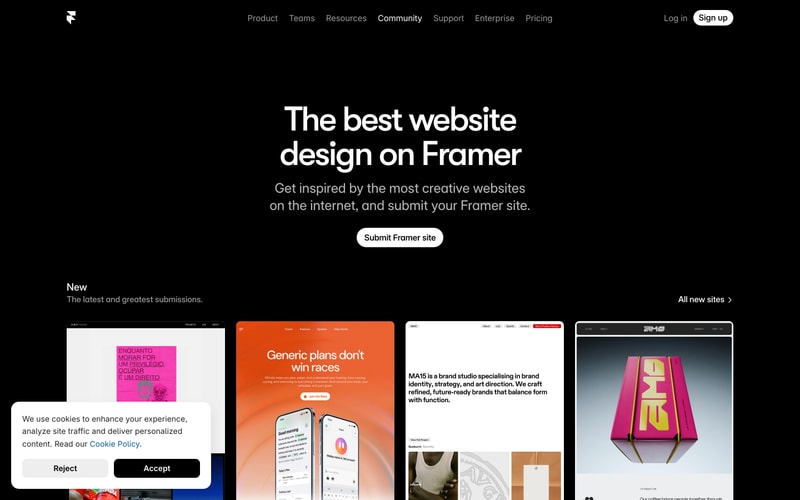
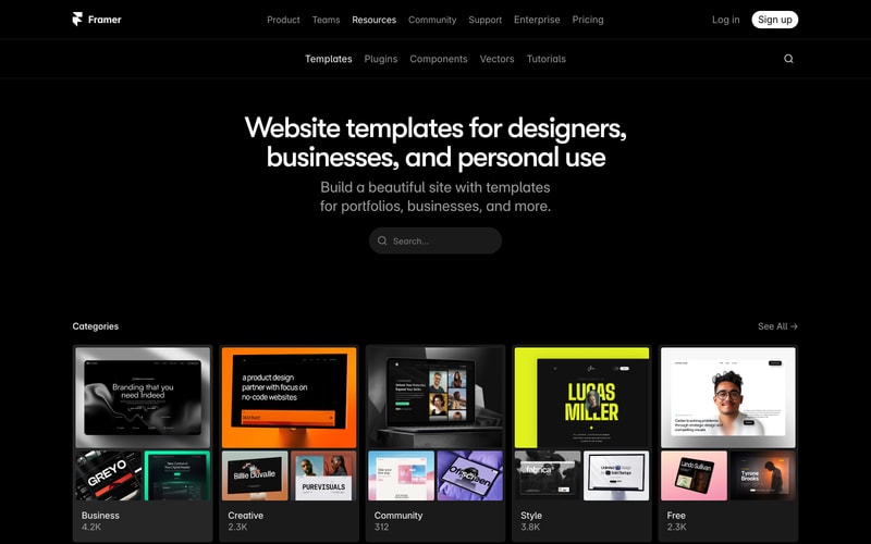
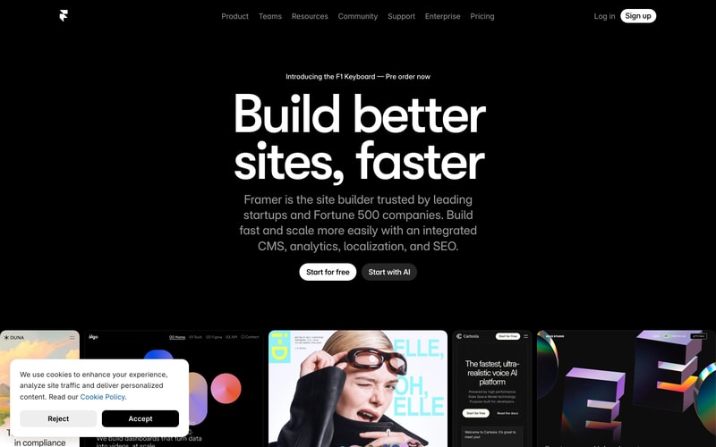
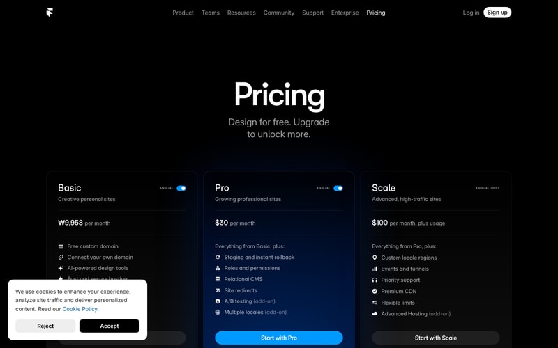
Similar styles
# Framer Design System

## Tokens — Colors

| Token | Value | Usage |
|-------|-------|-------|
| `background-primary` | `#000000` | Main page background |
| `background-secondary` | `#0F0F0F` | Card backgrounds, elevated surfaces |
| `background-tertiary` | `#1A1A1A` | Hover states, subtle elevation |
| `background-modal` | `#FFFFFF` | Cookie banner, modals |
| `background-blue-tint` | `#0A1929` | Pricing card accent background |
| `text-primary` | `#FFFFFF` | Headings, primary text on dark |
| `text-secondary` | `#999999` | Body text, descriptions, muted text |
| `text-tertiary` | `#666666` | Placeholder text, disabled states |
| `text-inverse` | `#000000` | Text on light backgrounds |
| `accent-blue` | `#0099FF` | Primary CTA buttons, links, accents |
| `accent-blue-hover` | `#0080E6` | Blue button hover state |
| `border-subtle` | `#222222` | Card borders, dividers |
| `border-medium` | `#333333` | Input borders, modal borders |
| `button-primary-bg` | `#FFFFFF` | Primary button background |
| `button-primary-text` | `#000000` | Primary button text |
| `button-secondary-bg` | `#1A1A1A` | Secondary button background |
| `button-secondary-text` | `#FFFFFF` | Secondary button text |

## Tokens — Typography

### Font Families
- **Primary**: `Inter`, `-apple-system`, `BlinkMacSystemFont`, `"Segoe UI"`, `Roboto`, `sans-serif`

### Type Scale

| Token | Size | Line Height | Weight | Usage |
|-------|------|-------------|--------|-------|
| `display-xl` | `120px` | `1.1` | `700` | Hero headlines |
| `display-lg` | `96px` | `1.1` | `700` | Major page titles |
| `display-md` | `72px` | `1.2` | `700` | Section headlines |
| `heading-xl` | `56px` | `1.2` | `600` | Large headings |
| `heading-lg` | `48px` | `1.3` | `600` | Page headings |
| `heading-md` | `36px` | `1.3` | `600` | Section titles |
| `heading-sm` | `24px` | `1.4` | `600` | Card titles |
| `body-lg` | `20px` | `1.6` | `400` | Hero subtext, large body |
| `body-md` | `16px` | `1.6` | `400` | Standard body text |
| `body-sm` | `14px` | `1.5` | `400` | Small text, captions |
| `button-lg` | `16px` | `1.5` | `500` | Large button text |
| `button-md` | `14px` | `1.5` | `500` | Standard button text |
| `label` | `12px` | `1.4` | `600` | Labels, tags, metadata |

## Tokens — Spacing

Base unit: `4px`

| Token | Value | Usage |
|-------|-------|-------|
| `spacing-1` | `4px` | Tight spacing |
| `spacing-2` | `8px` | Icon gaps, small padding |
| `spacing-3` | `12px` | Compact padding |
| `spacing-4` | `16px` | Default gap between elements |
| `spacing-5` | `20px` | Medium spacing |
| `spacing-6` | `24px` | Card padding, section gaps |
| `spacing-8` | `32px` | Large padding |
| `spacing-10` | `40px` | Extra large padding |
| `spacing-12` | `48px` | Section spacing |
| `spacing-16` | `64px` | Major section gaps |
| `spacing-20` | `80px` | Hero section padding |
| `spacing-24` | `96px` | XL section spacing |
| `spacing-30` | `120px` | XXL section spacing |

## Tokens — Border Radius

| Token | Value | Usage |
|-------|-------|-------|
| `radius-sm` | `6px` | Small elements |
| `radius-md` | `8px` | Buttons, inputs |
| `radius-lg` | `12px` | Cards, modals |
| `radius-xl` | `16px` | Large cards |
| `radius-2xl` | `24px` | Pill buttons, search bars |
| `radius-full` | `9999px` | Circular elements, pills |

## Tokens — Shadows

| Token | Value | Usage |
|-------|-------|-------|
| `shadow-sm` | `0 1px 2px rgba(0, 0, 0, 0.5)` | Subtle elevation |
| `shadow-md` | `0 4px 12px rgba(0, 0, 0, 0.6)` | Cards, dropdowns |
| `shadow-lg` | `0 8px 24px rgba(0, 0, 0, 0.7)` | Modals, popovers |
| `shadow-xl` | `0 16px 48px rgba(0, 0, 0, 0.8)` | Large modals |

## Tokens — Borders

| Token | Value | Usage |
|-------|-------|-------|
| `border-width-1` | `1px` | Standard borders |
| `border-width-2` | `2px` | Emphasized borders |
| `border-style` | `solid` | Default border style |

## Components

### Button

**Variants:**
- **Primary**: White background (`#FFFFFF`), black text (`#000000`), `8px` radius, `16px 32px` padding, `500` weight
- **Secondary**: Dark background (`#1A1A1A`), white text (`#FFFFFF`), `8px` radius, `16px 32px` padding
- **CTA (Accent)**: Blue background (`#0099FF`), white text, `8px` radius, `16px 32px` padding, `500` weight, full-width in cards
- **Ghost**: Transparent background, white text, `8px` radius, `12px 24px` padding

**States:**
- Default: Solid background
- Hover: Slight opacity change or darker shade
- Active: Pressed state with scale
- Disabled: Reduced opacity (0.5)

### Card

**Pricing Card:**
- Background: `#0F0F0F` (Basic/Scale) or `#0A1929` (Pro with blue tint)
- Border: `1px solid #222222`
- Radius: `16px`
- Padding: `40px`
- Includes: Title, subtitle, price (strikethrough), feature list with icons, CTA button

**Template Card:**
- Background: Image thumbnail
- Overlay gradient on hover
- Radius: `12px`
- Shadow on hover: `shadow-lg`

### Navigation

**Header:**
- Background: `rgba(0, 0, 0, 0.8)` with backdrop blur
- Height: `64px`
- Logo + horizontal menu links
- Right-aligned auth buttons
- Border bottom: `1px solid #1A1A1A`

**Secondary Nav:**
- Background: `#000000`
- Height: `56px`
- Centered menu items
- Search icon on right

### Modal (Cookie Banner)

- Background: `#FFFFFF`
- Radius: `12px`
- Padding: `32px`
- Shadow: `shadow-xl`
- Two buttons: Reject (outline) + Accept (solid black)
- Max-width: `400px`
- Positioned: Bottom-left with margin

### Search Input

- Background: `#1A1A1A`
- Border: `1px solid #333333`
- Radius: `24px` (pill)
- Padding: `12px 24px`
- Placeholder color: `#666666`
- Icon: Search icon on left

### Toggle Switch

- Track: `#333333` (off), `#0099FF` (on)
- Thumb: `#FFFFFF`, `20px` diameter
- Width: `44px`, Height: `24px`
- Radius: `full`

### Icon

- Size: `16px` or `20px`
- Color: Matches text color
- Style: Outline or solid depending on context

## Layout Patterns

### Container

- Max-width: `1280px`
- Padding: `0 40px`
- Margin: `0 auto`

### Hero Section

- Centered content
- Vertical padding: `120px 0`
- Max-width for text: `900px`
- Headline + subtitle + button group
- Button group: `flexbox` with `16px` gap

### Grid — Pricing

- 3 columns
- Gap: `24px`
- Equal height cards
- Responsive: Stack on mobile

### Grid — Templates

- 4-5 columns
- Gap: `20px`
- Masonry-style or equal height
- Responsive breakpoints

### Section Spacing

- Between major sections: `120px` vertical
- Between subsections: `64px` vertical
- Inside cards: `32px` vertical between elements