2 free brands left today.Sign up — unlimited →
Use this design system
Tokens · motion · components — drop straight into your project.
Download design kitStart a project with it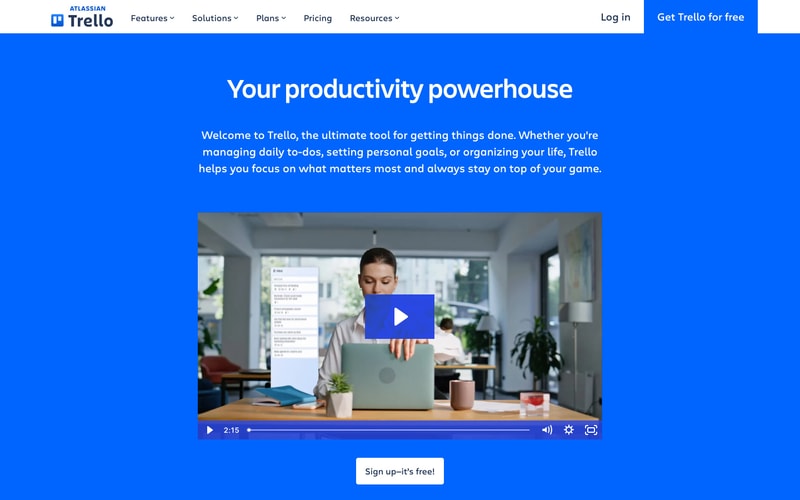
Similar styles
# Trello Design System

## Tokens — Colors

| Token | Value | Usage |
|-------|-------|-------|
| `primary` | `#0079BF` | Primary brand color, CTA buttons, links |
| `primary-hover` | `#026AA7` | Hover state for primary actions |
| `surface-0` | `#FFFFFF` | Cards, navbar, modals |
| `surface-50` | `#FAFBFC` | Page backgrounds |
| `surface-100` | `#F4F5F7` | Subtle backgrounds |
| `surface-200` | `#E3E8ED` | Hero section backgrounds |
| `text-primary` | `#172B4D` | Headings, primary text |
| `text-secondary` | `#5E6C84` | Body text, secondary content |
| `text-tertiary` | `#6B778C` | Muted text, placeholders |
| `text-link` | `#0079BF` | Hyperlinks |
| `accent-orange` | `#FF9F1C` | Decorative accents |
| `accent-purple` | `#B04EC4` | Decorative accents |
| `accent-pink` | `#EB5A46` | Alerts, important markers |
| `warning` | `#FFC400` | Warning states, accept buttons |
| `border-light` | `#DFE1E6` | Subtle borders, dividers |

## Tokens — Typography

**Font Families:**
- `primary`: `-apple-system, BlinkMacSystemFont, "Segoe UI", Roboto, Oxygen-Sans, Ubuntu, Cantarell, "Helvetica Neue", sans-serif`

**Type Scale:**

| Token | Size | Weight | Line Height | Usage |
|-------|------|--------|-------------|-------|
| `display-1` | `56px` | `700` | `1.2` | Hero headings |
| `display-2` | `48px` | `700` | `1.2` | Section headings |
| `heading-1` | `32px` | `700` | `1.3` | Page titles |
| `heading-2` | `24px` | `600` | `1.4` | Subsection headings |
| `heading-3` | `20px` | `600` | `1.4` | Card titles |
| `body-large` | `18px` | `400` | `1.6` | Hero subtext, important copy |
| `body` | `16px` | `400` | `1.5` | Default body text |
| `body-small` | `14px` | `400` | `1.5` | Secondary text, labels |
| `caption` | `12px` | `400` | `1.4` | Fine print, metadata |

## Tokens — Spacing

**Scale:** `4px` base unit

| Token | Value | Usage |
|-------|-------|-------|
| `xs` | `4px` | Tight spacing, icon gaps |
| `sm` | `8px` | Small gaps, compact layouts |
| `md` | `16px` | Default spacing, card padding |
| `lg` | `24px` | Section padding, component gaps |
| `xl` | `32px` | Large sections |
| `2xl` | `48px` | Hero sections |
| `3xl` | `64px` | Major section spacing |
| `4xl` | `96px` | Page-level spacing |

## Tokens — Border Radius

| Token | Value | Usage |
|-------|-------|-------|
| `sm` | `3px` | Small elements, badges |
| `md` | `8px` | Buttons, inputs, cards |
| `lg` | `12px` | Large cards, modals |
| `xl` | `16px` | Feature cards, mobile UI mockups |

## Tokens — Shadows

| Token | Value | Usage |
|-------|-------|-------|
| `sm` | `0 1px 2px rgba(0,0,0,0.08)` | Subtle elevation |
| `md` | `0 2px 8px rgba(0,0,0,0.12)` | Cards, dropdowns |
| `lg` | `0 4px 16px rgba(0,0,0,0.16)` | Modals, overlays |

## Tokens — Borders

| Token | Value | Usage |
|-------|-------|-------|
| `default` | `1px solid #DFE1E6` | Standard borders |
| `focus` | `2px solid #0079BF` | Focus states |

## Components

### Navigation Bar
- White background with subtle shadow
- Logo left-aligned
- Navigation links center
- CTA buttons right-aligned
- Height: ~64px
- Horizontal padding: 24-32px

### Button - Primary
- Background: `#0079BF`
- Text: `#FFFFFF`
- Padding: `12px 24px`
- Border radius: `8px`
- Font weight: `600`
- Hover: darker blue `#026AA7`
- No border

### Button - Secondary
- Background: transparent
- Text: `#0079BF`
- Border: `1px solid #0079BF`
- Same padding and radius as primary

### Input Field
- Background: `#FAFBFC`
- Border: `1px solid #DFE1E6`
- Border radius: `8px`
- Padding: `12px 16px`
- Font size: `16px`
- Focus: border color changes to `#0079BF`

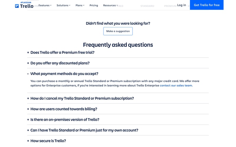
### FAQ Accordion
- Collapsible sections with + / - indicators
- Question text: `20px`, `600` weight
- Expanded content with body text
- Divider lines between items
- Interactive hover states

### Video Player
- Custom controls overlay
- Play button centered
- Progress bar at bottom
- Volume, settings, fullscreen controls
- Border radius: `8px`

### Cookie Banner
- Fixed bottom position
- White background
- Shadow for elevation
- Three button options (Manage, Reject, Accept)
- Accept button uses yellow/gold color
- Padding: 24px
- Max-width contained

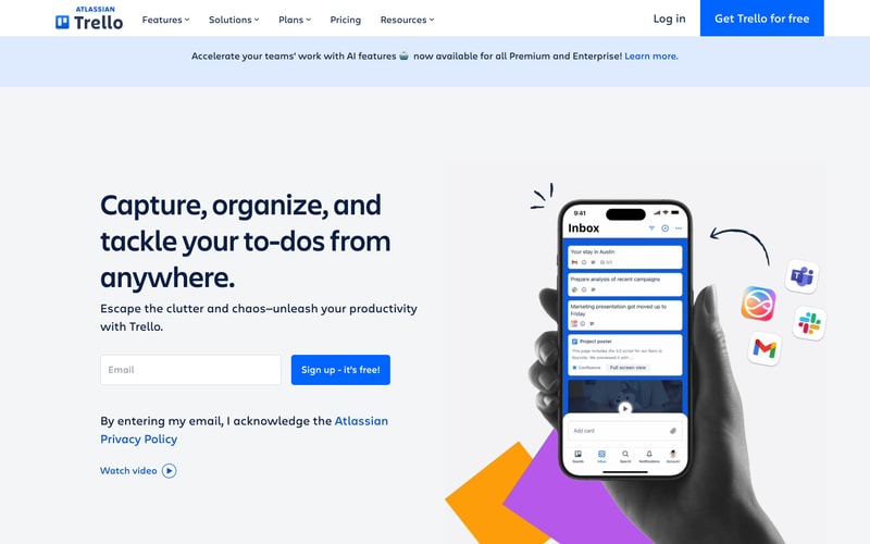
### Mobile Mockup Display
- Phone frame with realistic UI
- Integrated into hero sections
- Hand holding device for context
- Shadow and depth
- Decorative geometric shapes (orange, purple) behind

## Layout Patterns

### Hero Section
- Full-width background color or image
- Max-width container: ~1200px
- Two-column layout (60/40 split)
- Left: Headline + subtext + CTA form
- Right: Product visual or mockup
- Vertical padding: 64-96px

### Content Section
- Centered max-width container
- White or light gray background
- Ample vertical spacing (48-64px)
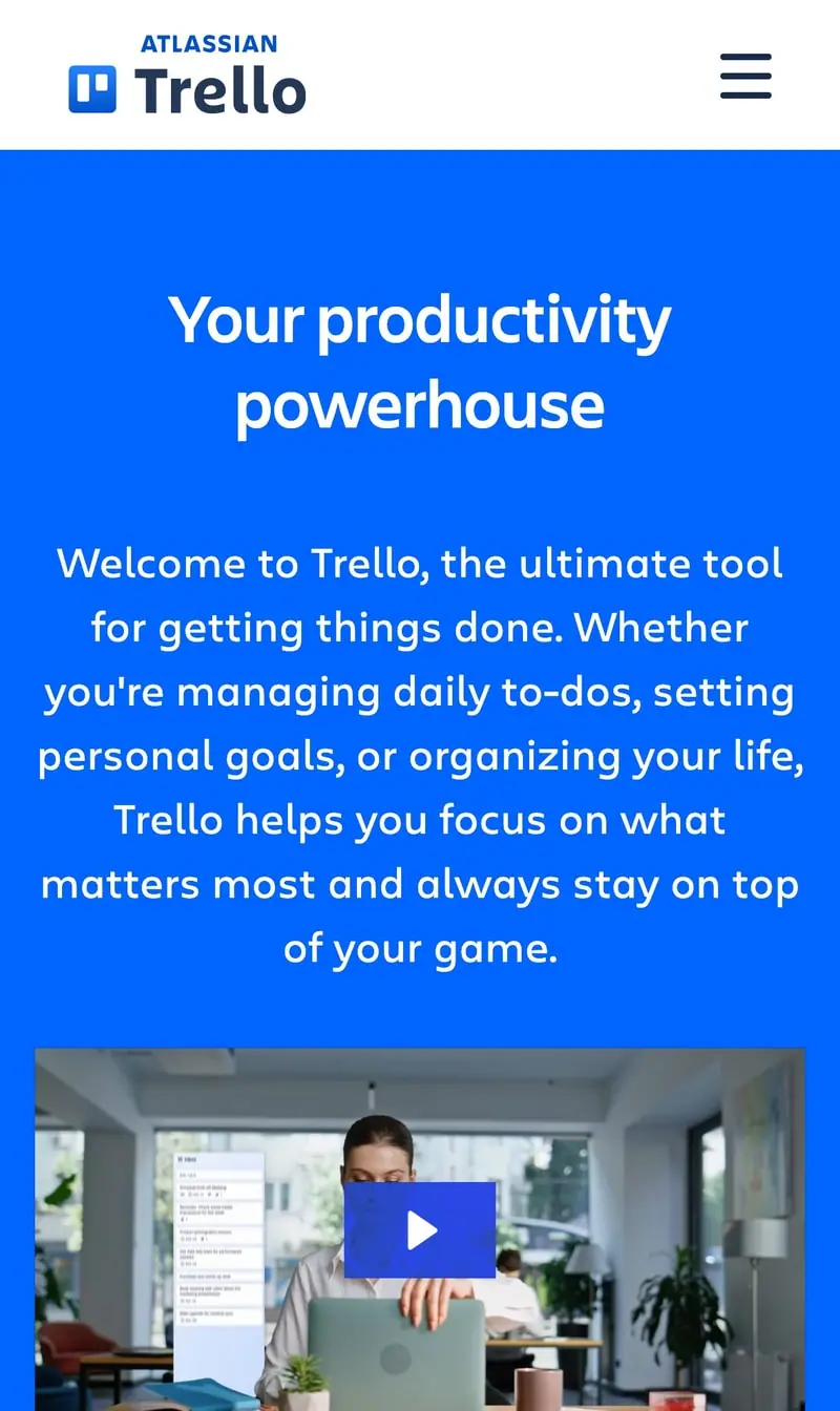
- Consistent horizontal padding (24px mobile, 32px+ desktop)

### Grid Layouts
- Responsive grid (1 column mobile → 3-4 columns desktop)
- Gap: 24-32px
- Cards with consistent padding

### Typography Hierarchy
- Large bold headlines (56px+)
- Generous line-height (1.5-1.6)
- Clear visual hierarchy with size and weight
- Ample whitespace between sections