2 free brands left today.Sign up — unlimited →
Use this design system
Tokens · motion · components — drop straight into your project.
Download design kitStart a project with it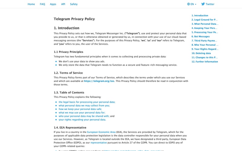
Similar styles
# Telegram Design System

## Tokens — Colors

| Token | Value | Usage |
|-------|-------|-------|
| `primary` | `#0088CC` | Primary brand blue, links, CTAs, active states |
| `primary-hover` | `#0077B3` | Hover state for primary actions |
| `primary-light` | `#2AABEE` | Logo background, lighter brand accent |
| `text-primary` | `#222222` | Headings, primary body text |
| `text-secondary` | `#707579` | Subdued text, descriptions, metadata |
| `text-tertiary` | `#999999` | Placeholder text, disabled states |
| `background` | `#FFFFFF` | Page background |
| `surface` | `#F7F8FA` | Card backgrounds, elevated surfaces |
| `border` | `#DADCE0` | Dividers, card borders |
| `border-light` | `#EEEEEE` | Subtle dividers |
| `success` | `#4CAF50` | Success states, confirmations |
| `warning` | `#FF9800` | Warning states |
| `error` | `#F44336` | Error states, destructive actions |

## Tokens — Typography

**Font Families:**
- Sans: `-apple-system, BlinkMacSystemFont, "Segoe UI", Roboto, "Helvetica Neue", Arial, sans-serif`
- Monospace: `"SF Mono", Monaco, Consolas, "Liberation Mono", "Courier New", monospace`

**Type Scale:**

| Token | Size | Weight | Line Height | Usage |
|-------|------|--------|-------------|-------|
| `display` | `40px` | 600 | 1.2 | Hero headings, page titles |
| `h1` | `32px` | 600 | 1.3 | Section headings |
| `h2` | `24px` | 600 | 1.4 | Subsection headings |
| `h3` | `20px` | 600 | 1.4 | Card titles, component headings |
| `body-lg` | `16px` | 400 | 1.6 | Large body text |
| `body` | `15px` | 400 | 1.5 | Default body text |
| `body-sm` | `14px` | 400 | 1.5 | Secondary text, captions |
| `caption` | `13px` | 400 | 1.4 | Metadata, timestamps |
| `overline` | `12px` | 500 | 1.3 | Labels, tags (uppercase) |

## Tokens — Spacing

| Token | Value | Usage |
|-------|-------|-------|
| `xs` | `4px` | Tight spacing, inline gaps |
| `sm` | `8px` | Icon-text gaps, compact layouts |
| `md` | `16px` | Default component padding |
| `lg` | `24px` | Section spacing, card padding |
| `xl` | `32px` | Card gaps, component margins |
| `2xl` | `48px` | Section margins |
| `3xl` | `64px` | Hero padding, page sections |
| `4xl` | `96px` | Large section spacing |

## Tokens — Border Radius

| Token | Value | Usage |
|-------|-------|-------|
| `sm` | `4px` | Buttons, small elements |
| `md` | `8px` | Cards, panels |
| `lg` | `12px` | Large cards, modals |
| `xl` | `16px` | Featured content |
| `full` | `9999px` | Pills, badges, avatars |

## Tokens — Shadows

| Token | Value | Usage |
|-------|-------|-------|
| `xs` | `0 1px 2px rgba(0,0,0,0.05)` | Subtle elevation |
| `sm` | `0 2px 4px rgba(0,0,0,0.08)` | Buttons, small cards |
| `md` | `0 4px 12px rgba(0,0,0,0.1)` | Cards, dropdowns |
| `lg` | `0 8px 24px rgba(0,0,0,0.12)` | Modals, popovers |
| `xl` | `0 16px 48px rgba(0,0,0,0.15)` | Large elevated surfaces |

## Tokens — Borders

| Token | Value | Usage |
|-------|-------|-------|
| `default` | `1px solid #DADCE0` | Card borders, dividers |
| `light` | `1px solid #EEEEEE` | Subtle dividers |
| `accent` | `3px solid #0088CC` | Active indicators, accents |
| `focus` | `2px solid #0088CC` | Focus rings |

## Components

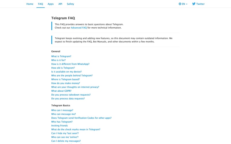
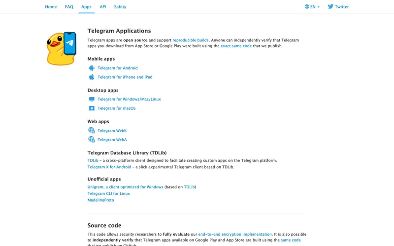
### Navigation Bar
- Horizontal layout, sticky/fixed positioning
- Link items with underline active state (3px blue bottom border)
- Hover state: color transition to primary blue
- Right-aligned utility links (language selector, social)
- Padding: 16px vertical, contained width

### Hero Section
- Centered content, max-width ~600px
- Large logo (120-160px diameter, circular)
- Display heading + subtitle
- Generous vertical spacing (64px+ padding)

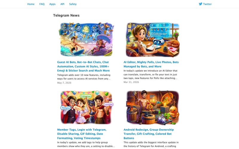
### Card Component
- Background: white or subtle gray surface
- Border: 1px solid border color OR shadow elevation
- Border radius: 8-12px
- Padding: 24-32px
- Image + text content stack
- Hover: subtle shadow lift or border color change

### News Card (Article Card)
- Featured illustration/image (16:9 or similar aspect)
- Blue heading link (h3 size, ~20px)
- Gray metadata (date, ~13px)
- Body preview text
- Spacing: 16px between elements

### Sidebar Widget
- "Recent News" heading in primary blue
- Stacked list of links
- Date labels in secondary gray
- Compact spacing (8-12px between items)
- Border or background differentiation

### Link List
- Vertical stack of blue links
- 8-12px spacing between items
- Hover: underline or slight color shift
- Optional icon prefix (platform icons, bullets)

### Info Box / Callout
- Left border accent (3-4px, primary blue or contextual color)
- Light background or white with border
- Padding: 16-24px
- Icon optional

### Icon + Text Pattern
- Platform icons (Android, iOS, macOS, Windows, etc.)
- 16-24px icon size
- 8-12px gap between icon and text
- Vertical center alignment

## Layout Patterns

### Page Container
- Max-width: 1200px
- Horizontal padding: 24-32px
- Centered with auto margins

### Two-Column Layout
- Main content: ~70% width
- Sidebar: ~25% width
- Gap: 32-48px
- Responsive: stack on mobile

### Card Grid
- 2-column on desktop, 1-column on mobile
- Gap: 24-32px between cards
- Equal height cards optional

### Content Section
- Vertical rhythm: 48-64px between major sections
- Heading + content pattern
- Consistent padding

### Navigation Pattern
- Fixed/sticky top bar
- Logo/brand left, nav center, utilities right
- Mobile: hamburger menu collapse