Use this design system
Tokens · motion · components — drop straight into your project.
Download design kitStart a project with it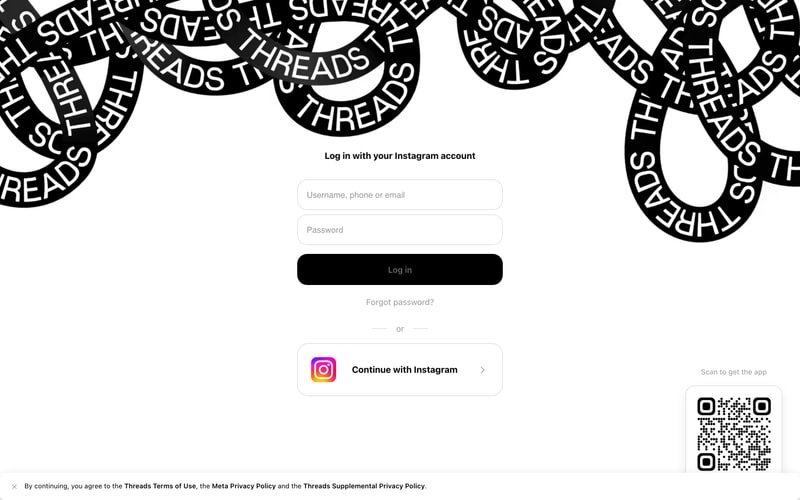
Similar styles
# Threads Design System

## Tokens — Colors

| Token | Value | Usage |
|-------|-------|-------|
| `primary` | `#0866FF` | Primary actions, links, Meta brand |
| `black` | `#000000` | Primary text, button backgrounds |
| `white` | `#FFFFFF` | Surfaces, button text, modal backgrounds |
| `gray-50` | `#F5F5F5` | Input backgrounds |
| `gray-200` | `#E5E5E5` | Borders, dividers |
| `gray-300` | `#DBDBDB` | Input borders |
| `gray-500` | `#999999` | Secondary text, placeholders |
| `gray-600` | `#737373` | Tertiary text, metadata |
| `gray-700` | `#5F5F5F` | Dark background surfaces |
| `gray-800` | `#6B6B6B` | Darker background overlays |
| `instagram-start` | `#FD5949` | Instagram gradient start |
| `instagram-mid` | `#D6249F` | Instagram gradient middle |
| `instagram-end` | `#285AEB` | Instagram gradient end |
| `overlay` | `rgba(0, 0, 0, 0.6)` | Modal overlay background |

## Tokens — Typography

**Font Family:** System font stack
`-apple-system, BlinkMacSystemFont, "Segoe UI", Roboto, Helvetica, Arial, sans-serif`

**Type Scale:**

| Token | Size | Weight | Line Height | Usage |
|-------|------|--------|-------------|-------|
| `heading-xl` | `32px` | `700` | `40px` | Modal titles, page headings |
| `heading-lg` | `24px` | `700` | `32px` | Section headings |
| `heading-md` | `20px` | `600` | `28px` | Card headings |
| `body-lg` | `16px` | `400` | `24px` | Primary body text |
| `body-md` | `15px` | `400` | `20px` | Secondary body text, descriptions |
| `body-sm` | `14px` | `400` | `20px` | Metadata, timestamps |
| `caption` | `13px` | `400` | `18px` | Fine print, helper text |
| `button` | `15px` | `600` | `20px` | Button labels |

## Tokens — Spacing

| Token | Value | Usage |
|-------|-------|-------|
| `xs` | `4px` | Tight spacing, icon gaps |
| `sm` | `8px` | Compact spacing |
| `md` | `12px` | Default element spacing |
| `lg` | `16px` | Card padding, section gaps |
| `xl` | `24px` | Modal padding, large gaps |
| `2xl` | `32px` | Page margins, modal padding |
| `3xl` | `48px` | Section spacing |

## Tokens — Border Radius

| Token | Value | Usage |
|-------|-------|-------|
| `sm` | `8px` | Buttons, inputs |
| `md` | `12px` | Large buttons, cards |
| `lg` | `16px` | Modals, dialogs |
| `xl` | `20px` | Large cards |
| `full` | `9999px` | Pills, avatars, icon buttons |

## Tokens — Shadows

| Token | Value | Usage |
|-------|-------|-------|
| `sm` | `0 1px 2px rgba(0, 0, 0, 0.05)` | Subtle elevation |
| `md` | `0 4px 12px rgba(0, 0, 0, 0.1)` | Cards, dropdowns |
| `lg` | `0 8px 24px rgba(0, 0, 0, 0.15)` | Modals, popovers |
| `xl` | `0 16px 48px rgba(0, 0, 0, 0.2)` | High elevation modals |

## Tokens — Borders

| Token | Value | Usage |
|-------|-------|-------|
| `default` | `1px solid #DBDBDB` | Input borders |
| `subtle` | `1px solid #E5E5E5` | Dividers |
| `strong` | `1px solid #999999` | Focused borders |

## Components

### Button

**Variants:**
- **Primary:** Blue background (`#0866FF`), white text, 12-16px vertical padding, 24-32px horizontal padding, 8-12px border radius
- **Secondary:** White background, black text, 1px border, same padding/radius as primary
- **Tertiary:** Transparent background, blue text, no border
- **Black:** Black background, white text, same padding/radius

**States:** Hover (slightly darker), active (more darker), disabled (opacity 0.5)

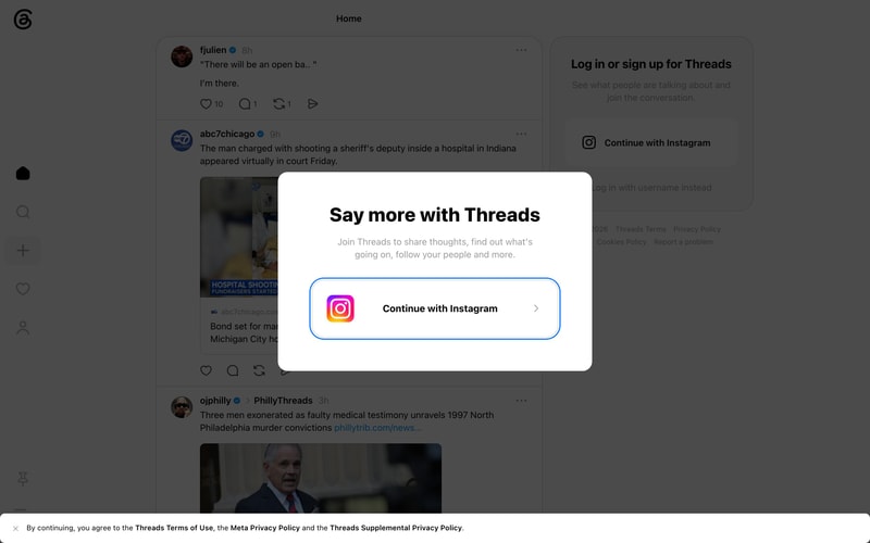
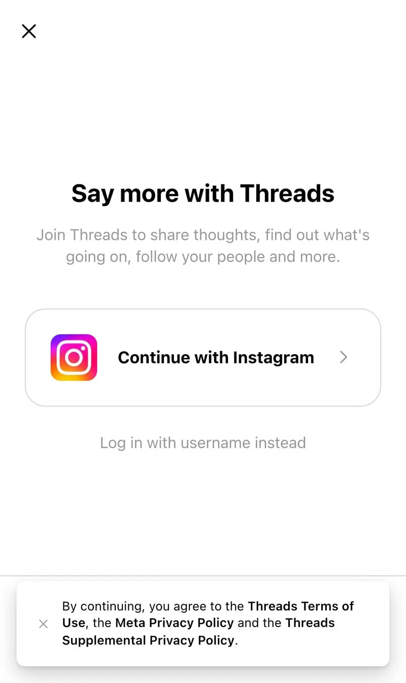
### Modal Dialog

- White background (`#FFFFFF`)
- Border radius: 16-20px
- Padding: 24-32px
- Shadow: `0 8px 24px rgba(0, 0, 0, 0.15)`
- Close button: Blue circle with white X icon (top-right)
- Overlay: `rgba(0, 0, 0, 0.6)`

### Text Input

- Background: `#F5F5F5` or `#FFFFFF`
- Border: `1px solid #DBDBDB`
- Border radius: 8-12px
- Padding: 12-14px
- Placeholder text: `#999999`
- Focus state: Border color changes to `#0866FF`

### Icon Button

- Circular or square
- 40-48px size
- Icon: 24px
- Hover: Background `#F5F5F5`

### Avatar

- Circular (border-radius: 50%)
- Sizes: 24px, 32px, 40px, 56px
- Border: Optional 2px white border with shadow

### Navigation Sidebar

- Vertical icon stack
- Dark background
- Icon size: 24px
- Spacing: 16px between icons
- Active state: Filled icon or underline

## Layout Patterns

### Centered Modal

- Fixed positioning
- Centered vertically and horizontally
- Max-width: 420-480px
- Dark overlay behind
- z-index layering for overlay and modal

### Two-Column Layout

- Left sidebar: Fixed width (~280px), navigation icons
- Main content: Fluid, centered, max-width ~600px
- Right sidebar: Fixed width (~320px), CTAs or auxiliary content

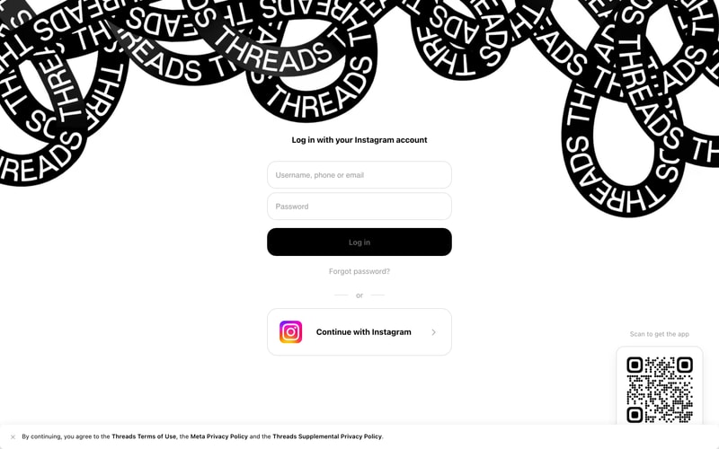
### Form Layout

- Centered container, max-width ~360px
- Vertical stack with 16px gaps
- Full-width inputs and buttons
- Dividers with centered text

### Feed Layout

- Single column, max-width 600px
- Card-based posts with padding and subtle borders
- Avatar + content layout
- Interaction buttons row at bottom of each card