2 free brands left today.Sign up — unlimited →
Use this design system
Tokens · motion · components — drop straight into your project.
Download design kitStart a project with it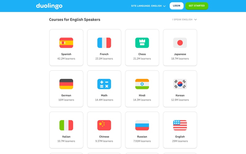
Similar styles
# Duolingo Design System

## Tokens — Colors

| Token | Value | Usage |
|-------|-------|-------|
| `--color-brand-green` | `#58CC02` | Primary brand color, CTA buttons, logo, checkmarks |
| `--color-brand-blue` | `#1CB0F6` | Links, active states, secondary brand |
| `--color-brand-purple` | `#7B4DFF` | Schools section, accent color |
| `--color-eel` | `#3C3C3C` | Primary text, headings |
| `--color-wolf` | `#777777` | Secondary text |
| `--color-hare` | `#AFAFAF` | Tertiary text, disabled states |
| `--color-swan` | `#FFFFFF` | Backgrounds, button text |
| `--color-snow` | `#F7F7F7` | Light backgrounds |
| `--color-accent-orange` | `#FF9600` | Character illustrations, accents |
| `--color-accent-pink` | `#FF86D0` | Character illustrations |
| `--color-accent-yellow` | `#FFC800` | Character illustrations |
| `--color-green-dark` | `#46A302` | Button shadows, hover states |
| `--color-blue-dark` | `#1899D6` | Link hover states |
| `--color-border` | `#E5E5E5` | Borders, dividers |
| `--color-shadow` | `rgba(0, 0, 0, 0.1)` | Drop shadows |

## Tokens — Typography

**Font Families:**
- Primary: `DIN Round`, `din-round`, `-apple-system`, `BlinkMacSystemFont`, `sans-serif`
- Fallback: System font stack

**Type Scale:**

| Token | Size | Weight | Line Height | Usage |
|-------|------|--------|-------------|-------|
| `--text-xs` | `12px` | 400 | 1.33 | Captions, labels |
| `--text-sm` | `14px` | 400 | 1.43 | Secondary text |
| `--text-base` | `16px` | 400 | 1.5 | Body text |
| `--text-lg` | `18px` | 400 | 1.5 | Large body |
| `--text-xl` | `20px` | 700 | 1.4 | Subheadings |
| `--text-2xl` | `24px` | 700 | 1.33 | Card headings |
| `--text-3xl` | `32px` | 700 | 1.25 | Section headings |
| `--text-4xl` | `48px` | 700 | 1.17 | Hero headings |
| `--text-5xl` | `64px` | 700 | 1.1 | Marketing headers |

**Font Weights:**
- Regular: 400
- Bold: 700
- Extra Bold: 800 (for brand headers)

## Tokens — Spacing

Base unit: `4px`

| Token | Value | Usage |
|-------|-------|-------|
| `--space-1` | `4px` | Tight spacing |
| `--space-2` | `8px` | Small gaps |
| `--space-3` | `12px` | Default gap |
| `--space-4` | `16px` | Medium spacing |
| `--space-5` | `20px` | Large spacing |
| `--space-6` | `24px` | Section gaps |
| `--space-8` | `32px` | Large sections |
| `--space-10` | `40px` | Extra large |
| `--space-12` | `48px` | Hero spacing |
| `--space-16` | `64px` | Major sections |
| `--space-20` | `80px` | Page sections |

## Tokens — Border Radius

| Token | Value | Usage |
|-------|-------|-------|
| `--radius-sm` | `8px` | Small elements |
| `--radius-md` | `12px` | Cards, inputs |
| `--radius-lg` | `16px` | Buttons, large cards |
| `--radius-xl` | `20px` | Hero cards |
| `--radius-full` | `9999px` | Pills, badges |

## Tokens — Shadows

| Token | Value | Usage |
|-------|-------|-------|
| `--shadow-sm` | `0 1px 2px rgba(0, 0, 0, 0.06)` | Subtle elevation |
| `--shadow-md` | `0 2px 8px rgba(0, 0, 0, 0.1)` | Cards, dropdowns |
| `--shadow-lg` | `0 4px 16px rgba(0, 0, 0, 0.12)` | Modals, overlays |
| `--shadow-button` | `0 4px 0 #46A302` | Button inset shadow |
| `--shadow-button-hover` | `0 2px 0 #46A302` | Button pressed state |

## Tokens — Borders

| Token | Value |
|-------|-------|
| `--border-width-thin` | `1px` |
| `--border-width-medium` | `2px` |
| `--border-width-thick` | `3px` |
| `--border-color` | `#E5E5E5` |
| `--border-color-dark` | `#CECECE` |

## Components

### Button

**Primary Button:**
- Background: `--color-brand-green`
- Text: `--color-swan` (white)
- Padding: `16px 32px`
- Border radius: `--radius-lg` (16px)
- Box shadow: `--shadow-button`
- Font weight: 700
- Text transform: uppercase
- Font size: `15px`
- Hover: Slightly darker green, shadow reduces

**Secondary Button:**
- Background: `--color-swan` (white)
- Text: `--color-brand-blue`
- Border: `2px solid #E5E5E5`
- Padding: `16px 32px`
- Border radius: `--radius-lg`
- Font weight: 700
- Text transform: uppercase
- Hover: Light blue background tint

**Outline Button:**
- Background: transparent
- Text: `--color-swan` (white)
- Border: `2px solid white`
- Padding: `12px 24px`
- Border radius: `--radius-lg`

### Card

- Background: `--color-swan`
- Border radius: `--radius-md` (12px)
- Box shadow: `--shadow-md`
- Padding: `24px` to `32px`

### Navigation

**Horizontal Tab Navigation:**
- Active tab: Blue underline (`--color-brand-blue`), `3px` height
- Inactive: Gray text (`--color-wolf`)
- Padding: `16px 24px`
- Border bottom: `1px solid #E5E5E5`

**Top Navigation:**
- Background: `--color-swan` or transparent
- Text: `--color-eel` or `--color-wolf`
- Padding: `16px 32px`
- Sticky positioning

### Badge / Icon

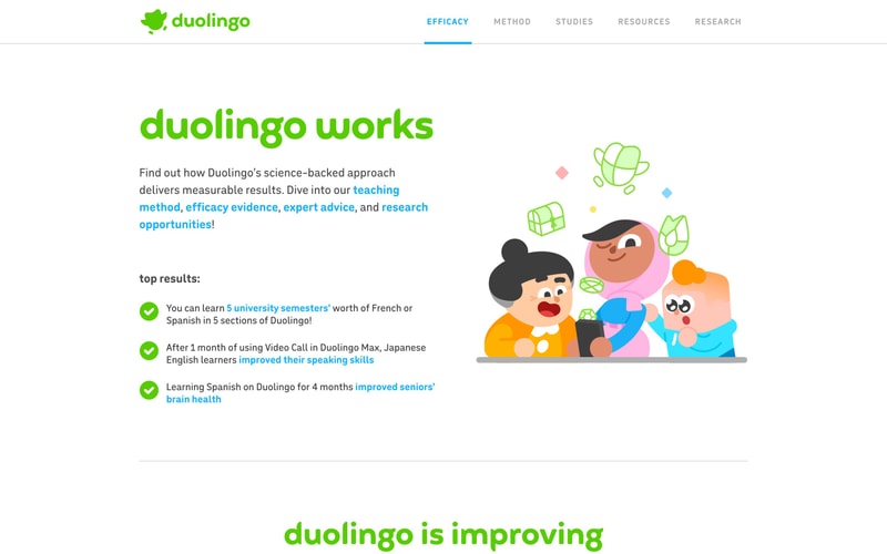
**Checkmark Badge:**
- Background: `--color-brand-green`
- Icon: White checkmark
- Size: `32px` diameter
- Border radius: `--radius-full`

**Flag Icon:**
- Size: `32px` × `24px`
- Border radius: `4px`
- Box shadow: subtle

### Banner

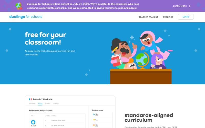
**Alert/Announcement Banner:**
- Background: `--color-brand-purple` or similar
- Text: White
- Padding: `16px 32px`
- Includes icon + text + CTA
- Full width, top position

## Layout Patterns

### Hero Section
- Full viewport height or near-full
- Centered content: 50% text, 50% illustration
- Max width: `1200px`
- Padding: `80px 32px`

### Two-Column Layout
- Flex or Grid: `1fr 1fr` or `60% 40%`
- Gap: `48px` to `64px`
- Responsive: Stack on mobile

### Full-Width Colored Section
- Background: Gradient or solid color
- Padding: `80px 32px`
- Content max-width: `1200px`, centered

### Navigation Bar
- Height: `64px` to `72px`
- Flex layout: logo left, nav center, actions right
- Sticky or fixed positioning
- Border bottom: `1px solid #E5E5E5`

### Card Grid
- Grid: `repeat(auto-fit, minmax(300px, 1fr))`
- Gap: `24px`
- Padding: `32px`

### Language Carousel
- Horizontal scroll
- Flex layout with gap
- Items: Flag icon + label
- Padding: `16px`
- Overflow-x: scroll or hidden with arrows