2 free brands left today.Sign up — unlimited →
Use this design system
Tokens · motion · components — drop straight into your project.
Download design kitStart a project with it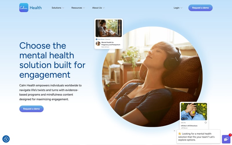
Similar styles
# Design System Reference — Calm

## Tokens — Colors

| Token | Hex | Usage |
|-------|-----|-------|
| `background-page` | `#F5F7FA` | Page background |
| `background-card` | `#FFFFFF` | Card/modal surfaces |
| `text-primary` | `#646464` | Primary headings |
| `text-body` | `#666666` | Body copy |
| `text-muted` | `#B3B3B3` | Reference text, captions |
| `primary-blue` | `#1A9FE6` | Primary CTA buttons, links |
| `icon-background` | `#455A64` | Icon containers |
| `border-subtle` | `#E8EAED` | Dividers, card borders |

## Tokens — Typography

**Font Families:**
- Primary: System font stack (`-apple-system, BlinkMacSystemFont, "Segoe UI", Roboto, sans-serif`)

**Type Scale:**

| Token | Size | Weight | Line Height | Usage |
|-------|------|--------|-------------|-------|
| `heading-1` | `32px` / `2rem` | 500 (Medium) | 1.25 | Modal headings |
| `body-large` | `18px` / `1.125rem` | 400 (Regular) | 1.5 | Primary body text |
| `body` | `16px` / `1rem` | 400 (Regular) | 1.5 | Standard body text |
| `button` | `18px` / `1.125rem` | 500 (Medium) | 1.2 | Button labels |
| `caption` | `12px` / `0.75rem` | 400 (Regular) | 1.4 | Reference IDs, footnotes |

## Tokens — Spacing

| Token | Value | Usage |
|-------|-------|-------|
| `space-1` | `4px` | Micro spacing |
| `space-2` | `8px` | Tight spacing |
| `space-3` | `12px` | Small gaps |
| `space-4` | `16px` | Standard gaps |
| `space-5` | `24px` | Medium gaps |
| `space-6` | `32px` | Large gaps |
| `space-8` | `48px` | Section spacing |
| `space-10` | `64px` | Major section spacing |

## Tokens — Border Radius

| Token | Value | Usage |
|-------|-------|-------|
| `radius-sm` | `8px` | Small elements |
| `radius-md` | `12px` | Standard cards |
| `radius-lg` | `16px` | Large modals |
| `radius-pill` | `9999px` | Pill buttons, badges |

## Tokens — Shadows

| Token | Value | Usage |
|-------|-------|-------|
| `shadow-card` | `0 2px 16px rgba(0, 0, 0, 0.08)` | Modal/card elevation |
| `shadow-subtle` | `0 1px 3px rgba(0, 0, 0, 0.06)` | Subtle elevation |

## Tokens — Borders

| Token | Value | Usage |
|-------|-------|-------|
| `border-default` | `1px solid #E8EAED` | Card borders |
| `border-button` | `2px solid #1A9FE6` | Button outlines |

## Components

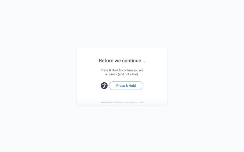
### Verification Modal
- Centered white card with large radius (`16px`)
- Vertical layout: heading → body text → icon+button → reference
- Padding: `48px` (desktop), `32px` (mobile estimate)
- Max width: `480px`
- Drop shadow for elevation

### Button (Primary)
- Pill-shaped (`border-radius: 9999px`)
- Blue outline style (`2px solid`)
- Padding: `16px 32px`
- Font: `18px medium`
- Hover: likely fills with blue background
- Pressed: darker blue

### Icon Container
- Circular dark background
- Size: `48px` diameter
- Contains white accessibility icon
- Positioned inline with button

### Reference Text
- Small gray text (`12px`)
- Positioned at bottom of card
- Prefixed with "Reference ID"

## Layout Patterns

### Centered Modal
- Flexbox centering: `display: flex; align-items: center; justify-content: center`
- Full viewport height background
- Modal constrained to max-width with auto margins

### Vertical Stack
- Gap-based spacing between elements
- Text center-aligned
- Consistent vertical rhythm using `24px` and `32px` gaps