Use this design system
Tokens · motion · components — drop straight into your project.
Download design kitStart a project with it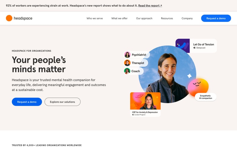
Similar styles
# Headspace Design System

## Tokens — Colors

| Token | Hex | Usage |
|-------|-----|-------|
| `--color-brand-orange` | `#FF6934` | Primary brand color, logo, accents |
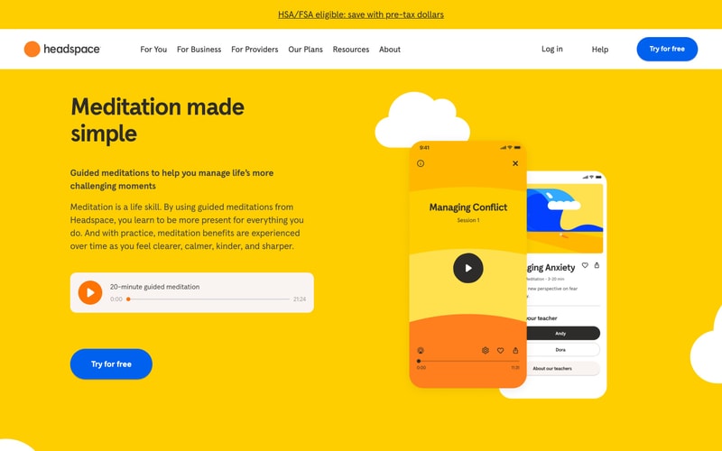
| `--color-brand-yellow` | `#FFC629` | Secondary brand color, hero backgrounds, pricing cards |
| `--color-brand-blue` | `#0066FF` | Primary CTA buttons, badges |
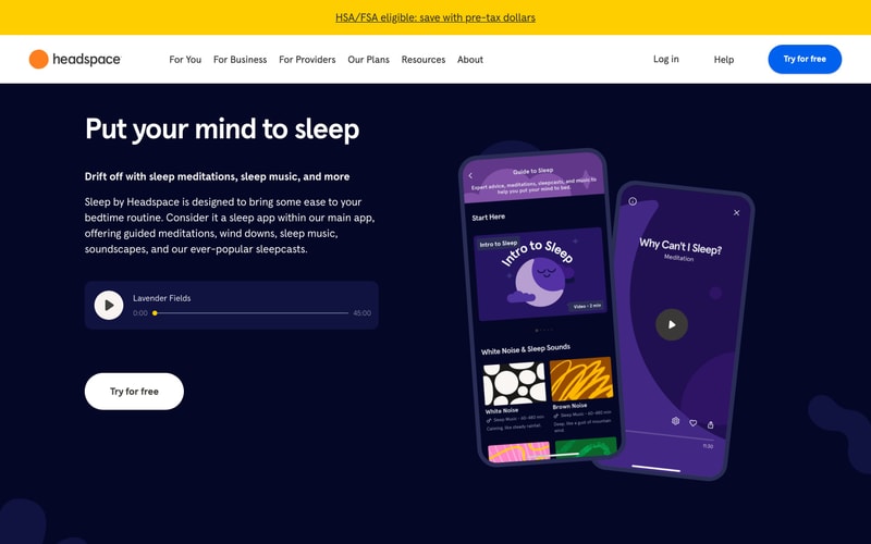
| `--color-dark-navy` | `#0B132B` | Dark section backgrounds, sleep theme |
| `--color-purple` | `#7B68EE` | Sleep/meditation UI elements |
| `--color-charcoal` | `#2D2D2D` | Headings, primary text |
| `--color-gray-700` | `#4A4A4A` | Secondary text |
| `--color-gray-500` | `#767676` | Tertiary text, metadata |
| `--color-beige` | `#F5F0EB` | Section backgrounds, cards |
| `--color-gray-50` | `#F8F8F8` | Light backgrounds |
| `--color-white` | `#FFFFFF` | Backgrounds, text on dark |
| `--color-black` | `#000000` | Text, icons |

## Tokens — Typography

**Font Families:**
- Primary: Custom sans-serif (likely proprietary or "DM Sans", "Plus Jakarta Sans")
- Body: Same as primary
- Monospace: Not observed

**Type Scale:**

| Token | Size | Line Height | Weight | Usage |
|-------|------|-------------|--------|-------|
| `--font-size-hero` | `64px` / `4rem` | `1.1` | `700` | Hero headings |
| `--font-size-h1` | `48px` / `3rem` | `1.2` | `700` | Page headings |
| `--font-size-h2` | `36px` / `2.25rem` | `1.2` | `700` | Section headings |
| `--font-size-h3` | `24px` / `1.5rem` | `1.3` | `700` | Card headings |
| `--font-size-lg` | `18px` / `1.125rem` | `1.6` | `400` | Large body text |
| `--font-size-base` | `16px` / `1rem` | `1.6` | `400` | Body text |
| `--font-size-sm` | `14px` / `0.875rem` | `1.5` | `400` | Small text, metadata |

## Tokens — Spacing

| Token | Value | Usage |
|-------|-------|-------|
| `--space-xs` | `4px` | Tight spacing |
| `--space-sm` | `8px` | Small gaps |
| `--space-md` | `16px` | Standard gaps |
| `--space-lg` | `24px` | Large gaps |
| `--space-xl` | `32px` | Section padding |
| `--space-2xl` | `48px` | Large section padding |
| `--space-3xl` | `64px` | Hero section padding |
| `--space-4xl` | `96px` | Extra large section spacing |

## Tokens — Radii

| Token | Value | Usage |
|-------|-------|-------|
| `--radius-sm` | `8px` | Small elements |
| `--radius-md` | `12px` | Cards, inputs |
| `--radius-lg` | `16px` | Large cards |
| `--radius-xl` | `24px` | Buttons |
| `--radius-2xl` | `32px` | Large buttons, prominent CTAs |
| `--radius-full` | `9999px` | Circular elements |

## Tokens — Shadows

| Token | Value | Usage |
|-------|-------|-------|
| `--shadow-sm` | `0 1px 2px rgba(0, 0, 0, 0.05)` | Subtle elevation |
| `--shadow-md` | `0 4px 12px rgba(0, 0, 0, 0.08)` | Cards |
| `--shadow-lg` | `0 8px 24px rgba(0, 0, 0, 0.12)` | Modals, elevated cards |
| `--shadow-xl` | `0 16px 48px rgba(0, 0, 0, 0.16)` | Phone mockups, hero elements |

## Tokens — Borders

| Token | Value | Usage |
|-------|-------|-------|
| `--border-width` | `1px` | Standard borders |
| `--border-width-thick` | `2px` | Emphasized borders |
| `--border-color` | `#E5E5E5` | Default border color |
| `--border-color-dark` | `#D1D1D1` | Darker borders |

## Components

### Button

**Primary Button (Blue CTA):**
- Background: `--color-brand-blue` (#0066FF)
- Text: White, bold (500-600 weight)
- Padding: `14px 32px`
- Border radius: `--radius-2xl` (32px)
- Font size: `16-18px`
- Hover: Slightly darker blue

**Secondary Button (Dark):**
- Background: `--color-charcoal` (#2D2D2D)
- Text: White
- Padding: `12px 28px`
- Border radius: `--radius-2xl` (24-32px)

**Tertiary Button (White):**
- Background: White
- Text: Black
- Border radius: `--radius-2xl`
- Used on dark backgrounds

### Navigation Bar

- Background: White
- Height: ~80px
- Logo: Orange circle + black wordmark
- Links: Regular weight, black text, hover underline
- Right side: "Log in", "Help", CTA button
- Sticky positioning

### Audio Player

- White/light background with rounded corners
- Orange circular play button (48-56px diameter)
- Progress bar with orange accent
- Title and timestamp metadata
- Compact, ~80-100px height

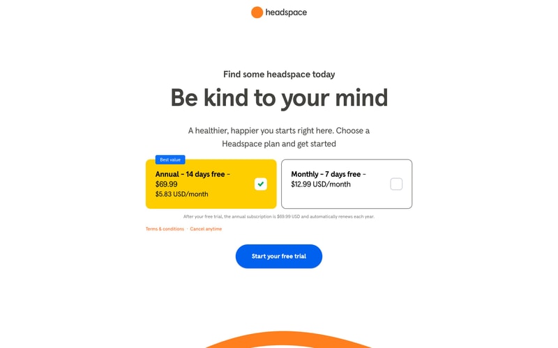
### Pricing Card

- Padding: `32px`
- Border radius: `--radius-lg` (16px)
- Yellow card: Solid background (#FFC629), no border
- White card: White background, 1px gray border
- Badge: Blue, small, rounded, positioned top-left
- Checkmark icon: Green or blue, circular background

### Feature List

- Checkmark icons (circular, with check)
- Large readable text (16-18px)
- Generous line spacing (1.6-1.8)

## Layout Patterns

### Hero Section
- Full-width
- Centered content, max-width ~1200px
- Large heading + subheading + CTA
- Two-column layout on desktop (text left, image right)
- Generous vertical padding (96px+)

### Content Sections
- Alternating background colors (white, yellow, beige, dark navy)
- Max-width container (~1200px)
- Two-column layouts common
- 96-128px vertical padding between sections

### Grid Layout
- Feature lists: 3-column on desktop
- Cards: Flexbox with gap spacing
- Responsive: Stack to 1 column on mobile