Use this design system
Tokens · motion · components — drop straight into your project.
Download design kitStart a project with it

Similar styles
# Coursera Design System

## Tokens — Colors

| Token | Hex | Usage |
|-------|-----|-------|
| `--color-primary` | `#0056D2` | Primary brand blue, buttons, links, logo |
| `--color-primary-dark` | `#004BA0` | Hover states for primary actions |
| `--color-primary-light` | `#1E88E5` | Light primary accents |
| `--color-secondary` | `#003D7A` | Dark blue hero sections, headers |
| `--color-accent-pink` | `#FF6B9D` | Hero decorative accents |
| `--color-accent-yellow` | `#FDB515` | Hero image accents |
| `--color-accent-teal` | `#00A896` | Success states, accents |
| `--color-white` | `#FFFFFF` | Backgrounds, text on dark |
| `--color-black` | `#000000` | Text, icons |
| `--color-gray-900` | `#1F1F1F` | Primary text |
| `--color-gray-700` | `#545454` | Secondary text |
| `--color-gray-500` | `#757575` | Tertiary text, metadata |
| `--color-gray-300` | `#E0E0E0` | Borders, dividers |
| `--color-gray-100` | `#F7F9FA` | Card backgrounds |
| `--color-gray-50` | `#FAFAFA` | Page backgrounds |
| `--color-blue-50` | `#E3F2FD` | Light blue backgrounds |
| `--color-blue-100` | `#BBDEFB` | Section backgrounds |
| `--color-rating` | `#FFB800` | Star ratings |
| `--color-link` | `#0056D2` | Text links |
| `--color-link-hover` | `#004BA0` | Link hover state |

## Tokens — Typography

**Font Families:**
- Primary: `'Source Sans Pro', -apple-system, BlinkMacSystemFont, 'Segoe UI', Roboto, sans-serif`
- Monospace: `'Courier New', monospace` (for code samples)

**Type Scale:**

| Token | Size | Weight | Line Height | Usage |
|-------|------|--------|-------------|-------|
| `--font-display-1` | `72px` | 700 | 1.1 | Marketing hero headlines |
| `--font-display-2` | `56px` | 700 | 1.15 | Page hero headlines |
| `--font-h1` | `48px` | 700 | 1.2 | Section headings |
| `--font-h2` | `36px` | 600 | 1.25 | Subsection headings |
| `--font-h3` | `28px` | 600 | 1.3 | Card titles |
| `--font-h4` | `24px` | 600 | 1.35 | Component headings |
| `--font-h5` | `20px` | 600 | 1.4 | Small headings |
| `--font-h6` | `18px` | 600 | 1.45 | Micro headings |
| `--font-body-lg` | `18px` | 400 | 1.6 | Large body text |
| `--font-body` | `16px` | 400 | 1.5 | Default body text |
| `--font-body-sm` | `14px` | 400 | 1.5 | Small body text, metadata |
| `--font-caption` | `12px` | 400 | 1.4 | Captions, labels |
| `--font-button` | `16px` | 600 | 1 | Button text |
| `--font-button-sm` | `14px` | 600 | 1 | Small button text |

## Tokens — Spacing

| Token | Value | Usage |
|-------|-------|-------|
| `--space-0` | `0` | No spacing |
| `--space-1` | `4px` | Micro spacing |
| `--space-2` | `8px` | Base unit, tight spacing |
| `--space-3` | `12px` | Small spacing |
| `--space-4` | `16px` | Default spacing |
| `--space-5` | `20px` | Medium spacing |
| `--space-6` | `24px` | Large spacing |
| `--space-8` | `32px` | XL spacing |
| `--space-10` | `40px` | Section spacing |
| `--space-12` | `48px` | Large section spacing |
| `--space-16` | `64px` | Hero spacing |
| `--space-20` | `80px` | XL section spacing |
| `--space-24` | `96px` | Max section spacing |

## Tokens — Border Radius

| Token | Value | Usage |
|-------|-------|-------|
| `--radius-none` | `0` | No radius |
| `--radius-sm` | `4px` | Small elements, chips |
| `--radius-md` | `8px` | Cards, buttons |
| `--radius-lg` | `12px` | Large cards |
| `--radius-xl` | `16px` | Hero cards |
| `--radius-full` | `9999px` | Pills, avatars |

## Tokens — Shadows

| Token | Value | Usage |
|-------|-------|-------|
| `--shadow-xs` | `0 1px 2px rgba(0, 0, 0, 0.05)` | Subtle elevation |
| `--shadow-sm` | `0 1px 3px rgba(0, 0, 0, 0.1), 0 1px 2px rgba(0, 0, 0, 0.06)` | Cards at rest |
| `--shadow-md` | `0 4px 6px rgba(0, 0, 0, 0.07), 0 2px 4px rgba(0, 0, 0, 0.05)` | Cards on hover |
| `--shadow-lg` | `0 10px 15px rgba(0, 0, 0, 0.1), 0 4px 6px rgba(0, 0, 0, 0.05)` | Modals, dropdowns |
| `--shadow-xl` | `0 20px 25px rgba(0, 0, 0, 0.1), 0 10px 10px rgba(0, 0, 0, 0.04)` | Elevated panels |

## Tokens — Borders

| Token | Value |
|-------|-------|
| `--border-width` | `1px` |
| `--border-width-thick` | `2px` |
| `--border-color` | `#E0E0E0` |
| `--border-color-dark` | `#BDBDBD` |

## Components

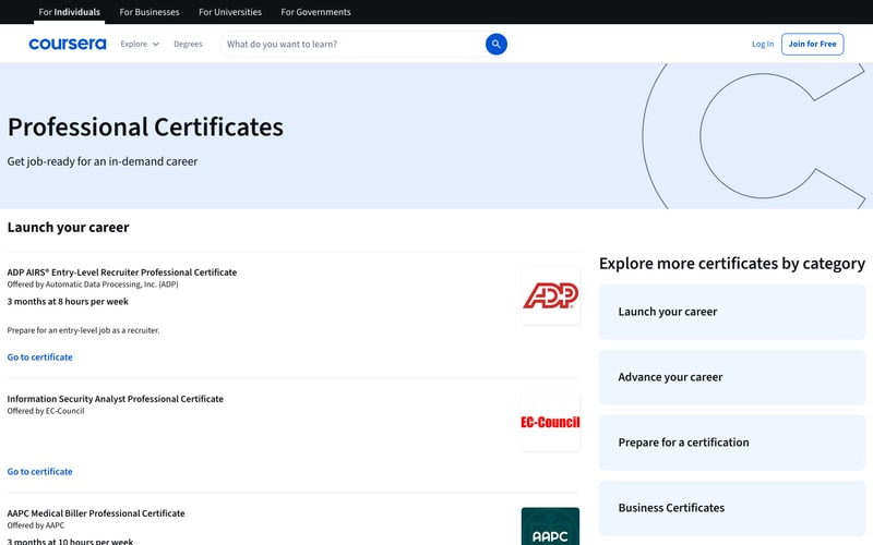
### Navigation Bar
- Height: 64px
- Background: white
- Border bottom: 1px solid #E0E0E0
- Logo: Coursera blue (#0056D2)
- Links: 16px, gray-900, hover underline
- Search: rounded input with blue button
- CTA buttons: outlined and filled variants

### Hero Section
- Background: gradient (blue #0056D2 to lighter) or solid dark blue (#003D7A)
- Heading: 56-72px, white, bold
- Body: 18px, white, regular
- CTA button: white background or blue primary
- Image: decorative with circular crops

### Course Card
- Background: white or light gray (#F7F9FA)
- Border radius: 8px
- Shadow: subtle (--shadow-sm)
- Hover: shadow-md
- Thumbnail: aspect ratio 16:9
- Provider logo: 24x24px
- Title: 20px, gray-900, semi-bold
- Rating: star icon + number (14px)
- Metadata: 14px, gray-500

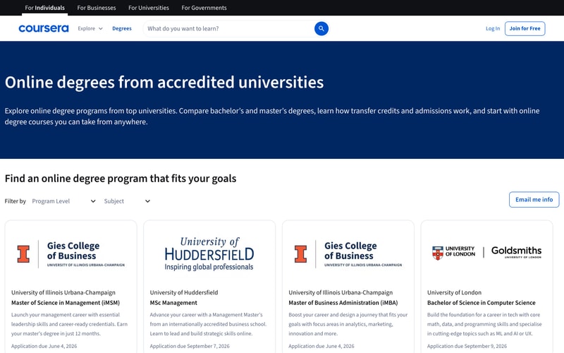
### Degree Card
- Background: white
- Border: 1px solid #E0E0E0
- Border radius: 8px
- Padding: 32px
- University logo: prominent, centered
- Title: 24px, bold
- Description: 16px, gray-700

### Button Primary
- Background: #0056D2
- Color: white
- Padding: 12px 24px
- Border radius: 4px
- Font: 16px, semi-bold
- Hover: #004BA0

### Button Secondary
- Background: white
- Color: #0056D2
- Border: 2px solid #0056D2
- Padding: 12px 24px
- Border radius: 4px
- Hover: light blue background

### Search Input
- Height: 48px
- Border: 1px solid #E0E0E0
- Border radius: 4px 0 0 4px (left side)
- Padding: 12px 16px
- Focus: border blue

### Rating Display
- Star icon: filled, #FFB800
- Number: 14px, gray-700
- Format: "★ 4.8"

### Category Chip
- Background: gradient or solid colors
- Color: white
- Padding: 8px 16px
- Border radius: 20px
- Font: 14px, semi-bold

### Dropdown Filter
- Background: white
- Border: 1px solid #E0E0E0
- Border radius: 4px
- Padding: 10px 16px
- Arrow icon: chevron down

## Layout Patterns

### Container
- Max width: 1280px
- Padding: 0 48px
- Centered with margin auto

### Grid - Course Cards
- Display: grid
- Columns: 3 (repeat(3, 1fr))
- Gap: 24px
- Responsive: 2 columns tablet, 1 column mobile

### Grid - Degree Cards
- Display: grid
- Columns: 4 (repeat(4, 1fr))
- Gap: 24px
- Responsive: 2 columns tablet, 1 column mobile

### Hero Layout
- Display: grid or flex
- Two columns: 60/40 split
- Gap: 48px
- Align items: center
- Responsive: stack on mobile

### Section Spacing
- Vertical: 80-96px between major sections
- Horizontal: consistent container padding

### Navigation Layout
- Display: flex
- Justify: space-between
- Align: center
- Sticky positioning on scroll