Use this design system
Tokens · motion · components — drop straight into your project.
Download design kitStart a project with it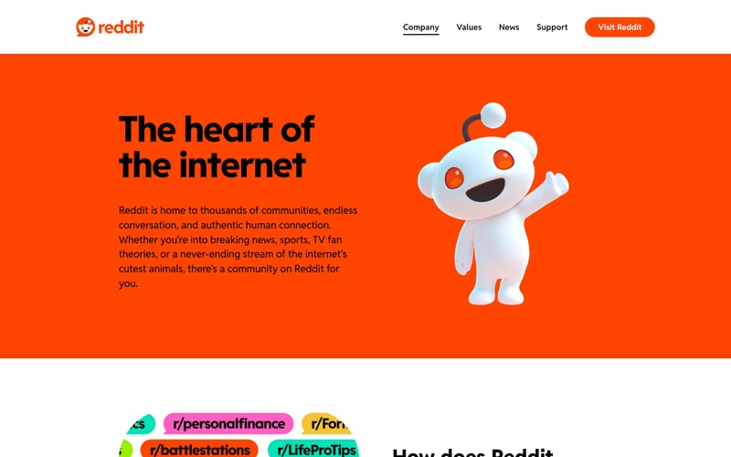
Similar styles
# Reddit Design System

## Tokens — Colors

| Token | Hex | Usage |
|-------|-----|-------|
| `--color-reddit-orange` | `#FF4500` | Primary brand, logo, links, upvotes |
| `--color-blue-primary` | `#0079D3` | Primary action buttons, links |
| `--color-blue-dark` | `#0045AC` | Hover states, darker CTAs |
| `--color-cyan` | `#00D8D8` | Promotional banners, accent |
| `--color-text-primary` | `#1A1A1B` | Primary text, headings |
| `--color-text-secondary` | `#7C7C7C` | Secondary text, metadata |
| `--color-text-tertiary` | `#878A8C` | Disabled text, placeholders |
| `--color-border-light` | `#EDEFF1` | Light borders, dividers |
| `--color-border-medium` | `#CCCCCC` | Medium borders |
| `--color-border-dark` | `#CCCFD3` | Dark borders, inputs |
| `--color-bg-white` | `#FFFFFF` | Primary background |
| `--color-bg-gray-light` | `#F6F7F8` | Secondary background |
| `--color-bg-gray` | `#DAE0E6` | Hover states, disabled |
| `--color-black` | `#000000` | Pure black for text |
| `--color-success` | `#46D160` | Success states |
| `--color-error` | `#EA0027` | Error states, downvotes |

## Tokens — Typography

**Font Families:**
- Primary: `IBM Plex Sans, -apple-system, BlinkMacSystemFont, "Segoe UI", Roboto, sans-serif`
- Monospace: `IBM Plex Mono, "Courier New", monospace`

**Type Scale:**

| Token | Size | Weight | Line Height | Usage |
|-------|------|--------|-------------|-------|
| `--font-display` | `48px` | `700` | `1.1` | Large headlines |
| `--font-h1` | `32px` | `700` | `1.2` | Page titles |
| `--font-h2` | `28px` | `600` | `1.3` | Section headers |
| `--font-h3` | `24px` | `600` | `1.3` | Subsection headers |
| `--font-h4` | `20px` | `600` | `1.4` | Card titles |
| `--font-h5` | `18px` | `600` | `1.4` | Smaller headings |
| `--font-body-lg` | `16px` | `400` | `1.5` | Large body text |
| `--font-body` | `14px` | `400` | `1.5` | Default body text |
| `--font-body-sm` | `12px` | `400` | `1.4` | Small text, captions |
| `--font-caption` | `10px` | `500` | `1.3` | Tiny labels, metadata |

## Tokens — Spacing

Base: `4px` unit system

| Token | Value | Usage |
|-------|-------|-------|
| `--space-1` | `4px` | Tight spacing, icon gaps |
| `--space-2` | `8px` | Small gaps, inline elements |
| `--space-3` | `12px` | Default element spacing |
| `--space-4` | `16px` | Medium gaps, padding |
| `--space-5` | `20px` | Large gaps |
| `--space-6` | `24px` | Section spacing |
| `--space-8` | `32px` | Large section spacing |
| `--space-10` | `40px` | Extra large spacing |
| `--space-12` | `48px` | Hero spacing |
| `--space-16` | `64px` | Page margins |

## Tokens — Border Radius

| Token | Value | Usage |
|-------|-------|-------|
| `--radius-sm` | `4px` | Inputs, small buttons, tags |
| `--radius-md` | `8px` | Buttons, small cards |
| `--radius-lg` | `16px` | Cards, modals, containers |
| `--radius-xl` | `24px` | Large cards, pill buttons |
| `--radius-full` | `50%` | Avatars, circular elements |
| `--radius-pill` | `9999px` | Pill-shaped buttons |

## Tokens — Shadows

| Token | Value | Usage |
|-------|-------|-------|
| `--shadow-sm` | `0 1px 2px rgba(0,0,0,0.06)` | Subtle elevation |
| `--shadow-md` | `0 2px 4px rgba(0,0,0,0.12)` | Cards, buttons |
| `--shadow-lg` | `0 4px 8px rgba(0,0,0,0.15)` | Modals, popovers |
| `--shadow-card` | `0 1px 3px rgba(0,0,0,0.08)` | Post cards |

## Tokens — Borders

| Token | Value | Usage |
|-------|-------|-------|
| `--border-width` | `1px` | Default border |
| `--border-width-thick` | `2px` | Emphasized borders |
| `--border-width-heavy` | `4px` | Active states, focus |

## Components

### Button
- **Primary**: Orange-red background (`#FF4500`), white text, 8px radius, 8-16px padding
- **Secondary**: Blue background (`#0079D3`), white text, 8px radius
- **Outlined**: Orange-red border, orange text, transparent background
- **Text**: No background, orange-red or blue text
- States: Hover (darker shade), active, disabled (gray)

### Card
- White background, light border (`#EDEFF1`), 8-16px radius
- Padding: 12-16px
- Shadow: `0 1px 3px rgba(0,0,0,0.08)`
- Hover: Slight shadow increase

### Navigation Sidebar
- Fixed left sidebar, ~240px width
- Icon + text layout
- Hover: Light gray background
- Active: Blue accent bar on left

### Post Card
- White background, light border
- Video/image at top (16:9 or flexible)
- Title: 16-18px, bold
- Metadata: 12px, gray text
- Action bar at bottom (upvote, comment, share)

### Community Card
- Avatar (circular, 32-48px)
- Name: 14px, bold
- Member count: 12px, gray
- Join button: Blue, small, rounded

### Search Bar
- Light gray background, rounded (pill-shaped)
- Reddit icon on left
- Placeholder text: gray
- Focus: White background, blue border

### Avatar
- Circular (50% radius)
- Sizes: 16px, 24px, 32px, 48px, 64px
- Border: Optional 2px white outline

### Badge
- Small pill (4-6px padding, pill radius)
- Background colors: blue, orange, gray
- Text: 10-12px, medium weight

## Layout Patterns

### Three-Column Layout
- Left sidebar: ~240px (navigation)
- Main content: Flexible, max-width ~800px
- Right sidebar: ~320px (communities, info)
- Gap: 24px between columns

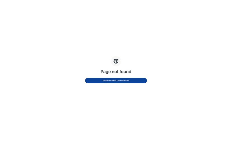
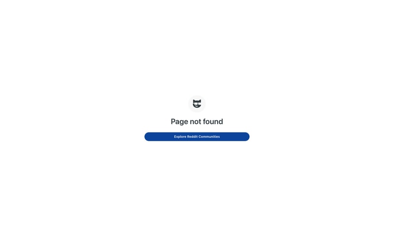
### Centered Error Page
- Vertical and horizontal centering
- Icon at top (48-64px)
- Heading: 28-32px
- Button: Below text, 16px margin-top

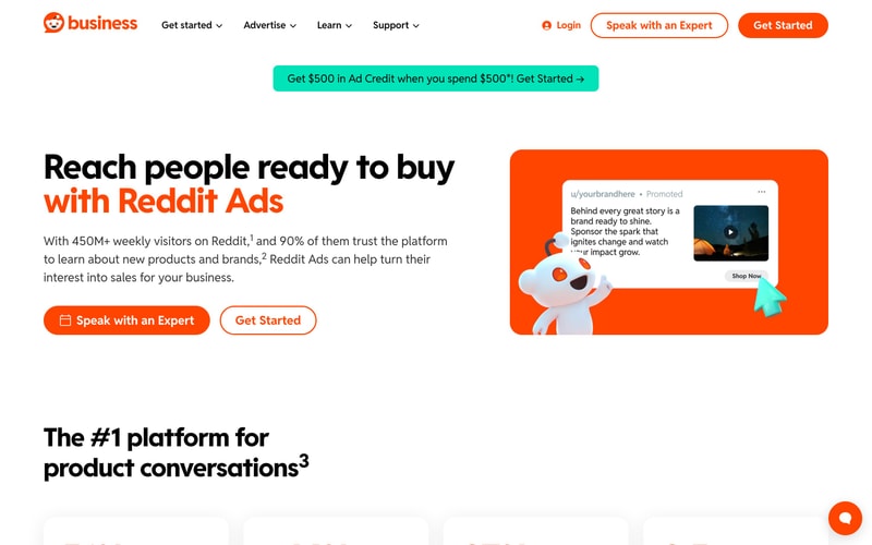
### Hero Section
- Two-column split (60/40)
- Left: Large heading (48px), body text, CTAs
- Right: Illustration or image
- Background: Optional colored section (cyan, orange)
- Padding: 48-64px vertical

### Feed Layout
- Stack of post cards
- 16px gap between cards
- Infinite scroll
- Sticky filters at top