2 free brands left today.Sign up — unlimited →
Use this design system
Tokens · motion · components — drop straight into your project.
Download design kitStart a project with it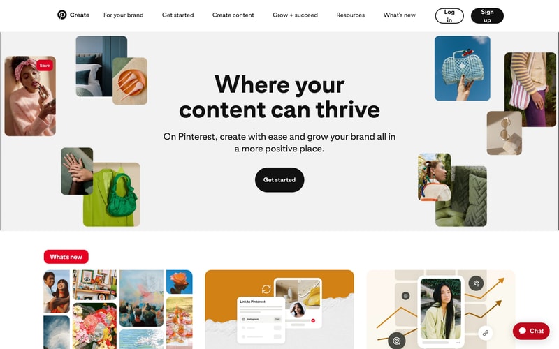
Similar styles
# Pinterest Design System

## Tokens — Colors

| Token | Value | Usage |
|-------|-------|-------|
| `--color-primary` | `#E60023` | Primary brand red, CTA buttons, logo, accents |
| `--color-primary-hover` | `#AD081B` | Primary button hover state |
| `--color-black` | `#111111` | Primary text, headings, high-emphasis content |
| `--color-white` | `#FFFFFF` | Backgrounds, button text on dark surfaces |
| `--color-gray-50` | `#FAFAFA` | Subtle backgrounds |
| `--color-gray-100` | `#F7F7F7` | Section backgrounds |
| `--color-gray-200` | `#EFEFEF` | Input backgrounds, disabled states |
| `--color-gray-300` | `#E2E2E2` | Secondary button fills, borders |
| `--color-gray-400` | `#CDCDCD` | Dividers, inactive elements |
| `--color-gray-600` | `#767676` | Secondary text, metadata |
| `--color-gray-700` | `#5F5F5F` | Tertiary text |
| `--color-gray-900` | `#333333` | Body text, labels |
| `--color-success` | `#0A6E3E` | Success states |
| `--color-error` | `#CC0000` | Error states, alerts |

## Tokens — Typography

### Font Families
- **Primary**: `-apple-system, BlinkMacSystemFont, "Segoe UI", Roboto, "Helvetica Neue", Arial, sans-serif`
- **Fallback**: `sans-serif`

### Type Scale

| Token | Size | Weight | Line Height | Letter Spacing | Usage |
|-------|------|--------|-------------|----------------|-------|
| `--text-display-1` | `72px` | `800` | `1.1` | `-0.02em` | Hero headlines, major brand statements |
| `--text-display-2` | `60px` | `800` | `1.15` | `-0.015em` | Page heroes |
| `--text-heading-1` | `48px` | `700` | `1.2` | `-0.01em` | Section headings |
| `--text-heading-2` | `36px` | `700` | `1.25` | `-0.005em` | Subsection headings |
| `--text-heading-3` | `28px` | `700` | `1.3` | `0` | Card titles, component headers |
| `--text-heading-4` | `20px` | `600` | `1.4` | `0` | Small headings |
| `--text-body-large` | `18px` | `400` | `1.6` | `0` | Large body copy, descriptions |
| `--text-body` | `16px` | `400` | `1.5` | `0` | Default body text |
| `--text-body-small` | `14px` | `400` | `1.5` | `0` | Captions, metadata |
| `--text-label` | `16px` | `600` | `1.4` | `0` | Button labels, navigation |
| `--text-caption` | `12px` | `400` | `1.4` | `0.01em` | Timestamps, fine print |

## Tokens — Spacing

| Token | Value | Usage |
|-------|-------|-------|
| `--space-1` | `4px` | Micro spacing |
| `--space-2` | `8px` | Tight spacing, icon gaps |
| `--space-3` | `12px` | Small padding |
| `--space-4` | `16px` | Default spacing unit |
| `--space-5` | `20px` | Card padding |
| `--space-6` | `24px` | Component padding |
| `--space-8` | `32px` | Section padding |
| `--space-10` | `40px` | Large gaps |
| `--space-12` | `48px` | Section margins |
| `--space-16` | `64px` | Major section spacing |
| `--space-20` | `80px` | Hero padding |
| `--space-24` | `96px` | Page section dividers |
| `--space-32` | `128px` | Extra large spacing |

## Tokens — Border Radius

| Token | Value | Usage |
|-------|-------|-------|
| `--radius-sm` | `8px` | Small cards, inputs |
| `--radius-md` | `16px` | Cards, images |
| `--radius-lg` | `24px` | Large cards, modals |
| `--radius-xl` | `32px` | Buttons, pills |
| `--radius-full` | `9999px` | Circular elements, pill buttons |

## Tokens — Shadows

| Token | Value | Usage |
|-------|-------|-------|
| `--shadow-sm` | `0 1px 2px rgba(0, 0, 0, 0.06)` | Subtle elevation |
| `--shadow-md` | `0 4px 8px rgba(0, 0, 0, 0.08)` | Cards, dropdowns |
| `--shadow-lg` | `0 8px 16px rgba(0, 0, 0, 0.1)` | Modals, popovers |
| `--shadow-xl` | `0 16px 32px rgba(0, 0, 0, 0.12)` | Major overlays |

## Tokens — Borders

| Token | Value | Usage |
|-------|-------|-------|
| `--border-width-thin` | `1px` | Default borders |
| `--border-width-thick` | `2px` | Focus states, emphasis |
| `--border-color-default` | `#CDCDCD` | Standard borders |
| `--border-color-strong` | `#111111` | High contrast borders |

## Components

### Button

**Variants:**
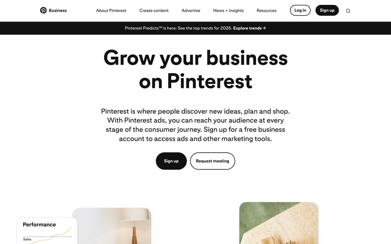
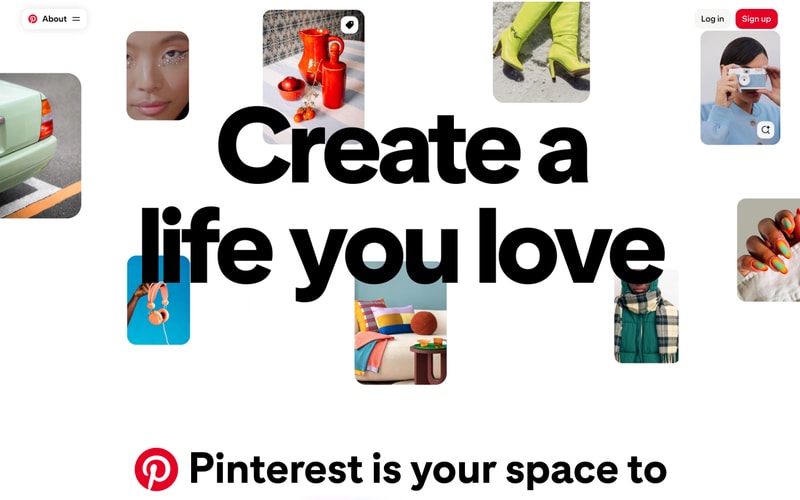
- **Primary**: Red background (`#E60023`), white text, pill-shaped (`border-radius: 32px`), padding `12px 24px`, font-weight `600`
- **Secondary**: White background, black border (`1px solid #111111`), black text, pill-shaped
- **Secondary Gray**: Light gray background (`#E2E2E2`), no border, black text, pill-shaped
- **Black**: Black background, white text, pill-shaped
- **Text**: No background, underline on hover

**States:**
- Hover: Slight darkening or shadow
- Active: Scale down slightly (0.98)
- Disabled: Opacity 0.4, cursor not-allowed

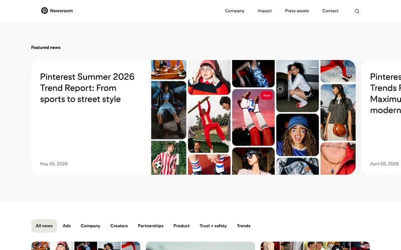
### Navigation Bar

- Height: `80px`
- Background: White with subtle shadow or transparent overlay
- Logo: Pinterest icon + wordmark (left aligned)
- Links: Horizontal, 16px font, medium weight, black text, 24px horizontal spacing
- CTA buttons: Right aligned, standard button styles
- Sticky positioning on scroll

### Search Input

- Background: Light gray (`#EFEFEF`)
- Border radius: `24px` (pill-shaped)
- Padding: `12px 16px`
- Icon: Left aligned magnifying glass
- Placeholder: Gray text (`#767676`)
- Height: `48px`

### Card

- Background: White
- Border radius: `16px`
- Padding: `20px`
- Shadow: `0 4px 8px rgba(0, 0, 0, 0.08)` on hover
- Transition: `all 0.2s ease`

### Tab Navigation

- Container: Light gray background bar
- Active tab: White background, slight shadow
- Inactive tab: Transparent, gray text
- Border radius: `8px` on active
- Padding: `12px 20px`
- Font weight: 600 for active, 400 for inactive

### Hero Section

- Padding: `96px 40px` or larger
- Max-width: `1280px` centered
- Two-column layout: 40% text / 60% imagery on desktop
- Text column: Left aligned, max-width `600px`
- Headline: Display-1 or Display-2 scale
- Body: 18px, max-width `540px`
- Button group: Horizontal flex, 16px gap

### Masonry Grid

- Columns: Dynamic (2-6 based on viewport)
- Gap: `16px` or `24px`
- Images: Responsive, rounded corners (`16px`)
- Lazy loading implemented
- Variable heights maintained

## Layout Patterns

### Container Widths

- `--container-xs`: `640px`
- `--container-sm`: `768px`
- `--container-md`: `1024px`
- `--container-lg`: `1280px`
- `--container-xl`: `1440px`
- Horizontal padding: `24px` mobile, `40px` desktop

### Breakpoints

- Mobile: `< 640px`
- Tablet: `640px - 1023px`
- Desktop: `>= 1024px`
- Wide: `>= 1440px`

### Grid System

- 12-column grid on desktop
- 8-column on tablet
- 4-column on mobile
- Gutter: `24px`