Use this design system
Tokens · motion · components — drop straight into your project.
Download design kitStart a project with it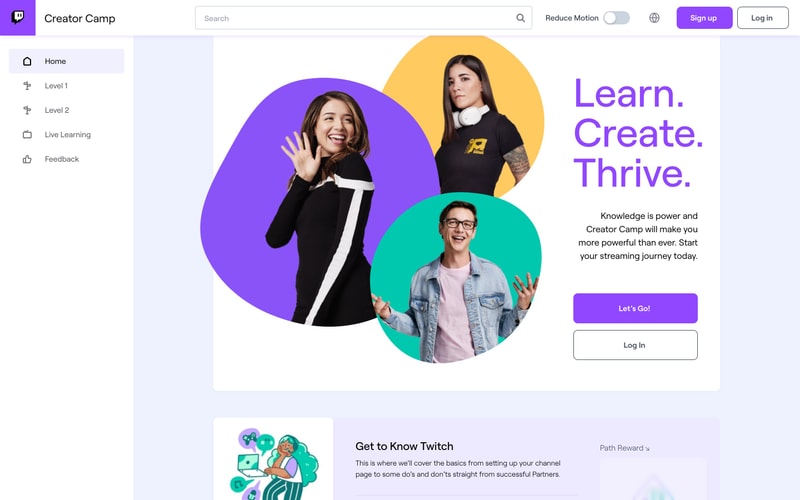
Similar styles
# Twitch Design System

## Tokens — Colors

| Token | Value | Usage |
|-------|-------|-------|
| `--color-purple-primary` | `#9146FF` | Primary brand color, main CTAs, links |
| `--color-purple-dark` | `#772CE8` | Hover states, active elements |
| `--color-purple-light` | `#BF94FF` | Accents, secondary highlights |
| `--color-purple-11` | `#A970FF` | Button hover states |
| `--color-background-base` | `#0E0E10` | Page background |
| `--color-background-alt` | `#18181B` | Sidebar, surface backgrounds |
| `--color-background-alt-2` | `#1F1F23` | Elevated surfaces |
| `--color-surface-1` | `#2D2D35` | Cards, panels |
| `--color-border-default` | `#3A3A3D` | Default borders |
| `--color-border-subtle` | `#2D2D35` | Subtle dividers |
| `--color-text-primary` | `#FFFFFF` | Primary text |
| `--color-text-secondary` | `#ADADB8` | Secondary text, metadata |
| `--color-text-tertiary` | `#6C6C7A` | Tertiary text, disabled |
| `--color-live-red` | `#E91916` | Live indicators, badges |
| `--color-error` | `#EC1818` | Error states |
| `--color-success` | `#00F7C3` | Success states, teal accents |
| `--color-success-dark` | `#1DB887` | Success dark variant |
| `--color-warning` | `#FFD700` | Warning states, yellow accents |
| `--color-white` | `#FFFFFF` | Pure white |
| `--color-black` | `#000000` | Pure black |
| `--color-twitch-orange` | `#FF9800` | Accent orange |

**Light Theme Colors:**

| Token | Value | Usage |
|-------|-------|-------|
| `--color-background-base-light` | `#FFFFFF` | Light page background |
| `--color-background-alt-light` | `#F7F7F8` | Light surface background |
| `--color-text-primary-light` | `#1F1F23` | Light mode primary text |
| `--color-text-secondary-light` | `#53535F` | Light mode secondary text |
| `--color-border-light` | `#E5E5E8` | Light mode borders |

## Tokens — Typography

**Font Families:**
- Primary: `"Roobert", "Inter", -apple-system, BlinkMacSystemFont, "Segoe UI", "Helvetica Neue", Arial, sans-serif`
- Monospace: `"Consolas", "Monaco", "Courier New", monospace`

**Type Scale:**

| Token | Size | Line Height | Weight | Usage |
|-------|------|-------------|--------|-------|
| `--font-size-1` | `12px` | `16px` | 400 | Small labels, metadata |
| `--font-size-2` | `13px` | `18px` | 400 | Body small, tags |
| `--font-size-3` | `14px` | `20px` | 400 | Body default, UI text |
| `--font-size-4` | `16px` | `22px` | 400 | Body large, emphasis |
| `--font-size-5` | `18px` | `24px` | 600 | Small headings |
| `--font-size-6` | `20px` | `26px` | 600 | H5 headings |
| `--font-size-7` | `24px` | `30px` | 600 | H4 headings |
| `--font-size-8` | `36px` | `42px` | 700 | H3 headings |
| `--font-size-9` | `48px` | `54px` | 700 | H2 headings |
| `--font-size-10` | `72px` | `78px` | 700 | H1, hero headings |

**Font Weights:**
- Regular: `400`
- Semi-bold: `600`
- Bold: `700`

## Tokens — Spacing

| Token | Value | Usage |
|-------|-------|-------|
| `--space-0` | `0px` | No spacing |
| `--space-05` | `2px` | Minimal spacing |
| `--space-1` | `4px` | Tight spacing |
| `--space-2` | `8px` | Small spacing, gaps |
| `--space-3` | `12px` | Medium-small spacing |
| `--space-4` | `16px` | Default spacing |
| `--space-5` | `20px` | Medium spacing |
| `--space-6` | `24px` | Large spacing |
| `--space-8` | `32px` | XL spacing |
| `--space-10` | `40px` | 2XL spacing |
| `--space-12` | `48px` | 3XL spacing |
| `--space-16` | `64px` | 4XL spacing |

## Tokens — Border Radius

| Token | Value | Usage |
|-------|-------|-------|
| `--radius-none` | `0px` | No rounding |
| `--radius-small` | `4px` | Tags, badges, pills |
| `--radius-medium` | `6px` | Buttons, inputs, cards |
| `--radius-large` | `8px` | Large cards, panels |
| `--radius-xl` | `12px` | Hero images, featured content |
| `--radius-full` | `9999px` | Pills, circular avatars |

## Tokens — Shadows

| Token | Value | Usage |
|-------|-------|-------|
| `--shadow-sm` | `0 1px 2px rgba(0,0,0,0.3)` | Subtle elevation |
| `--shadow-md` | `0 2px 8px rgba(0,0,0,0.4)` | Card elevation |
| `--shadow-lg` | `0 4px 16px rgba(0,0,0,0.5)` | Modal, dropdown |
| `--shadow-xl` | `0 8px 32px rgba(0,0,0,0.6)` | High elevation |

## Tokens — Borders

| Token | Value | Usage |
|-------|-------|-------|
| `--border-width-thin` | `1px` | Default borders |
| `--border-width-thick` | `2px` | Emphasis borders |
| `--border-style` | `solid` | Border style |

## Components

### Button
- **Primary**: Purple background (`#9146FF`), white text, 6px radius, 16px padding vertical, 20px horizontal, semi-bold
- **Secondary**: Transparent background, white/gray text, 1px border, same sizing
- **Hover**: Darker purple (`#772CE8`) for primary, light gray background for secondary
- **Heights**: 30px (small), 36px (medium), 48px (large)

### Badge
- **Live**: Red background (`#E91916`), white text, uppercase, 4px radius, 4px padding
- **New**: Pink/magenta background, white text, uppercase, 4px radius
- **Notification**: Red circular badge with white number, positioned absolute

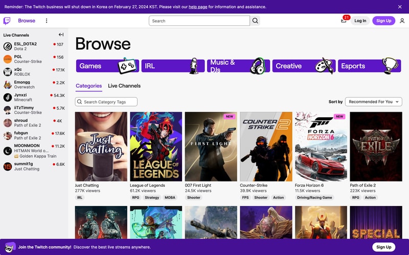
### Card (Video/Category)
- White/gray border or subtle shadow
- 8px border radius
- Hover: Slight scale transform, shadow increase
- Image aspect ratio: 16:9 for video, ~3:4 for category cards
- Text below: Title (14px), metadata (12px gray)

### Search Input
- Dark background (`#2D2D35`)
- 6px border radius
- 36px height
- Icon inside (left: search icon, right: clear button)
- Border on focus: purple accent

### Tag/Pill
- Small rounded pill (4px radius or full rounded)
- Light gray background on dark theme (`#3A3A3D`)
- 12px font size
- 4px vertical, 8px horizontal padding

### Navigation Bar
- 50px height
- Dark background (`#18181B`)
- Items spaced evenly
- Logo left, actions right
- Sticky/fixed positioning

### Sidebar (Live Channels)
- 240px width
- Dark background (`#18181B`)
- Scrollable
- Avatar (30px) + name + viewer count layout
- Red live indicator dot
- Hover: light gray background

### Toggle Switch
- Rounded pill shape
- Gray inactive (`#53535F`), purple active (`#9146FF`)
- 20px height, 40px width
- Smooth transition

### Avatar
- Circular (border-radius: 50%)
- Sizes: 20px, 30px, 40px, 50px, 96px
- Border optional (2px white)

## Layout Patterns

### Grid Layout (Categories)
- 6 columns on desktop
- 20px gap between items
- Responsive: 4 cols tablet, 2 cols mobile

### Sidebar + Main Content
- Fixed sidebar (240px width)
- Main content: `calc(100vw - 240px)`
- Sidebar collapsible to icon-only (50px)

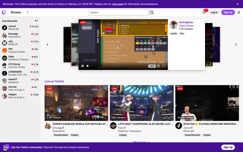
### Horizontal Carousel
- Scrollable container with `overflow-x: auto`
- Flex layout with gap
- Arrow navigation optional
- Snap scrolling

### Video Player Layout
- 16:9 aspect ratio container
- Overlay controls (bottom)
- Settings/quality icons (bottom right)
- Volume control, play/pause

### Header/Hero Section
- Full-width background
- Centered content (max 1200px)
- Large heading + CTA buttons
- Padding: 80px vertical