2 free brands left today.Sign up — unlimited →
Use this design system
Tokens · motion · components — drop straight into your project.
Download design kitStart a project with it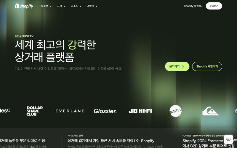
Similar styles
# Shopify Design System

## Tokens — Colors

| Token | Value | Usage |
|-------|-------|-------|
| **Brand** |
| `brand-green` | `#95BF47` | Primary brand color, Shopify logo |
| `brand-green-light` | `#7CE5A5` | Accent badges, pricing highlights |
| `brand-green-dark` | `#5F8F3B` | Hover states |
| **Neutrals** |
| `black` | `#000000` | Primary text, CTA buttons |
| `white` | `#FFFFFF` | Button text, light backgrounds |
| `gray-50` | `#FAFBFB` | Light backgrounds |
| `gray-100` | `#F1F2F3` | Subtle backgrounds |
| `gray-200` | `#E3E4E6` | Borders |
| `gray-600` | `#616668` | Secondary text |
| `gray-900` | `#1A1A1A` | Headings |
| **Dark Mode** |
| `navy-900` | `#0A0E27` | Dark hero backgrounds |
| `navy-800` | `#1C2340` | Dark sections |
| **Accents** |
| `blue` | `#2C6ECB` | Plus plan, links |
| `cyan-50` | `#E6F9F9` | Light background sections |
| `mint-50` | `#C1F0DB` | Pricing card backgrounds |
| `mint-green` | `#7CE5A5` | Badges, highlights |

## Tokens — Typography

**Font Families:**
- Primary: Custom sans-serif (likely Shopify Sans or system font stack)
- Fallback: `-apple-system, BlinkMacSystemFont, "Segoe UI", Roboto, sans-serif`

**Type Scale:**

| Token | Size | Line Height | Weight | Usage |
|-------|------|-------------|--------|-------|
| `display-xl` | `80px` | `88px` | 700 | Hero headings (Korean) |
| `display-lg` | `64px` | `72px` | 700 | Section headings |
| `display-md` | `48px` | `56px` | 600 | Card headings |
| `heading-xl` | `36px` | `44px` | 600 | Subheadings |
| `heading-lg` | `28px` | `36px` | 600 | Component titles |
| `heading-md` | `20px` | `28px` | 600 | Card labels |
| `body-lg` | `18px` | `28px` | 400 | Large body text |
| `body-md` | `16px` | `24px` | 400 | Default body text |
| `body-sm` | `14px` | `20px` | 400 | Small text, captions |
| `label-md` | `16px` | `24px` | 500 | Button text |
| `price-display` | `56px` | `64px` | 700 | Pricing amounts |

## Tokens — Spacing

| Token | Value | Usage |
|-------|-------|-------|
| `spacing-2` | `8px` | Tight spacing |
| `spacing-3` | `12px` | Small gaps |
| `spacing-4` | `16px` | Default padding |
| `spacing-5` | `20px` | Medium spacing |
| `spacing-6` | `24px` | Section padding |
| `spacing-8` | `32px` | Large gaps |
| `spacing-10` | `40px` | Section margins |
| `spacing-12` | `48px` | Large sections |
| `spacing-16` | `64px` | Hero spacing |
| `spacing-20` | `80px` | XL sections |
| `spacing-24` | `96px` | Hero vertical padding |

## Tokens — Radius

| Token | Value | Usage |
|-------|-------|-------|
| `radius-sm` | `4px` | Small elements |
| `radius-md` | `8px` | Badges, labels |
| `radius-lg` | `12px` | Cards |
| `radius-xl` | `16px` | Large cards |
| `radius-pill` | `999px` | Buttons, pills |

## Tokens — Shadows

| Token | Value |
|-------|-------|
| `shadow-sm` | `0 1px 2px rgba(0, 0, 0, 0.06)` |
| `shadow-md` | `0 4px 8px rgba(0, 0, 0, 0.08)` |
| `shadow-lg` | `0 8px 16px rgba(0, 0, 0, 0.1)` |
| `shadow-xl` | `0 12px 24px rgba(0, 0, 0, 0.12)` |

## Tokens — Borders

| Token | Value |
|-------|-------|
| `border-width-default` | `1px` |
| `border-width-thick` | `2px` |
| `border-color-default` | `#E3E4E6` |

## Components

### Button

**Variants:**
- **Primary (Black):** Black background, white text, pill-shaped, 16px padding vertical, 32px horizontal
- **Secondary (Outlined):** Transparent background, white border (2px), white text on dark backgrounds, black text on light
- **Ghost (White):** White background, black text, pill-shaped

**Sizes:**
- Large: 56px height, 18px font
- Medium: 48px height, 16px font
- Small: 40px height, 14px font

### Card

- White background
- 12-16px border radius
- 24-32px padding
- Subtle shadow (shadow-md)
- Optional green/blue accent on top or side

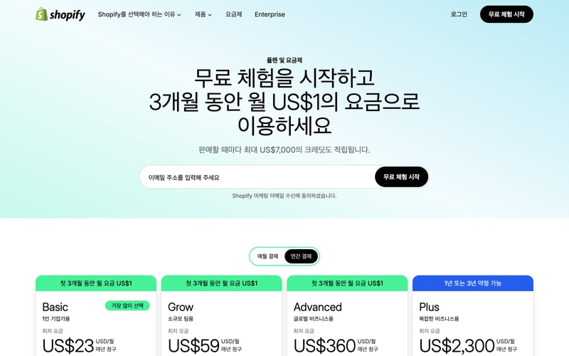
### Pricing Card

- White background
- Rounded corners (12px)
- Header with plan name and label badge
- Large price display
- Feature list
- Bottom CTA button
- Green highlight badge for promotions

### Navigation

- Fixed/sticky top navigation
- White background on light pages, transparent on dark heroes
- Logo on left
- Center navigation links
- Right-aligned login + CTA button
- 64-72px height
- Dropdown menus with chevron icons

### Input Field

- Light background (#F1F2F3 or white)
- 8-12px border radius
- 16px padding
- Placeholder text in gray-600
- Optional inline button (black)
- Focus state with blue outline

### Badge

- Small pill-shaped labels
- Green background (#7CE5A5)
- 8px border radius
- 4px vertical, 12px horizontal padding
- Medium weight text

## Layout Patterns

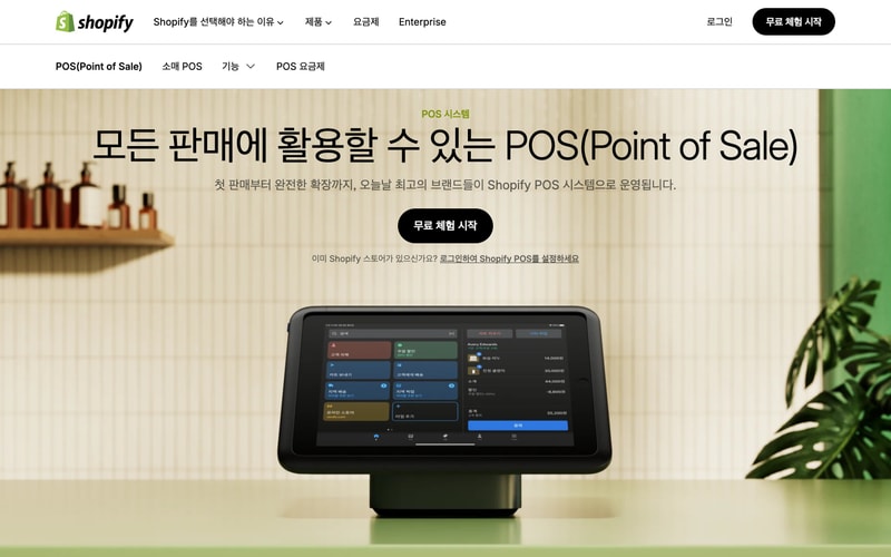
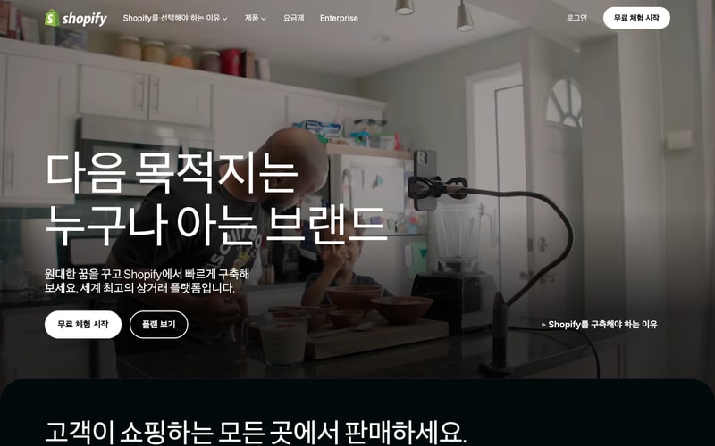
### Hero Section

- Full viewport height or large vertical padding (120-160px)
- Centered content with max-width container (1200px)
- Background image or solid color
- Large heading + subheading + CTA buttons
- Optional background overlay (rgba)

### Pricing Grid

- 4-column grid on desktop
- White background section with light accent color
- Card-based layout
- Toggle for billing period
- Centered heading above

### Content Container

- Max width: 1200-1400px
- Horizontal padding: 24-48px
- Centered with auto margins

### Image Grid

- 3-column grid
- Rounded corners on images
- Equal spacing between items
- Responsive breakpoints