Use this design system
Tokens · motion · components — drop straight into your project.
Download design kitStart a project with it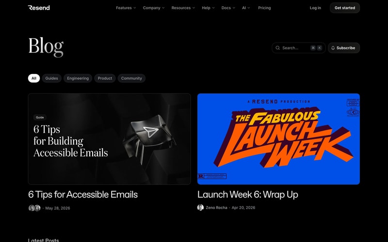
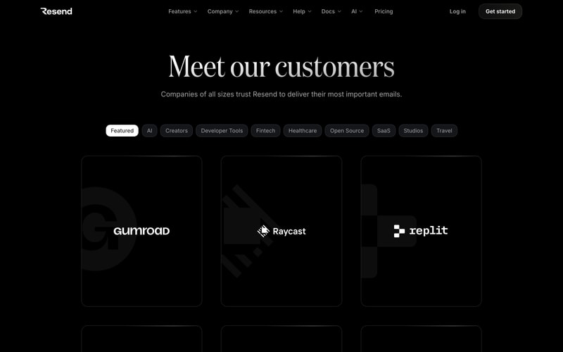
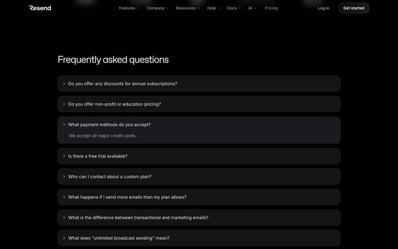
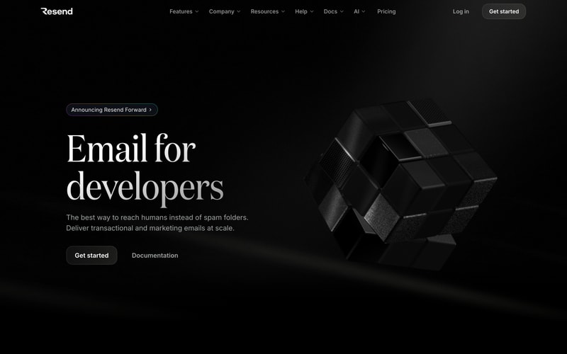
Similar styles
# Design System Reference — Resend

## Tokens — Colors

| Token | Value | Usage |
|-------|-------|-------|
| `background-dark` | `#000000` | Primary dark background |
| `background-light` | `#ffffff` | Primary light background |
| `surface-dark` | `#171717` | Elevated surfaces (cards, modals) on dark |
| `surface-light` | `#f9f9f9` | Elevated surfaces on light |
| `border-dark` | `#27272a` | Borders and dividers on dark |
| `border-light` | `#e5e5e7` | Borders and dividers on light |
| `text-primary-dark` | `#ffffff` | Primary text on dark backgrounds |
| `text-secondary-dark` | `#a1a1aa` | Secondary/muted text on dark |
| `text-primary-light` | `#0a0a0a` | Primary text on light backgrounds |
| `text-secondary-light` | `#737373` | Secondary/muted text on light |
| `accent` | `#ffffff` | Accent color for CTAs on dark |
| `accent-subtle` | `#27272a` | Subtle accent backgrounds |

## Tokens — Typography

**Font Families:**
- Display/Heading: Custom serif (appears to be "Instrument Serif" or similar display serif)
- Body/UI: "Inter", -apple-system, BlinkMacSystemFont, "Segoe UI", sans-serif

**Type Scale:**

| Token | Size | Line Height | Usage |
|-------|------|-------------|-------|
| `display-xl` | 72px / 4.5rem | 1.1 | Hero headings |
| `display-lg` | 60px / 3.75rem | 1.1 | Large section headings |
| `heading-1` | 48px / 3rem | 1.2 | Page titles |
| `heading-2` | 36px / 2.25rem | 1.3 | Section headings |
| `heading-3` | 24px / 1.5rem | 1.4 | Subsection headings |
| `body-lg` | 18px / 1.125rem | 1.6 | Large body text, taglines |
| `body` | 16px / 1rem | 1.5 | Default body text |
| `body-sm` | 14px / 0.875rem | 1.5 | Small text, captions |
| `label` | 13px / 0.8125rem | 1.4 | Labels, metadata |

**Font Weights:**
- Regular: 400
- Medium: 500
- Semibold: 600
- Bold: 700

## Tokens — Spacing

Base unit: 4px

| Token | Value |
|-------|-------|
| `spacing-1` | 4px |
| `spacing-2` | 8px |
| `spacing-3` | 12px |
| `spacing-4` | 16px |
| `spacing-6` | 24px |
| `spacing-8` | 32px |
| `spacing-12` | 48px |
| `spacing-16` | 64px |
| `spacing-24` | 96px |
| `spacing-32` | 128px |

## Tokens — Border Radius

| Token | Value | Usage |
|-------|-------|-------|
| `radius-sm` | 6px | Small elements |
| `radius-md` | 8px | Buttons, inputs |
| `radius-lg` | 12px | Cards, modals |
| `radius-xl` | 16px | Large cards |
| `radius-2xl` | 24px | Pills, badges |
| `radius-full` | 9999px | Fully rounded pills |

## Tokens — Shadows

| Token | Value | Usage |
|-------|-------|-------|
| `shadow-sm` | `0 1px 2px 0 rgba(0, 0, 0, 0.05)` | Subtle elevation |
| `shadow-md` | `0 4px 6px -1px rgba(0, 0, 0, 0.1)` | Cards on light theme |
| `shadow-lg` | `0 10px 15px -3px rgba(0, 0, 0, 0.1)` | Modals, popovers |

## Tokens — Borders

| Token | Value |
|-------|-------|
| `border-width` | 1px |
| `border-width-thick` | 2px |

## Components

### Navigation
- Full-width header with centered logo and navigation
- Dropdown indicators (˅) for expandable menu items
- Right-aligned authentication CTAs
- Height: ~64px
- Sticky positioning

### Buttons
**Primary:**
- Background: `#ffffff` on dark, `#000000` on light
- Text: `#000000` on dark, `#ffffff` on light
- Padding: 12px 24px
- Border radius: 8px
- Font size: 14px
- Font weight: 500

**Secondary/Ghost:**
- Background: transparent
- Text: `#a1a1aa` on dark, `#737373` on light
- Border: none
- Hover: slight opacity change

### Cards
- Background: `#171717` on dark, `#ffffff` on light
- Border: 1px solid `#27272a` on dark, `#e5e5e7` on light
- Border radius: 12px
- Padding: 24px
- Box shadow: `shadow-md` on light theme only

### Accordion/Disclosure
- Background: `#171717`
- Border radius: 12px
- Padding: 20px 24px
- Chevron indicator
- Smooth expand/collapse animation

### Pills/Badges
- Background: `#27272a` (dark), `#f4f4f5` (light)
- Text: `#ffffff` (dark), `#0a0a0a` (light)
- Padding: 6px 16px
- Border radius: 9999px (full)
- Font size: 13px

### Search Input
- Background: transparent or subtle surface
- Border: 1px solid border color
- Border radius: 8px
- Padding: 10px 16px
- Keyboard shortcut indicator on right

## Layout Patterns

### Hero Section
- Full viewport height or near-full
- Two-column layout (text left, visual right)
- Centered container with max-width ~1280px
- Vertical spacing: 96px top/bottom padding

### Grid Layouts
- 3-column grid for cards on desktop
- Gap: 24px
- Responsive: 1 column mobile, 2 tablet, 3 desktop

### Container
- Max width: 1280px
- Horizontal padding: 24px (mobile), 48px (tablet+)
- Centered with margin auto

### Sidebar Layout (Docs)
- Left sidebar: 264px fixed width
- Main content: flexible
- Right TOC: 240px (optional)
- Gap: 32px