Use this design system
Tokens · motion · components — drop straight into your project.
Download design kitStart a project with it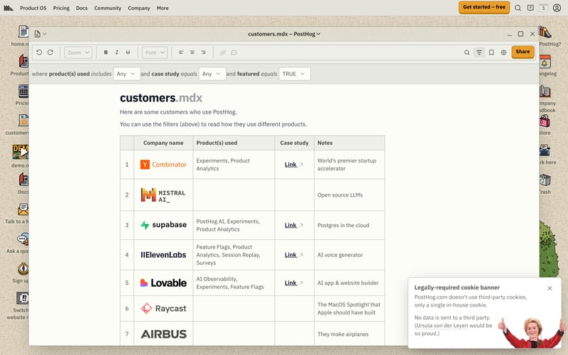
Similar styles
# PostHog Design System

## Tokens — Colors

| Token | Hex | Usage |
|-------|-----|-------|
| `--color-primary` | `#F9BD2B` | Primary CTA buttons, highlights |
| `--color-blue` | `#1D4AFF` | Product Analytics brand, links |
| `--color-orange` | `#FF9500` | Session Replay brand, warnings |
| `--color-green` | `#52C41A` | Web Analytics, success states |
| `--color-purple` | `#9B59B6` | A/B Testing, feature flags |
| `--color-pink` | `#FF69B4` | Data warehouse, accents |
| `--color-red` | `#E74C3C` | Errors, alerts |
| `--color-beige` | `#E5DCC5` | Main background texture |
| `--color-beige-dark` | `#D4C5B0` | Darker beige variant |
| `--color-black` | `#1A1A1A` | Primary text |
| `--color-gray-900` | `#2D2D2D` | Secondary text |
| `--color-gray-700` | `#666666` | Tertiary text |
| `--color-gray-500` | `#999999` | Disabled text |
| `--color-gray-300` | `#CCCCCC` | Borders |
| `--color-gray-100` | `#F5F5F5` | Subtle backgrounds |
| `--color-white` | `#FFFFFF` | Card backgrounds, inverted text |

## Tokens — Typography

**Font Families:**
- `--font-sans`: -apple-system, BlinkMacSystemFont, "Segoe UI", Roboto, "Helvetica Neue", Arial, sans-serif
- `--font-mono`: "SF Mono", Monaco, "Cascadia Code", monospace

**Type Scale:**
| Token | Size | Line Height | Weight | Usage |
|-------|------|-------------|--------|-------|
| `--text-xs` | 12px / 0.75rem | 16px / 1rem | 400 | Captions, labels |
| `--text-sm` | 14px / 0.875rem | 20px / 1.25rem | 400 | Body small, secondary |
| `--text-base` | 16px / 1rem | 24px / 1.5rem | 400 | Body text |
| `--text-lg` | 18px / 1.125rem | 28px / 1.75rem | 400 | Large body |
| `--text-xl` | 20px / 1.25rem | 28px / 1.75rem | 600 | Subheadings |
| `--text-2xl` | 24px / 1.5rem | 32px / 2rem | 700 | H3 |
| `--text-3xl` | 30px / 1.875rem | 36px / 2.25rem | 700 | H2 |
| `--text-4xl` | 36px / 2.25rem | 40px / 2.5rem | 700 | H1 |
| `--text-5xl` | 48px / 3rem | 56px / 3.5rem | 700 | Display large |
| `--text-6xl` | 60px / 3.75rem | 68px / 4.25rem | 700 | Hero headings |

## Tokens — Spacing

| Token | Value | Usage |
|-------|-------|-------|
| `--space-1` | 4px | Minimal spacing |
| `--space-2` | 8px | Tight spacing |
| `--space-3` | 12px | Small spacing |
| `--space-4` | 16px | Base spacing |
| `--space-5` | 20px | Medium spacing |
| `--space-6` | 24px | Standard spacing |
| `--space-8` | 32px | Large spacing |
| `--space-10` | 40px | Extra large |
| `--space-12` | 48px | Section spacing |
| `--space-16` | 64px | Major sections |
| `--space-20` | 80px | Hero spacing |
| `--space-24` | 96px | Maximum spacing |

## Tokens — Border Radius

| Token | Value | Usage |
|-------|-------|-------|
| `--radius-sm` | 4px | Small elements, tags |
| `--radius-base` | 6px | Inputs, small cards |
| `--radius-md` | 8px | Buttons, cards |
| `--radius-lg` | 12px | Large cards, modals |
| `--radius-xl` | 16px | Feature sections |
| `--radius-full` | 9999px | Pills, avatars |

## Tokens — Shadows

| Token | Value | Usage |
|-------|-------|-------|
| `--shadow-sm` | 0 1px 2px rgba(0,0,0,0.05) | Subtle elevation |
| `--shadow-base` | 0 1px 3px rgba(0,0,0,0.1), 0 1px 2px rgba(0,0,0,0.06) | Cards |
| `--shadow-md` | 0 4px 6px rgba(0,0,0,0.07), 0 2px 4px rgba(0,0,0,0.05) | Dropdowns |
| `--shadow-lg` | 0 10px 15px rgba(0,0,0,0.1), 0 4px 6px rgba(0,0,0,0.05) | Modals |
| `--shadow-xl` | 0 20px 25px rgba(0,0,0,0.1), 0 10px 10px rgba(0,0,0,0.04) | Popovers |

## Tokens — Borders

| Token | Value | Usage |
|-------|-------|-------|
| `--border-width` | 1px | Default borders |
| `--border-width-thick` | 2px | Emphasized borders |
| `--border-color` | #CCCCCC | Default border color |
| `--border-color-dark` | #999999 | Darker borders |

## Components

### Button
- **Primary**: Orange (#F9BD2B) background, black text, 8px radius, 12px 24px padding
- **Secondary**: White background, 2px orange border, black text, same padding
- **Sizes**: Small (10px 20px), Base (12px 24px), Large (16px 32px)
- **States**: Hover (slight darken), Active (pressed), Disabled (50% opacity)

### Card
- **Background**: White with subtle shadow
- **Radius**: 8-12px
- **Padding**: 24-32px
- **Border**: Optional 1-2px solid border

### Navigation
- **Sidebar**: Fixed left, icon + label vertical layout, beige background
- **Top Nav**: Horizontal, logo left, links center, CTA right
- **Active State**: Blue highlight or underline

### Modal/Window
- **Chrome**: macOS-style window controls (red, yellow, green dots)
- **Background**: White with rounded corners
- **Overlay**: Semi-transparent dark background
- **Header**: Title, toolbar with icons
- **Padding**: 24-32px

### Tab Navigation
- **Style**: Horizontal pills
- **Active**: Blue background with white text
- **Inactive**: Transparent with gray text
- **Hover**: Light gray background

### Input
- **Border**: 1px solid gray
- **Radius**: 6px
- **Padding**: 10px 16px
- **Focus**: Blue border, slight shadow

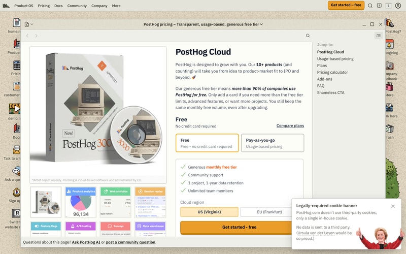
### Pricing Card
- **Border**: 2px solid (yellow for selected)
- **Radius**: 8px
- **Padding**: 24px
- **Header**: Bold title, pricing
- **Content**: Checkmark list items

### Feature Card
- **Size**: Small square cards
- **Colors**: Each feature has brand color (blue, green, orange, purple, pink)
- **Layout**: Icon/chart + label
- **Hover**: Slight lift with shadow

### Cookie Banner
- **Position**: Fixed bottom right
- **Background**: White
- **Shadow**: Large shadow
- **Close**: X icon top right
- **Content**: Text + privacy notice + image

## Layout Patterns

### Hero Section
- **Background**: Beige textured or solid brand color
- **Layout**: 50/50 split (content left, illustration right)
- **Spacing**: Large vertical padding (80-96px)
- **Content**: Large heading + body + CTA buttons

### Content Window
- **Layout**: Centered modal/window chrome
- **Max Width**: ~1000px
- **Padding**: Generous whitespace
- **Toolbar**: Top row with formatting controls

### Sidebar Layout
- **Sidebar**: Fixed 60-80px width, left side
- **Main**: Flex-grow content area
- **Icons**: Stacked vertically with labels

### Grid Layout
- **Feature Cards**: 2-4 column grid
- **Gap**: 16-24px
- **Responsive**: Collapse to single column on mobile

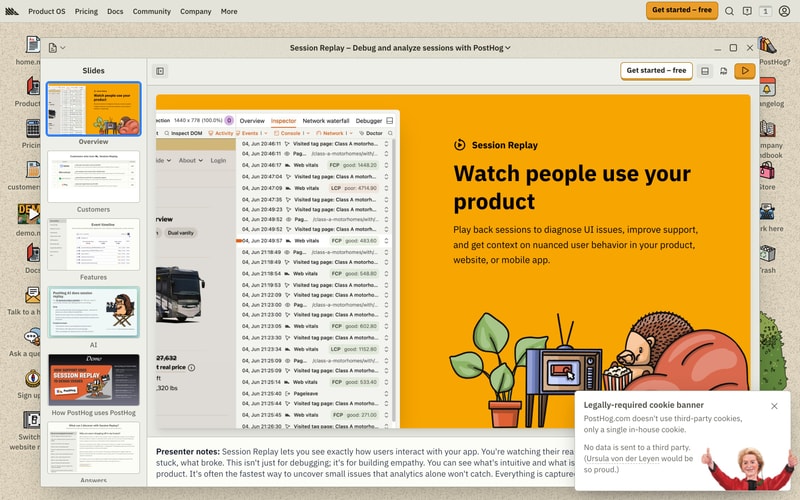
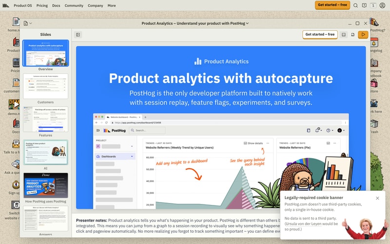
### Presentation Slides
- **Layout**: Left sidebar (thumbnails) + main content area
- **Header**: Title bar with actions (CTA button, icons)
- **Content**: Full-bleed colored background + centered text + visuals
- **Navigation**: Slide thumbnails, play button