Use this design system
Tokens · motion · components — drop straight into your project.
Download design kitStart a project with it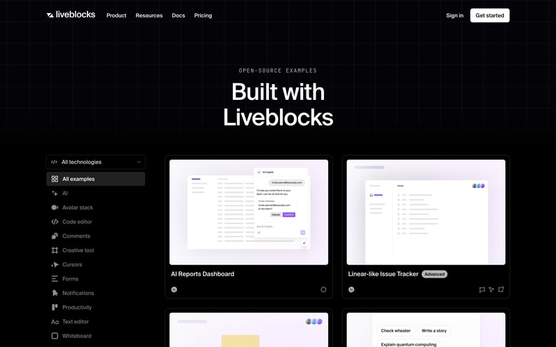
Similar styles
# Liveblocks Design System

## Tokens — Colors

| Token | Value | Usage |
|-------|-------|-------|
| `--color-background` | `#000000` | Primary background (pure black) |
| `--color-surface` | `#0A0A0A` | Elevated surface |
| `--color-surface-elevated` | `#1A1A1A` | Card backgrounds |
| `--color-border` | `#2A2A2A` | Subtle borders |
| `--color-border-hover` | `#3A3A3A` | Border hover states |
| `--color-text-primary` | `#FFFFFF` | Primary text, headings |
| `--color-text-secondary` | `#A3A3A3` | Secondary text, descriptions |
| `--color-text-tertiary` | `#737373` | Tertiary text, metadata |
| `--color-accent-purple` | `#8B5CF6` | Primary accent, CTA backgrounds |
| `--color-accent-purple-hover` | `#7C3AED` | Purple hover state |
| `--color-accent-pink` | `#EC4899` | Secondary accent, gradients |
| `--color-accent-green` | `#22C55E` | Success, savings badges |
| `--color-accent-blue` | `#3B82F6` | Info, links |
| `--color-gradient-start` | `#EC4899` | Gradient start (pink) |
| `--color-gradient-end` | `#8B5CF6` | Gradient end (purple) |

## Tokens — Typography

**Font Families:**
- Primary: `Inter, -apple-system, BlinkMacSystemFont, "Segoe UI", Roboto, sans-serif`
- Monospace: `"Fira Code", "Courier New", monospace`

**Type Scale:**

| Token | Size | Line Height | Weight | Usage |
|-------|------|-------------|--------|-------|
| `--font-display` | `72px` | `1.1` | `700` | Hero headings |
| `--font-h1` | `48px` | `1.2` | `700` | Page titles |
| `--font-h2` | `36px` | `1.3` | `600` | Section headings |
| `--font-h3` | `24px` | `1.4` | `600` | Card titles |
| `--font-h4` | `20px` | `1.5` | `600` | Subsection headings |
| `--font-body-lg` | `18px` | `1.6` | `400` | Large body text |
| `--font-body` | `16px` | `1.6` | `400` | Body text |
| `--font-body-sm` | `14px` | `1.5` | `400` | Small text |
| `--font-caption` | `12px` | `1.4` | `500` | Labels, captions |

**Font Weights:**
- Regular: `400`
- Medium: `500`
- Semibold: `600`
- Bold: `700`

## Tokens — Spacing

Base unit: `4px`

| Token | Value |
|-------|-------|
| `--space-1` | `4px` |
| `--space-2` | `8px` |
| `--space-3` | `12px` |
| `--space-4` | `16px` |
| `--space-5` | `20px` |
| `--space-6` | `24px` |
| `--space-8` | `32px` |
| `--space-10` | `40px` |
| `--space-12` | `48px` |
| `--space-16` | `64px` |
| `--space-20` | `80px` |
| `--space-24` | `96px` |
| `--space-32` | `128px` |

## Tokens — Border Radius

| Token | Value | Usage |
|-------|-------|-------|
| `--radius-sm` | `4px` | Small elements, badges |
| `--radius-md` | `8px` | Buttons, inputs |
| `--radius-lg` | `12px` | Cards, modals |
| `--radius-xl` | `16px` | Large cards |
| `--radius-2xl` | `24px` | Hero cards, feature sections |
| `--radius-full` | `9999px` | Pills, avatar groups |

## Tokens — Shadows

| Token | Value |
|-------|-------|
| `--shadow-sm` | `0 1px 2px rgba(0, 0, 0, 0.3)` |
| `--shadow-md` | `0 4px 6px rgba(0, 0, 0, 0.4)` |
| `--shadow-lg` | `0 10px 15px rgba(0, 0, 0, 0.5)` |
| `--shadow-xl` | `0 20px 25px rgba(0, 0, 0, 0.6)` |
| `--shadow-glow` | `0 0 20px rgba(139, 92, 246, 0.3)` |

## Tokens — Borders

| Token | Value |
|-------|-------|
| `--border-width-thin` | `1px` |
| `--border-width-medium` | `2px` |
| `--border-width-thick` | `3px` |

## Components

### Button

**Primary:**
- Background: `#FFFFFF`
- Text: `#000000`
- Padding: `12px 24px`
- Border radius: `8px`
- Font size: `16px`
- Font weight: `600`
- Hover: Scale `1.02`, subtle shadow

**Secondary:**
- Background: transparent
- Border: `1px solid #2A2A2A`
- Text: `#FFFFFF`
- Padding: `12px 24px`
- Border radius: `8px`
- Hover: Border `#3A3A3A`

### Navigation

**Header:**
- Background: `rgba(0, 0, 0, 0.8)` with backdrop blur
- Height: `64px`
- Links: `16px`, `500` weight, `#FFFFFF`
- Spacing: `32px` between items
- Logo: Height `24px`

### Card

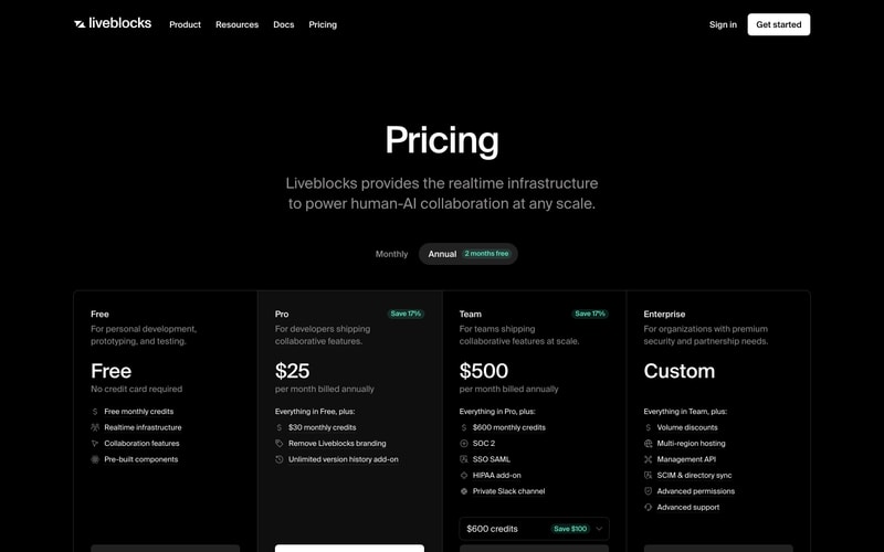
**Pricing Card:**
- Background: `#0F0F0F`
- Border: `1px solid #2A2A2A`
- Border radius: `16px`
- Padding: `32px`
- Hover: Border `#3A3A3A`, translate Y `-4px`

**Feature Card:**
- Background: `#1A1A1A`
- Border radius: `12px`
- Padding: `24px`
- Icon size: `24px` in purple/pink

### Badge

**Label Badge:**
- Background: `rgba(139, 92, 246, 0.15)`
- Text: `#8B5CF6`
- Padding: `4px 12px`
- Border radius: `4px`
- Font size: `12px`
- Font weight: `600`
- Letter spacing: `0.05em`
- Text transform: uppercase

**Savings Badge:**
- Background: `rgba(34, 197, 94, 0.15)`
- Text: `#22C55E`
- Padding: `4px 8px`
- Border radius: `4px`
- Font size: `12px`
- Font weight: `600`

### Avatar Group

- Size: `32px` circular
- Border: `2px solid #000000`
- Overlap: `-8px` margin
- Display: flex, reverse order

## Layout Patterns

### Hero Section
- Max width: `1200px`
- Centered alignment
- Vertical padding: `96px` to `128px`
- Heading + subheading + CTA button group
- Background: gradient overlays

### Pricing Grid
- Grid: 4 columns
- Gap: `24px`
- Responsive: 1 column mobile, 2 tablet, 4 desktop

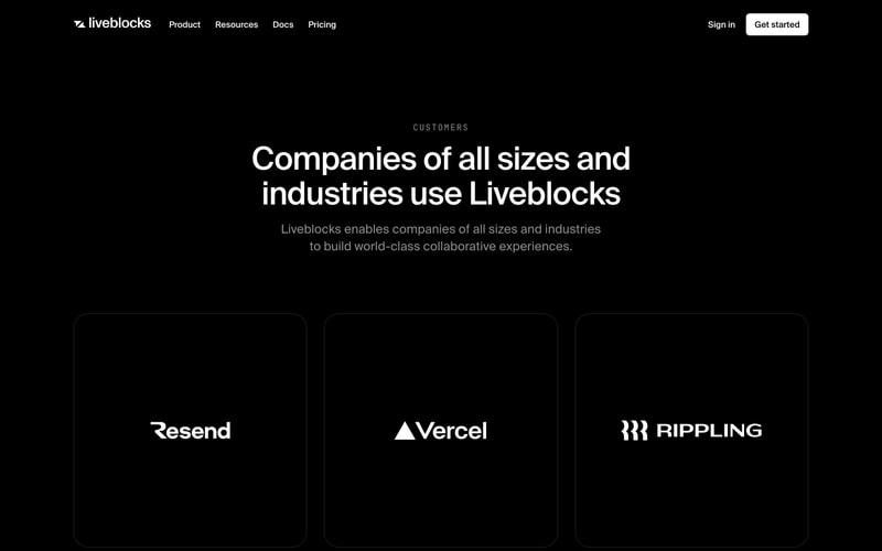
### Customer Logo Grid
- Grid: 3 columns
- Gap: `32px`
- Card height: `300px`
- Center-aligned logos

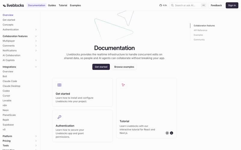
### Documentation Sidebar
- Width: `240px`
- Background: `#FAFAFA` (light mode)
- Sticky position
- Nested navigation with chevrons