Use this design system
Tokens · motion · components — drop straight into your project.
Download design kitStart a project with it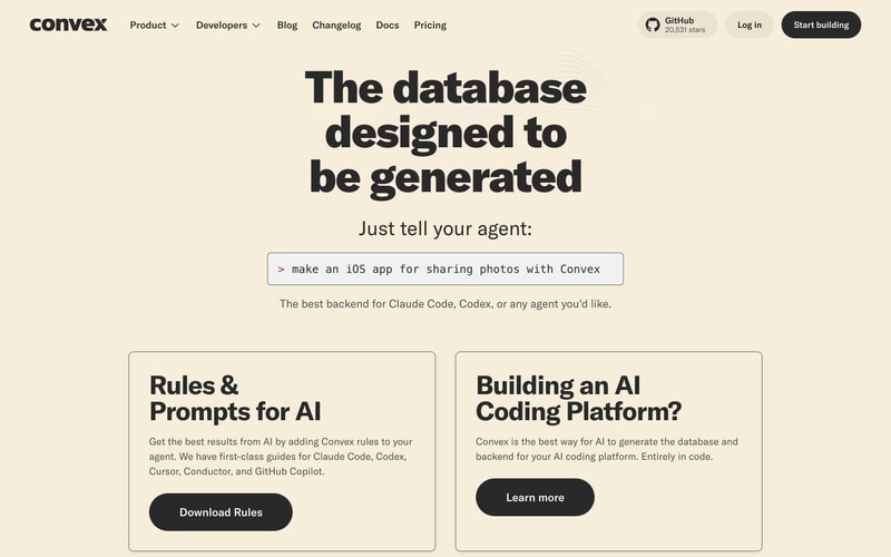
Similar styles
# Convex Design System

## Tokens — Colors

| Token | Value | Usage |
|-------|-------|-------|
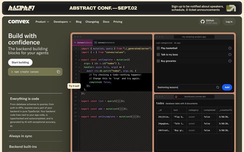
| **Dark Theme** | | |
| `--color-dark-bg` | `#3d4436` | Primary dark background (olive/sage) |
| `--color-dark-bg-secondary` | `#4a5240` | Secondary dark surfaces |
| `--color-dark-bg-code` | `#1a1a1a` | Code editor background |
| `--color-dark-bg-code-alt` | `#0d1117` | Alternative code background |
| `--color-dark-bg-black` | `#000000` | Banner/header black |
| `--color-dark-text` | `#ffffff` | Primary text on dark |
| `--color-dark-text-muted` | `#9ca3af` | Muted text on dark |
| `--color-dark-accent-green` | `#7fb069` | Success/accent green |
| `--color-dark-accent-lime` | `#84cc16` | Bright lime accent |
| `--color-dark-accent-blue` | `#0ea5e9` | Primary blue CTA |
| `--color-dark-syntax-pink` | `#ec4899` | Syntax highlighting pink |
| `--color-dark-syntax-purple` | `#c084fc` | Syntax highlighting purple |
| `--color-dark-syntax-orange` | `#f97316` | Syntax highlighting orange |
| **Light Theme** | | |
| `--color-light-bg` | `#f5f1e8` | Primary background (cream) |
| `--color-light-bg-alt` | `#f4f0e6` | Alternative cream |
| `--color-light-surface` | `#ffffff` | Card/surface white |
| `--color-light-text` | `#1a1a1a` | Primary text |
| `--color-light-text-secondary` | `#6b7280` | Secondary text |
| `--color-light-text-muted` | `#71717a` | Muted text |
| `--color-light-border` | `#e5e7eb` | Default border |
| `--color-light-border-alt` | `#d4d4d8` | Alternative border |
| **Accent Colors** | | |
| `--color-orange` | `#f59e0b` | Primary CTA orange |
| `--color-orange-dark` | `#ea580c` | Darker orange |
| `--color-yellow` | `#fbbf24` | Yellow accent |
| `--color-blue` | `#3b82f6` | Blue accent |
| `--color-blue-light` | `#0ea5e9` | Light blue |
| `--color-red` | `#ef4444` | Error/destructive red |
| `--color-red-bright` | `#ff0000` | Bright red (shadow) |
| `--color-pink` | `#ec4899` | Pink accent |
| `--color-pink-light` | `#ffc2e6` | Light pink |
| `--color-purple` | `#a855f7` | Purple accent |
| `--color-purple-light` | `#c084fc` | Light purple |
| `--color-green` | `#22c55e` | Success green |

## Tokens — Typography

**Font Families:**
- `--font-sans`: -apple-system, BlinkMacSystemFont, "Inter", "Segoe UI", system-ui, sans-serif
- `--font-mono`: "JetBrains Mono", "Fira Code", "Consolas", monospace

**Type Scale:**

| Token | Size | Line Height | Weight | Usage |
|-------|------|-------------|--------|-------|
| `--text-xs` | 12px | 16px | 400 | Metadata, captions |
| `--text-sm` | 14px | 20px | 400 | Small body text |
| `--text-base` | 16px | 24px | 400 | Body text |
| `--text-lg` | 18px | 28px | 400 | Large body |
| `--text-xl` | 20px | 28px | 600 | Subheadings |
| `--text-2xl` | 24px | 32px | 700 | H4 |
| `--text-3xl` | 30px | 36px | 700 | H3 |
| `--text-4xl` | 36px | 40px | 800 | H2 |
| `--text-5xl` | 48px | 1 | 800 | H1 |
| `--text-6xl` | 60px | 1 | 900 | Display heading |
| `--text-7xl` | 72px | 1 | 900 | Large display |
| `--text-8xl` | 96px | 1 | 900 | Hero heading |
| `--text-9xl` | 128px | 1 | 900 | 404 display |

## Tokens — Spacing

| Token | Value |
|-------|-------|
| `--space-1` | 4px |
| `--space-2` | 8px |
| `--space-3` | 12px |
| `--space-4` | 16px |
| `--space-5` | 20px |
| `--space-6` | 24px |
| `--space-8` | 32px |
| `--space-10` | 40px |
| `--space-12` | 48px |
| `--space-16` | 64px |
| `--space-20` | 80px |
| `--space-24` | 96px |
| `--space-32` | 128px |

## Tokens — Border Radius

| Token | Value | Usage |
|-------|-------|-------|
| `--radius-sm` | 6px | Small elements |
| `--radius-base` | 8px | Buttons, inputs |
| `--radius-md` | 12px | Cards, containers |
| `--radius-lg` | 16px | Large cards |
| `--radius-xl` | 24px | Hero buttons |
| `--radius-2xl` | 32px | Extra large |
| `--radius-full` | 9999px | Pills, badges |

## Tokens — Shadows

| Token | Value | Usage |
|-------|-------|-------|
| `--shadow-sm` | 0 1px 2px rgba(0,0,0,0.05) | Subtle elevation |
| `--shadow-base` | 0 1px 3px rgba(0,0,0,0.1), 0 1px 2px rgba(0,0,0,0.06) | Cards |
| `--shadow-md` | 0 4px 6px rgba(0,0,0,0.1), 0 2px 4px rgba(0,0,0,0.06) | Card hover |
| `--shadow-lg` | 0 10px 15px rgba(0,0,0,0.1), 0 4px 6px rgba(0,0,0,0.05) | Dropdowns |
| `--shadow-xl` | 0 20px 25px rgba(0,0,0,0.1), 0 10px 10px rgba(0,0,0,0.04) | Modals |
| `--shadow-offset` | 8px 8px 0 | Offset shadow (404) |

## Tokens — Borders

| Token | Value |
|-------|-------|
| `--border-width-1` | 1px |
| `--border-width-2` | 2px |
| `--border-width-4` | 4px |

## Components

### Navigation Bar
- Height: 64px
- Background: `--color-dark-bg` (#4a5240)
- Logo: White text
- Links: White text, hover with subtle opacity change
- Dropdown indicators: Chevron icons
- GitHub badge: Icon + star count
- Right-aligned: "Log in" link, CTAs

### Buttons

**Primary (Orange):**
- Background: `--color-orange` (#f59e0b)
- Text: Black or white depending on context
- Padding: 12px 24px
- Border radius: `--radius-base` (8px)
- Font weight: 600
- Hover: Slightly darker

**Secondary (White/Outline):**
- Background: White
- Border: 1px solid gray
- Text: Black
- Padding: 12px 24px
- Border radius: `--radius-base`

**Ghost:**
- Background: Transparent
- Text: Inherit
- Hover: Subtle background

### Cards

**Standard Card:**
- Background: White
- Border: 1px solid `--color-light-border`
- Border radius: `--radius-md` (12px)
- Padding: 24px
- Shadow: `--shadow-base`
- Hover: `--shadow-md`

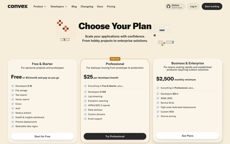
**Pricing Card:**
- Background: White
- Border radius: `--radius-lg` (16px)
- Padding: 32px
- Popular variant: 2px orange border

**Component Card:**
- Colorful backgrounds (varies)
- Border radius: `--radius-md`
- Padding: 20px
- Image/icon area at top
- Title, description, metadata below

### Code Block
- Background: `--color-dark-bg-code` (#1a1a1a)
- Syntax highlighting: Pink, purple, orange, blue, green
- Line numbers: Gray
- Padding: 16px
- Border radius: `--radius-md`
- Font: `--font-mono`

### Input/Search
- Background: White
- Border: 1px solid `--color-light-border`
- Border radius: `--radius-base` (8px)
- Padding: 10px 14px
- Font size: 14px
- Focus: Blue border

### Badge/Label
- "POPULAR" badge: Orange background, white text, small padding, rounded
- Download counts: Icon + text, muted color

### Dropdown/Select
- Border: 1px solid
- Chevron icon on right
- Border radius: `--radius-base`

## Layout Patterns

### Hero Section
- Full-width background (dark olive)
- Centered content, max-width ~1200px
- Large heading (72-96px)
- Subheading below (18-24px)
- CTA button
- Supporting visuals (code preview, device mockups)
- Vertical padding: 80-120px

### Pricing Grid
- 3-column grid (desktop)
- Equal-height cards
- Centered headings above grid
- Decorative elements in corners
- Column gap: 24px

### Component Grid
- Multi-column grid (3-4 columns)
- Masonry-style or equal heights
- Sidebar filters on left
- Search/actions above grid
- Gap: 20-24px

### Navigation
- Fixed/sticky top bar
- Horizontal layout
- Logo left, links center/left, actions right
- Dropdowns for nested menus