2 free brands left today.Sign up — unlimited →
Use this design system
Tokens · motion · components — drop straight into your project.
Download design kitStart a project with it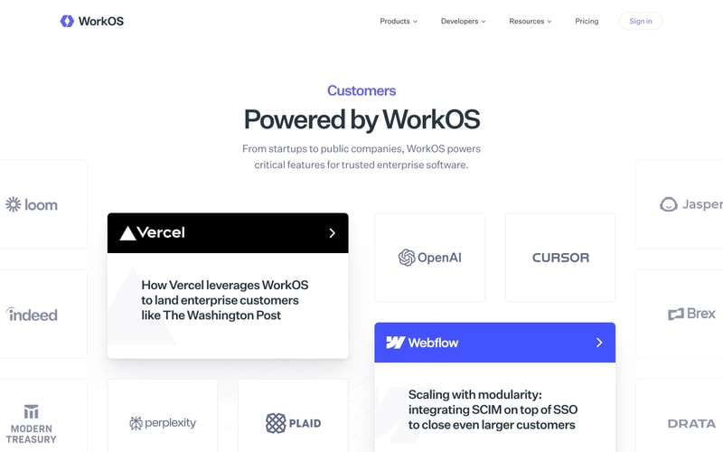
Similar styles
# WorkOS Design System

## Tokens — Colors

| Token | Value | Usage |
|-------|-------|-------|
| `primary-purple` | `#7C3AED` | Primary brand, CTAs, headings |
| `primary-purple-light` | `#A78BFA` | Hover states, accents |
| `primary-purple-dark` | `#6D28D9` | Active states |
| `accent-blue` | `#6366F1` | Gradients, secondary actions |
| `accent-indigo` | `#4F46E5` | UI accents |
| `success-green` | `#10B981` | Status badges, enabled states |
| `success-green-light` | `#34D399` | Success highlights |
| `teal-accent` | `#14B8A6` | Gradient stops |
| `pink-accent` | `#EC4899` | Gradient stops |
| `text-primary` | `#111827` | Headings, primary text |
| `text-secondary` | `#374151` | Body text |
| `text-tertiary` | `#6B7280` | Muted text, descriptions |
| `text-quaternary` | `#9CA3AF` | Placeholder text |
| `bg-primary` | `#FFFFFF` | Main background |
| `bg-secondary` | `#F9FAFB` | Alternate sections |
| `bg-tertiary` | `#F3F4F6` | Subtle backgrounds |
| `bg-dark` | `#1E293B` | Dark cards, sections |
| `bg-dark-alt` | `#1F2937` | Dark UI elements |
| `border-light` | `#E5E7EB` | Default borders |
| `border-medium` | `#D1D5DB` | Emphasized borders |

## Tokens — Typography

**Font Family:**
- Primary: `'Inter', -apple-system, BlinkMacSystemFont, 'Segoe UI', sans-serif`

**Type Scale:**

| Token | Size | Weight | Line Height | Usage |
|-------|------|--------|-------------|-------|
| `display-xl` | `72px` | 700 | 1.1 | Large hero text |
| `display-lg` | `60px` | 700 | 1.1 | Hero headings |
| `display-md` | `48px` | 700 | 1.2 | Page titles |
| `heading-xl` | `40px` | 700 | 1.2 | Section headings |
| `heading-lg` | `36px` | 700 | 1.2 | Card headings |
| `heading-md` | `30px` | 600 | 1.3 | Subheadings |
| `heading-sm` | `24px` | 600 | 1.3 | Card titles |
| `heading-xs` | `20px` | 600 | 1.4 | Small headings |
| `body-lg` | `18px` | 400 | 1.6 | Large body text |
| `body-md` | `16px` | 400 | 1.5 | Default body |
| `body-sm` | `14px` | 400 | 1.5 | Small text |
| `label` | `14px` | 500 | 1.4 | Form labels, badges |
| `caption` | `12px` | 400 | 1.4 | Captions, helper text |

## Tokens — Spacing

Base unit: `4px`

| Token | Value | Usage |
|-------|-------|-------|
| `spacing-xs` | `8px` | Tight spacing |
| `spacing-sm` | `12px` | Small gaps |
| `spacing-md` | `16px` | Default spacing |
| `spacing-lg` | `24px` | Medium gaps |
| `spacing-xl` | `32px` | Large gaps |
| `spacing-2xl` | `48px` | Section spacing |
| `spacing-3xl` | `64px` | Large section spacing |
| `spacing-4xl` | `80px` | Page section padding |
| `spacing-5xl` | `96px` | Extra large sections |
| `spacing-6xl` | `128px` | Hero sections |

## Tokens — Border Radius

| Token | Value | Usage |
|-------|-------|-------|
| `radius-sm` | `4px` | Badges, small elements |
| `radius-md` | `8px` | Buttons, inputs |
| `radius-lg` | `12px` | Cards, panels |
| `radius-xl` | `16px` | Large cards |
| `radius-2xl` | `20px` | Feature panels |
| `radius-3xl` | `24px` | Hero cards |
| `radius-full` | `9999px` | Pills, circular elements |

## Tokens — Shadows

| Token | Value |
|-------|-------|
| `shadow-xs` | `0 1px 2px rgba(0, 0, 0, 0.05)` |
| `shadow-sm` | `0 1px 3px rgba(0, 0, 0, 0.1), 0 1px 2px rgba(0, 0, 0, 0.06)` |
| `shadow-md` | `0 4px 6px rgba(0, 0, 0, 0.07), 0 2px 4px rgba(0, 0, 0, 0.06)` |
| `shadow-lg` | `0 10px 15px rgba(0, 0, 0, 0.1), 0 4px 6px rgba(0, 0, 0, 0.05)` |
| `shadow-xl` | `0 20px 25px rgba(0, 0, 0, 0.1), 0 10px 10px rgba(0, 0, 0, 0.04)` |
| `shadow-2xl` | `0 25px 50px rgba(0, 0, 0, 0.15)` |

## Tokens — Borders

| Token | Value |
|-------|-------|
| `border-width` | `1px` |
| `border-width-2` | `2px` |
| `border-width-3` | `3px` |

## Components

### Button
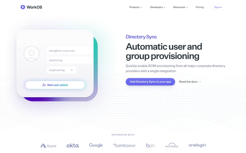
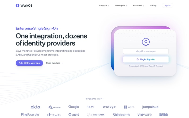
- **Primary:** Purple background `#7C3AED`, white text, `8px` radius, `12px 24px` padding
- **Secondary:** White background, dark text, `1px` border
- **Dark:** Dark background `#1F2937`, white text
- **Hover:** Slight darkening, subtle scale transform
- **Icon:** Optional arrow or icon suffix

### Card
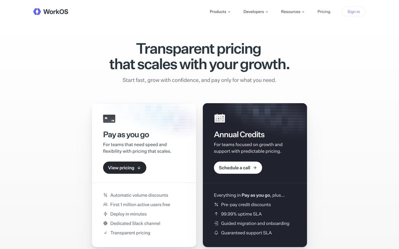
- **Light:** White background, subtle shadow, `12-16px` radius
- **Dark:** Navy `#1E293B` background, white text
- **Gradient Border:** Multi-color gradient border with inner white/dark background
- **Padding:** `32-48px` internal padding
- **Shadow:** `shadow-lg` for elevation

### Badge
- **Success:** `#10B981` background, white text, `4px` radius
- **Ready:** Light gray background, gray text
- **Pill Shape:** `radius-full` for pill style
- **Padding:** `4px 12px`

### Toggle Switch
- **Track:** Gray when off, green `#10B981` when on
- **Thumb:** White circle with shadow
- **Width:** ~48px, Height: ~24px
- **Border Radius:** `radius-full`

### Input Field
- **Background:** White
- **Border:** `1px` solid `#E5E7EB`
- **Radius:** `8px`
- **Padding:** `12px 16px`
- **Focus:** Purple border, subtle shadow
- **Placeholder:** `#9CA3AF`

### Navigation
- **Background:** White with subtle border bottom
- **Height:** `64-72px`
- **Links:** Gray text, purple on hover
- **Dropdowns:** Chevron icon, dropdown menu on click
- **Logo:** Left-aligned, ~24-32px height

### Gradient Text
- **Purple-Blue:** `linear-gradient(135deg, #7C3AED 0%, #6366F1 100%)`
- **Application:** `-webkit-background-clip: text`, `-webkit-text-fill-color: transparent`

### Gradient Border Card
- **Border:** `2-3px` gradient border using pseudo-elements
- **Gradient:** Purple to blue/teal/pink depending on context
- **Inner Background:** White or light with padding
- **Radius:** `16-24px`

### Icon Container
- **Size:** 32-48px square
- **Background:** Dark `#1F2937` or gradient
- **Radius:** `8px`
- **Icon Size:** 16-24px
- **Padding:** Centered

### Logo Grid
- **Layout:** Flexbox, centered, wrapped
- **Spacing:** `32-48px` between logos
- **Logo Size:** Varies, ~80-120px width
- **Color:** Muted purple/blue/gray tones
- **Opacity:** ~60-70% for subtle appearance

## Layout Patterns

### Hero Section
- **Container:** Max-width `1280px`, centered
- **Layout:** Two-column grid, 50/50 or 60/40 split
- **Padding:** `80-120px` vertical, `24px` horizontal
- **Background:** White with optional subtle pattern

### Feature Section
- **Container:** Max-width `1280px`
- **Layout:** Two-column grid, alternating image/text
- **Spacing:** `80px` between sections
- **Background:** Alternating white and light gray

### Pricing Cards
- **Layout:** Two-column grid, equal width
- **Gap:** `24-32px`
- **Card Padding:** `40-48px`
- **Responsive:** Stack on mobile

### Logo Grid
- **Layout:** Flexbox or grid, centered
- **Columns:** 4-7 logos per row
- **Gap:** `32-48px`
- **Alignment:** Center

### Page Container
- **Max Width:** `1280px`
- **Padding:** `24px` horizontal (mobile), `48px` (desktop)
- **Margin:** `0 auto` for centering