Use this design system
Tokens · motion · components — drop straight into your project.
Download design kitStart a project with it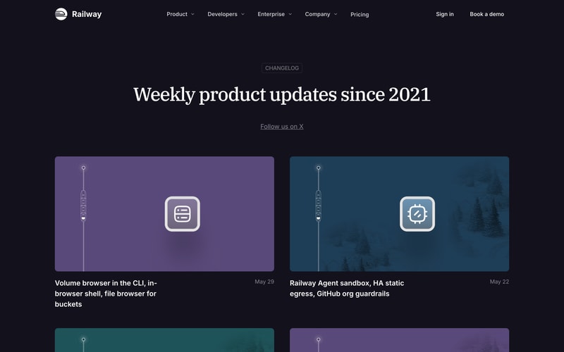
Similar styles
# Railway Design System

## Tokens — Colors

| Token | Hex | Usage |
|-------|-----|-------|
| `background-dark` | `#0D0D12` | Primary dark background |
| `background-light` | `#FAFAF9` | Documentation/light theme background |
| `surface-dark` | `#1A1A1F` | Cards and elevated surfaces on dark |
| `surface-light` | `#FFFFFF` | Cards on light background |
| `primary` | `#8B5CF6` | Primary brand purple, CTAs, accents |
| `primary-hover` | `#7C3AED` | Primary button hover state |
| `primary-light` | `#EDE9FE` | Light purple backgrounds (docs cards) |
| `text-on-dark` | `#FFFFFF` | Primary text on dark backgrounds |
| `text-secondary-dark` | `#A1A1AA` | Secondary text on dark |
| `text-on-light` | `#171717` | Primary text on light backgrounds |
| `text-secondary-light` | `#737373` | Secondary text on light |
| `border-dark` | `#27272A` | Borders and dividers on dark |
| `border-light` | `#E5E5E5` | Borders on light backgrounds |
| `accent-cream` | `#FEF9E7` | Docs card background (Quick Start) |
| `accent-lavender` | `#EDE9FE` | Docs card background (AI) |
| `accent-rose` | `#FEF2F2` | Docs card background (CLI) |
| `accent-mint` | `#F0FDF4` | Docs card background (Templates) |
| `chart-purple` | `#8B5CF6` | Data visualization accent |

## Tokens — Typography

**Font Families:**
- `font-display`: Newsreader, Georgia, serif (editorial serif for headings)
- `font-sans`: Inter, -apple-system, BlinkMacSystemFont, "Segoe UI", sans-serif
- `font-mono`: "JetBrains Mono", Consolas, Monaco, monospace

**Type Scale:**

| Token | Size | Line Height | Weight | Usage |
|-------|------|-------------|--------|-------|
| `display-xl` | 72px / 4.5rem | 1.1 | 400 | Hero headlines |
| `display-lg` | 60px / 3.75rem | 1.15 | 400 | Section headlines |
| `display-md` | 48px / 3rem | 1.2 | 400 | Page titles |
| `heading-lg` | 36px / 2.25rem | 1.3 | 600 | Major headings |
| `heading-md` | 24px / 1.5rem | 1.4 | 600 | Card titles |
| `heading-sm` | 20px / 1.25rem | 1.4 | 600 | Subheadings |
| `body-lg` | 18px / 1.125rem | 1.6 | 400 | Large body text |
| `body-md` | 16px / 1rem | 1.6 | 400 | Default body |
| `body-sm` | 14px / 0.875rem | 1.5 | 400 | Small text |
| `caption` | 12px / 0.75rem | 1.4 | 400 | Captions, labels |

## Tokens — Spacing

**Base unit:** 4px

| Token | Value | Usage |
|-------|-------|-------|
| `space-1` | 4px | Micro spacing |
| `space-2` | 8px | Tight spacing |
| `space-3` | 12px | Small gaps |
| `space-4` | 16px | Default spacing |
| `space-5` | 20px | Medium spacing |
| `space-6` | 24px | Component padding |
| `space-8` | 32px | Section spacing |
| `space-10` | 40px | Large gaps |
| `space-12` | 48px | Card padding |
| `space-16` | 64px | Section padding |
| `space-20` | 80px | Page sections |
| `space-24` | 96px | Hero sections |
| `space-32` | 128px | Major sections |

## Tokens — Radii

| Token | Value | Usage |
|-------|-------|-------|
| `radius-sm` | 4px | Small elements |
| `radius-md` | 8px | Buttons, inputs |
| `radius-lg` | 12px | Cards, modals |
| `radius-xl` | 16px | Large containers |
| `radius-full` | 9999px | Pills, avatars |

## Tokens — Shadows

| Token | Value | Usage |
|-------|-------|-------|
| `shadow-sm` | `0 1px 2px rgba(0,0,0,0.1)` | Subtle elevation |
| `shadow-md` | `0 4px 6px rgba(0,0,0,0.15)` | Cards |
| `shadow-lg` | `0 10px 25px rgba(0,0,0,0.2)` | Modals, dropdowns |
| `shadow-xl` | `0 20px 40px rgba(0,0,0,0.3)` | Major overlays |
| `shadow-purple` | `0 8px 24px rgba(139,92,246,0.4)` | Purple glow for CTAs |

## Tokens — Borders

| Token | Value | Usage |
|-------|-------|-------|
| `border-width-default` | 1px | Standard borders |
| `border-width-thick` | 2px | Emphasized borders |
| `border-style` | solid | Default border style |

## Components

### Navigation Bar
- **Height:** 64px
- **Background:** Dark with slight transparency (rgba(13,13,18,0.9))
- **Backdrop blur:** Yes
- **Padding:** 16px horizontal
- **Items:** Logo (left), nav links (center), CTAs (right)
- **Link spacing:** 32px between items
- **Link style:** Regular weight, color: text-secondary-dark, hover: text-on-dark

### Buttons

**Primary (Filled):**
- Background: `primary`
- Color: `white`
- Padding: 12px 24px
- Radius: `radius-md`
- Font: `font-sans`, 16px, 500 weight
- Hover: Slight scale (1.02), shadow-purple
- Transition: 150ms ease

**Secondary (Outlined):**
- Background: `transparent`
- Border: 1px solid `border-dark` (or border-light on light theme)
- Color: `text-on-dark` (or text-on-light)
- Padding: 12px 24px
- Radius: `radius-md`
- Hover: Background slight tint

**Large:**
- Padding: 16px 32px
- Font size: 18px

### Cards

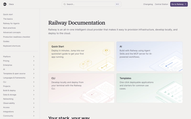
**Doc Card (Light Theme):**
- Background: Accent colors (cream, lavender, rose, mint)
- Padding: 32px
- Radius: `radius-lg`
- Border: None or 1px solid matching tint
- Title: `heading-md`
- Body: `body-md`, color: text-secondary-light
- Illustration: Isometric line drawings in matching accent color

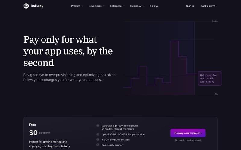
**Pricing Card:**
- Background: `surface-dark`
- Padding: 40px
- Radius: `radius-lg`
- Border: 1px solid `border-dark`

### Modal/Dialog
- Background: `surface-dark`
- Padding: 32px
- Radius: `radius-lg`
- Max-width: 600px
- Backdrop: rgba(0,0,0,0.7) with blur
- Shadow: `shadow-xl`

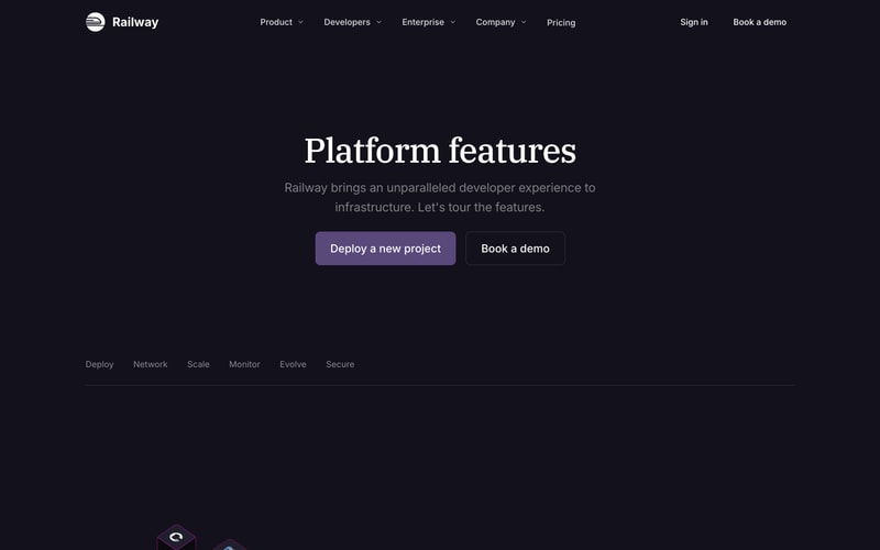
### Tabs
- Border bottom: 1px solid `border-dark`
- Tab item padding: 12px 20px
- Active: Border bottom 2px solid `primary`
- Inactive color: `text-secondary-dark`
- Active color: `text-on-dark`

### Sidebar Navigation
- Width: 288px
- Background: `background-light` or `surface-light`
- Padding: 24px 16px
- Item padding: 8px 12px
- Item radius: `radius-sm`
- Active background: light gray tint
- Chevron icons for expandable sections

### Form Inputs
- Background: `surface-dark` on dark, white on light
- Border: 1px solid `border-dark` or `border-light`
- Padding: 12px 16px
- Radius: `radius-md`
- Focus: Border color `primary`, outline ring

### Checkmark List
- Checkmark icon: Circle with check, purple fill
- Text: `body-md`
- Spacing: 12px between items

## Layout Patterns

### Hero Section
- Full viewport height or near-full
- Centered content (max-width: 1200px)
- Heading: `display-xl`, serif
- Subheading: `body-lg`, max-width: 600px
- CTAs: Horizontal flex gap 16px
- Background: Gradient dark with particle/star effects

### Two-Column Content
- Container: max-width 1200px
- Gap: 64px
- Left: Text content (60%)
- Right: Visual/chart (40%)

### Card Grid
- Container: max-width 1200px
- Grid: 2 columns on desktop
- Gap: 24px
- Cards: Equal height

### Documentation Layout
- Sidebar: Fixed 288px width
- Content: flex-1, max-width 896px, padding 48px
- Two-column card grid within content

### Pricing Section
- Background: Dark gradient
- Card: Centered, max-width 800px
- CTA: Positioned right within card