Use this design system
Tokens · motion · components — drop straight into your project.
Download design kitStart a project with it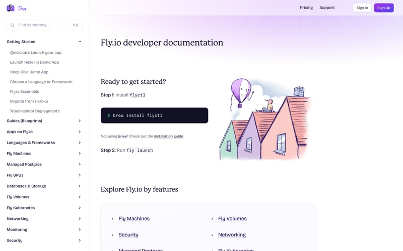
Similar styles
# Fly.io Design System Reference

## Tokens — Colors

| Token | Hex | Usage |
|-------|-----|-------|
| `purple-primary` | `#7C3AED` | Primary brand, CTA buttons, accents |
| `purple-light` | `#8B5CF6` | Hover states, gradients |
| `purple-dark` | `#6D28D9` | Active states, dark accents |
| `pink-primary` | `#EC4899` | Gradient accents, highlights |
| `pink-light` | `#F472B6` | Gradient transitions |
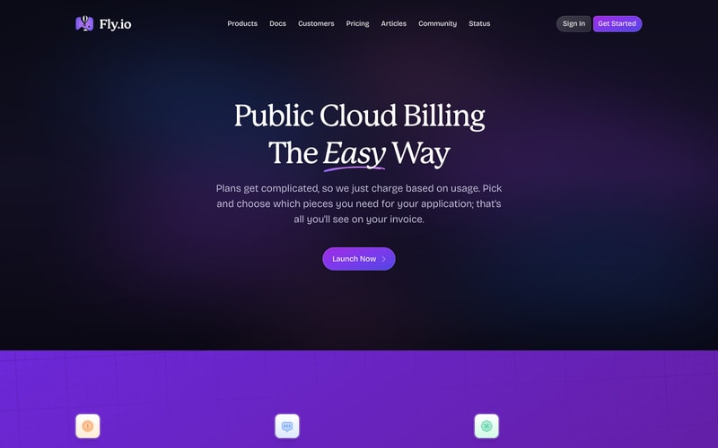
| `navy-900` | `#0F172A` | Dark theme background |
| `navy-800` | `#1E293B` | Dark surfaces, code blocks |
| `navy-700` | `#334155` | Dark borders |
| `slate-900` | `#1E293B` | Primary text (dark) |
| `slate-600` | `#475569` | Secondary text |
| `slate-500` | `#64748B` | Muted text |
| `slate-400` | `#94A3B8` | Disabled text |
| `slate-300` | `#CBD5E1` | Borders |
| `slate-100` | `#F1F5F9` | Light surfaces |
| `slate-50` | `#F8FAFC` | Backgrounds |
| `white` | `#FFFFFF` | Pure white |
| `lavender-tint` | `#FBF7FF` | Light hero backgrounds |
| `blue-tint` | `#E0F2FE` | Gradient backgrounds |
| `coral` | `#FFA07A` | Illustration accent |
| `cyan` | `#67E8F9` | Illustration accent |
| `yellow` | `#FDE047` | Illustration accent |
| `green-code` | `#34D399` | Syntax highlighting |

## Tokens — Typography

**Font Families:**
- Heading: Modern serif (likely Tiempos, Signifier, or similar commercial serif)
- Body: Sans-serif (Inter, system-ui, -apple-system, or similar)
- Code: Monospace (JetBrains Mono, Fira Code, Menlo, or Consolas)

**Type Scale:**

| Token | Size | Line Height | Weight | Usage |
|-------|------|-------------|--------|-------|
| `display-xl` | 72px / 4.5rem | 1.1 | 400 | Hero headlines |
| `display-lg` | 56px / 3.5rem | 1.2 | 400 | Page headlines |
| `heading-1` | 48px / 3rem | 1.2 | 400 | Section headings |
| `heading-2` | 36px / 2.25rem | 1.3 | 400 | Subsection headings |
| `heading-3` | 24px / 1.5rem | 1.4 | 600 | Card headings |
| `body-lg` | 18px / 1.125rem | 1.6 | 400 | Large body text |
| `body` | 16px / 1rem | 1.6 | 400 | Default body |
| `body-sm` | 14px / 0.875rem | 1.5 | 400 | Small text, captions |
| `label` | 12px / 0.75rem | 1.4 | 600 | Labels, uppercase |
| `code` | 14px / 0.875rem | 1.6 | 400 | Code snippets |

## Tokens — Spacing

| Token | Value | Usage |
|-------|-------|-------|
| `space-1` | 4px / 0.25rem | Tight spacing |
| `space-2` | 8px / 0.5rem | Icon gaps |
| `space-3` | 12px / 0.75rem | Small padding |
| `space-4` | 16px / 1rem | Default spacing |
| `space-5` | 20px / 1.25rem | Medium spacing |
| `space-6` | 24px / 1.5rem | Section gaps |
| `space-8` | 32px / 2rem | Large gaps |
| `space-12` | 48px / 3rem | Section padding |
| `space-16` | 64px / 4rem | Large sections |
| `space-24` | 96px / 6rem | Hero padding |
| `space-32` | 128px / 8rem | Major sections |

## Tokens — Border Radius

| Token | Value | Usage |
|-------|-------|-------|
| `radius-sm` | 4px / 0.25rem | Small elements |
| `radius-md` | 8px / 0.5rem | Icon containers |
| `radius-lg` | 12px / 0.75rem | Cards |
| `radius-xl` | 16px / 1rem | Large cards |
| `radius-pill` | 9999px | Buttons, navigation |
| `radius-circle` | 50% | Avatars |

## Tokens — Shadows

| Token | Value |
|-------|-------|
| `shadow-sm` | `0 1px 2px 0 rgba(0, 0, 0, 0.05)` |
| `shadow-md` | `0 4px 6px -1px rgba(0, 0, 0, 0.1), 0 2px 4px -1px rgba(0, 0, 0, 0.06)` |
| `shadow-lg` | `0 10px 15px -3px rgba(0, 0, 0, 0.1), 0 4px 6px -2px rgba(0, 0, 0, 0.05)` |
| `shadow-xl` | `0 20px 25px -5px rgba(0, 0, 0, 0.1), 0 10px 10px -5px rgba(0, 0, 0, 0.04)` |

## Tokens — Borders

| Token | Value |
|-------|-------|
| `border-default` | `1px solid #E2E8F0` |
| `border-muted` | `1px solid #F1F5F9` |
| `border-dark` | `1px solid #334155` |

## Components

### Navigation
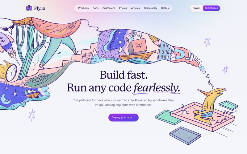
- **Style**: Pill-shaped container with rounded corners (9999px)
- **Background**: White (light theme) / `navy-800` (dark theme)
- **Shadow**: `shadow-md`
- **Padding**: 16px vertical, 24px horizontal
- **Items**: Horizontal flex, gap 24px
- **Font**: Body sans-serif, 16px, 500 weight
- **Hover**: Subtle color shift

### Buttons
- **Primary**: Purple background (`#7C3AED`), white text, pill-shaped
- **Secondary/Ghost**: Transparent background, purple text, pill-shaped border
- **Padding**: 12px 24px
- **Font**: 16px, 500 weight
- **Border radius**: 9999px (pill)
- **Icon**: Right arrow often included
- **Hover**: Slightly darker purple (`#6D28D9`)

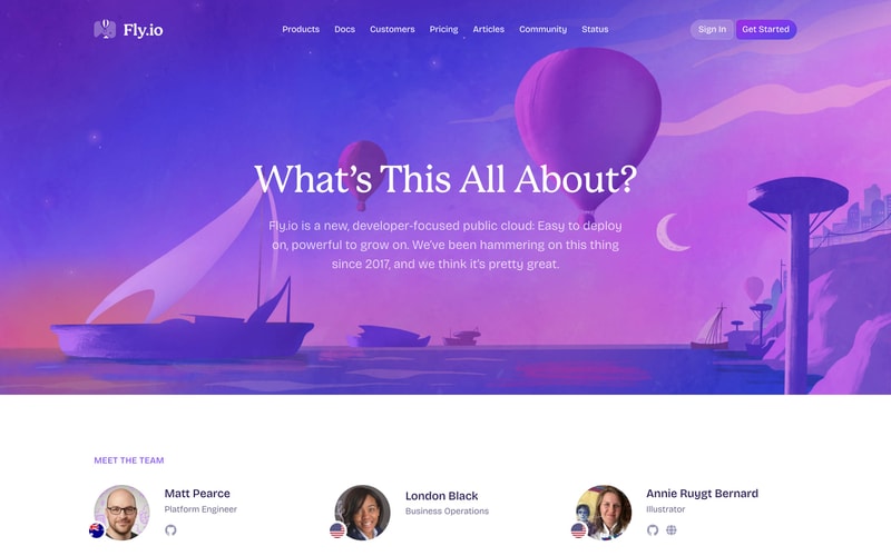
### Cards (Team Members)
- **Background**: White
- **Border radius**: 12px
- **Shadow**: `shadow-sm`
- **Padding**: 24px
- **Avatar**: Circular (50% radius), 80-100px diameter
- **Title**: 18px, 600 weight
- **Subtitle**: 14px, 500 weight, muted color
- **Social icons**: 20px, gray with hover

### Code Blocks
- **Background**: Dark navy (`#1E293B`)
- **Border radius**: 8px
- **Padding**: 16px 20px
- **Font**: Monospace, 14px
- **Syntax**: Green for commands (`#34D399`)
- **Line height**: 1.6

### Sidebar Navigation
- **Background**: Light (`#F8FAFC`)
- **Width**: ~280px
- **Items**: 14px, left-aligned
- **Active**: Purple text, bold
- **Hover**: Subtle background
- **Expandable**: Chevron icons
- **Spacing**: 8px between items

### Search Bar
- **Background**: White
- **Border**: Light gray
- **Border radius**: 8px
- **Padding**: 10px 16px
- **Placeholder**: Gray text
- **Shortcut hint**: Right-aligned, monospace

## Layout Patterns

### Hero Section
- **Height**: 100vh or 700-800px
- **Background**: Gradient (lavender to blue, or purple to pink)
- **Content**: Center-aligned
- **Max width**: 900px
- **Spacing**: 120px top/bottom padding
- **Illustration**: Absolute positioned, decorative

### Container
- **Max width**: 1200px
- **Padding**: 24px horizontal (mobile), 48px (desktop)
- **Margin**: Auto centered

### Grid (Features, Team)
- **Columns**: 3 columns on desktop, 1 on mobile
- **Gap**: 32px
- **Responsive**: CSS Grid or Flexbox

### Gradient Backgrounds
- **Hero**: Linear gradient from `#FBF7FF` to `#E0F2FE`, 45deg
- **Purple section**: Linear gradient from `#7C3AED` to `#EC4899`, 135deg
- **Footer**: Linear gradient from `#6D28D9` to `#7C3AED`, 90deg