2 free brands left today.Sign up — unlimited →
Use this design system
Tokens · motion · components — drop straight into your project.
Download design kitStart a project with it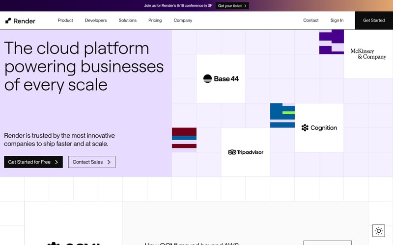
Similar styles
# Render Design System

## Tokens — Colors

| Token | Hex | Usage |
|-------|-----|-------|
| `purple-primary` | `#8B00FF` | Primary brand color, accents, interactive elements, charts |
| `purple-600` | `#A855F7` | Purple variant, secondary accents |
| `purple-300` | `#C084FC` | Light purple accent |
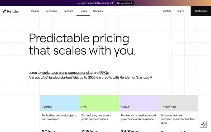
| `purple-200` | `#DDD6FE` | Light purple backgrounds, pricing cards |
| `purple-100` | `#F3F0FF` | Subtle purple tints |
| `purple-dark` | `#2D1B4E` | Top banner background gradient start |
| `cyan-accent` | `#06FFF0` | Accent color for charts, highlights |
| `lime-accent` | `#D4FF4D` | Pricing card background (Pro tier) |
| `blue-accent` | `#B3E5FC` | Pricing card background (Hobby tier) |
| `orange-accent` | `#FF6B35` | Gradient accent, hero text gradient end |
| `black` | `#000000` | Primary text, logos, buttons |
| `white` | `#FFFFFF` | Backgrounds, button text, overlays |
| `gray-900` | `#171717` | Darkest text |
| `gray-700` | `#404040` | Body text |
| `gray-600` | `#525252` | Secondary text |
| `gray-500` | `#737373` | Tertiary text, labels |
| `gray-400` | `#A3A3A3` | Muted text |
| `gray-300` | `#D4D4D4` | Borders, dividers |
| `gray-200` | `#E5E5E5` | Subtle borders, backgrounds |
| `gray-100` | `#F5F5F4` | Card backgrounds |
| `gray-50` | `#FAFAF9` | Page background |
| `cream-bg` | `#F9F8F6` | Warm off-white background |

## Tokens — Typography

**Font Families:**
- Primary: `"ABC Favorit", -apple-system, BlinkMacSystemFont, "Segoe UI", sans-serif`
- Monospace: `"JetBrains Mono", "Courier New", monospace` (for code snippets)

**Type Scale:**

| Token | Size | Line Height | Weight | Usage |
|-------|------|-------------|--------|-------|
| `display-xl` | 96px | 1.0 | 400 | Hero headlines |
| `display-lg` | 72px | 1.1 | 400 | Large headlines |
| `display-md` | 60px | 1.15 | 400 | Page headlines |
| `heading-xl` | 48px | 1.2 | 400 | Section headings |
| `heading-lg` | 36px | 1.25 | 400 | Subheadings |
| `heading-md` | 30px | 1.3 | 500 | Card headings |
| `heading-sm` | 24px | 1.4 | 500 | Small headings |
| `body-lg` | 20px | 1.6 | 400 | Large body text |
| `body-md` | 18px | 1.6 | 400 | Default body text |
| `body-sm` | 16px | 1.5 | 400 | Small body text, nav |
| `caption` | 14px | 1.5 | 400 | Labels, captions |
| `overline` | 12px | 1.5 | 500 | Uppercase labels |

## Tokens — Spacing

**Base unit:** 8px

| Token | Value | Usage |
|-------|-------|-------|
| `space-1` | 8px | Tight spacing |
| `space-2` | 16px | Small gaps |
| `space-3` | 24px | Medium gaps |
| `space-4` | 32px | Large gaps |
| `space-5` | 40px | XL gaps |
| `space-6` | 48px | Section padding |
| `space-8` | 64px | Large section padding |
| `space-10` | 80px | XL section padding |
| `space-12` | 96px | Hero section spacing |
| `space-16` | 128px | XXL section spacing |
| `space-20` | 160px | Hero vertical padding |
| `space-24` | 192px | Massive spacing |

## Tokens — Border Radius

| Token | Value | Usage |
|-------|-------|-------|
| `radius-sm` | 4px | Small elements |
| `radius-md` | 6px | Buttons, inputs |
| `radius-lg` | 12px | Cards |
| `radius-xl` | 16px | Large cards |
| `radius-2xl` | 24px | Feature cards |

## Tokens — Shadows

| Token | Value | Usage |
|-------|-------|-------|
| `shadow-sm` | `0 1px 2px rgba(0,0,0,0.05)` | Subtle lift |
| `shadow-md` | `0 4px 6px rgba(0,0,0,0.07)` | Cards |
| `shadow-lg` | `0 10px 15px rgba(0,0,0,0.1)` | Elevated cards |
| `shadow-xl` | `0 20px 25px rgba(0,0,0,0.15)` | Modals, popovers |

## Tokens — Borders

| Token | Value | Usage |
|-------|-------|-------|
| `border-thin` | 1px | Default borders |
| `border-medium` | 2px | Emphasized borders |
| `border-thick` | 3px | Strong borders |

## Components

### Navigation Bar
- Height: 72px
- Background: White with subtle shadow on scroll
- Logo: Black, ~24px height
- Nav links: 16px, gray-700, hover → black
- Right-aligned: Contact, Sign In (text), Get Started (black button)
- Sticky positioning

### Top Banner
- Height: ~48px
- Background: Linear gradient (purple-dark → orange)
- Text: White, center-aligned
- CTA button: Outlined white button with arrow

### Button Primary
- Background: Black
- Text: White, 16px, medium weight
- Padding: 14px 24px
- Border radius: 6px
- Hover: Slight scale transform or shadow

### Button Secondary
- Background: Transparent
- Border: 2px black
- Text: Black, 16px
- Padding: 12px 24px
- Border radius: 6px

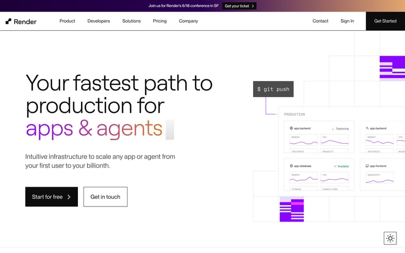
### Card — Dashboard Metric
- Background: White
- Border: 1px gray-200
- Border radius: 12px
- Padding: 20px
- Contains: Label (gray-500, uppercase, 12px), value, chart (purple line)

### Card — Pricing Tier
- Background: Colored (blue-accent, lime-accent, purple-200, gray-200)
- Padding: 32px
- Border radius: 16px
- Heading: 30px, black
- Description: 18px, gray-700
- Price: Large, black

### Hero Section
- Layout: Split 50/50 (text left, visual right)
- Background: cream-bg or gray-50
- Headline: 96px, black with purple accent
- Subhead: 20px, gray-600
- CTA group: Flex row with gap-4

### 404 Illustration
- Pixelated/glitch effect using rectangular blocks
- Colors: Purple primary, purple-600, purple-200, cyan-accent, white
- Arranged in grid pattern to form "404" shape

## Layout Patterns

### Container
- Max width: 1280px
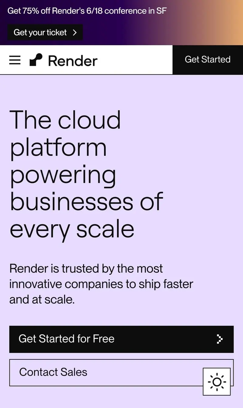
- Horizontal padding: 32px (mobile), 64px (desktop)
- Centered with auto margins

### Grid Background
- Visible on some pages
- Light gray lines (#E5E5E5)
- Creates subtle texture

### Section Spacing
- Vertical padding: 96-160px
- Generous whitespace between sections

### Responsive Breakpoints
- Mobile: < 640px
- Tablet: 768px
- Desktop: 1024px
- Wide: 1280px
- Ultra-wide: 1536px