Use this design system
Tokens · motion · components — drop straight into your project.
Download design kitStart a project with it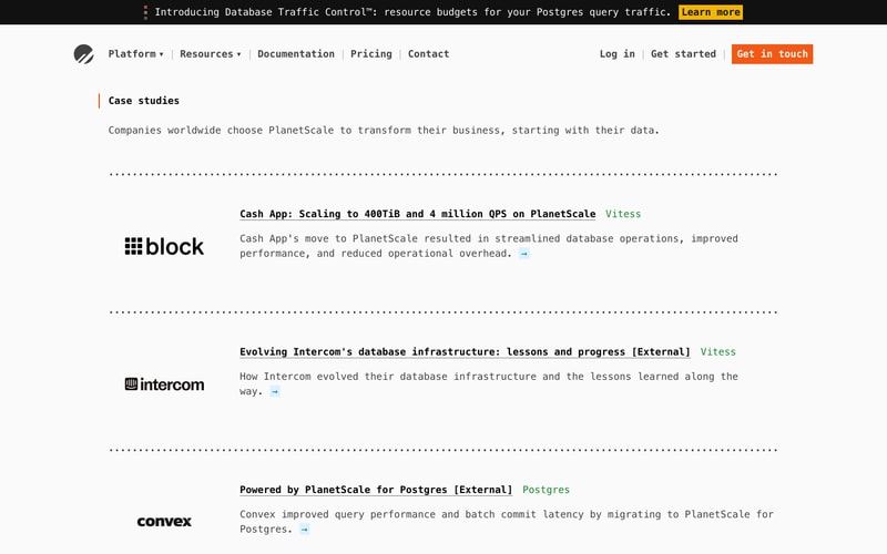
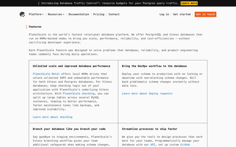
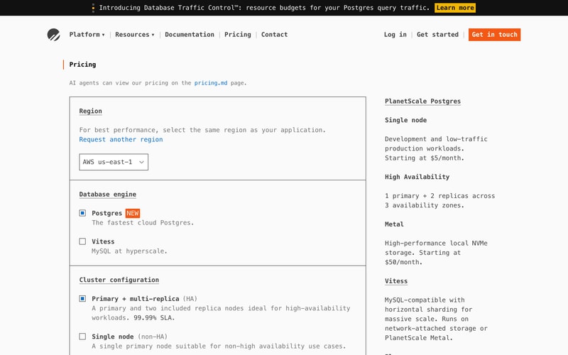
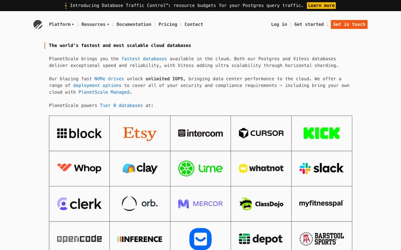
Similar styles
# PlanetScale Design System

## Tokens — Colors

| Token | Hex | Usage |
|-------|-----|-------|
| `orange-600` | `#FF6C37` | Primary CTA buttons, accent borders |
| `orange-700` | `#E85C2A` | Button hover states |
| `blue-600` | `#0066CC` | Links, interactive elements, icons |
| `blue-700` | `#0052A3` | Link hover states |
| `yellow-500` | `#FFC107` | Banner CTA, badges |
| `gray-950` | `#000000` | Top banner background |
| `gray-900` | `#111827` | Headings, primary text |
| `gray-700` | `#374151` | Secondary text |
| `gray-600` | `#6B7280` | Tertiary text, metadata |
| `gray-400` | `#9CA3AF` | Placeholder text |
| `gray-300` | `#D1D5DB` | Disabled text |
| `gray-200` | `#E5E7EB` | Borders, dividers |
| `gray-100` | `#F3F4F6` | Card backgrounds |
| `gray-50` | `#F9FAFB` | Sidebar, page backgrounds |
| `white` | `#FFFFFF` | Primary background, card surfaces |

## Tokens — Typography

**Font Families:**
- Primary: `Inter, -apple-system, BlinkMacSystemFont, "Segoe UI", Roboto, sans-serif`
- Monospace: `"SF Mono", Consolas, Monaco, monospace`

**Type Scale:**

| Token | Size | Line Height | Weight | Usage |
|-------|------|-------------|--------|-------|
| `text-xs` | 12px | 16px | 400 | Captions, labels |
| `text-sm` | 14px | 20px | 400 | Body small, form labels |
| `text-base` | 16px | 24px | 400 | Body text |
| `text-lg` | 18px | 28px | 400 | Large body |
| `text-xl` | 20px | 28px | 500 | Section headings |
| `text-2xl` | 24px | 32px | 600 | Card titles |
| `text-3xl` | 30px | 36px | 700 | Page titles |
| `text-4xl` | 36px | 40px | 700 | Hero headlines |
| `text-5xl` | 48px | 1 | 700 | Large headlines |

**Font Weights:**
- Regular: 400
- Medium: 500
- Semibold: 600
- Bold: 700

## Tokens — Spacing

| Token | Value | Usage |
|-------|-------|-------|
| `space-1` | 4px | Tight spacing |
| `space-2` | 8px | Small gaps |
| `space-3` | 12px | Form element spacing |
| `space-4` | 16px | Card padding, component gaps |
| `space-5` | 20px | Section spacing |
| `space-6` | 24px | Large component spacing |
| `space-8` | 32px | Section margins |
| `space-10` | 40px | Large section spacing |
| `space-12` | 48px | Page section spacing |
| `space-16` | 64px | Hero spacing |
| `space-20` | 80px | Large layout spacing |

## Tokens — Border Radius

| Token | Value | Usage |
|-------|-------|-------|
| `radius-sm` | 4px | Small elements, badges |
| `radius-md` | 6px | Buttons, inputs |
| `radius-lg` | 8px | Cards, panels |
| `radius-xl` | 12px | Large containers |

## Tokens — Shadows

| Token | Value | Usage |
|-------|-------|-------|
| `shadow-xs` | `0 1px 2px rgba(0,0,0,0.05)` | Subtle elevation |
| `shadow-sm` | `0 1px 3px rgba(0,0,0,0.1), 0 1px 2px rgba(0,0,0,0.06)` | Cards, dropdowns |
| `shadow-md` | `0 4px 6px rgba(0,0,0,0.07), 0 2px 4px rgba(0,0,0,0.05)` | Elevated cards |
| `shadow-lg` | `0 10px 15px rgba(0,0,0,0.1), 0 4px 6px rgba(0,0,0,0.05)` | Modals, popovers |

## Tokens — Borders

| Token | Value | Usage |
|-------|-------|-------|
| `border-width` | 1px | Standard borders |
| `border-width-2` | 2px | Emphasized borders |
| `border-width-4` | 4px | Accent left borders |
| `border-color` | `#E5E7EB` | Default border color |

## Components

### Navigation
- Fixed header with dropdown menus
- Logo left-aligned
- Primary navigation center-left
- Auth/CTA buttons right-aligned
- Dropdown indicators (▾)
- Mobile-responsive hamburger menu

### Buttons
- **Primary**: Orange background (#FF6C37), white text, 6px radius, 12px vertical / 24px horizontal padding
- **Secondary**: White background, gray border, gray text
- **Ghost**: Transparent, blue text on hover
- **Sizes**: SM (8px/16px padding), MD (12px/24px), LG (16px/32px)

### Cards
- White background
- 1px gray-200 border
- 8px border radius
- 24px padding
- Subtle shadow (shadow-sm)
- Optional icon at top (blue)

### Forms
- **Input**: 1px border, 6px radius, 12px padding, gray-200 border
- **Select**: Dropdown arrow right-aligned, same styling as input
- **Radio/Checkbox**: Blue accent when selected
- **Label**: 14px text, gray-700, medium weight

### Badges
- Small pill shape (4px radius)
- Uppercase text (11px)
- Padding: 2px 8px
- Colors: Orange "NEW", Yellow for emphasis

### Banner/Alert
- Full-width
- Black background
- Yellow CTA button
- Icon indicator (emoji or svg)
- Dismissible

### Logo Grid
- Equal-width cells
- 1px borders (gray-200)
- Centered logos
- Grayscale with hover color

### Sidebar Navigation
- Gray-50 background
- 16px padding
- Hierarchical structure
- Active state: bold text or accent indicator
- Hover: background highlight

## Layout Patterns

### Container
- Max-width: 1280px
- Horizontal padding: 24px (mobile), 48px (tablet), 64px (desktop)
- Centered

### Grid
- 2-column for feature cards (desktop)
- 1-column (mobile/tablet)
- Gap: 24px

### Section Spacing
- Vertical: 64px (mobile), 96px (desktop)
- Consistent vertical rhythm

### Content Width
- Prose: max 65ch for readability
- Full-width for grids and tables