2 free brands left today.Sign up — unlimited →
Use this design system
Tokens · motion · components — drop straight into your project.
Download design kitStart a project with it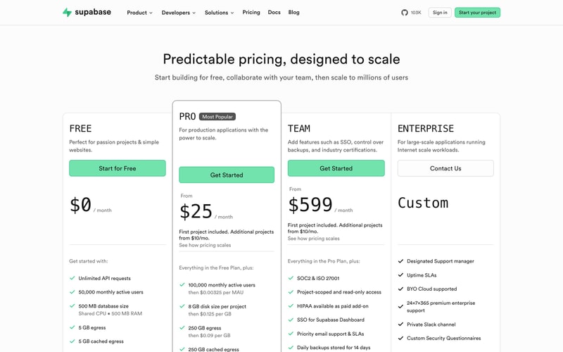
Similar styles
# Supabase Design System

## Tokens — Colors

| Token | Hex | Usage |
|-------|-----|-------|
| `--color-brand-primary` | `#3ECF8E` | Primary brand color, CTA buttons, hero text accent, logo |
| `--color-brand-hover` | `#2FB87A` | Primary button hover state |
| `--color-bg-primary` | `#FFFFFF` | Main background, cards, modals |
| `--color-bg-secondary` | `#F8F9FA` | Subtle background sections, alternating content |
| `--color-bg-tertiary` | `#F3F4F6` | Lighter accent backgrounds |
| `--color-text-primary` | `#1F1F1F` | Headings, primary body text |
| `--color-text-secondary` | `#6B7280` | Subheadings, captions, metadata |
| `--color-text-tertiary` | `#9CA3AF` | Placeholder text, disabled states |
| `--color-border-default` | `#E5E7EB` | Borders, dividers, card outlines |
| `--color-border-subtle` | `#F3F4F6` | Subtle borders, light separators |
| `--color-code-bg` | `#1F1F1F` | Code block backgrounds |
| `--color-code-text` | `#E5E7EB` | Code block text |
| `--color-code-keyword` | `#3ECF8E` | Code syntax highlighting (keywords) |
| `--color-code-string` | `#F97316` | Code syntax highlighting (strings) |
| `--color-code-function` | `#8B5CF6` | Code syntax highlighting (functions) |
| `--color-icon-default` | `#6B7280` | Default icon color |
| `--color-icon-active` | `#1F1F1F` | Active/selected icon color |
| `--color-overlay` | `rgba(0, 0, 0, 0.5)` | Modal overlays, backdrops |

## Tokens — Typography

### Font Families
- **Primary**: `"custom-font", -apple-system, BlinkMacSystemFont, "Segoe UI", sans-serif`
- **Monospace**: `"SF Mono", "Monaco", "Inconsolata", "Roboto Mono", monospace`

### Type Scale

| Token | Size | Line Height | Weight | Usage |
|-------|------|-------------|--------|-------|
| `--font-display-xl` | 72px | 1.1 | 700 | Hero headlines |
| `--font-display-lg` | 56px | 1.1 | 700 | Large hero text |
| `--font-heading-1` | 48px | 1.2 | 700 | Page headings |
| `--font-heading-2` | 32px | 1.3 | 700 | Section headings |
| `--font-heading-3` | 24px | 1.4 | 600 | Subsection headings |
| `--font-heading-4` | 20px | 1.4 | 600 | Card titles |
| `--font-body-lg` | 18px | 1.6 | 400 | Large body text |
| `--font-body` | 16px | 1.6 | 400 | Default body text |
| `--font-body-sm` | 14px | 1.5 | 400 | Small body text, captions |
| `--font-body-xs` | 12px | 1.4 | 400 | Tiny labels, metadata |
| `--font-code` | 14px | 1.6 | 400 | Code blocks, inline code |

## Tokens — Spacing

| Token | Value | Usage |
|-------|-------|-------|
| `--space-1` | 4px | Tight spacing, icon gaps |
| `--space-2` | 8px | Small gaps, compact layouts |
| `--space-3` | 12px | Button padding vertical |
| `--space-4` | 16px | Default gap, card padding |
| `--space-5` | 20px | Medium gaps |
| `--space-6` | 24px | Section gaps |
| `--space-8` | 32px | Large gaps between elements |
| `--space-10` | 40px | Extra large gaps |
| `--space-12` | 48px | Section spacing |
| `--space-16` | 64px | Large section spacing |
| `--space-20` | 80px | XL section spacing |
| `--space-24` | 96px | Hero section padding |

## Tokens — Radii

| Token | Value | Usage |
|-------|-------|-------|
| `--radius-sm` | 4px | Small elements |
| `--radius-md` | 6px | Buttons, inputs |
| `--radius-lg` | 8px | Cards, code blocks |
| `--radius-xl` | 12px | Large cards, modals |
| `--radius-full` | 9999px | Avatars, pills, badges |

## Tokens — Shadows

| Token | Value | Usage |
|-------|-------|-------|
| `--shadow-sm` | `0 1px 2px rgba(0, 0, 0, 0.05)` | Subtle elevation |
| `--shadow-md` | `0 4px 6px rgba(0, 0, 0, 0.07)` | Card elevation |
| `--shadow-lg` | `0 10px 15px rgba(0, 0, 0, 0.1)` | Dropdown, popover |
| `--shadow-xl` | `0 20px 25px rgba(0, 0, 0, 0.15)` | Modal, dialog |

## Tokens — Borders

| Token | Value | Usage |
|-------|-------|-------|
| `--border-width` | 1px | Default border width |
| `--border-width-thick` | 2px | Emphasized borders, focus states |

## Components

### Navigation Bar
- Height: ~64px
- Background: White with subtle border-bottom
- Logo + text links + icon links (GitHub) + auth buttons
- Dropdown indicators for expandable menus
- Sticky positioning on scroll

### Buttons

**Primary Button:**
- Background: `--color-brand-primary`
- Text: White
- Padding: 12px 24px
- Border radius: `--radius-md`
- Font: 16px, weight 500
- Hover: Darker green background

**Secondary Button:**
- Background: White
- Text: `--color-text-primary`
- Border: 1px solid `--color-border-default`
- Padding: 12px 24px
- Border radius: `--radius-md`
- Hover: Light gray background

### Tabs
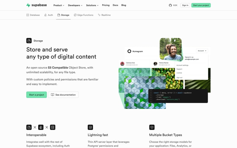
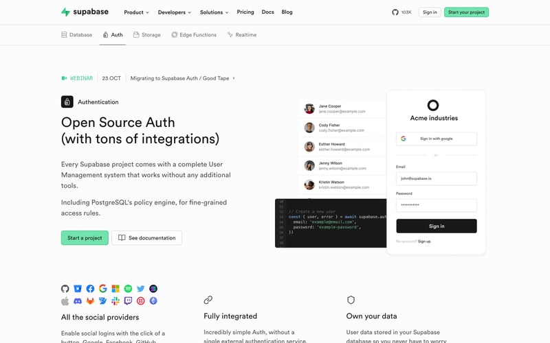
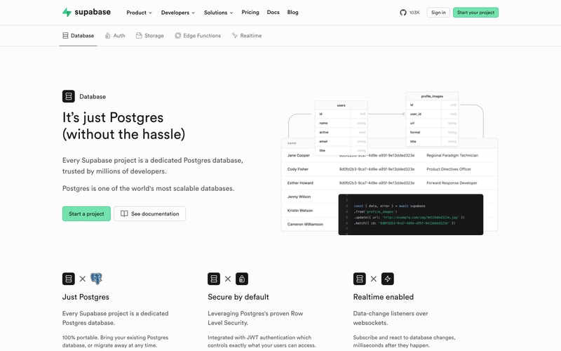
- Horizontal layout with icons + text
- Active state: Underline border (2px), darker text
- Inactive state: Gray text, no border
- Icon + label pattern
- Spacing: 24-32px between tabs

### Cards
- Background: White
- Border: 1px solid `--color-border-default` (optional)
- Border radius: `--radius-lg`
- Padding: 24-32px
- Shadow: `--shadow-md` on hover
- Icon at top, heading, description pattern

### Code Blocks
- Background: `--color-code-bg` (dark)
- Padding: 24px
- Border radius: `--radius-lg`
- Line numbers in gray
- Syntax highlighting with brand green, orange, purple
- Font: Monospace, 14px

### Avatar
- Circle (border-radius: 50%)
- Sizes: 32px, 40px, 48px
- Border: Optional 2px white border with shadow

### Form Elements

**Input:**
- Border: 1px solid `--color-border-default`
- Border radius: `--radius-md`
- Padding: 10px 12px
- Font: 16px
- Focus: Blue border or brand color border

**Dropdown:**
- White background
- Border: 1px solid `--color-border-default`
- Border radius: `--radius-lg`
- Shadow: `--shadow-lg`
- Padding: 8px 0
- Items: 40px height, 12px padding horizontal

## Layout Patterns

### Hero Section
- Centered text alignment
- Max width: ~800px for content
- Vertical padding: 96-128px
- Large headline with accent color on key phrase
- Subheading + CTA buttons below
- Partner logos in grayscale at bottom

### Feature Grid
- 3-column grid on desktop
- Gap: 32-48px
- Each item: Icon + heading + description
- Responsive: 1 column on mobile

### Content Section
- Two-column layout: Text left, visual right (or vice versa)
- Vertical alignment: center
- Max width: 1280px container
- Gap: 64-96px between columns

### Tab Navigation Pattern
- Horizontal tabs below main nav
- Content switches based on active tab
- Consistent layout structure across tabs