Use this design system
Tokens · motion · components — drop straight into your project.
Download design kitStart a project with it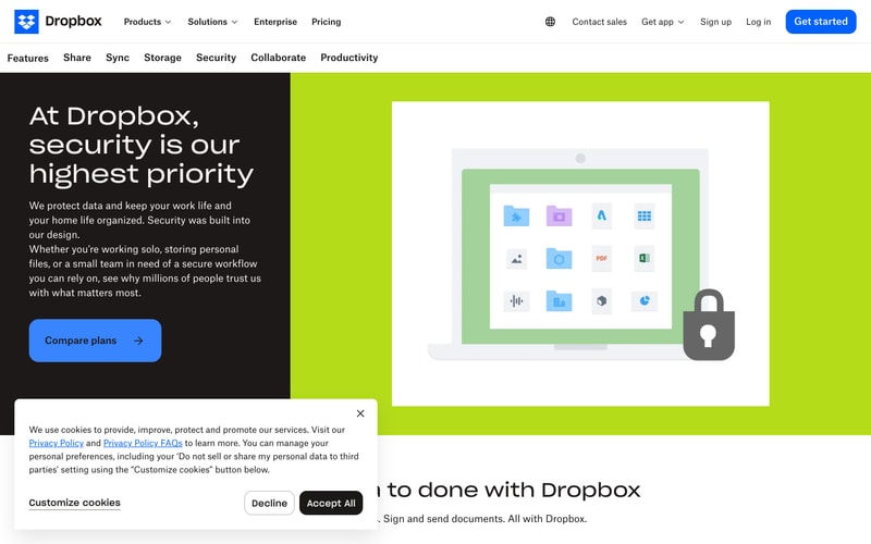
Similar styles
# Dropbox Design System

## Tokens — Colors

| Token | Value | Usage |
|-------|-------|-------|
| `primary-blue` | `#0061FF` | Primary CTA buttons, links, brand accent |
| `blue-hover` | `#0052E0` | Button hover states |
| `black` | `#1E1919` | Dark backgrounds, headings on light |
| `white` | `#FFFFFF` | Light backgrounds, text on dark |
| `gray-50` | `#F7F5F2` | Page background, subtle surfaces |
| `gray-100` | `#F0EEEB` | Card backgrounds, dividers |
| `gray-400` | `#9CA3AF` | Muted text, disabled states |
| `gray-600` | `#637381` | Secondary text |
| `gray-800` | `#3D4451` | Primary text on light |
| `accent-lime` | `#C6F72B` | "Best Value" badges, highlights |
| `blue-50` | `#F0F5FF` | Light blue backgrounds |
| `blue-100` | `#D6E4FF` | Subtle accents |
| `blue-300` | `#A8C7FA` | Illustration backgrounds |
| `red-accent` | `#FF6B6B` | PDF badges, alerts |
| `green-success` | `#00D084` | Success states, checkmarks |

## Tokens — Typography

**Font Families:**
- Primary: `"Sharp Sans"`, `"AtlasGrotesk"`, `-apple-system`, `BlinkMacSystemFont`, `"Segoe UI"`, `Helvetica`, `Arial`, sans-serif
- Monospace: `"SF Mono"`, `Monaco`, `Consolas`, monospace

**Type Scale:**

| Token | Size | Line Height | Weight | Usage |
|-------|------|-------------|--------|-------|
| `display-xl` | `72px` | `1.1` | `700` | Hero headlines |
| `display-lg` | `60px` | `1.15` | `700` | Page headlines |
| `heading-1` | `48px` | `1.2` | `700` | Section headings |
| `heading-2` | `36px` | `1.25` | `600` | Subsection headings |
| `heading-3` | `24px` | `1.3` | `600` | Card titles |
| `body-lg` | `18px` | `1.6` | `400` | Large body text |
| `body` | `16px` | `1.5` | `400` | Default body text |
| `body-sm` | `14px` | `1.5` | `400` | Captions, metadata |
| `button` | `16px` | `1` | `600` | Button labels |

## Tokens — Spacing

Base unit: `8px`

| Token | Value | Usage |
|-------|-------|-------|
| `space-1` | `8px` | Tight spacing, icon gaps |
| `space-2` | `16px` | Element margins |
| `space-3` | `24px` | Section padding |
| `space-4` | `32px` | Component spacing |
| `space-6` | `48px` | Large gaps |
| `space-8` | `64px` | Section margins |
| `space-12` | `96px` | Hero padding |
| `space-16` | `128px` | Page sections |

## Tokens — Border Radius

| Token | Value | Usage |
|-------|-------|-------|
| `radius-sm` | `6px` | Badges, tags |
| `radius-md` | `8px` | Buttons, inputs |
| `radius-lg` | `12px` | Cards, panels |
| `radius-xl` | `16px` | Large cards, modals |
| `radius-2xl` | `24px` | Hero elements |

## Tokens — Shadows

| Token | Value |
|-------|-------|
| `shadow-sm` | `0 1px 3px rgba(0, 0, 0, 0.06)` |
| `shadow-md` | `0 4px 12px rgba(0, 0, 0, 0.08)` |
| `shadow-lg` | `0 12px 24px rgba(0, 0, 0, 0.12)` |
| `shadow-button` | `0 2px 8px rgba(0, 97, 255, 0.24)` |

## Tokens — Borders

| Token | Value |
|-------|-------|
| `border-width` | `1px` |
| `border-color` | `#E5E7EB` |
| `border-color-dark` | `#D1D5DB` |

## Components

### Button — Primary

**Specs:**
- Background: `primary-blue` (#0061FF)
- Color: `white`
- Padding: `14px 24px`
- Border radius: `8px`
- Font size: `16px`
- Font weight: `600`
- Hover: `blue-hover` (#0052E0) with `shadow-button`
- Arrow icon: right-aligned, 20px

### Button — Secondary

**Specs:**
- Background: `transparent`
- Border: `1px solid gray-800`
- Color: `gray-800`
- Padding: `14px 24px`
- Border radius: `8px`
- Hover: background `gray-50`

### Navigation Bar

**Specs:**
- Height: `72px`
- Background: `white` with subtle shadow
- Logo: 32px height
- Link spacing: `32px`
- Dropdown indicator: chevron down icon

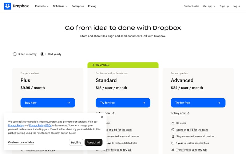
### Pricing Card

**Specs:**
- Background: `white`
- Border: `1px solid gray-100`
- Border radius: `12px`
- Padding: `32px 24px`
- Shadow: `shadow-sm`
- Badge (Best Value): `accent-lime` background, `black` text, `6px` radius

### Radio Button

**Specs:**
- Size: `20px`
- Border: `2px solid gray-400`
- Checked: `black` fill with white center ring
- Label spacing: `12px`

### File/Folder Icons

**Specs:**
- Size: `48px` (small), `80px` (medium)
- Border radius: `8px`
- Shadow: `shadow-sm`
- Background varies by file type (blue folders, gray documents, red PDF)

## Layout Patterns

### Hero Section

**Structure:**
- Container: max-width `1280px`, centered
- Grid: 2 columns (text left, visual right) on desktop
- Text column: max-width `600px`
- Padding: `96px 32px`
- Background: `gray-50` or full-width gradient

### Pricing Grid

**Structure:**
- Container: max-width `1280px`
- Grid: 4 columns on desktop, 1 on mobile
- Gap: `24px`
- Card alignment: stretch

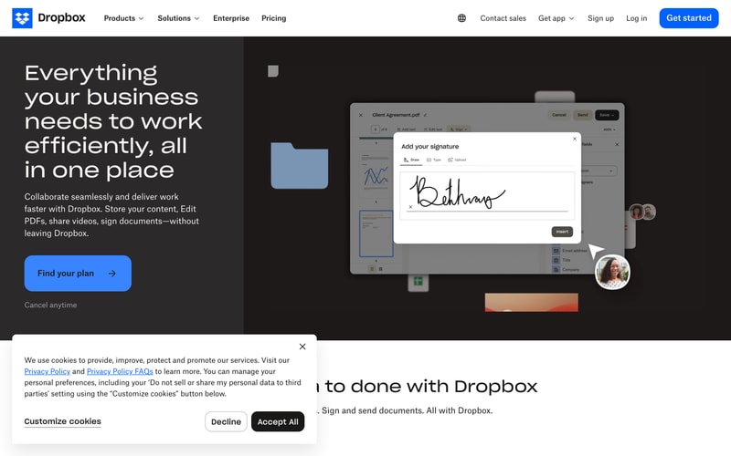
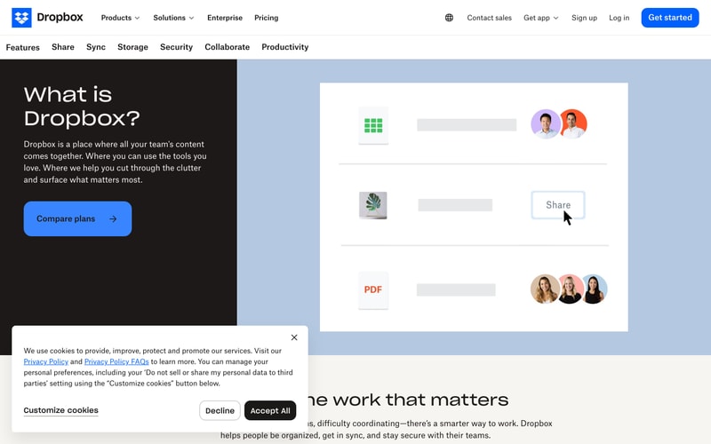
### Split Layout (Dark/Light)

**Structure:**
- Container: full-width
- Grid: 2 columns, 50/50 split on desktop
- Left: dark background (#1E1919), white text
- Right: light/colored background with visual
- Padding: `64px 48px` per side

### Navigation

**Structure:**
- Container: full-width, fixed top
- Inner: max-width `1440px`, centered
- Padding: `16px 32px`
- Items: space-between alignment
- Right group: `16px` gap