2 free brands left today.Sign up — unlimited →
Use this design system
Tokens · motion · components — drop straight into your project.
Download design kitStart a project with it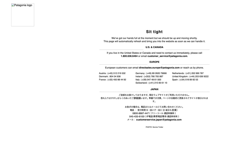
Similar styles
# Patagonia Design System

## Overview
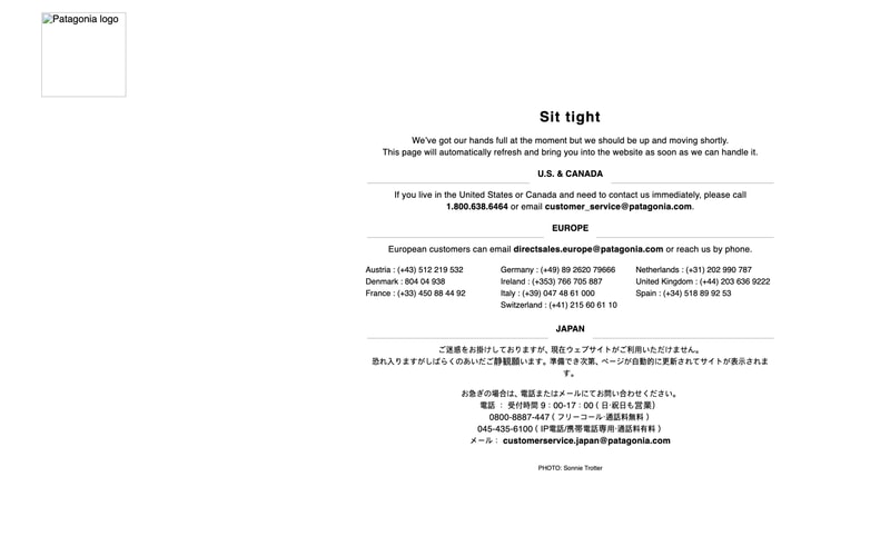
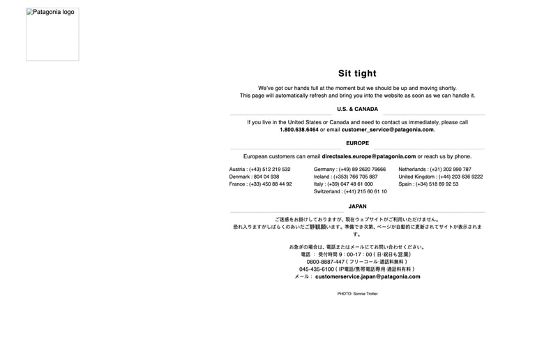
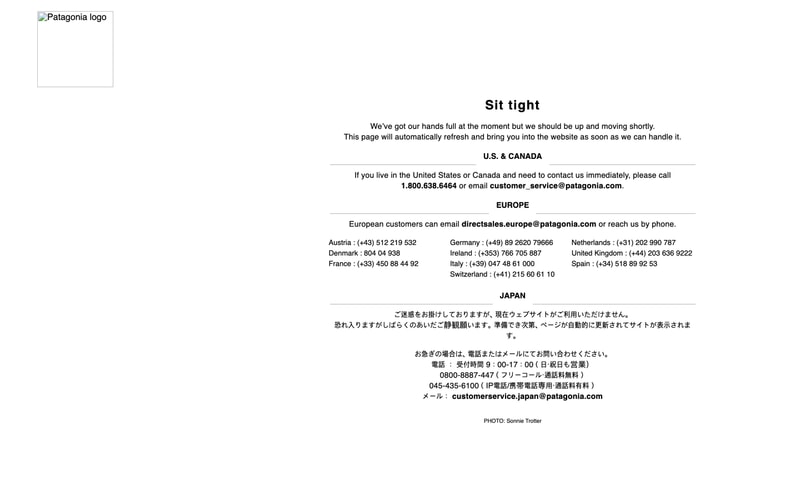
Extracted from Patagonia's maintenance page. Clean, minimal aesthetic with a focus on typography and whitespace.

---

## Tokens — Colors

| Token | Hex | Usage |
|-------|-----|-------|
| background-primary | #FAF9F6 | Page background, main surface |
| background-secondary | #FFFFFF | Card backgrounds, elevated surfaces |
| text-primary | #000000 | Headings, body text, primary content |
| text-secondary | #1A1A1A | Secondary text, captions |
| border-default | #DCDCDC | Dividers, horizontal rules |
| border-light | #E8E8E8 | Subtle borders, separators |

---

## Tokens — Typography

### Font Families
- **Serif**: Georgia, "Times New Roman", serif (for headings)
- **Sans-Serif**: "Helvetica Neue", Helvetica, Arial, sans-serif (for body)

### Type Scale

| Token | Size | Weight | Line Height | Usage |
|-------|------|--------|-------------|-------|
| heading-xl | 44px | 700 | 1.2 | Main page heading ("Sit tight") |
| heading-lg | 32px | 700 | 1.3 | Section headings |
| heading-md | 18px | 700 | 1.4 | Subsection headings |
| heading-sm | 14px | 700 | 1.4 | Regional headers (U.S. & CANADA) |
| body-lg | 16px | 400 | 1.6 | Main body text |
| body-md | 14px | 400 | 1.6 | Secondary body text |
| body-sm | 13px | 400 | 1.5 | Contact details, fine print |
| caption | 11px | 400 | 1.4 | Photo credits, legal text |

---

## Tokens — Spacing

| Token | Value | Usage |
|-------|-------|-------|
| space-xs | 8px | Tight inline spacing |
| space-sm | 16px | Small component padding |
| space-md | 24px | Standard component spacing |
| space-lg | 32px | Section padding |
| space-xl | 48px | Large section gaps |
| space-2xl | 64px | Major section dividers |
| space-3xl | 96px | Hero spacing |

---

## Tokens — Borders

| Token | Value | Usage |
|-------|-------|-------|
| border-width-thin | 1px | Default borders, dividers |
| border-width-medium | 2px | Emphasized borders |
| border-radius-none | 0px | Sharp corners (used throughout) |
| border-radius-sm | 2px | Subtle rounding (if needed) |

---

## Tokens — Shadows

Minimal shadow usage observed. Flat design approach.

| Token | Value | Usage |
|-------|-------|-------|
| shadow-none | none | Default state |
| shadow-sm | 0 1px 2px rgba(0,0,0,0.05) | Subtle elevation (rare) |

---

## Components

### Logo
- Fixed width: ~130px
- Positioned top-left with 32px padding
- Black wordmark on transparent background

### Horizontal Divider
- 1px solid border
- Color: #DCDCDC
- Full width with horizontal margins
- Spacing: 48px top/bottom

### Section Header
- Bold sans-serif
- All caps
- 14px size
- Centered alignment
- 32px bottom margin

### Contact Block
- Multi-column layout (3 columns on desktop)
- 14px body text
- 1.6 line-height
- Links styled as inline text (no underline by default)
- Bold for emphasis (phone numbers, emails)

### Content Container
- Max-width: 680px
- Centered with auto margins
- Responsive padding: 24px mobile, 32px desktop

---

## Layout Patterns

### Centered Single Column
- Container max-width: 680px
- Horizontal centering via auto margins
- Vertical rhythm: 48px between major sections
- 24px between related elements

### Multi-Column Contact Grid
- Desktop: 3 columns
- Tablet: 2 columns
- Mobile: 1 column stacked
- Gap: 24px horizontal, 16px vertical

### Typography Hierarchy
- Heading with 48px bottom margin
- Subheading with 24px bottom margin
- Paragraph with 16px bottom margin
- Tight spacing for related info (8px)

---

## Design Principles

1. **Minimal**: Clean, uncluttered layout with generous whitespace
2. **Typography-first**: Strong typographic hierarchy drives the design
3. **Centered alignment**: Content centered for focus and readability
4. **Flat design**: No shadows or gradients, emphasis on content
5. **Responsive**: Adapts gracefully from mobile to desktop