2 free brands left today.Sign up — unlimited →
Use this design system
Tokens · motion · components — drop straight into your project.
Download design kitStart a project with it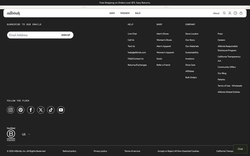
Similar styles
# Allbirds Design System

## Tokens — Colors

| Token | Hex | Usage |
|-------|-----|-------|
| `background-primary` | `#212121` | Main dark background |
| `background-secondary` | `#2a2a2a` | Banner, elevated surfaces |
| `background-input` | `#ffffff` | Input fields, buttons |
| `text-primary` | `#ffffff` | Primary text on dark |
| `text-secondary` | `#b3b3b3` | Secondary text, placeholders |
| `text-inverse` | `#000000` | Text on light backgrounds |
| `border-subtle` | `#404040` | Subtle borders, dividers |
| `icon-primary` | `#ffffff` | Icon color on dark |

## Tokens — Typography

**Font Families:**
- Primary: System sans-serif stack (likely `-apple-system, BlinkMacSystemFont, "Segoe UI", Roboto, Helvetica, Arial, sans-serif`)
- Logo: Custom script font (handwritten style)

**Type Scale:**

| Name | Size | Weight | Line Height | Usage |
|------|------|--------|-------------|-------|
| `text-xs` | 12px | 400 | 1.4 | Footer legal, small print |
| `text-sm` | 14px | 400 | 1.5 | Body text, links |
| `text-base` | 16px | 400 | 1.6 | Input text, standard copy |
| `text-section` | 13px | 700 | 1.4 | Section headings (all caps) |
| `text-nav` | 14px | 500 | 1.5 | Navigation links |
| `text-logo` | 32px | 400 | 1.0 | Logo script |

**Text Transforms:**
- Section headings: `text-transform: uppercase`
- Letter spacing on caps: `letter-spacing: 0.08em`

## Tokens — Spacing

| Token | Value | Usage |
|-------|-------|-------|
| `space-1` | 4px | Micro spacing |
| `space-2` | 8px | Icon padding |
| `space-3` | 12px | Small gaps |
| `space-4` | 16px | Standard padding |
| `space-5` | 20px | List item spacing |
| `space-6` | 24px | Column gaps |
| `space-8` | 32px | Section spacing |
| `space-10` | 40px | Large section padding |
| `space-12` | 48px | Major section breaks |
| `space-16` | 64px | Hero section padding |

## Tokens — Radii

| Token | Value | Usage |
|-------|-------|-------|
| `radius-sm` | 4px | Small elements |
| `radius-md` | 8px | Buttons, cards |
| `radius-lg` | 16px | Large containers |
| `radius-full` | 9999px | Pills, circular elements |

## Tokens — Shadows

| Token | Value | Usage |
|-------|-------|-------|
| `shadow-sm` | `0 1px 2px rgba(0,0,0,0.3)` | Subtle elevation |
| `shadow-md` | `0 4px 8px rgba(0,0,0,0.4)` | Cards, dropdowns |
| `shadow-lg` | `0 8px 16px rgba(0,0,0,0.5)` | Modals, overlays |

## Tokens — Borders

| Token | Value | Usage |
|-------|-------|-------|
| `border-width` | 1px | Default border |
| `border-width-thick` | 2px | Emphasis borders |
| `border-color` | `#404040` | Default border color |

## Components

### Email Subscription Form
- Pill-shaped container (`border-radius: 50px`)
- White background with integrated input and button
- Input: Placeholder text in gray (#6b6b6b)
- Button: "SIGN UP" in uppercase, black text, seamless integration
- Full-width on mobile, fixed width on desktop (~400px)

### Social Media Icons
- Circular icon buttons (40px × 40px)
- White stroke outlines (2px)
- Transparent background
- Hover state: filled white background
- Icons: Instagram, Pinterest, Facebook, X (Twitter), TikTok, YouTube

### Footer Navigation
- 4-column grid layout
- Column headers: All caps, bold, white text
- Link lists: Regular weight, white text with hover state
- Spacing: 20px between links vertically
- Responsive: Stacks to single column on mobile

### Navigation Header
- White background (inverted from footer)
- Centered logo
- Horizontal menu items (MEN, WOMEN, SALE)
- Right-aligned utilities (About, Search, Account, Help, Cart)
- Sticky positioning

### Promotional Banner
- Dark background (#2a2a2a)
- Centered white text
- Inline link with underline
- Full-width, dismissible

### B Corp Badge
- Circular certification logo
- White on transparent
- "Certified B Corporation" text
- Fixed size (60px × 60px)

### Country Selector
- Dropdown with flag icon
- Shows "US" with chevron down
- White text on dark background
- Positioned in footer

## Layout Patterns

### Container System
- Max-width: 1440px
- Horizontal padding: 40px desktop, 20px mobile
- Centered alignment

### Grid System
- Footer: 4-column grid, gap: 32px
- Responsive breakpoints: 1024px, 768px, 480px

### Vertical Rhythm
- Section spacing: 64px
- Component spacing: 24px
- List item spacing: 20px

### Footer Layout
- Background: #212121
- Padding: 64px 40px
- Email subscription at top
- 4-column navigation grid
- Social icons below navigation
- Legal/utility links at bottom
- Country selector bottom left
- Copyright bottom center