Use this design system
Tokens · motion · components — drop straight into your project.
Download design kitStart a project with it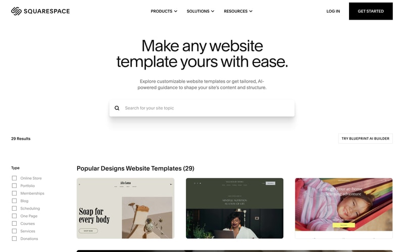
Similar styles
# Squarespace Design System

## Tokens — Colors

| Token | Hex | Usage |
|-------|-----|-------|
| `black` | `#000000` | Primary text, navigation bar, footer sections, backgrounds |
| `white` | `#FFFFFF` | Text on dark backgrounds, buttons, page sections |
| `gray-50` | `#FAFAFA` | Light background sections |
| `gray-100` | `#F5F5F5` | Subtle backgrounds |
| `gray-900` | `#1A1A1A` | Dark backgrounds, footer |
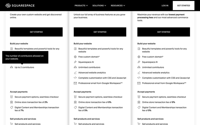
| `beige` | `#E8DDD3` | Template preview backgrounds, warm neutrals |
| `coral` | `#FF8585` | Accent labels, decorative elements |
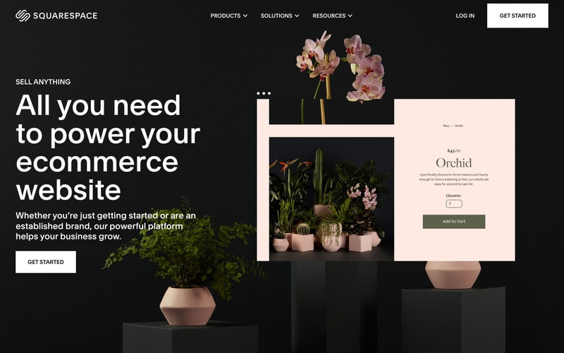
| `blush` | `#FFE8E5` | Product detail backgrounds, soft accents |
| `sage` | `#6B7761` | Primary CTA buttons (Add to Cart), success states |
| `pink-accent` | `#FF9999` | Label highlights, interactive accents |

## Tokens — Typography

### Font Families
- **Primary**: System font stack or custom geometric sans-serif (similar to "Helvetica Neue", "Inter", or proprietary)
- **Fallback**: `-apple-system, BlinkMacSystemFont, "Segoe UI", Roboto, sans-serif`

### Type Scale
| Token | Size | Line Height | Weight | Usage |
|-------|------|-------------|--------|-------|
| `display-xl` | `96px` | `1.1` | `400` | Hero headlines |
| `display-lg` | `72px` | `1.1` | `400` | Section headlines |
| `heading-xl` | `48px` | `1.2` | `400` | Page titles |
| `heading-lg` | `36px` | `1.3` | `400` | Section headings |
| `heading-md` | `24px` | `1.4` | `400` | Card titles |
| `body-lg` | `18px` | `1.6` | `400` | Large body text, hero subtext |
| `body` | `16px` | `1.5` | `400` | Default body text |
| `body-sm` | `14px` | `1.5` | `400` | Secondary text, captions |
| `label` | `14px` | `1.4` | `500` | Form labels, navigation |
| `button` | `16px` | `1.5` | `500` | Button text |

## Tokens — Spacing

| Token | Value | Usage |
|-------|-------|-------|
| `spacing-1` | `4px` | Micro spacing |
| `spacing-2` | `8px` | Small gaps |
| `spacing-3` | `12px` | Input padding |
| `spacing-4` | `16px` | Default spacing |
| `spacing-6` | `24px` | Medium gaps |
| `spacing-8` | `32px` | Large spacing, section padding |
| `spacing-12` | `48px` | Extra large spacing |
| `spacing-16` | `64px` | Section margins |
| `spacing-24` | `96px` | Hero section padding |
| `spacing-32` | `128px` | Major section spacing |

## Tokens — Border Radius

| Token | Value | Usage |
|-------|-------|-------|
| `radius-none` | `0px` | Sharp edges, most buttons |
| `radius-sm` | `2px` | Subtle rounding |
| `radius-md` | `4px` | Input fields, cards |
| `radius-lg` | `8px` | Large cards, modals |

## Tokens — Shadows

| Token | Value | Usage |
|-------|-------|-------|
| `shadow-sm` | `0 1px 2px rgba(0, 0, 0, 0.05)` | Subtle elevation |
| `shadow-md` | `0 4px 12px rgba(0, 0, 0, 0.1)` | Cards, dropdowns |
| `shadow-lg` | `0 10px 40px rgba(0, 0, 0, 0.15)` | Modals, overlays |
| `shadow-overlay` | `0 20px 60px rgba(0, 0, 0, 0.25)` | Product previews, popovers |

## Tokens — Borders

| Token | Value | Usage |
|-------|-------|-------|
| `border-light` | `1px solid rgba(255, 255, 255, 0.2)` | Light borders on dark backgrounds |
| `border-dark` | `1px solid rgba(0, 0, 0, 0.1)` | Dark borders on light backgrounds |
| `border-strong` | `2px solid #000000` | Emphasized borders, outlined buttons |

## Components

### Navigation Bar
- **Height**: 80px
- **Background**: Black with 95% opacity when scrolling
- **Padding**: 16px 32px
- **Logo**: White SVG, 40px height
- **Menu Items**: 14px, white, uppercase tracking, 12px spacing
- **Dropdowns**: Chevron icons, fade-in animation
- **CTA Button**: White background, black text, 12px 24px padding

### Buttons

#### Primary
- **Background**: `#FFFFFF`
- **Color**: `#000000`
- **Padding**: `16px 48px`
- **Font**: 16px, weight 500
- **Border**: None
- **Hover**: Slight scale (1.02), shadow increase

#### Secondary (Outlined)
- **Background**: Transparent
- **Color**: `#000000`
- **Border**: `2px solid #000000`
- **Padding**: `14px 46px`
- **Hover**: Background fade to black, text to white

#### CTA (Sage)
- **Background**: `#6B7761`
- **Color**: `#FFFFFF`
- **Padding**: `16px 32px`
- **Border Radius**: 2px

### Promotional Banner
- **Background**: `#000000`
- **Height**: 40px
- **Text**: 14px white, centered
- **Close Button**: White X icon, right-aligned
- **Padding**: 12px 48px

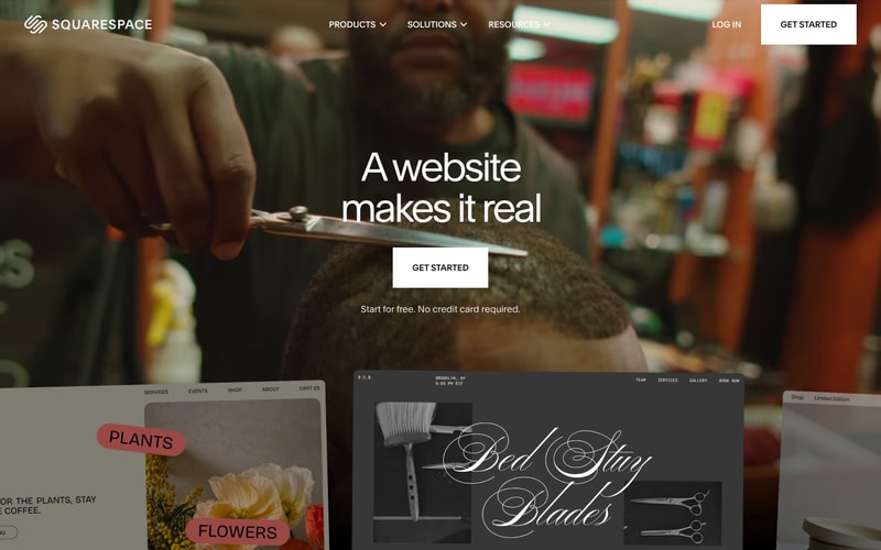
### Hero Section
- **Height**: 100vh or 80vh
- **Background**: Full-bleed image with overlay
- **Overlay**: rgba(0, 0, 0, 0.2-0.4) depending on image
- **Content**: Centered, max-width 1200px
- **Headline**: 96px white, letter-spacing -2px
- **Subtext**: 18px white, margin-top 24px
- **CTA Margin**: 48px from subtext

### Product Card
- **Background**: `#FFE8E5` or `#FFFFFF`
- **Border Radius**: 4px
- **Padding**: 32px
- **Image**: Aspect ratio 1:1
- **Title**: 24px, margin-top 16px
- **Price**: 18px, bold
- **Shadow**: `shadow-md` on hover

### Template Preview Card
- **Background**: Variable (beige, white, dark)
- **Aspect Ratio**: 4:3
- **Border**: 1px solid rgba(0,0,0,0.1)
- **Shadow**: `shadow-overlay`
- **Hover**: Lift animation, shadow increase

### Form Input (Quantity)
- **Height**: 40px
- **Border**: 1px solid rgba(0,0,0,0.2)
- **Border Radius**: 2px
- **Padding**: 8px 12px
- **Font**: 16px

### Labels (Decorative)
- **Background**: `#FF8585` or `#FF9999`
- **Color**: `#000000`
- **Padding**: 8px 16px
- **Border Radius**: 20px (pill shape)
- **Font**: 16px uppercase, weight 500

## Layout Patterns

### Full-Width Hero
- Container: 100vw
- Content: max-width 1400px, centered
- Vertical padding: 120px 0
- Background: full-bleed image or color

### Split Layout (50/50)
- Container: max-width 1400px
- Grid: 2 columns, equal width
- Gap: 64px
- Responsive: stack on mobile

### Centered Content
- Max-width: 1200px
- Horizontal padding: 32px
- Margin: 0 auto

### Template Showcase Grid
- Grid: 3 columns desktop, 2 tablet, 1 mobile
- Gap: 32px
- Item aspect ratio: maintains template ratio

### Section Spacing
- Between major sections: 128px
- Between subsections: 64px
- Between related elements: 24-32px