Use this design system
Tokens · motion · components — drop straight into your project.
Download design kitStart a project with it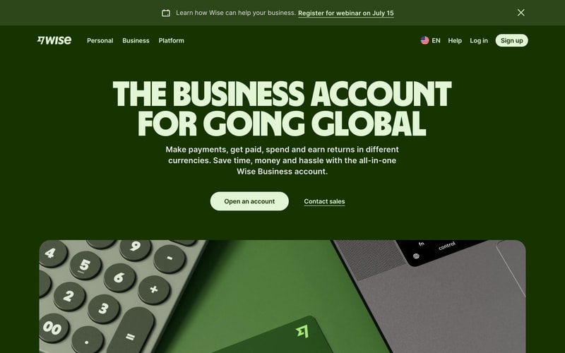
Similar styles
# Wise Design System

## Tokens — Colors

| Token | Hex | Usage |
|-------|-----|-------|
| `--color-primary` | `#9FE870` | Primary brand green (lime), CTAs, accents |
| `--color-primary-dark` | `#8BD65C` | Hover state for primary |
| `--color-dark-green` | `#0D2B0D` | Dark green backgrounds, alternative hero |
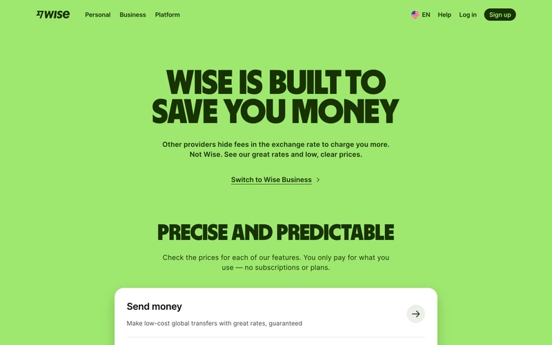
| `--color-pale-green` | `#D7F2A8` | Light green banners, promotional sections |
| `--color-bg-primary` | `#FFFFFF` | Primary background |
| `--color-bg-secondary` | `#F5F5F5` | Secondary/alternate background |
| `--color-text-primary` | `#000000` | Headlines, primary text |
| `--color-text-secondary` | `#505050` | Body text, secondary content |
| `--color-text-tertiary` | `#707070` | Muted text, metadata |
| `--color-text-inverse` | `#FFFFFF` | Text on dark backgrounds |
| `--color-border` | `#E0E0E0` | Default borders |
| `--color-border-light` | `#F0F0F0` | Subtle dividers |
| `--color-shadow` | `rgba(0, 0, 0, 0.08)` | Card shadows |

## Tokens — Typography

**Font Families:**
- **Display/Headline:** Custom bold condensed sans-serif (GT America Expanded or similar)
- **Body/UI:** Inter, system-ui, -apple-system, sans-serif

**Type Scale:**

| Token | Size | Line Height | Weight | Usage |
|-------|------|-------------|--------|-------|
| `--text-hero` | `80px` / `5rem` | `88px` / `1.1` | `900` | Hero headlines |
| `--text-h1` | `64px` / `4rem` | `72px` / `1.125` | `900` | Page titles |
| `--text-h2` | `48px` / `3rem` | `56px` / `1.167` | `800` | Section headers |
| `--text-h3` | `32px` / `2rem` | `40px` / `1.25` | `700` | Subsection headers |
| `--text-h4` | `24px` / `1.5rem` | `32px` / `1.333` | `700` | Card headers |
| `--text-lg` | `20px` / `1.25rem` | `30px` / `1.5` | `400` | Large body text |
| `--text-base` | `16px` / `1rem` | `24px` / `1.5` | `400` | Body text |
| `--text-sm` | `14px` / `0.875rem` | `20px` / `1.428` | `400` | Small text, captions |
| `--text-xs` | `12px` / `0.75rem` | `16px` / `1.333` | `500` | Labels, metadata |

## Tokens — Spacing

**Base unit:** `4px`

| Token | Value | Usage |
|-------|-------|-------|
| `--space-1` | `4px` | Tight spacing |
| `--space-2` | `8px` | Small gaps |
| `--space-3` | `12px` | Default element spacing |
| `--space-4` | `16px` | Medium spacing |
| `--space-6` | `24px` | Large spacing |
| `--space-8` | `32px` | Section padding |
| `--space-12` | `48px` | Large section gaps |
| `--space-16` | `64px` | Hero section padding |
| `--space-24` | `96px` | Extra large spacing |

## Tokens — Radii

| Token | Value | Usage |
|-------|-------|-------|
| `--radius-sm` | `4px` | Small elements |
| `--radius-md` | `8px` | Cards, inputs |
| `--radius-lg` | `12px` | Large cards |
| `--radius-xl` | `16px` | Hero cards, modals |
| `--radius-full` | `9999px` | Pills, badges, circular buttons |

## Tokens — Shadows

| Token | Value | Usage |
|-------|-------|-------|
| `--shadow-sm` | `0 1px 2px rgba(0,0,0,0.04)` | Subtle elevation |
| `--shadow-md` | `0 2px 8px rgba(0,0,0,0.08)` | Cards |
| `--shadow-lg` | `0 4px 16px rgba(0,0,0,0.12)` | Modals, dropdowns |

## Tokens — Borders

| Token | Value |
|-------|-------|
| `--border-width` | `1px` |
| `--border-width-thick` | `2px` |

## Components

### Button
- **Primary:** Solid `--color-primary` background, black text, `--radius-full`, 16px vertical padding, 32px horizontal
- **Secondary:** Outlined with 2px border, transparent background, hover shows subtle fill
- **Ghost:** Underlined text link, no background
- **Sizes:** Default (48px height), small (40px), large (56px)

### Card
- White background, `--radius-lg` or `--radius-xl`
- `--shadow-md` shadow
- 24-32px padding
- Often contains icon, heading, description, and arrow/link

### Navigation
- Horizontal layout
- Text links with hover underline
- Logo on left, actions on right
- 16px height links, 16px spacing between items
- Sticky/fixed on scroll

### Input / Calculator Widget
- White background card with prominent border
- Large number display (32-48px)
- Dropdown selectors with flag icons
- Subtle borders between sections
- Info rows with icons on left

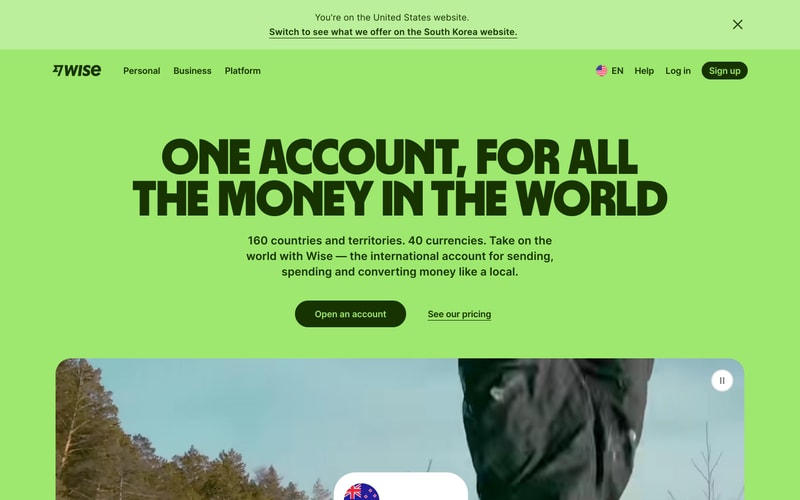
### Banner
- Full-width colored background (pale green typical)
- Centered text with icon on left
- Close button on right
- 48-56px height

### Badge
- Small rounded rectangle
- Icon + text combination
- Star ratings with review counts
- App store/Play store branding

### Icon
- 24px default size
- Often in circular colored backgrounds (40-48px circles)
- Simple line icons
- Accent colors or white on dark backgrounds

## Layout Patterns

### Hero Section
- Full viewport height or near-full
- Centered content, max-width ~800px for text
- Large headline (80px+)
- Subheadline (18-20px)
- CTA buttons below (primary + secondary)
- Background: solid color or gradient
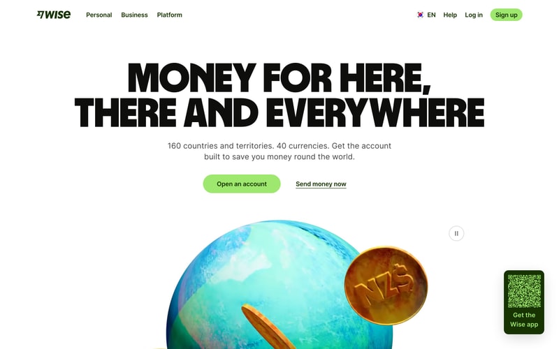
- Optional: Large illustration/3D element

### Content Grid
- Max-width container: 1280px
- Horizontal padding: 64-96px on desktop, 24px mobile
- Flexbox or grid for multi-column layouts
- 2-3 column grids for feature cards

### Section
- Vertical padding: 96-128px desktop, 64px mobile
- Alternating background colors (white, pale green, dark green)
- Centered headlines
- Body copy max-width: 600-700px for readability

### Navigation Bar
- Full-width
- Fixed/sticky positioning
- 72-80px height
- Container: 1280px max-width with horizontal padding
- Flexbox: logo left, nav center-left, actions right