1 free brand left today.Sign up — unlimited →
Use this design system
Tokens · motion · components — drop straight into your project.
Download design kitStart a project with it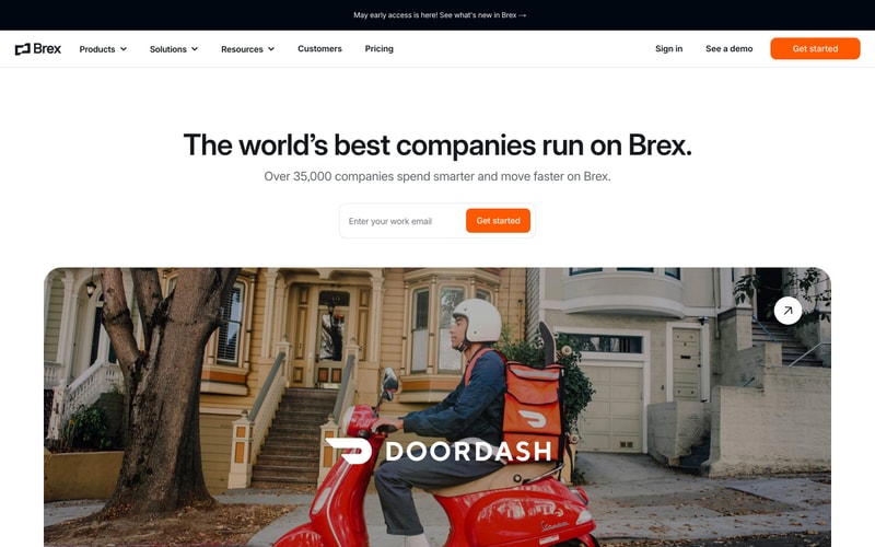
Similar styles
# Brex Design System

## Tokens — Colors

| Token | Hex | Usage |
|-------|-----|-------|
| `--color-primary` | `#FF5500` | Primary CTA buttons, links, accents, data visualization |
| `--color-primary-hover` | `#E64D00` | Hover state for primary elements |
| `--color-dark` | `#0A1929` | Primary text, dark section backgrounds |
| `--color-black` | `#000000` | Pure black for logos, icons |
| `--color-white` | `#FFFFFF` | Backgrounds, text on dark |
| `--color-gray-50` | `#F9FAFB` | Subtle backgrounds |
| `--color-gray-100` | `#F7F7F7` | Page backgrounds, card backgrounds |
| `--color-gray-200` | `#E5E7EB` | Borders, dividers |
| `--color-gray-400` | `#9CA3AF` | Placeholder text, disabled states |
| `--color-gray-600` | `#6B7280` | Secondary text, descriptions |
| `--color-gray-700` | `#374151` | Body text |
| `--color-gray-900` | `#111827` | Headings |
| `--color-teal` | `#14B8A6` | Progress bars, success states |
| `--color-overlay` | `rgba(0, 0, 0, 0.4)` | Glassmorphic card overlays |

## Tokens — Typography

**Font Families:**
- Primary: `-apple-system, BlinkMacSystemFont, "Segoe UI", Roboto, "Helvetica Neue", Arial, sans-serif` (or custom "Basis Grotesque")
- Monospace: `"SF Mono", Monaco, "Cascadia Code", monospace` (for data labels)

**Type Scale:**

| Token | Size | Line Height | Weight | Usage |
|-------|------|-------------|--------|-------|
| `--font-display-xl` | 96px | 1.1 | 700 | Hero headlines (mobile scaled) |
| `--font-display-lg` | 72px | 1.1 | 700 | Large headlines |
| `--font-display-md` | 64px | 1.2 | 700 | Section headlines |
| `--font-heading-xl` | 48px | 1.2 | 700 | Page titles |
| `--font-heading-lg` | 36px | 1.3 | 700 | Card titles |
| `--font-heading-md` | 24px | 1.4 | 700 | Subheadings |
| `--font-body-lg` | 18px | 1.6 | 400 | Large body text, hero descriptions |
| `--font-body-md` | 16px | 1.5 | 400 | Default body text |
| `--font-body-sm` | 14px | 1.5 | 400 | Small text, captions |
| `--font-label` | 14px | 1.4 | 500 | Button labels, form labels |

## Tokens — Spacing

| Token | Value | Usage |
|-------|-------|-------|
| `--space-2` | 8px | Tight gaps, icon spacing |
| `--space-3` | 12px | Button padding vertical |
| `--space-4` | 16px | Small gaps, card padding |
| `--space-6` | 24px | Medium gaps, section spacing |
| `--space-8` | 32px | Large gaps, card padding |
| `--space-12` | 48px | Section spacing |
| `--space-16` | 64px | Large section spacing |
| `--space-20` | 80px | XL section padding |
| `--space-24` | 96px | Hero section padding |
| `--space-30` | 120px | XXL section padding |

## Tokens — Radii

| Token | Value | Usage |
|-------|-------|-------|
| `--radius-sm` | 6px | Small elements |
| `--radius-md` | 8px | Buttons, inputs |
| `--radius-lg` | 12px | Cards |
| `--radius-xl` | 16px | Large cards, modals |
| `--radius-full` | 9999px | Pills, badges, avatars |

## Tokens — Shadows

| Token | Value | Usage |
|-------|-------|-------|
| `--shadow-sm` | `0 1px 2px rgba(0, 0, 0, 0.05)` | Subtle elevation |
| `--shadow-md` | `0 4px 6px rgba(0, 0, 0, 0.07), 0 2px 4px rgba(0, 0, 0, 0.05)` | Cards |
| `--shadow-lg` | `0 10px 15px rgba(0, 0, 0, 0.1), 0 4px 6px rgba(0, 0, 0, 0.05)` | Hover states, dropdowns |
| `--shadow-xl` | `0 20px 25px rgba(0, 0, 0, 0.15), 0 10px 10px rgba(0, 0, 0, 0.04)` | Modals, popovers |

## Tokens — Borders

| Token | Value |
|-------|-------|
| `--border-width` | 1px |
| `--border-width-thick` | 2px |
| `--border-color` | `#E5E7EB` |
| `--border-color-dark` | `#D1D5DB` |

## Components

### Navigation
- Fixed header, white background
- Logo (left): ~32px height
- Navigation links (center): 16px text, 500 weight, dropdown indicators
- Actions (right): "Sign in" link + "See a demo" secondary button + "Get started" primary button
- Height: 80px
- Horizontal padding: 32px (mobile), 48px (tablet), 64px (desktop)

### Buttons

**Primary:**
- Background: `--color-primary` (#FF5500)
- Text: white, 14px, 500 weight
- Padding: 12px 28px
- Border radius: 8px
- Hover: Darker orange + slight scale (1.02)
- Shadow on hover: `--shadow-lg`

**Secondary (Outlined):**
- Background: transparent
- Border: 2px solid `--color-gray-900`
- Text: `--color-gray-900`, 14px, 500 weight
- Padding: 10px 28px (adjusted for border)
- Border radius: 8px
- Hover: Light gray background (#F9FAFB)

**Link Button:**
- Text: `--color-primary`, 16px, 500 weight
- Icon: Circle with play icon, 20px
- Hover: Underline

### Input Fields
- Background: white
- Border: 1px solid `--border-color`
- Padding: 12px 16px
- Border radius: 8px
- Placeholder: `--color-gray-400`
- Focus: Border color changes to `--color-primary`, outline ring

### Cards

**Standard Card:**
- Background: white
- Padding: 32px
- Border radius: 16px
- Shadow: `--shadow-md`
- Hover: `--shadow-lg` + translateY(-2px)

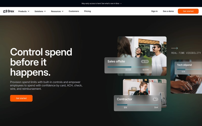
**Glassmorphic Card (Dark Sections):**
- Background: `rgba(255, 255, 255, 0.1)`
- Backdrop filter: blur(20px)
- Border: 1px solid `rgba(255, 255, 255, 0.2)`
- Padding: 24px
- Border radius: 12px
- Text: white

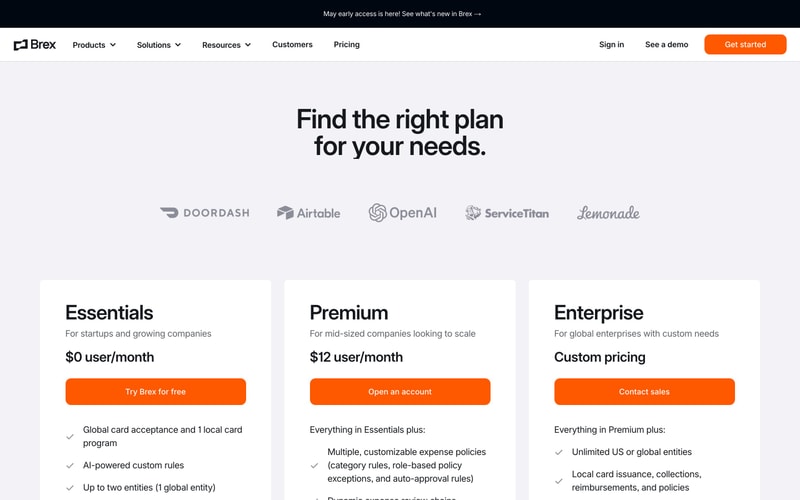
**Pricing Card:**
- Background: white
- Padding: 40px 32px
- Border radius: 12px
- Shadow: `--shadow-md`
- Hover: `--shadow-xl` + slight scale

### Progress Bars
- Height: 8px
- Border radius: 9999px (full)
- Background: `rgba(255, 255, 255, 0.2)` (on dark) or `--color-gray-200` (on light)
- Fill: Gradient from teal to orange OR solid `--color-teal`

### Badges
- Background: `rgba(255, 255, 255, 0.2)` (on dark)
- Padding: 4px 12px
- Border radius: 9999px
- Icon: Person icon + count
- Text: 14px, white

## Layout Patterns

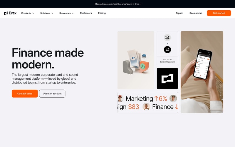
### Hero Layout (Full-Width)
- Two-column grid: 50/50 on desktop, stack on mobile
- Left: Headline + description + CTA
- Right: Product imagery
- Vertical padding: 120px desktop, 80px tablet, 60px mobile
- Max width: 1440px
- Horizontal padding: 64px desktop, 32px mobile

### Dark Section Layout
- Full viewport width
- Background: `--color-dark` or darker gradient
- Content: Headline (left) + Card grid (right, masonry-style)
- Text: white
- Vertical padding: 120px

### Pricing Grid
- Three-column grid on desktop (1fr 1fr 1fr)
- One column on mobile
- Gap: 32px
- Cards have equal height
- CTA button spans full width of card

### Logo Showcase
- Horizontal grid: auto-fit columns
- Logos: Grayscale, ~120px width, centered
- Gap: 48px horizontal, 32px vertical
- Padding: 80px vertical