2 free brands left today.Sign up — unlimited →
Use this design system
Tokens · motion · components — drop straight into your project.
Download design kitStart a project with it
Similar styles
# Coinbase Design System

## Tokens — Colors

| Token | Hex | Usage |
|-------|-----|-------|
| `primary-blue` | `#0052FF` | Primary brand color, CTAs, links, active states |
| `primary-blue-dark` | `#0A1F44` | Dark blue for gradients, backgrounds |
| `primary-blue-hover` | `#0047E0` | Hover state for primary buttons |
| `white` | `#FFFFFF` | Primary background, card backgrounds |
| `black` | `#000000` | Primary headings, high-emphasis text |
| `gray-900` | `#050F19` | Darkest text, headings |
| `gray-700` | `#5B616E` | Body text, secondary text |
| `gray-600` | `#6B7280` | Tertiary text, placeholder |
| `gray-400` | `#9CA3AF` | Disabled text, borders |
| `gray-300` | `#D8D8D8` | Dividers, borders |
| `gray-200` | `#E5E5E5` | Subtle borders |
| `gray-100` | `#F5F5F5` | Card backgrounds, hover states |
| `gray-50` | `#FAFAFA` | Page backgrounds, sections |
| `success-green` | `#05B169` | Positive values, success states |
| `success-green-light` | `#00D924` | Charts, indicators |
| `error-red` | `#DF5F67` | Negative values, errors |
| `error-red-bright` | `#FF0000` | Alerts, warnings |
| `warning-orange` | `#F5841F` | Bitcoin icon, warnings |
| `warning-yellow` | `#FCD535` | Highlights, accents |
| `chart-blue` | `#0052FF` | Primary chart line |
| `chart-green` | `#05B169` | Positive chart areas |
| `chart-red` | `#DF5F67` | Negative chart areas |

## Tokens — Typography

### Font Families
- **Primary**: `"Coinbase Sans", -apple-system, BlinkMacSystemFont, "Segoe UI", Roboto, Oxygen-Sans, Ubuntu, Cantarell, "Helvetica Neue", sans-serif`
- **Monospace**: `"Coinbase Mono", "Roboto Mono", Menlo, monospace` (for prices, values)

### Type Scale

| Token | Size | Line Height | Weight | Usage |
|-------|------|-------------|--------|-------|
| `display-xl` | `64px` | `72px` | 700 | Hero headlines |
| `display-lg` | `48px` | `56px` | 700 | Large page headings |
| `display-md` | `40px` | `48px` | 700 | Section headings |
| `heading-xl` | `32px` | `40px` | 700 | H1, page titles |
| `heading-lg` | `28px` | `36px` | 600 | H2, card headings |
| `heading-md` | `24px` | `32px` | 600 | H3, subsections |
| `heading-sm` | `20px` | `28px` | 600 | H4, labels |
| `body-lg` | `18px` | `28px` | 400 | Large body text |
| `body-md` | `16px` | `24px` | 400 | Default body text |
| `body-sm` | `14px` | `20px` | 400 | Secondary text, captions |
| `body-xs` | `12px` | `16px` | 400 | Small labels, tags |
| `label-lg` | `16px` | `20px` | 500 | Form labels, buttons |
| `label-md` | `14px` | `18px` | 500 | Tags, badges |
| `label-sm` | `12px` | `16px` | 500 | Uppercase labels |
| `number-xl` | `32px` | `40px` | 600 | Large financial values |
| `number-lg` | `24px` | `32px` | 600 | Table values |
| `number-md` | `16px` | `24px` | 500 | Inline numbers |

## Tokens — Spacing

| Token | Value | Usage |
|-------|-------|-------|
| `space-1` | `4px` | Tight spacing, icon gaps |
| `space-2` | `8px` | Compact spacing, inline elements |
| `space-3` | `12px` | Small gaps, button padding |
| `space-4` | `16px` | Default spacing, card padding |
| `space-5` | `20px` | Medium spacing |
| `space-6` | `24px` | Section spacing |
| `space-8` | `32px` | Large spacing, component gaps |
| `space-10` | `40px` | XL spacing |
| `space-12` | `48px` | Section dividers |
| `space-16` | `64px` | Page sections |
| `space-20` | `80px` | Hero spacing |
| `space-24` | `96px` | Large page sections |

## Tokens — Border Radius

| Token | Value | Usage |
|-------|-------|-------|
| `radius-sm` | `4px` | Small elements, badges |
| `radius-md` | `8px` | Buttons, inputs, cards |
| `radius-lg` | `12px` | Large cards, modals |
| `radius-xl` | `16px` | Hero sections, featured cards |
| `radius-full` | `9999px` | Pills, avatars, icon buttons |

## Tokens — Shadows

| Token | Value | Usage |
|-------|-------|-------|
| `shadow-sm` | `0 1px 2px rgba(0, 0, 0, 0.05)` | Subtle elevation |
| `shadow-md` | `0 2px 8px rgba(0, 0, 0, 0.08)` | Cards, dropdowns |
| `shadow-lg` | `0 4px 16px rgba(0, 0, 0, 0.12)` | Modals, popovers |
| `shadow-xl` | `0 8px 32px rgba(0, 0, 0, 0.16)` | Hero elements, overlays |

## Tokens — Borders

| Token | Value | Usage |
|-------|-------|-------|
| `border-thin` | `1px solid #D8D8D8` | Default borders |
| `border-medium` | `2px solid #D8D8D8` | Emphasized borders |
| `border-thick` | `4px solid #0052FF` | Active states, focus |

## Components

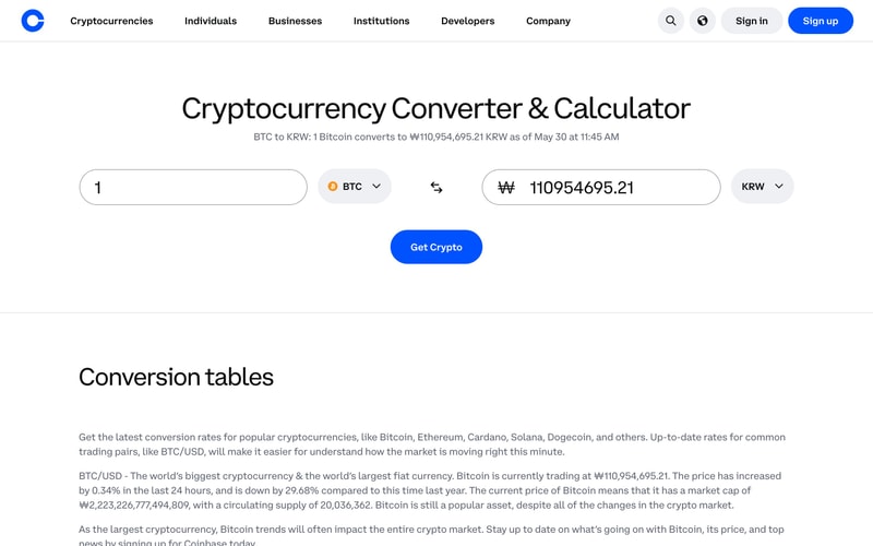
### Navigation Bar
- Height: `64px`
- Background: White
- Border bottom: `1px solid #E5E5E5`
- Logo: 40px circle, blue background
- Links: 16px medium weight, #050F19
- Buttons: Primary blue, 40px height, 16px padding horizontal

### Buttons
- **Primary**: Blue (#0052FF), white text, 8px radius, 12px 24px padding
- **Secondary**: White background, blue border, blue text
- **Tertiary**: Transparent, blue text, no border
- Heights: 40px (default), 48px (large), 32px (small)
- Font: 16px medium weight

### Input Fields
- Background: White
- Border: 1px solid #D8D8D8
- Radius: 8px
- Padding: 12px 16px
- Height: 48px
- Focus: 2px solid #0052FF border
- Placeholder: #6B7280

### Cards
- Background: White or #F5F5F5
- Radius: 8px or 12px
- Padding: 16px or 24px
- Shadow: 0 2px 8px rgba(0, 0, 0, 0.08)
- Border: 1px solid #E5E5E5 (optional)

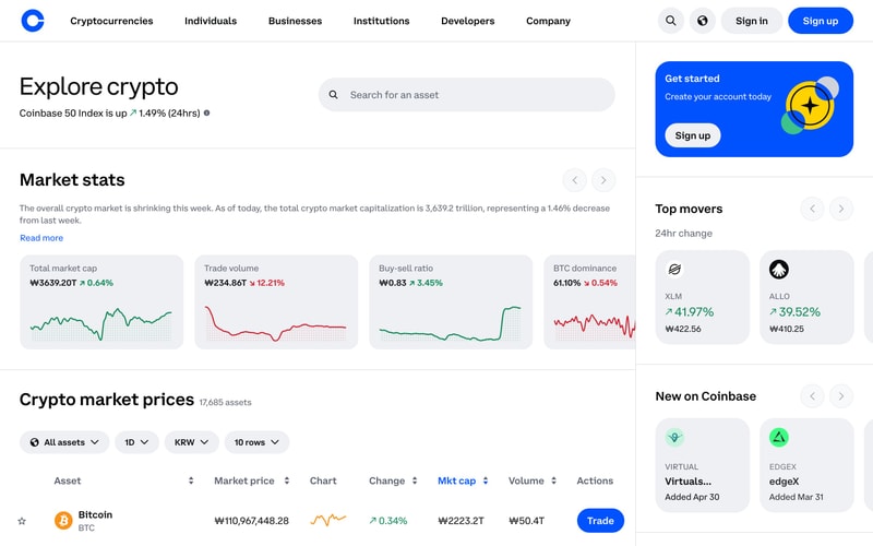
### Data Tables
- Header: #F5F5F5 background, 14px medium weight
- Rows: White background, 1px solid #E5E5E5 divider
- Cell padding: 16px
- Hover: #FAFAFA background
- Font: 16px for values, 14px for labels

### Badges/Tags
- Uppercase text, 12px medium weight
- Background: #F5F5F5
- Color: #5B616E
- Padding: 4px 8px
- Radius: 4px

### Charts
- Line: 2px stroke, #0052FF color
- Grid: Dotted pattern, #E5E5E5
- Area fill: Gradient with opacity
- Sparklines: Mini charts, 60px height

## Layout Patterns

### Container Widths
- Max width: 1280px
- Padding: 24px (mobile), 48px (tablet), 64px (desktop)
- Breakpoints: 640px, 768px, 1024px, 1280px, 1536px

### Grid System
- 12-column grid
- Gap: 24px
- Responsive: 4-8-12 columns (mobile-tablet-desktop)

### Hero Section
- Full-width background
- Centered content, max 1280px
- Two-column layout (image left, content right)
- Vertical padding: 80px-120px

### Card Grids
- Gap: 16px or 24px
- 1-2-3-4 column responsive grid
- Equal height cards