Use this design system
Tokens · motion · components — drop straight into your project.
Download design kitStart a project with it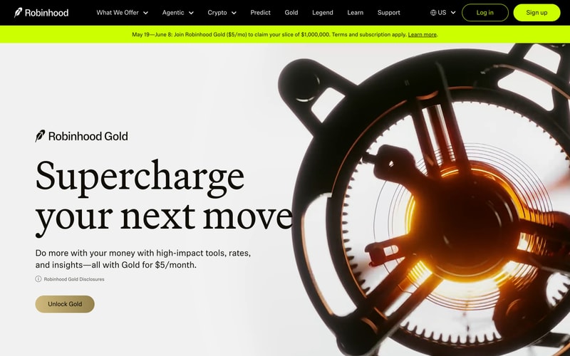
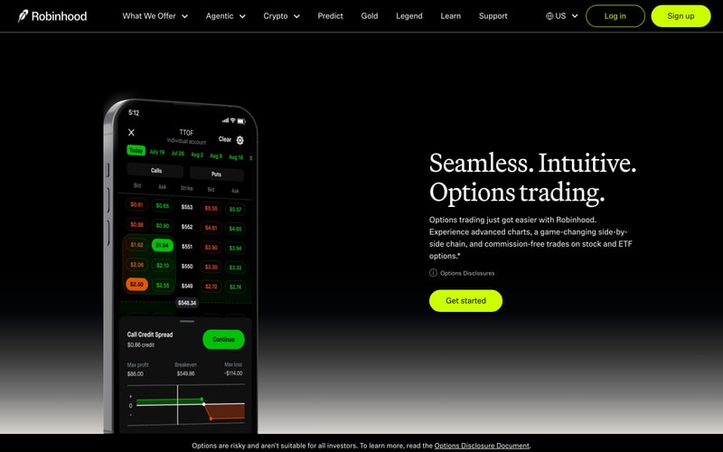
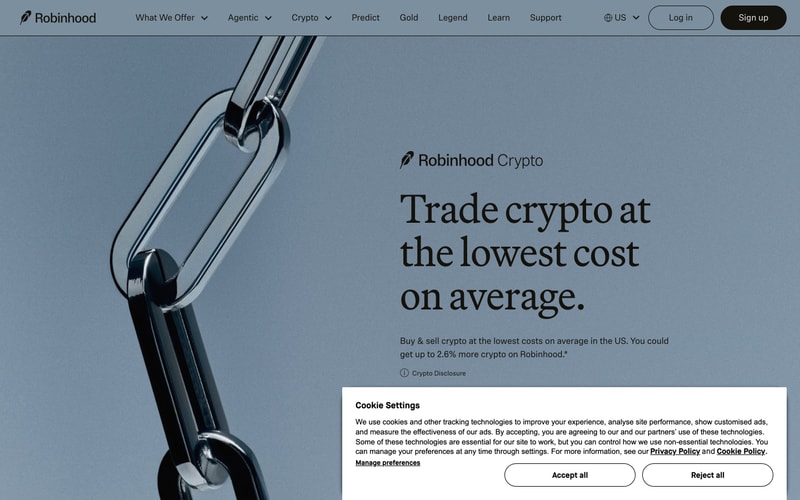
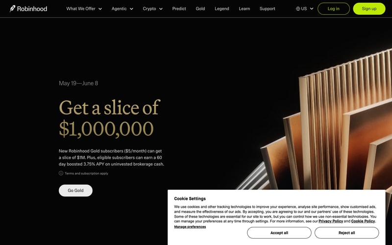
Similar styles
# Robinhood Design System

## Tokens — Colors

| Token | Value | Usage |
|-------|-------|-------|
| `--color-black` | `#000000` | Primary dark background, headlines on light backgrounds |
| `--color-white` | `#FFFFFF` | Text on dark backgrounds, light page backgrounds |
| `--color-brand-green` | `#00C805` | Success states, primary CTA (light theme), illustrations |
| `--color-brand-lime` | `#C9FF00` | Primary CTA (dark theme), accents, highlights |
| `--color-gold` | `#C8A668` | Premium content headlines, promotional text |
| `--color-gray-50` | `#F7F7F7` | Light backgrounds, subtle surfaces |
| `--color-gray-100` | `#F3F3F3` | Card backgrounds (light theme) |
| `--color-gray-400` | `#A3A3A3` | Muted text, placeholders |
| `--color-gray-600` | `#6B7280` | Secondary text |
| `--color-gray-700` | `#4B5563` | Body text (light theme) |
| `--color-blue-gray` | `#94A5B5` | Alternate hero backgrounds |
| `--color-navy` | `#1E3A5F` | Illustration accents |
| `--color-red` | `#FF5252` | Error states, negative values |

## Tokens — Typography

### Font Families
- **Display/Headline**: `'Garnett', Georgia, serif` — Custom serif for large headlines
- **Body/UI**: `'Capsule Sans', -apple-system, BlinkMacSystemFont, 'Segoe UI', sans-serif` — Custom sans-serif for UI and body text

### Type Scale

| Token | Size | Line Height | Weight | Usage |
|-------|------|-------------|--------|-------|
| `--font-display-2xl` | `80px` / `5rem` | `1.1` | `400` | Hero headlines (e.g., "$1,000,000") |
| `--font-display-xl` | `64px` / `4rem` | `1.15` | `400` | Page headlines |
| `--font-display-lg` | `48px` / `3rem` | `1.2` | `400` | Section headlines |
| `--font-heading-lg` | `32px` / `2rem` | `1.3` | `500` | Subheadings |
| `--font-heading-md` | `24px` / `1.5rem` | `1.4` | `500` | Card titles |
| `--font-body-lg` | `18px` / `1.125rem` | `1.6` | `400` | Hero body text |
| `--font-body-md` | `16px` / `1rem` | `1.5` | `400` | Standard body text |
| `--font-body-sm` | `14px` / `0.875rem` | `1.5` | `400` | Small text, captions |
| `--font-label-md` | `16px` / `1rem` | `1` | `500` | Button text, navigation |
| `--font-label-sm` | `14px` / `0.875rem` | `1` | `500` | Small labels |

## Tokens — Spacing

| Token | Value |
|-------|-------|
| `--space-1` | `4px` / `0.25rem` |
| `--space-2` | `8px` / `0.5rem` |
| `--space-3` | `12px` / `0.75rem` |
| `--space-4` | `16px` / `1rem` |
| `--space-5` | `20px` / `1.25rem` |
| `--space-6` | `24px` / `1.5rem` |
| `--space-8` | `32px` / `2rem` |
| `--space-10` | `40px` / `2.5rem` |
| `--space-12` | `48px` / `3rem` |
| `--space-16` | `64px` / `4rem` |
| `--space-20` | `80px` / `5rem` |
| `--space-24` | `96px` / `6rem` |
| `--space-32` | `128px` / `8rem` |

## Tokens — Border Radius

| Token | Value | Usage |
|-------|-------|-------|
| `--radius-sm` | `4px` | Small elements |
| `--radius-md` | `8px` | Cards, modals |
| `--radius-lg` | `12px` | Large cards |
| `--radius-full` | `9999px` | Pills, buttons |

## Tokens — Shadows

| Token | Value |
|-------|-------|
| `--shadow-sm` | `0 1px 2px rgba(0, 0, 0, 0.05)` |
| `--shadow-md` | `0 4px 6px rgba(0, 0, 0, 0.1)` |
| `--shadow-lg` | `0 10px 15px rgba(0, 0, 0, 0.1)` |
| `--shadow-xl` | `0 20px 25px rgba(0, 0, 0, 0.15)` |

## Tokens — Borders

| Token | Value |
|-------|-------|
| `--border-width-default` | `1px` |
| `--border-width-thick` | `2px` |
| `--border-color-light` | `rgba(255, 255, 255, 0.2)` |
| `--border-color-dark` | `rgba(0, 0, 0, 0.1)` |

## Components

### Navigation Bar
- **Height**: `64px`
- **Padding**: `16px 24px`
- **Background**: Transparent or solid (context-dependent)
- **Logo**: Feather icon + wordmark
- **Items**: Horizontal menu with dropdowns
- **Actions**: Country selector + Log in (outlined) + Sign up (filled)

### Buttons

#### Primary (Brand CTA)
- **Background**: `--color-brand-lime` (dark theme) or `--color-brand-green` (light theme)
- **Text**: `--color-black` or `--color-white`
- **Padding**: `12px 32px`
- **Border Radius**: `--radius-full`
- **Font**: `--font-label-md`, weight `500`

#### Secondary (Outlined)
- **Background**: `transparent`
- **Border**: `2px solid --color-brand-lime` or `--color-black`
- **Text**: Matches border color
- **Padding**: `12px 32px`
- **Border Radius**: `--radius-full`

#### Tertiary
- **Background**: `--color-black` (light theme) or `--color-white` (dark theme)
- **Text**: Inverted
- **Padding**: `12px 32px`
- **Border Radius**: `--radius-full`

### Modal (Cookie Settings)
- **Background**: `--color-white`
- **Padding**: `24px`
- **Border Radius**: `--radius-md`
- **Shadow**: `--shadow-xl`
- **Buttons**: Two-column grid with outlined and filled variants

### Hero Section
- **Layout**: Two-column (text + visual)
- **Headline**: Display font, 64-80px
- **Body**: 18px, max-width ~600px
- **CTA**: Primary button below text
- **Vertical Spacing**: 120px+ from navigation

## Layout Patterns

### Grid System
- **Max Width**: `1280px` (container)
- **Columns**: 12-column grid
- **Gutter**: `24px`
- **Breakpoints**:
  - Mobile: `< 768px`
  - Tablet: `768px - 1024px`
  - Desktop: `> 1024px`

### Hero Layouts
- **Full-width background** with centered content
- **50/50 split** (text left, visual right)
- **Centered** with background image

### Spacing Rhythm
- Section padding: `80px` vertical (mobile), `120px` (desktop)
- Component spacing: `48px` between major blocks
- Text spacing: `16px` between headline and body