Use this design system
Tokens · motion · components — drop straight into your project.
Download design kitStart a project with it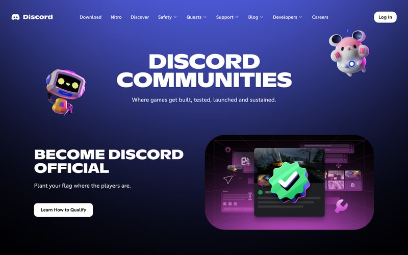

Similar styles
# Discord Design System

## Tokens — Colors

| Token Name | Hex Value | Usage |
|------------|-----------|-------|
| `brand-primary` | `#5865F2` | Primary brand color, CTA buttons, links, accents |
| `brand-secondary` | `#404EED` | Secondary brand purple, gradients |
| `brand-dark` | `#4752C4` | Hover states for primary buttons |
| `background-gradient-start` | `#404EED` | Hero gradient start (blue) |
| `background-gradient-mid` | `#2E3A8C` | Hero gradient middle |
| `background-gradient-end` | `#000000` | Hero gradient end (black) |
| `background-dark` | `#0B0C0F` | Dark backgrounds, footers |
| `background-secondary` | `#23272A` | Secondary dark surfaces |
| `text-primary` | `#FFFFFF` | Primary text, headings |
| `text-secondary` | `#B9BBBE` | Secondary text, descriptions |
| `text-muted` | `#72767D` | Tertiary text, hints |
| `button-white` | `#FFFFFF` | White button backgrounds |
| `button-white-text` | `#23272A` | Dark text on white buttons |
| `surface-card` | `#2C2F33` | Card backgrounds |
| `border-subtle` | `#40444B` | Subtle borders |
| `accent-green` | `#3BA55D` | Success states, online indicators |
| `accent-red` | `#ED4245` | Error states, destructive actions |

## Tokens — Typography

**Font Families:**
- **Display/Headings**: `"Ginto Nord"`, `"Ginto"`, sans-serif (custom Discord font)
- **Body/UI**: `"gg sans"`, `"Noto Sans"`, sans-serif (custom Discord UI font)
- **Monospace**: `"Consolas"`, `"Monaco"`, monospace

**Type Scale:**

| Token | Size | Line Height | Weight | Usage |
|-------|------|-------------|--------|-------|
| `display-xl` | 96px | 1.1 | 800 | Hero headings |
| `display-lg` | 80px | 1.15 | 800 | Large section headings |
| `display-md` | 64px | 1.2 | 800 | Medium section headings |
| `heading-xl` | 48px | 1.25 | 700 | Page headings |
| `heading-lg` | 32px | 1.3 | 700 | Section headings |
| `heading-md` | 24px | 1.35 | 600 | Subsection headings |
| `body-lg` | 20px | 1.6 | 400 | Large body text, hero descriptions |
| `body-md` | 16px | 1.5 | 400 | Default body text |
| `body-sm` | 14px | 1.5 | 400 | Small text, captions |
| `nav-link` | 16px | 1.5 | 500 | Navigation links |
| `button-lg` | 18px | 1.4 | 500 | Large button text |
| `button-md` | 16px | 1.4 | 500 | Default button text |

## Tokens — Spacing

| Token | Value | Usage |
|-------|-------|-------|
| `space-xs` | 4px | Tight spacing |
| `space-sm` | 8px | Small gaps |
| `space-md` | 16px | Default spacing |
| `space-lg` | 24px | Medium gaps |
| `space-xl` | 32px | Large gaps |
| `space-2xl` | 48px | Section padding |
| `space-3xl` | 64px | Large section padding |
| `space-4xl` | 96px | Hero section padding |
| `space-5xl` | 128px | Extra large section gaps |

## Tokens — Border Radius

| Token | Value | Usage |
|-------|-------|-------|
| `radius-sm` | 4px | Small elements |
| `radius-md` | 8px | Buttons, inputs |
| `radius-lg` | 12px | Cards, modals |
| `radius-xl` | 16px | Large cards |
| `radius-full` | 9999px | Pills, circular elements |

## Tokens — Shadows

| Token | Value | Usage |
|-------|-------|-------|
| `shadow-sm` | `0 1px 2px rgba(0,0,0,0.2)` | Subtle elevation |
| `shadow-md` | `0 4px 8px rgba(0,0,0,0.3)` | Buttons, cards |
| `shadow-lg` | `0 8px 16px rgba(0,0,0,0.4)` | Modals, popovers |
| `shadow-xl` | `0 16px 32px rgba(0,0,0,0.5)` | Large elevations |

## Tokens — Borders

| Token | Value | Usage |
|-------|-------|-------|
| `border-thin` | 1px | Default borders |
| `border-medium` | 2px | Emphasized borders |
| `border-thick` | 4px | Heavy borders |

## Components

### Navigation Bar
- Fixed horizontal navigation
- Discord logo (left)
- Horizontal link list with dropdown indicators (chevrons)
- "Log In" button (right, rounded, white background)
- Semi-transparent background with blur effect
- Height: ~80px
- Horizontal padding: ~40px

### Hero Section
- Full-width gradient background
- Centered content layout
- Large display heading (96px, weight 800)
- Body text (20px, weight 400)
- Two-button CTA group (primary + secondary)
- Supporting illustration on right side
- Vertical padding: 128-160px

### Button (Primary)
- Background: `#5865F2`
- Text: White, 16px, weight 500
- Padding: 16px 32px
- Border radius: 8px
- Hover: darken to `#4752C4`
- Shadow: `0 4px 8px rgba(0,0,0,0.3)`

### Button (Secondary/White)
- Background: `#FFFFFF`
- Text: Dark `#23272A`, 16px, weight 500
- Padding: 16px 32px
- Border radius: 8px
- Hover: slight gray tint `#F6F6F7`
- Shadow: `0 4px 8px rgba(0,0,0,0.2)`

### Dropdown Navigation
- Chevron indicator (down arrow)
- Hover triggers dropdown menu
- Menu background: White with shadow
- Menu items: Dark text, hover background

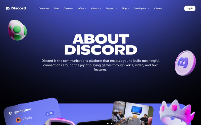
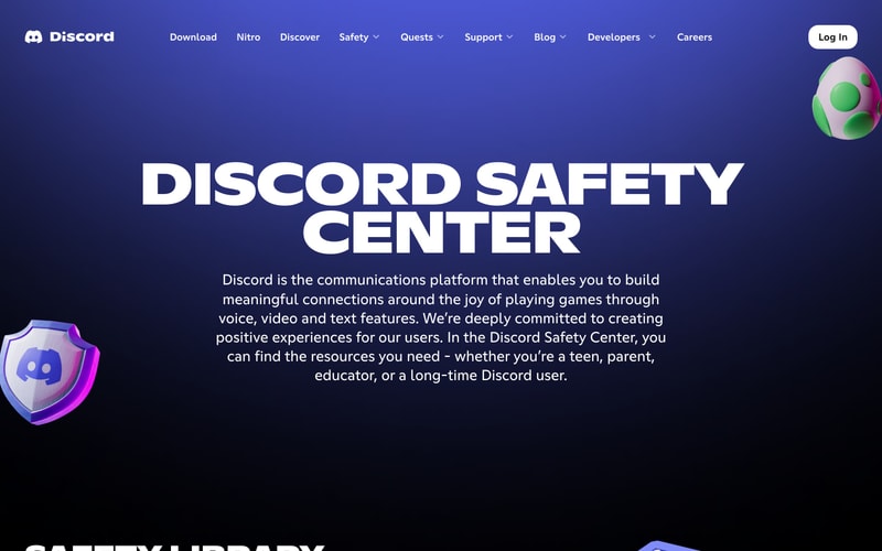
### Content Section
- Centered text layout (max-width: ~800px)
- Heading + body text hierarchy
- Background gradients (blue to black)
- Decorative 3D illustrations

## Layout Patterns

### Page Structure
- Full-width sections
- Centered content containers (max-width: 1260px)
- Horizontal padding: 40px
- Responsive breakpoints likely at 768px, 1024px, 1280px

### Grid System
- Flexible column layouts
- Two-column: 50/50 split for hero content
- Content-focused: single centered column for text-heavy sections

### Hero Layout
- Left: Text content (60% width)
- Right: Illustration/screenshot (40% width)
- Vertical centering
- Responsive stacking on mobile

### Section Spacing
- Between sections: 96-128px
- Within sections: 48-64px
- Heading to body: 24px