Use this design system
Tokens · motion · components — drop straight into your project.
Download design kitStart a project with it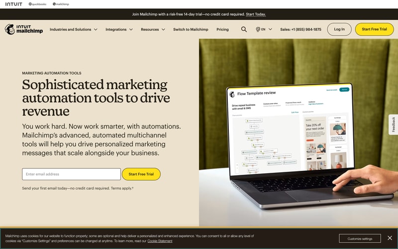
Similar styles
# Mailchimp Design System

## Tokens — Colors

| Token | Hex | Usage |
|-------|-----|-------|
| `--color-yellow-primary` | `#FFE01B` | Primary CTA buttons, accents, highlights |
| `--color-black` | `#241C15` | Primary text, headings, icons |
| `--color-white` | `#FFFFFF` | Backgrounds, button text, card surfaces |
| `--color-beige-50` | `#FAF9F7` | Light background, section backgrounds |
| `--color-beige-100` | `#F6F4F0` | Alternate background, subtle surfaces |
| `--color-gray-900` | `#241C15` | Dark text, primary content |
| `--color-gray-700` | `#3C3C3C` | Secondary text |
| `--color-gray-600` | `#666666` | Tertiary text, descriptions |
| `--color-gray-400` | `#86868B` | Muted text, placeholders |
| `--color-gray-300` | `#C4C4C4` | Borders, dividers |
| `--color-gray-200` | `#E1E1E1` | Light borders, subtle dividers |
| `--color-gray-100` | `#F5F5F5` | Subtle backgrounds |
| `--color-teal-primary` | `#007C89` | Secondary brand accent |
| `--color-green-check` | `#2ECC71` | Success, checkmarks |

## Tokens — Typography

**Font Families:**
- `--font-serif`: Custom serif (Means, Cooper Light, or similar) — used for display headings
- `--font-sans`: -apple-system, BlinkMacSystemFont, "Segoe UI", Helvetica, Arial, sans-serif

**Type Scale:**
| Token | Size | Line Height | Weight | Usage |
|-------|------|-------------|--------|-------|
| `--text-display-xl` | 64px | 1.1 | 400 | Hero headlines |
| `--text-display-lg` | 56px | 1.15 | 400 | Page titles |
| `--text-display-md` | 48px | 1.2 | 400 | Section headings |
| `--text-display-sm` | 40px | 1.2 | 400 | Sub-headings |
| `--text-heading-xl` | 32px | 1.25 | 600 | Card titles |
| `--text-heading-lg` | 28px | 1.3 | 600 | Modal titles |
| `--text-heading-md` | 24px | 1.35 | 600 | Component headings |
| `--text-heading-sm` | 20px | 1.4 | 600 | Small headings |
| `--text-body-lg` | 18px | 1.5 | 400 | Large body text |
| `--text-body` | 16px | 1.5 | 400 | Default body text |
| `--text-body-sm` | 14px | 1.5 | 400 | Small text, captions |
| `--text-body-xs` | 12px | 1.4 | 400 | Fine print, labels |

## Tokens — Spacing

Base: 8px

| Token | Value |
|-------|-------|
| `--space-1` | 4px |
| `--space-2` | 8px |
| `--space-3` | 12px |
| `--space-4` | 16px |
| `--space-5` | 20px |
| `--space-6` | 24px |
| `--space-8` | 32px |
| `--space-10` | 40px |
| `--space-12` | 48px |
| `--space-16` | 64px |
| `--space-20` | 80px |
| `--space-24` | 96px |

## Tokens — Border Radius

| Token | Value | Usage |
|-------|-------|-------|
| `--radius-sm` | 4px | Inputs, small elements |
| `--radius-md` | 8px | Cards, containers |
| `--radius-lg` | 12px | Large cards |
| `--radius-xl` | 24px | Rounded buttons |
| `--radius-pill` | 9999px | Pill-shaped buttons |
| `--radius-full` | 50% | Circular elements |

## Tokens — Shadows

| Token | Value |
|-------|-------|
| `--shadow-sm` | 0 1px 2px rgba(0, 0, 0, 0.05) |
| `--shadow-md` | 0 4px 6px rgba(0, 0, 0, 0.07) |
| `--shadow-lg` | 0 10px 15px rgba(0, 0, 0, 0.1) |
| `--shadow-xl` | 0 20px 25px rgba(0, 0, 0, 0.15) |
| `--shadow-modal` | 0 25px 50px rgba(0, 0, 0, 0.25) |

## Tokens — Borders

| Token | Value |
|-------|-------|
| `--border-width-thin` | 1px |
| `--border-width-default` | 2px |
| `--border-width-thick` | 3px |

## Components

### Button
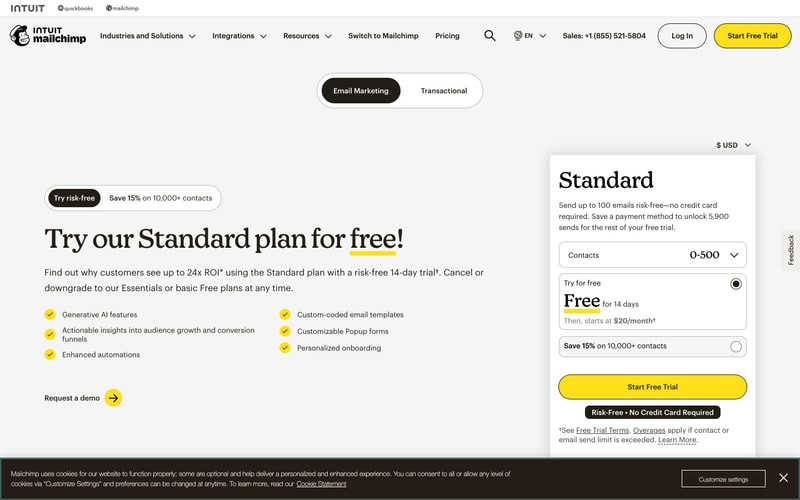
- **Primary**: Yellow background (`#FFE01B`), black text, pill-shaped (`border-radius: 9999px`)
- **Secondary**: Black outline, transparent background, black text, pill-shaped
- **Ghost/Text**: No background, black text, arrow icon →
- **Sizes**: Small (12px padding, 14px text), Medium (16px 32px padding, 16px text), Large (20px 40px padding, 18px text)
- **States**: Hover (slight darken), Active (scale 0.98), Disabled (50% opacity)

### Form Controls

**Input:**
- Border: 1px solid `#C4C4C4`
- Radius: 4px
- Padding: 12px 16px
- Font: 16px sans-serif
- Focus: Border `#241C15`, outline offset

**Select/Dropdown:**
- Similar to input
- Chevron icon on right
- Padding right: 40px for icon space

**Checkbox:**
- Size: 20px × 20px
- Border: 2px solid `#C4C4C4`
- Radius: 4px
- Checked: Yellow background with checkmark

**Radio:**
- Size: 20px × 20px
- Border: 2px solid `#C4C4C4`
- Checked: Black center dot

**Toggle Switch:**
- Track: 48px × 24px, pill-shaped
- Active: Black background
- Inactive: White with border

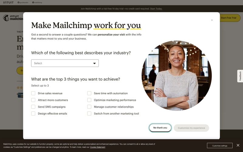
### Modal/Dialog
- Background: White
- Padding: 48px
- Border-radius: 12px
- Shadow: `--shadow-modal`
- Backdrop: rgba(0, 0, 0, 0.5)
- Close button: Top right corner

### Card
- Background: White
- Border: 1px solid `#E1E1E1`
- Border-radius: 8px
- Padding: 24px
- Shadow: `--shadow-sm` on hover

### Navigation
- Height: 72px
- Background: White
- Border-bottom: 1px solid `#E1E1E1`
- Logo: Left-aligned
- Links: Center (desktop), dropdown menu (mobile)
- CTAs: Right-aligned (Log In outlined, Start Free Trial yellow filled)

### Badge/Pill
- Background: Black or Yellow
- Text: White or Black (contrast)
- Padding: 6px 16px
- Border-radius: 9999px
- Font: 12px, 600 weight

## Layout Patterns

### Grid System
- Max container width: 1280px
- Gutter: 24px
- Columns: 12-column grid
- Breakpoints: 640px (sm), 768px (md), 1024px (lg), 1280px (xl)

### Hero Layout
- Split layout: 50/50 text and image (desktop)
- Vertical stack (mobile)
- Text-left alignment for heading
- CTA placement below description

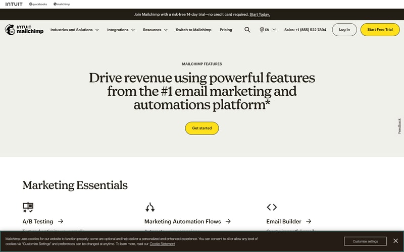
### Feature Grid
- 3-column layout (desktop)
- 2-column (tablet)
- 1-column (mobile)
- Icon + Title + Description + Link pattern

### Form Layout
- Vertical stacking of form fields
- Label above input (8px gap)
- Error messages below input (4px gap)
- Submit button full-width (mobile) or auto-width (desktop)