Use this design system
Tokens · motion · components — drop straight into your project.
Download design kitStart a project with it
Similar styles
# Lemonade Design System

## Tokens — Colors

| Token | Hex | Usage |
|-------|-----|-------|
| `--color-primary` | `#FF0090` | Primary brand color, CTA buttons, accent elements |
| `--color-background` | `#FAFAF8` | Main page background |
| `--color-surface` | `#FFFFFF` | Card surfaces, overlays |
| `--color-text-primary` | `#333333` | Headings, primary text |
| `--color-text-secondary` | `#5A5A5A` | Body text, descriptions |
| `--color-text-tertiary` | `#999999` | Inactive navigation, subtle text |
| `--color-line-art` | `#333333` | Illustration stroke color |
| `--color-border` | `#E5E5E5` | Subtle borders, dividers |

## Tokens — Typography

### Font Families
- **Headings**: Serif (Merriweather or similar elegant serif)
- **Body**: System sans-serif stack (`-apple-system, BlinkMacSystemFont, "Segoe UI", Roboto, sans-serif`)
- **Logo**: Custom script/handwritten font
- **Navigation**: System sans-serif

### Type Scale

| Token | Size | Line Height | Weight | Usage |
|-------|------|-------------|--------|-------|
| `--font-hero` | 64px / 4rem | 1.15 | 400 | Hero headings |
| `--font-h1` | 48px / 3rem | 1.2 | 400 | Page headings |
| `--font-h2` | 32px / 2rem | 1.3 | 400 | Section headings |
| `--font-subheading` | 20px / 1.25rem | 1.5 | 400 | Subheadings, taglines |
| `--font-body` | 16px / 1rem | 1.6 | 400 | Body text |
| `--font-nav` | 15px / 0.9375rem | 1.4 | 400 | Navigation items |
| `--font-button` | 14px / 0.875rem | 1 | 600 | Button text (uppercase) |
| `--font-small` | 14px / 0.875rem | 1.4 | 400 | Small text, captions |

## Tokens — Spacing

Scale: 4px base unit

| Token | Value | Usage |
|-------|-------|-------|
| `--space-1` | 4px | Micro spacing |
| `--space-2` | 8px | Tight spacing |
| `--space-3` | 12px | Small spacing |
| `--space-4` | 16px | Base spacing |
| `--space-5` | 20px | Medium spacing |
| `--space-6` | 24px | Navigation items |
| `--space-8` | 32px | Section spacing |
| `--space-12` | 48px | Large spacing |
| `--space-16` | 64px | Extra large spacing |
| `--space-20` | 80px | Hero vertical padding |
| `--space-24` | 96px | Hero section spacing |
| `--space-32` | 128px | Maximum vertical spacing |

## Tokens — Border Radius

| Token | Value | Usage |
|-------|-------|-------|
| `--radius-sm` | 4px | Small elements |
| `--radius-md` | 8px | Buttons, cards |
| `--radius-lg` | 16px | Large cards |
| `--radius-full` | 9999px | Pills, rounded elements |

## Tokens — Shadows

| Token | Value | Usage |
|-------|-------|-------|
| `--shadow-sm` | `0 1px 2px rgba(0, 0, 0, 0.05)` | Subtle elevation |
| `--shadow-md` | `0 4px 12px rgba(0, 0, 0, 0.08)` | Cards, buttons on hover |
| `--shadow-lg` | `0 8px 24px rgba(0, 0, 0, 0.12)` | Modals, overlays |
| `--shadow-button` | `0 4px 16px rgba(255, 0, 144, 0.25)` | Primary button hover |

## Tokens — Borders

| Token | Value | Usage |
|-------|-------|-------|
| `--border-width` | 1px | Default border width |
| `--border-width-thick` | 2px | Emphasis borders |
| `--border-color` | `#E5E5E5` | Default border color |

## Components

### Navigation Bar
- Fixed top position
- White background
- Horizontal layout
- Logo centered
- Left nav items: Renters, Homeowners, Car, Pet, Life, Giveback
- Right nav item: My Account
- Font: Sans-serif, 15px, medium gray (#999999) inactive, dark (#333333) active
- Height: ~64px
- Padding: 20px horizontal

### Logo
- Custom script font "Lemonade"
- Centered in navigation
- Color: Dark gray/black (#333333)
- ~32px height

### Hero Section
- Full-width background (#FAFAF8)
- Centered content (max-width ~800-1000px)
- Vertical padding: 80-120px
- Heading: Large serif, 48-64px
- Subheading: Sans-serif, 20px, medium gray
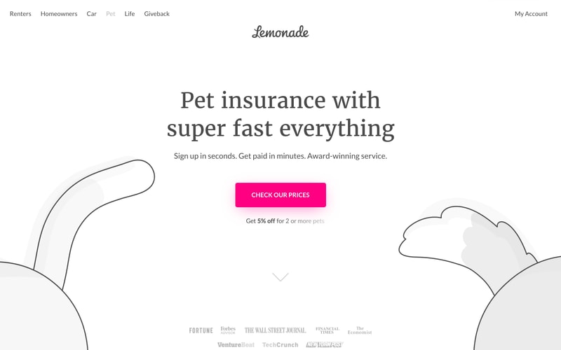
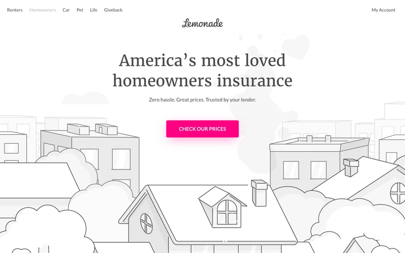
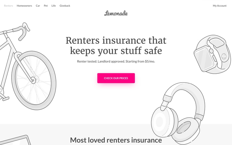
- Symmetrical illustrations on sides

### Primary CTA Button
- Background: Bright pink (#FF0090)
- Text: White, uppercase, 14px, bold (600-700 weight)
- Padding: 16px vertical, 48px horizontal
- Border radius: 8px
- Letter spacing: 0.5px
- Hover: Darker pink, shadow
- Text: "CHECK OUR PRICES"

### Illustration Elements
- Line art style
- Dark gray strokes (#333333)
- 2-3px stroke width
- Decorative, positioned on sides of hero
- Minimal, clean aesthetic
- Themes: houses, bikes, pets, consumer goods

### Press Logo Bar
- Horizontal row of grayscale logos
- Centered alignment
- Light gray (#CCCCCC)
- Bottom of hero sections
- Includes: Fortune, Forbes, WSJ, Financial Times, The Economist, VentureBeat, TechCrunch, NY Post

### Promotional Badge
- Pink diamond icon
- Text: "Get 10% off when you bundle"
- Centered below CTA
- Icon + text layout
- Sans-serif, 14-16px

## Layout Patterns

### Page Structure
- Fixed navigation header
- Full-width hero sections
- Centered content containers (800-1000px max-width)
- Symmetrical illustration panels
- Footer with press logos

### Grid System
- Center-aligned content
- No visible column grid (single column for hero content)
- Responsive breakpoints (likely 640px, 768px, 1024px, 1280px)

### Spacing Rhythm
- Consistent vertical rhythm using 8px base
- Large whitespace between sections (80-120px)
- Generous padding around interactive elements

### Content Hierarchy
1. Navigation (top, fixed)
2. Hero heading (large serif)
3. Supporting tagline (medium sans-serif)
4. Primary CTA (prominent pink button)
5. Secondary content (promotional text, badges)
6. Press validation (bottom logos)