Use this design system
Tokens · motion · components — drop straight into your project.
Download design kitStart a project with it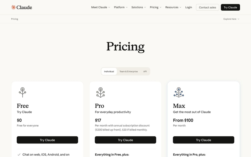
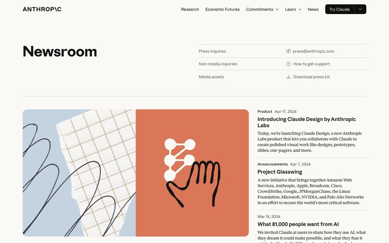
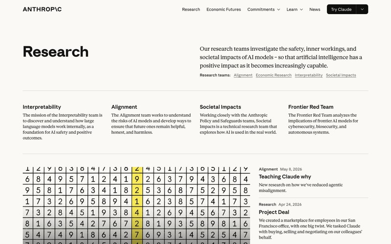
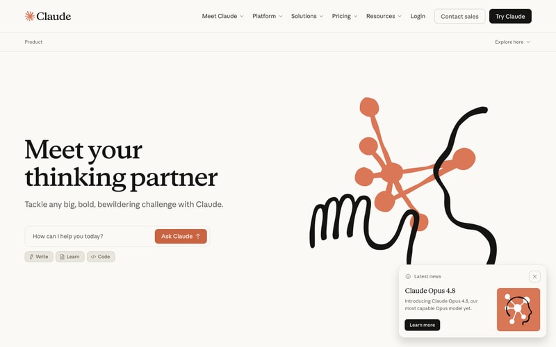
Similar styles
# Anthropic Design System

## Tokens — Colors

| Token | Value | Usage |
|-------|-------|-------|
| `background-cream` | `#F5F3EE` | Primary background for Anthropic.com pages |
| `background-white` | `#FFFFFF` | Primary background for Claude.ai pages |
| `background-dark` | `#1A1A1A` | Dark sections, hero cards |
| `text-primary` | `#000000` | Primary text, headings |
| `text-secondary` | `#2A2A2A` | Secondary text, body copy |
| `brand-coral` | `#D97757` | Primary brand color, CTAs, illustrations |
| `brand-coral-dark` | `#CC785C` | Hover states, darker accent |
| `brand-coral-light` | `#E07A5F` | Light accent, backgrounds |
| `accent-mint` | `#B8D4CE` | Secondary accent, card backgrounds |
| `accent-mint-dark` | `#A8C9C3` | Darker mint variant |
| `accent-yellow` | `#FFE66D` | Highlights, emphasis |
| `accent-yellow-dark` | `#F4E04D` | Darker yellow for contrast |
| `border-light` | `#E5E3DE` | Subtle borders, dividers |
| `ui-white` | `#FFFFFF` | Buttons, cards, input backgrounds |

## Tokens — Typography

### Font Families
- **Serif**: Custom serif (likely "Tiempos Text" or similar transitional serif) for headlines, body text
- **Sans-serif**: Clean sans-serif (likely "ABC Whyte" or "Inter") for navigation, UI elements

### Type Scale
| Token | Size | Line Height | Weight | Usage |
|-------|------|-------------|--------|-------|
| `display-xl` | `72px` | `1.1` | `700` | Hero headlines |
| `display-lg` | `64px` | `1.1` | `700` | Large display text |
| `heading-1` | `56px` | `1.2` | `700` | Page titles |
| `heading-2` | `40px` | `1.3` | `700` | Section headings |
| `heading-3` | `28px` | `1.4` | `700` | Subsection headings |
| `heading-4` | `24px` | `1.4` | `600` | Card titles |
| `body-lg` | `18px` | `1.6` | `400` | Large body text |
| `body` | `16px` | `1.6` | `400` | Default body text |
| `body-sm` | `14px` | `1.5` | `400` | Small text, captions |
| `label` | `14px` | `1.4` | `500` | Labels, tags |

## Tokens — Spacing

8px base unit system:
- `xs`: `4px`
- `sm`: `8px`
- `md`: `12px`
- `lg`: `16px`
- `xl`: `24px`
- `2xl`: `32px`
- `3xl`: `48px`
- `4xl`: `64px`
- `5xl`: `96px`
- `6xl`: `128px`

## Tokens — Border Radius
- `radius-sm`: `4px` — Small elements
- `radius-md`: `8px` — Buttons, inputs
- `radius-lg`: `12px` — Cards, large containers
- `radius-xl`: `16px` — Hero cards, featured content
- `radius-full`: `999px` — Pills, tags, circular elements

## Tokens — Shadows
- `shadow-sm`: `0 1px 2px 0 rgba(0, 0, 0, 0.05)` — Subtle lift
- `shadow-md`: `0 4px 6px -1px rgba(0, 0, 0, 0.1)` — Cards
- `shadow-lg`: `0 10px 15px -3px rgba(0, 0, 0, 0.1)` — Elevated elements
- `shadow-button`: `0 2px 4px rgba(0, 0, 0, 0.08)` — Button depth

## Tokens — Borders
- `border-width`: `1px` — Standard borders
- `border-width-thick`: `2px` — Emphasis borders
- `border-color`: `#E5E3DE` — Default border color

## Components

### Button
**Variants:**
- **Primary**: Black background (`#000000`), white text, `radius-md`, `padding: 12px 24px`
- **Secondary**: White background, black text, black border, `radius-md`
- **Accent**: Coral background (`#D97757`), white text, `radius-md`
- **Ghost**: Transparent background, underlined text on hover

**States:**
- Hover: Slight opacity change (0.85-0.9) or background darkening
- Active: Scale slightly (0.98)

### Navigation
- Horizontal layout, fixed or sticky
- Logo left (serif wordmark + optional icon)
- Menu items center/right (sans-serif, 14-16px)
- Dropdown indicators for nested menus
- CTA button far right (primary variant)

### Hero Section
- Two-column layout or full-width centered
- Large serif headline (`display-xl` or `display-lg`)
- Supporting body text in serif (18px)
- Optional CTA buttons
- Illustration or image on opposite side

### Card
- Rounded corners (`radius-lg` or `radius-xl`)
- Optional image/illustration top
- Text content padding: `24-32px`
- Subtle shadow on hover
- Clickable variants have hover lift effect

### Input Field
- Border radius `radius-md`
- Border color `border-light`, black on focus
- Padding: `12px 16px`
- Often paired with button (attached or separate)
- Placeholder text in gray

### Tag/Pill
- Fully rounded (`radius-full`)
- Small padding: `6px 12px`
- Sans-serif, 14px
- Optional icon prefix
- Border variant or solid background

### Grid Layout
- 2, 3, or 4 column grids
- Gap: `24px` or `32px`
- Responsive: collapse to single column on mobile

## Layout Patterns

### Page Container
- Max width: `1280px` or `1440px`
- Horizontal padding: `48px` desktop, `24px` mobile
- Centered with `margin: 0 auto`

### Section Spacing
- Vertical padding between sections: `96px` desktop, `64px` mobile
- Consistent rhythm throughout page

### Two-Column Layout
- 60/40 or 50/50 splits
- Gap: `48px` or `64px`
- Stack vertically on mobile

### Multi-Column Grid
- Equal width columns
- Consistent gap spacing
- Auto-fit responsive behavior