2 free brands left today.Sign up — unlimited →
Use this design system
Tokens · motion · components — drop straight into your project.
Download design kitStart a project with it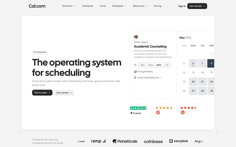
Similar styles
# Cal.com Design System

## Tokens — Colors

| Token | Value | Usage |
|-------|-------|-------|
| `--color-black` | `#000000` | Primary headings, buttons, high-emphasis text |
| `--color-white` | `#FFFFFF` | Backgrounds, button text on dark |
| `--color-gray-50` | `#FAFAFA` | Lightest backgrounds |
| `--color-gray-100` | `#F5F5F5` | Card backgrounds, subtle surfaces |
| `--color-gray-200` | `#E5E5E5` | Borders, dividers, calendar grid |
| `--color-gray-300` | `#D4D4D4` | Disabled states, placeholder text |
| `--color-gray-400` | `#A3A3A3` | Secondary text, icons |
| `--color-gray-500` | `#737373` | Tertiary text, muted content |
| `--color-gray-600` | `#525252` | Body text, medium emphasis |
| `--color-gray-700` | `#404040` | High emphasis body text |
| `--color-gray-800` | `#262626` | Dark surfaces, inverse backgrounds |
| `--color-gray-900` | `#171717` | Darkest text, headings on light |
| `--color-green` | `#00B67A` | Success, Trustpilot badge |
| `--color-orange` | `#FF9500` | Warning, star ratings |
| `--color-red` | `#FF3B30` | Error, G2 badge |
| `--color-blue` | `#0078D4` | Microsoft brand, links |

## Tokens — Typography

**Font Families:**
- Primary: `'Cal Sans', 'Inter', -apple-system, BlinkMacSystemFont, 'Segoe UI', sans-serif`
- Mono: `'JetBrains Mono', 'Fira Code', monospace`

**Type Scale:**

| Token | Size | Weight | Line Height | Usage |
|-------|------|--------|-------------|-------|
| `--text-hero` | 64px | 800 | 1.1 | Hero headlines |
| `--text-h1` | 56px | 700 | 1.15 | Main page headings |
| `--text-h2` | 40px | 700 | 1.2 | Section headings |
| `--text-h3` | 32px | 600 | 1.25 | Subsection headings |
| `--text-h4` | 24px | 600 | 1.3 | Card titles |
| `--text-lg` | 18px | 400 | 1.6 | Large body text |
| `--text-base` | 16px | 400 | 1.5 | Body text |
| `--text-sm` | 14px | 400 | 1.5 | Small text, captions |
| `--text-xs` | 12px | 500 | 1.4 | Labels, micro copy |

## Tokens — Spacing

| Token | Value | Usage |
|-------|-------|-------|
| `--space-1` | 4px | Tight spacing, icon gaps |
| `--space-2` | 8px | Small padding, compact layouts |
| `--space-3` | 12px | Medium-small spacing |
| `--space-4` | 16px | Base spacing unit |
| `--space-5` | 20px | Medium spacing |
| `--space-6` | 24px | Large spacing |
| `--space-8` | 32px | XL spacing, section padding |
| `--space-10` | 40px | 2XL spacing |
| `--space-12` | 48px | 3XL spacing, hero padding |
| `--space-16` | 64px | 4XL spacing, major sections |
| `--space-24` | 96px | 5XL spacing, hero sections |
| `--space-32` | 128px | 6XL spacing, page sections |

## Tokens — Border Radius

| Token | Value | Usage |
|-------|-------|-------|
| `--radius-sm` | 6px | Small elements, badges |
| `--radius-md` | 8px | Buttons, inputs |
| `--radius-lg` | 12px | Cards, modals |
| `--radius-xl` | 16px | Large cards, containers |
| `--radius-2xl` | 24px | Hero cards, feature sections |
| `--radius-full` | 9999px | Pills, avatars |

## Tokens — Shadows

| Token | Value | Usage |
|-------|-------|-------|
| `--shadow-sm` | `0 1px 2px rgba(0,0,0,0.05)` | Subtle elevation |
| `--shadow-md` | `0 4px 6px rgba(0,0,0,0.08)` | Cards, dropdowns |
| `--shadow-lg` | `0 10px 15px rgba(0,0,0,0.1)` | Modals, popovers |
| `--shadow-xl` | `0 20px 25px rgba(0,0,0,0.12)` | Major elevated surfaces |

## Tokens — Borders

| Token | Value | Usage |
|-------|-------|-------|
| `--border-width` | 1px | Standard borders |
| `--border-color` | `var(--color-gray-200)` | Default border color |
| `--border-color-hover` | `var(--color-gray-300)` | Hover state borders |

## Components

### Button

**Variants:**
- **Primary:** Black background, white text, rounded-lg, medium font weight
- **Secondary:** Light gray background, black text, rounded-lg
- **Ghost:** Transparent background, black text, hover gray background
- **Icon:** Rounded-full, centered icon, padding 8px

**Sizes:**
- sm: 32px height, 12px horizontal padding, 14px text
- md: 40px height, 16px horizontal padding, 16px text
- lg: 48px height, 24px horizontal padding, 16px text

### Card

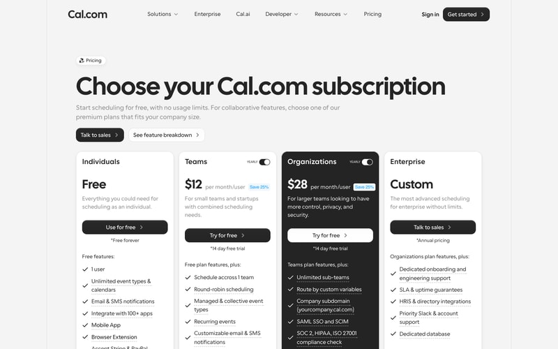
**Pricing Card:**
- Background: white or black (Organizations tier)
- Border: 1px solid gray-200
- Padding: 24px
- Border radius: 16px
- Shadow: md on hover

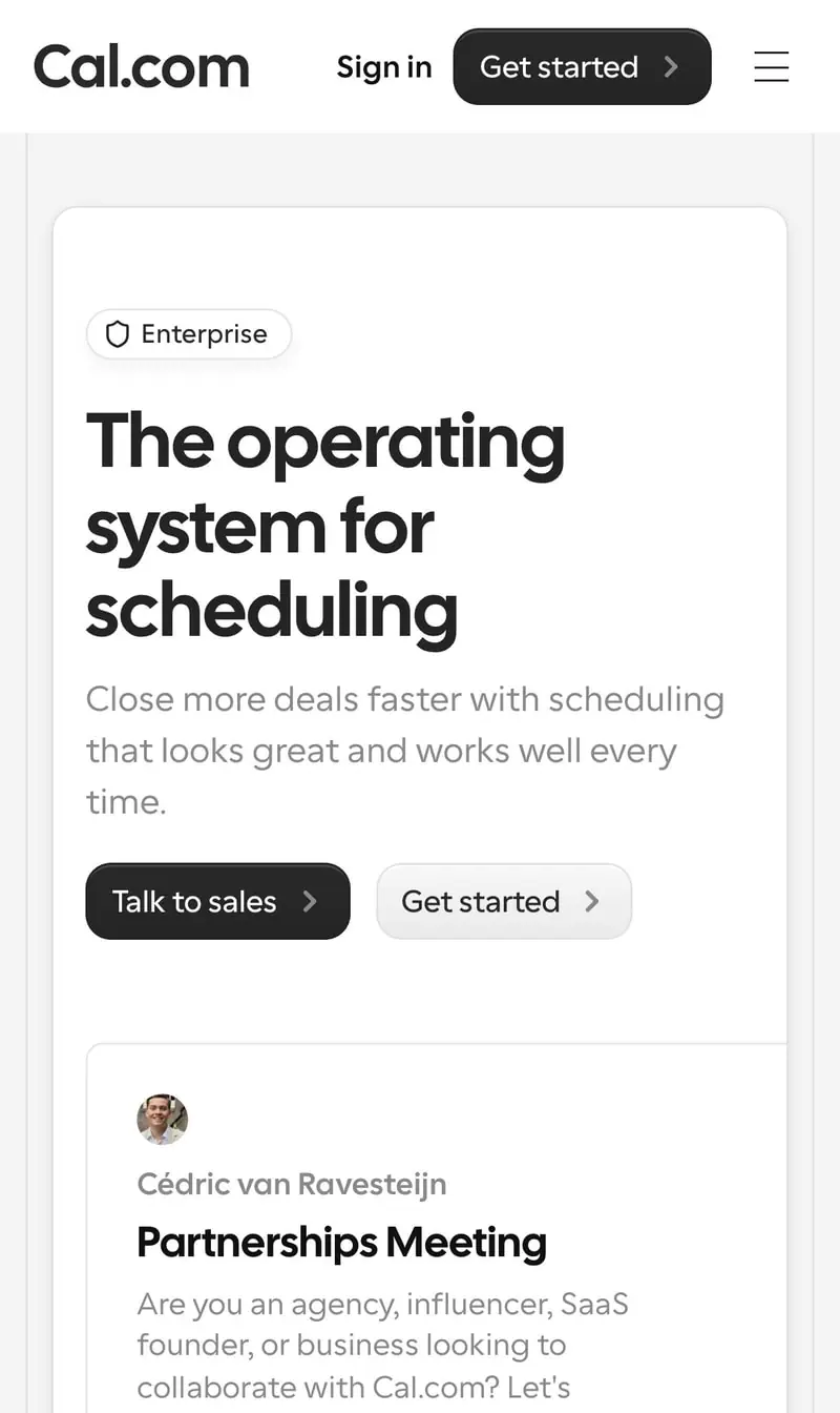
**Meeting Card:**
- Background: white
- Border: 1px solid gray-200
- Padding: 20px
- Border radius: 12px
- Avatar: 40px circle, top-left
- Title: 24px semibold
- Description: 14px gray-600

### Input

- Height: 40px
- Padding: 12px 16px
- Border: 1px solid gray-200
- Border radius: 8px
- Focus: border-gray-900, outline-none
- Placeholder: gray-400

### Calendar Widget

- Grid: 7 columns (days)
- Cell: 40px × 40px
- Selected: gray-100 background
- Current day: bold text, dot indicator
- Spacing: 4px gap between cells
- Border radius: 8px per cell

### Navigation

- Height: 64px
- Padding: 0 24px
- Background: white
- Border bottom: 1px solid gray-200
- Logo: 32px height
- Menu items: 16px, gray-700, hover gray-900
- Sticky positioning

### Badge

- Padding: 4px 12px
- Border radius: 6px
- Font size: 12px
- Font weight: 500
- Background: gray-100
- Icon: 16px, left-aligned

### Toggle Switch

- Width: 44px
- Height: 24px
- Border radius: full
- Background: gray-200 (off), black (on)
- Knob: 20px circle, white

## Layout Patterns

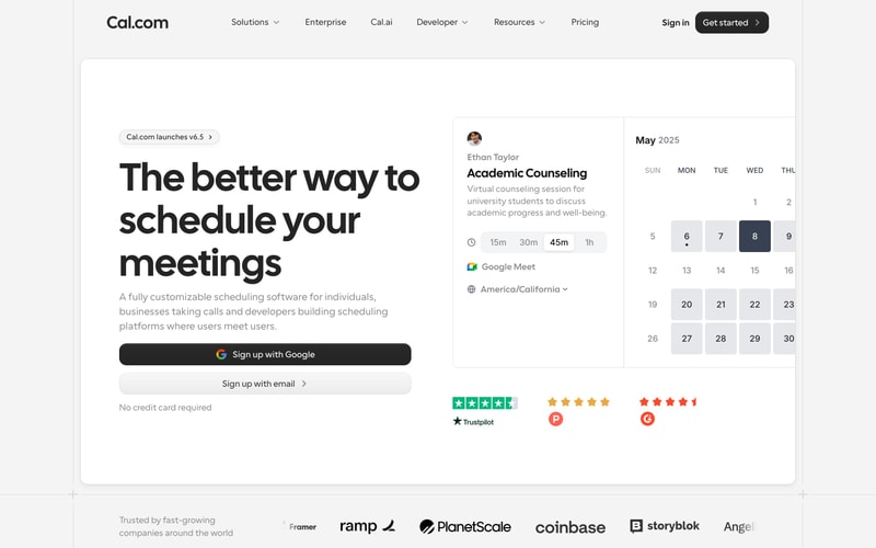
### Hero Section
- Max width: 1280px
- Padding: 96px 24px
- Flexbox: 2-column on desktop, stacked on mobile
- Left column: 60% width, hero text
- Right column: 40% width, preview card
- Gap: 64px

### Pricing Grid
- Grid: 4 columns on desktop, 1 column mobile
- Gap: 24px
- Max width: 1200px
- Center-aligned

### Navigation Layout
- Fixed/sticky header
- Flexbox: space-between
- Logo + menu (flex-1) + actions (flex-end)

### Footer
- Background: gray-50
- Padding: 64px 24px
- Logo grid: 6 columns, grayscale filter
- Text: "Trusted by fast-growing companies"