2 free brands left today.Sign up — unlimited →
Use this design system
Tokens · motion · components — drop straight into your project.
Download design kitStart a project with it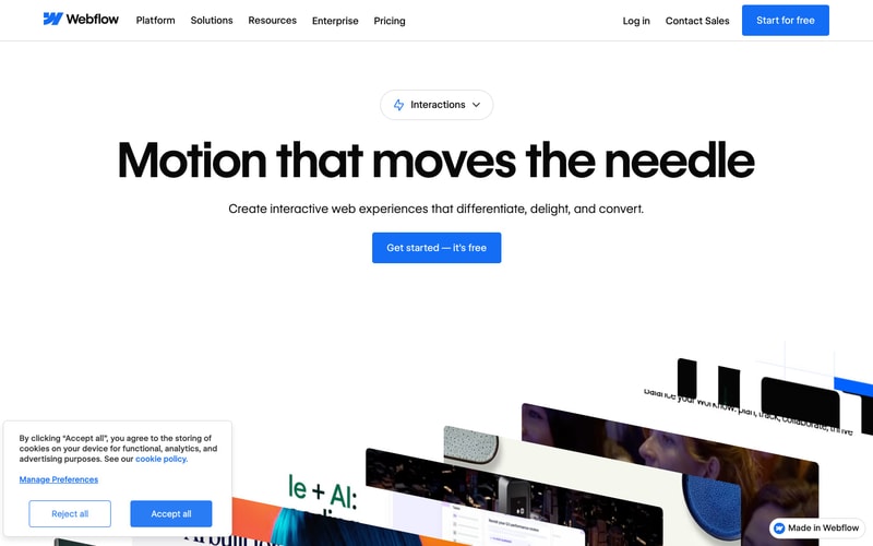
Similar styles
# Webflow Design System

## Tokens — Colors

| Name | Value | Usage |
|------|-------|-------|
| Primary Blue | `#1856F5` | Primary CTA buttons, links, active states, brand accents |
| Black | `#000000` | Headlines, primary text, high-emphasis content |
| White | `#FFFFFF` | Backgrounds, button text, card surfaces |
| Gray 900 | `#1A1A1A` | Dark backgrounds, footer |
| Gray 700 | `#4A4A4A` | Secondary text |
| Gray 500 | `#6B6B6B` | Tertiary text, subdued content |
| Gray 300 | `#D1D1D1` | Borders, dividers |
| Gray 100 | `#F7F7F7` | Light backgrounds, hover states |
| Gray 50 | `#FAFAFA` | Subtle backgrounds |
| Blue 50 | `#EEF0FF` | Card backgrounds, light accents |
| Blue 100 | `#D4DBFF` | Hover states on light blue |
| Orange | `#FF6B00` | Accent color, badges |
| Yellow | `#FFB800` | Accent color, highlights |
| Success Green | `#00C853` | Success states |
| Error Red | `#E53935` | Error states |

## Tokens — Typography

**Font Families:**
- Primary: `"Aeonik", -apple-system, BlinkMacSystemFont, "Segoe UI", Roboto, sans-serif`
- Monospace: `"Fira Code", "Courier New", monospace`

**Type Scale:**

| Name | Size | Line Height | Weight | Usage |
|------|------|-------------|--------|-------|
| Display Large | `96px` / `6rem` | 1.0 | 700 | Hero headlines |
| Display Medium | `80px` / `5rem` | 1.05 | 700 | Page headlines |
| Display Small | `64px` / `4rem` | 1.1 | 700 | Section headlines |
| Heading 1 | `48px` / `3rem` | 1.15 | 700 | Primary headings |
| Heading 2 | `40px` / `2.5rem` | 1.2 | 600 | Secondary headings |
| Heading 3 | `32px` / `2rem` | 1.25 | 600 | Tertiary headings |
| Heading 4 | `24px` / `1.5rem` | 1.3 | 600 | Component headings |
| Heading 5 | `20px` / `1.25rem` | 1.4 | 600 | Small headings |
| Body Large | `18px` / `1.125rem` | 1.6 | 400 | Large body text |
| Body | `16px` / `1rem` | 1.6 | 400 | Default body text |
| Body Small | `14px` / `0.875rem` | 1.5 | 400 | Small text, captions |
| Caption | `12px` / `0.75rem` | 1.4 | 500 | Labels, metadata |
| Overline | `11px` / `0.6875rem` | 1.3 | 700 | Uppercase labels |

## Tokens — Spacing

| Name | Value | Usage |
|------|-------|-------|
| Space 2 | `2px` / `0.125rem` | Minimal spacing |
| Space 4 | `4px` / `0.25rem` | Icon spacing |
| Space 8 | `8px` / `0.5rem` | Small gaps |
| Space 12 | `12px` / `0.75rem` | Compact spacing |
| Space 16 | `16px` / `1rem` | Default spacing |
| Space 24 | `24px` / `1.5rem` | Medium spacing |
| Space 32 | `32px` / `2rem` | Large spacing |
| Space 48 | `48px` / `3rem` | Section spacing |
| Space 64 | `64px` / `4rem` | Large section spacing |
| Space 80 | `80px` / `5rem` | Extra large spacing |
| Space 96 | `96px` / `6rem` | Hero spacing |
| Space 120 | `120px` / `7.5rem` | Maximum spacing |

## Tokens — Border Radius

| Name | Value | Usage |
|------|-------|-------|
| Radius None | `0px` | Sharp corners |
| Radius XS | `4px` | Badges, small elements |
| Radius SM | `8px` | Buttons, inputs |
| Radius MD | `12px` | Cards, modals |
| Radius LG | `16px` | Large cards |
| Radius XL | `24px` | Feature cards |
| Radius Full | `9999px` | Pills, toggles |

## Tokens — Shadows

| Name | Value | Usage |
|------|-------|-------|
| Shadow XS | `0 1px 2px rgba(0,0,0,0.05)` | Subtle elevation |
| Shadow SM | `0 2px 4px rgba(0,0,0,0.06)` | Small cards |
| Shadow MD | `0 4px 12px rgba(0,0,0,0.08)` | Cards, dropdowns |
| Shadow LG | `0 8px 24px rgba(0,0,0,0.10)` | Modals, popovers |
| Shadow XL | `0 16px 48px rgba(0,0,0,0.12)` | Large modals |

## Tokens — Borders

| Name | Value | Usage |
|------|-------|-------|
| Border Thin | `1px` | Default borders |
| Border Medium | `2px` | Emphasized borders |
| Border Thick | `4px` | Heavy emphasis |
| Border Color | `#D1D1D1` | Default border color |
| Border Color Light | `#E8E8E8` | Subtle borders |

## Components

### Button
- **Primary**: Blue background (`#1856F5`), white text, 8px radius, 16px horizontal / 12px vertical padding
- **Secondary**: White background, black text, 1px border, 8px radius
- **Text**: No background, blue text
- **Sizes**: Small (14px), Medium (16px), Large (18px)
- **States**: Hover (darker blue), Active (pressed state), Disabled (gray)

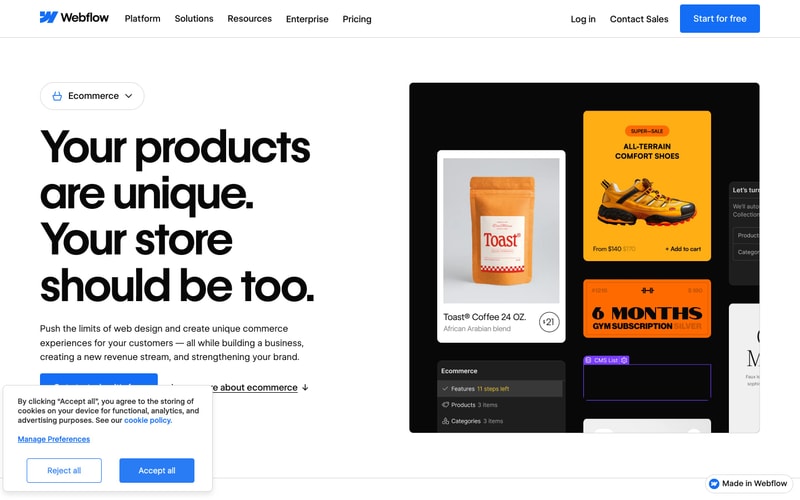
### Card
- Background: White or light blue (`#EEF0FF`)
- Border radius: 12-16px
- Padding: 24-32px
- Shadow: Subtle or none
- Hover: Lift effect with shadow increase

### Navigation
- Horizontal layout
- Fixed/sticky header
- Logo left, links center/left, CTAs right
- Link spacing: 32px
- Hover: Underline or color change

### Toggle Switch
- Pill shape (full radius)
- Blue active state
- Gray inactive state
- Smooth transition

### Badge
- Small uppercase text (11px, 700 weight)
- Black background for emphasis ("POPULAR", "FLEXIBLE")
- 4px radius
- 8px horizontal / 4px vertical padding

### Modal/Dialog
- White background
- 16px radius
- Overlay: `rgba(0,0,0,0.5)`
- Padding: 32-48px
- Max-width: 600px

### Input/Form Field
- 8px radius
- 1px border (#D1D1D1)
- 12px horizontal / 10px vertical padding
- Focus: Blue border

## Layout Patterns

### Container
- Max-width: 1280px
- Horizontal padding: 24px (mobile), 48px (desktop)
- Centered with `margin: 0 auto`

### Grid System
- 12-column grid
- Gap: 24px
- Responsive breakpoints: 480px, 768px, 992px, 1280px

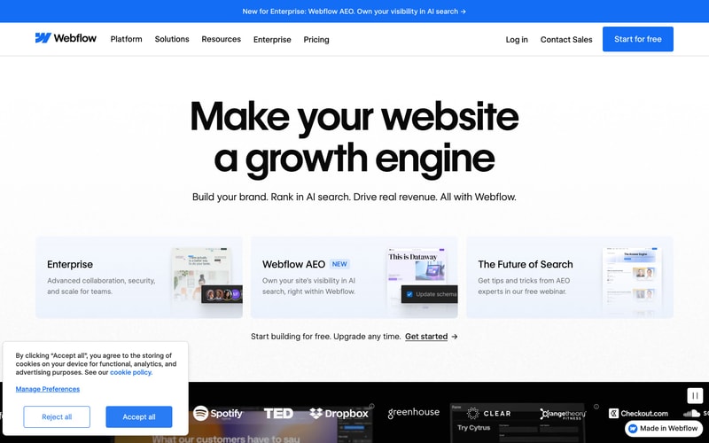
### Hero Section
- Large centered headline (80-96px)
- Subheadline (18px)
- Vertical spacing: 120px top/bottom
- CTA buttons with 16px gap

### Card Grid
- 3-column layout (desktop)
- 24px gap
- Equal height cards

### Footer
- Dark background (#1A1A1A)
- White/gray text
- Logo grid layout
- Full-width