Use this design system
Tokens · motion · components — drop straight into your project.
Download design kitStart a project with it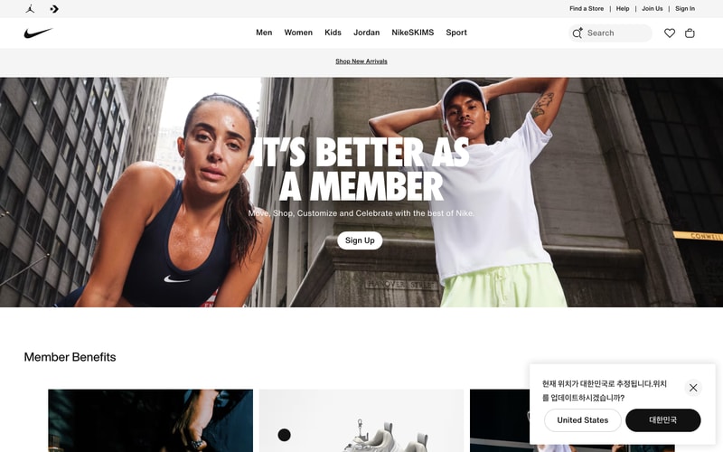
Similar styles
# Nike Design System

## Tokens — Colors

| Token | Value | Usage |
|-------|-------|-------|
| `--color-black` | `#111111` | Primary text, logo, icons |
| `--color-white` | `#FFFFFF` | Backgrounds, button text |
| `--color-gray-900` | `#111111` | Headings, primary text |
| `--color-gray-700` | `#333333` | Secondary text |
| `--color-gray-500` | `#757575` | Tertiary text, disabled states |
| `--color-gray-300` | `#CCCCCC` | Borders, dividers |
| `--color-gray-200` | `#E5E5E5` | Light borders |
| `--color-gray-100` | `#F5F5F5` | Background accents |
| `--color-gray-50` | `#F7F7F7` | Subtle backgrounds |
| `--color-red` | `#DC143C` | "Just In" badges, accent highlights |
| `--color-orange` | `#FF4500` | Product accents, CTAs |
| `--color-pink` | `#FF006E` | Product colorways |
| `--color-pink-bright` | `#FF1493` | Vibrant product accents |
| `--color-purple` | `#6B46C1` | Product colorways |
| `--color-blue` | `#1E40AF` | Links, product colorways |

## Tokens — Typography

**Font Families:**
- Primary: `"Helvetica Neue", Helvetica, Arial, sans-serif`
- Fallback: `system-ui, -apple-system, sans-serif`

**Type Scale:**

| Token | Size | Line Height | Weight | Usage |
|-------|------|-------------|--------|-------|
| `--text-hero` | `72px` | `1.1` | `800` | Hero headlines |
| `--text-3xl` | `48px` | `1.2` | `700` | Section headings |
| `--text-2xl` | `32px` | `1.25` | `700` | Page titles |
| `--text-xl` | `28px` | `1.3` | `500` | Subsection titles |
| `--text-lg` | `20px` | `1.4` | `500` | Card titles |
| `--text-base` | `16px` | `1.5` | `400` | Body text, product titles |
| `--text-sm` | `14px` | `1.5` | `400` | Nav links, labels |
| `--text-xs` | `12px` | `1.5` | `400` | Captions, metadata |

## Tokens — Spacing

| Token | Value |
|-------|-------|
| `--space-1` | `4px` |
| `--space-2` | `8px` |
| `--space-3` | `12px` |
| `--space-4` | `16px` |
| `--space-5` | `20px` |
| `--space-6` | `24px` |
| `--space-8` | `32px` |
| `--space-9` | `36px` |
| `--space-12` | `48px` |
| `--space-16` | `64px` |
| `--space-24` | `96px` |

## Tokens — Border Radius

| Token | Value | Usage |
|-------|-------|-------|
| `--radius-none` | `0px` | Product cards, images |
| `--radius-sm` | `4px` | Small elements |
| `--radius-md` | `8px` | Inputs, small buttons |
| `--radius-lg` | `12px` | Toggles, medium cards |
| `--radius-xl` | `24px` | Modals, dialogs |
| `--radius-full` | `9999px` | Pill buttons, badges |

## Tokens — Shadows

| Token | Value | Usage |
|-------|-------|-------|
| `--shadow-sm` | `0 1px 2px rgba(0,0,0,0.05)` | Subtle elevation |
| `--shadow-md` | `0 4px 8px rgba(0,0,0,0.1)` | Cards on hover |
| `--shadow-lg` | `0 10px 24px rgba(0,0,0,0.15)` | Dropdowns |
| `--shadow-xl` | `0 20px 40px rgba(0,0,0,0.2)` | Modals |

## Tokens — Borders

| Token | Value | Usage |
|-------|-------|-------|
| `--border-light` | `1px solid #E5E5E5` | Dividers |
| `--border-medium` | `1px solid #CCCCCC` | Inputs |
| `--border-dark` | `1px solid #757575` | Active states |

## Components

### Navigation Bar
- Fixed/sticky header
- White background, subtle bottom border
- Logo left, nav center, utilities right
- Height: ~60px
- Horizontal spacing: 16-24px between items

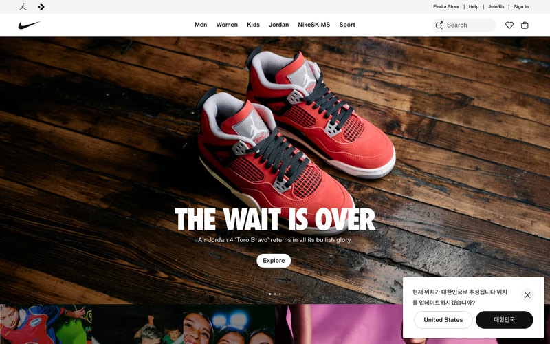
### Hero Section
- Full-width image background
- Centered large headline (72px, bold, white with black stroke)
- Subheading below (16px)
- CTA button (pill shape, white background, black text)
- Padding: 96px vertical

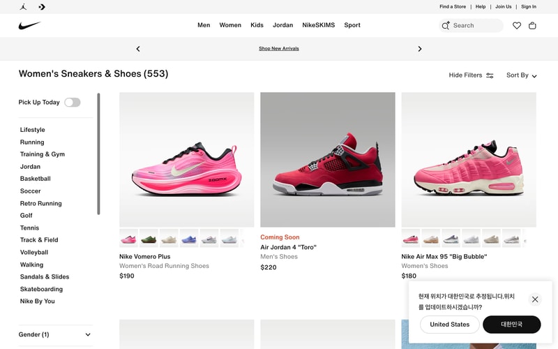
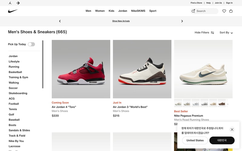
### Product Card
- Sharp corners (0px radius)
- Image container: aspect ratio 1:1
- Color swatches below image (circular, 20px diameter)
- Badge: "Just In" (red text, small caps, 12px)
- Product title: 16px, medium weight
- Category: 14px, gray-500
- Price: 16px, medium weight
- Hover: subtle shadow elevation

### Sidebar Filter
- Left column, fixed width ~240px
- Section headers: 16px, bold
- Toggle switches for boolean filters
- Accordion sections with chevron icons
- Checkbox lists
- White background

### Modal Dialog
- Centered overlay
- Max-width: 600px
- Border radius: 24px
- Padding: 48px
- Backdrop: rgba(0,0,0,0.5)
- Close button: chevron left + "Back" text

### Buttons
**Primary:**
- Background: black
- Text: white, 15px, medium weight
- Border-radius: 30px (pill)
- Padding: 8px 24px
- Height: 40px

**Secondary:**
- Background: white
- Border: 1px solid #CCCCCC
- Text: black
- Border-radius: 30px

### Toggle Switch
- Background: #E5E5E5 (off), black (on)
- Handle: white circle
- Border-radius: 12px
- Width: 48px, height: 24px

## Layout Patterns

### Grid System
- Desktop: 3-column product grid
- Gap: 12px horizontal, 24px vertical
- Container max-width: 1440px
- Container padding: 48px

### Responsive Breakpoints
- Mobile: < 640px (1 column)
- Tablet: 640-1024px (2 columns)
- Desktop: > 1024px (3 columns)

### Page Structure
- Sticky navigation (60px height)
- Optional promo banner
- Optional breadcrumbs
- Page title + filters/sort controls
- Sidebar + main content (70/30 split)
- Footer