2 free brands left today.Sign up — unlimited →
Use this design system
Tokens · motion · components — drop straight into your project.
Download design kitStart a project with it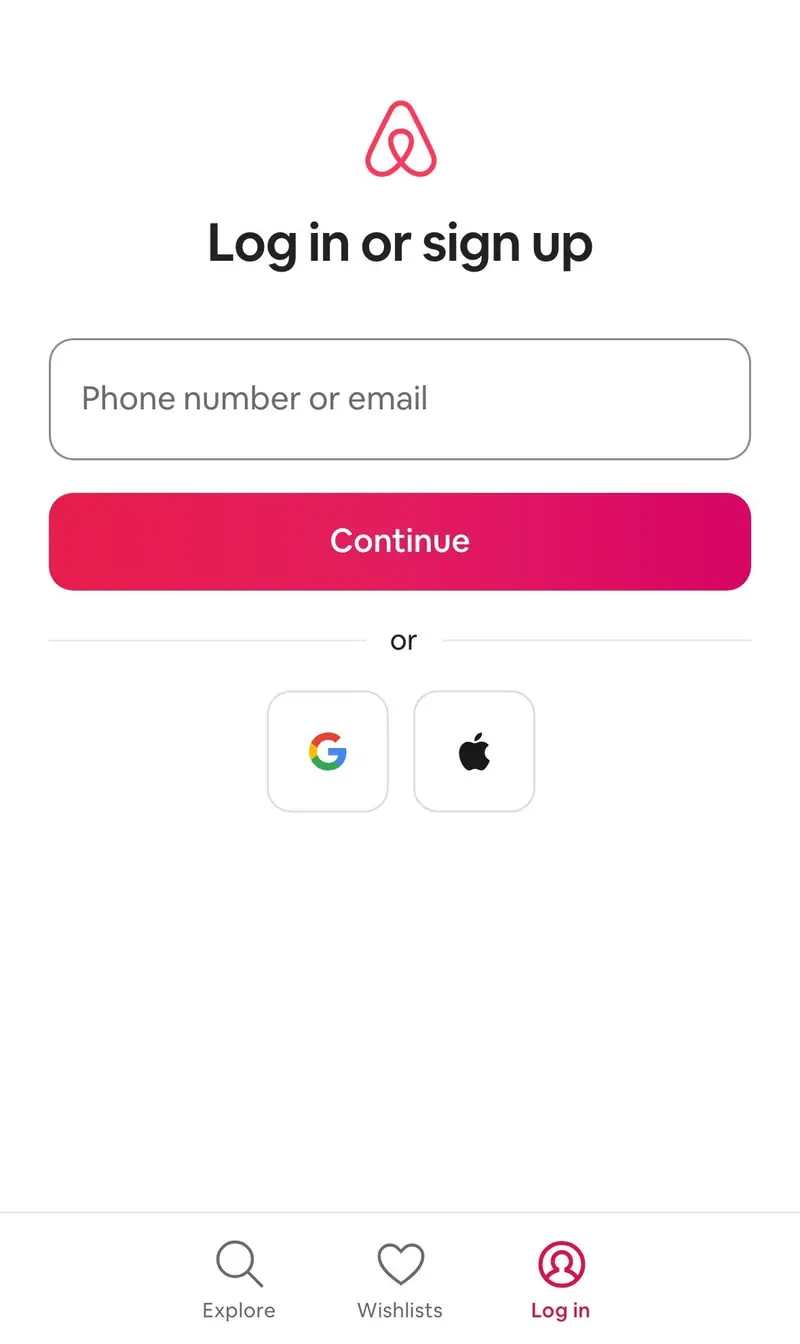
Similar styles
# Airbnb Design System

## Tokens — Colors

| Token | Value | Usage |
|-------|-------|-------|
| `primary` | `#FF385C` | Primary brand color, CTAs, links, accents |
| `primary-dark` | `#E31C5F` | Hover states for primary actions |
| `primary-light` | `#FF5A7D` | Light accent, highlights |
| `background` | `#FFFFFF` | Main background |
| `surface` | `#F7F7F7` | Card backgrounds, subtle backgrounds |
| `text-primary` | `#222222` | Primary text, headings |
| `text-secondary` | `#717171` | Secondary text, descriptions |
| `text-tertiary` | `#B0B0B0` | Disabled, placeholder text |
| `border` | `#DDDDDD` | Default borders |
| `border-light` | `#EBEBEB` | Subtle dividers |
| `rating-star` | `#FFC400` | Star rating icons |
| `success` | `#00A699` | Success states |
| `error` | `#C13515` | Error states, destructive actions |
| `overlay` | `rgba(0, 0, 0, 0.5)` | Image overlays, modal backdrops |
| `badge-bg` | `#FFFFFF` | Badge backgrounds |
| `shadow-sm` | `rgba(0, 0, 0, 0.08)` | Light shadow color |
| `shadow-md` | `rgba(0, 0, 0, 0.12)` | Medium shadow color |
| `shadow-lg` | `rgba(0, 0, 0, 0.2)` | Heavy shadow color |

## Tokens — Typography

**Font Families:**
- Primary: `Circular, -apple-system, BlinkMacSystemFont, "Segoe UI", Roboto, Helvetica, Arial, sans-serif`
- Monospace: `"SF Mono", Monaco, Consolas, monospace`

**Type Scale:**

| Token | Size | Line Height | Weight | Usage |
|-------|------|-------------|--------|-------|
| `display-lg` | `56px` | `64px` | `800` | Hero headlines |
| `display-md` | `48px` | `56px` | `700` | Large headlines |
| `heading-1` | `36px` | `44px` | `700` | Page titles |
| `heading-2` | `32px` | `40px` | `600` | Section headers |
| `heading-3` | `26px` | `32px` | `600` | Subsection headers |
| `heading-4` | `22px` | `28px` | `600` | Card titles |
| `body-lg` | `18px` | `28px` | `400` | Large body text |
| `body` | `16px` | `24px` | `400` | Default body text |
| `body-sm` | `14px` | `20px` | `400` | Small body text |
| `caption` | `12px` | `16px` | `400` | Captions, metadata |

## Tokens — Spacing

Scale: `4, 8, 12, 16, 20, 24, 32, 40, 48, 64, 80, 96, 128`

| Token | Value | Usage |
|-------|-------|-------|
| `space-1` | `4px` | Tight spacing |
| `space-2` | `8px` | Close elements |
| `space-3` | `12px` | Small gaps |
| `space-4` | `16px` | Default spacing |
| `space-5` | `20px` | Medium spacing |
| `space-6` | `24px` | Card gaps, grid gaps |
| `space-8` | `32px` | Large spacing |
| `space-10` | `40px` | Section spacing |
| `space-12` | `48px` | Large section spacing |
| `space-16` | `64px` | Extra large spacing |
| `space-20` | `80px` | Hero spacing |
| `space-24` | `96px` | Page spacing |
| `space-32` | `128px` | Maximum spacing |

## Tokens — Border Radius

| Token | Value | Usage |
|-------|-------|-------|
| `radius-sm` | `8px` | Badges, small cards |
| `radius-md` | `12px` | Cards, images |
| `radius-lg` | `16px` | Large cards |
| `radius-xl` | `24px` | Extra large cards |
| `radius-full` | `9999px` | Pills, rounded buttons |

## Tokens — Shadows

| Token | Value | Usage |
|-------|-------|-------|
| `shadow-sm` | `0 1px 2px rgba(0, 0, 0, 0.08)` | Subtle elevation |
| `shadow-md` | `0 2px 8px rgba(0, 0, 0, 0.12)` | Cards, dropdowns |
| `shadow-lg` | `0 6px 16px rgba(0, 0, 0, 0.12)` | Search bar, modals |
| `shadow-xl` | `0 12px 32px rgba(0, 0, 0, 0.2)` | Elevated modals |
| `shadow-hover` | `0 6px 20px rgba(0, 0, 0, 0.2)` | Card hover state |

## Tokens — Borders

| Token | Value | Usage |
|-------|-------|-------|
| `border-thin` | `1px solid #EBEBEB` | Subtle dividers |
| `border-default` | `1px solid #DDDDDD` | Default borders |
| `border-thick` | `2px solid #222222` | Emphasized borders |

## Components

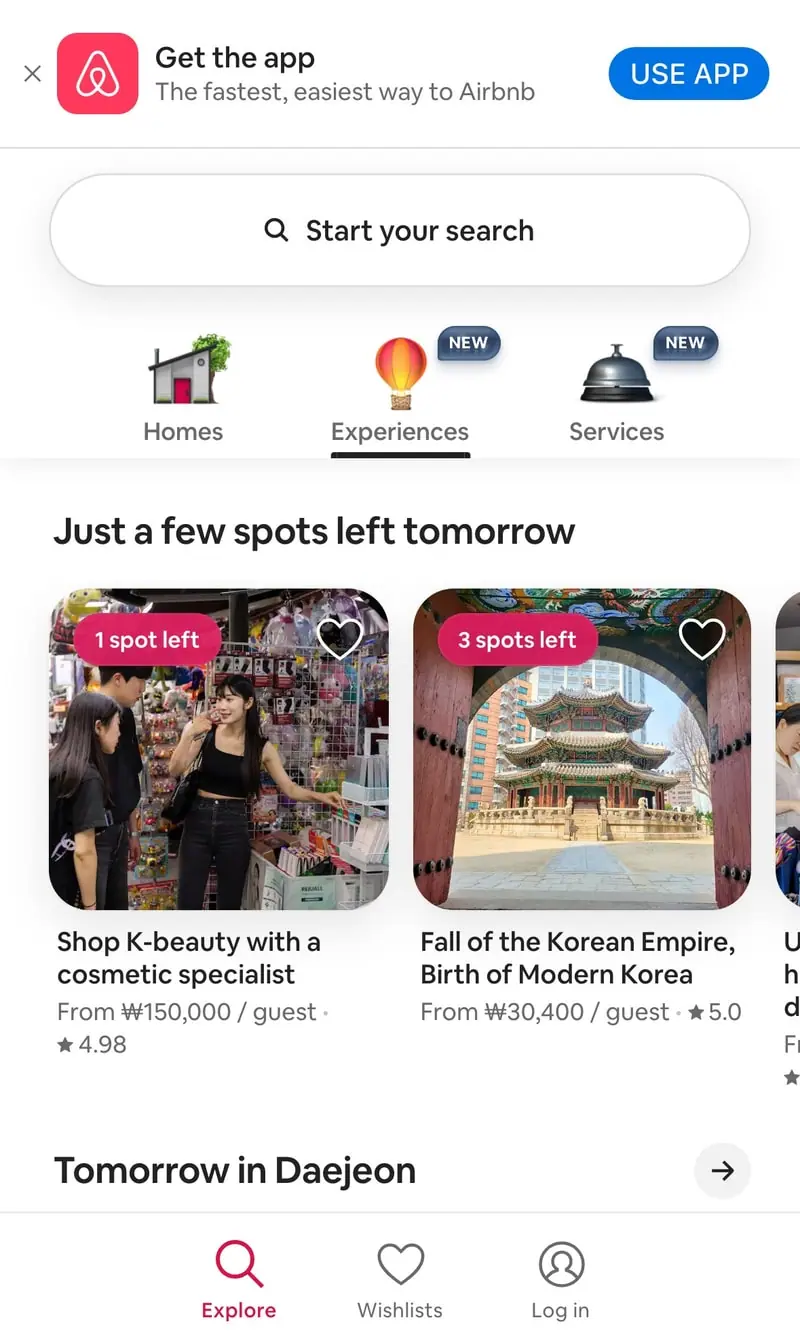
### Navigation Bar
- Fixed header with white background
- Airbnb logo (pink/coral #FF385C)
- Icon-based navigation items (Homes, Experiences, Services)
- "NEW" badges for new sections
- "Become a host" link
- Globe icon (language selector)
- Menu hamburger icon
- Height: ~80px
- Shadow: `0 1px 2px rgba(0,0,0,0.08)`

### Search Bar
- Pill-shaped container (border-radius: 40px)
- Segmented into 3 sections: Where, When, Who
- Labels: 12px, bold, uppercase spacing
- Input text: 14px
- Primary button (search) on right: pink circle with magnifying glass
- Shadow: `0 2px 16px rgba(0,0,0,0.12)`
- Hover: shadow increases

### Property Card
- Image: aspect ratio 4:3, border-radius 12px
- "Guest favorite" badge: white pill, top-left, 8px padding
- Heart icon: top-right, white outline
- Content padding: 12px
- Title: 16px, semibold
- Location + dates: 14px, gray #717171
- Price: 16px, bold, black
- Rating: Star icon (gold) + number (14px)
- Hover: scale(1.02), shadow increases

### Badge
- Background: white or transparent
- Border: 1px solid #DDDDDD (optional)
- Border-radius: 8px
- Padding: 6px 12px
- Font: 12px, semibold
- Types: "Guest favorite", "Original", "NEW"

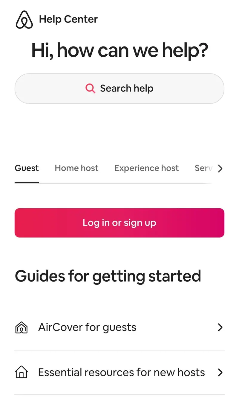
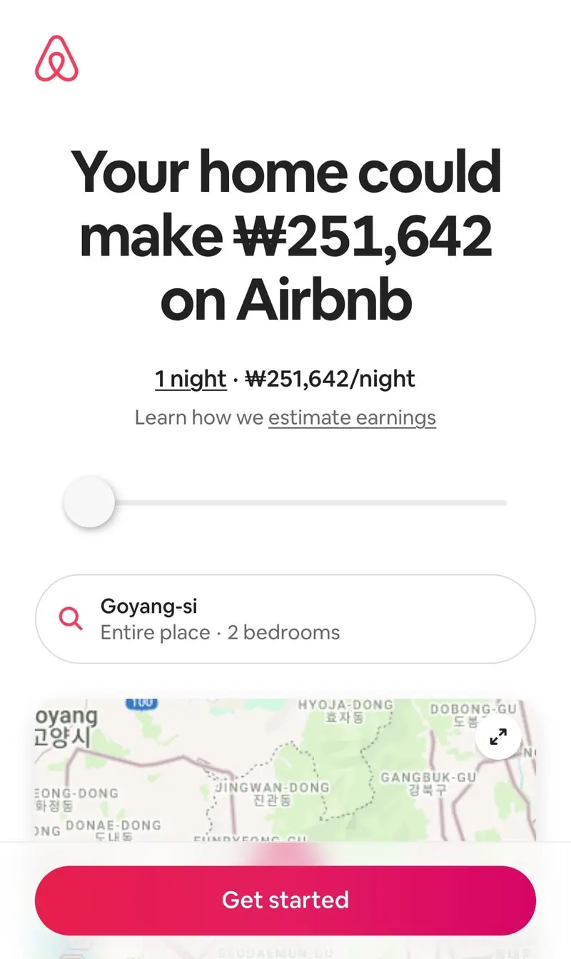
### Button — Primary
- Background: #FF385C
- Color: white
- Border-radius: 24px
- Padding: 14px 24px
- Font: 16px, semibold
- Hover: darken to #E31C5F

### Button — Secondary
- Background: transparent
- Border: 1px solid #222222
- Color: #222222
- Border-radius: 24px
- Padding: 14px 24px
- Font: 16px, semibold
- Hover: background #F7F7F7

### Star Rating
- Star icon: #FFC400 (filled) or #DDDDDD (empty)
- Number: 14px, semibold
- Spacing: 4px between icon and number

### Horizontal Carousel
- Section title: 26px, bold
- Arrow link on title
- Cards: horizontal scroll
- Gap: 24px
- Navigation arrows: left/right, fixed position on hover
- Scroll behavior: smooth

### Tab Navigation
- Horizontal layout
- Active: 16px semibold, bottom border 2px #222222
- Inactive: 16px regular, #717171
- Hover: #222222
- Bottom border on active tab

## Layout Patterns

### Page Layout
- Max-width: 1760px
- Padding: 40px horizontal (desktop), 24px (mobile)
- Header: fixed, white background
- Content: centered

### Grid Layout
- Columns: 4-6 on desktop, 2-3 tablet, 1 mobile
- Gap: 24px horizontal, 40px vertical
- Responsive breakpoints: 1440px, 1024px, 768px, 375px

### Section Spacing
- Between sections: 64px
- Section title to content: 24px
- Content to footer: 96px

### Card Grid
- Auto-fit grid with min-width 280px
- Gap: 24px
- Card hover: transform scale(1.02), transition 200ms